html界面嵌入网易云,使用flex进行网易云音乐界面构建和布局解析(1)
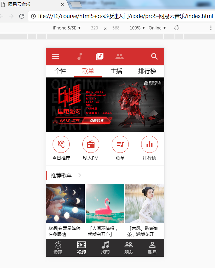
使用flex进行网易云音乐界面构建和布局解析1.为什么要用flex进行webapp布局第一,float布局 需要清除浮动,很麻烦。第二,绝对定位需要考虑位置和空间占位第三,元素垂直水平居中问题。2.网易云音乐首页分析3.啥也别说,直接上代码先来一个html,001别的不说咱们先用色块把各部分堆出来,这个跟flex没半毛钱关系,只是用了rem.html{font-size: 100px;}#head
使用flex进行网易云音乐界面构建和布局解析
1.为什么要用flex进行webapp布局
第一,float布局 需要清除浮动,很麻烦。
第二,绝对定位需要考虑位置和空间占位
第三,元素垂直水平居中问题。
2.网易云音乐首页分析
3.啥也别说,直接上代码
先来一个html,
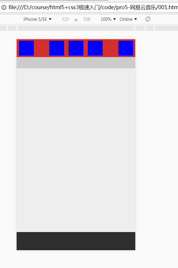
001别的不说咱们先用色块把各部分堆出来,这个跟flex没半毛钱关系,只是用了rem.
html{
font-size: 100px;
}
#header{
background-color: #d32f2f;
min-height: 0.48rem;
position: fixed;
top: 0;
left: 0;
right: 0;
z-index: 1000;
}
#navbar {
position: fixed;
top: 0.48rem;
left: 0;
right: 0;
z-index: 1000;
background: #ccc;
min-height: 0.3rem;
}
#footer {
height: 0.49rem;
background: #2f2d2e;
width: 100%;
position: fixed;
bottom: 0;
left: 0;
color: rgba(255, 255, 255, .87);
font-size: 0.12rem;
}
.routerview {
padding-bottom: 0.49rem;
}
.routerview {
position: absolute;
left: 0;
top: 0.81rem;
width: 100%;
height: 2000px;
background: #eeeeee;
}
接着往下就是重点了,我们来看看头部细节细节,左右图标,
css部分,
#header{
align-items: center;
justify-content: space-between;
}
那中间部分三个等距怎么办?
html,
上css,
.title {
display: flex;
justify-content: center;
}
结果如下,
最复杂的部分已经结束了,剩下的就很OK了。
最后给大家三个小尝试吧。
1.剩下的部分切出来。
2.解决动态的多屏幕适配问题(提示:js+rem动态计算)
//参考代码:
function getRem(pwidth,prem){
var html = document.getElementsByTagName("html")[0];
var oWidth = 2*document.body.clientWidth || document.documentElement.clientWidth;
html.style.fontSize = oWidth/pwidth*prem + "px";
}
3.flex兼容性(提示:postcss)

华为开发者空间,是为全球开发者打造的专属开发空间,汇聚了华为优质开发资源及工具,致力于让每一位开发者拥有一台云主机,基于华为根生态开发、创新。
更多推荐


 0
0 0
0- 0


 已为社区贡献4条内容

所有评论(0)