echarts柱状图x,y轴对应多条数据(可自定义)
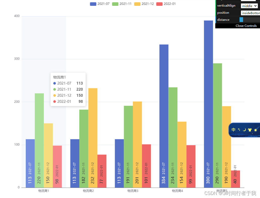
echarts,x,y轴对应多条数据,y轴取反就行先说需求,我做这个图表是多个物流商对应不同月份的数值配置项optionoption = {tooltip: {trigger: 'axis',axisPointer: {type: 'shadow'}},legend: {data: ['2021-07', '2021-11', '2021-12', '2022-01'] // 换接口的值},xAx
·
echarts,x,y轴对应多条数据,y轴取反就行
先说需求,我做这个图表是多个物流商对应不同月份的数值
配置项option
option = {
  tooltip: {
    trigger: 'axis',
    axisPointer: {
      type: 'shadow'
    }
  },
  legend: {
    data: ['2021-07', '2021-11', '2021-12', '2022-01'] // 换接口的值
  },
  xAxis: [
    {
      type: 'category',
      axisTick: { show: false },
      data: ['物流商1', '物流商2', '物流商3', '物流商4', '物流商5'] // 换接口的值
    }
  ],
  yAxis: [ // 如果是y轴显示,将上面xAxis里的值互换一下就行了
    {
      type: 'value'
    }
  ],
  series: [ // 循环接口的值,也就是legend里的data数据
    {
      name: '2021-07',//legend里的data数据分别渲染上去
      type: 'bar',
      barGap: 0,
      label: { // 在柱状图上面显示
        show: true,
        position: 'top'
      },
      emphasis: { // 这个属性是强调,突出的
        focus: 'series'
      },
      data: [113, 113, 113, 334, 390]  // 换接口的值
    },
    {
      name: '2021-11',
      type: 'bar',
      label: {
        show: true,
        position: 'top'
      },
      emphasis: {
        focus: 'series'
      },
      data: [220, 182, 191, 234, 290]
    },
    {
      name: '2021-12',
      type: 'bar',
      label: {
        show: true,
        position: 'top'
      },
      emphasis: {
        focus: 'series'
      },
      data: [150, 232, 201, 154, 190]
    },
    {
      name: '2022-01',
      type: 'bar',
      label: {
        show: true,
        position: 'top'
      },
      emphasis: {
        focus: 'series'
      },
      data: [98, 77, 101, 99, 40]
    }
  ]
};
循环月份批量生产数据,对应series的数据,数据格式可根据自己风格来定
let mmm = temp.shippingCompany0.map(item => item.deliverMonth)
seriesValue = mmm.map((key, index) => {
  return {
    name: key,
    type: 'bar',
    label: {
      show: true,
      position: 'top'
    },
    barMaxWidth: 36, // 柱图宽度
    data: Object.keys(temp).map(key => temp[key][index].effectRate)
  }
})
// series: seriesValue

为开发者提供学习成长、分享交流、生态实践、资源工具等服务,帮助开发者快速成长。
更多推荐


 2
2 0
0- 0


 已为社区贡献11条内容

所有评论(0)