uni-app自定义导航栏实现中间凸起效果
效果图主要实现的是:点击中间图标后中间图标凸起的样式,找了很多插件都没法实现,于是自己封装了个组件。点击中间图标前:点击中间图标后:封装组件在components文件夹中新建一个tabbar.vue文件html代码:图片和文字样式是用三元运算符,通过判断选中的下标是否是当前下标来改变样式<template><view class="tabbar"><view clas
·
效果图
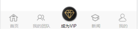
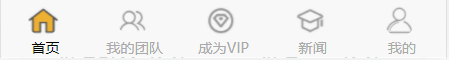
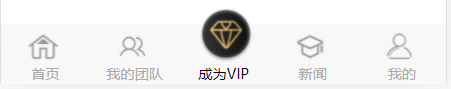
主要实现的是:点击中间图标后中间图标凸起的样式,找了很多插件都没法实现,于是自己封装了个组件。
点击中间图标前:
点击中间图标后:
封装组件
在components文件夹中新建一个tabbar.vue文件
html代码:
图片和文字样式是用三元运算符,通过判断选中的下标是否是当前下标来改变样式
<template>
	<view class="tabbar">
		<view class="tarbar-list">
			<view class="barPart" @click="changPage(index)" v-for="(list , index) in tabBar.list" :key="index">
				<image :src="selected == index ? list.selectedIconPath : list.iconPath"
					:style="{marginLeft : index == 2&&selected == index ? '34'+'rpx':'46'+'rpx' , width : list.iconWith+'rpx' , height : list.iconHeight+'rpx'}">
				</image>
				<view :style='{color: selected == index ? tabBar.selectedColor : tabBar.color}'>
					{{list.text}}
				</view>
			</view>

		</view>
	</view>
</template>
js代码:
export default {
		data() {
			return {

				tabBar: {
					color: '#A9A9A9',
					selectedColor: '#000000',
					list: [{
							iconPath: "../../static/index/home.png",
							selectedIconPath: "../../static/index/home_1.png",
							text: '首页',
							pagePath: "/pages/index/index",
							iconWith: '50',
							iconHeight: '50',
						},
						{
							iconPath: "../../static/index/team.png",
							selectedIconPath: "../../static/index/team_1.png",
							text: '我的团队',
							pagePath: "/pages/myTeam/myTeam",
							iconWith: '50',
							iconHeight: '50',
						},
						{
							iconPath: "../../static/index/vip.png",
							selectedIconPath: "../../static/index/vip_1.png",
							text: '成为VIP',
							pagePath: "/pages/tobeVIP/tobeVIP",
							iconWith: '50',
							iconHeight: '50',
						},
						{
							iconPath: "../../static/index/college.png",
							selectedIconPath: "../../static/index/college_1.png",
							text: '新闻',
							pagePath: "/pages/news/news",
							iconWith: '50',
							iconHeight: '50',
						},
						{
							iconPath: "../../static/index/mine.png",
							selectedIconPath: "../../static/index/mine_1.png",
							text: '我的',
							pagePath: "/pages/me/me",
							iconWith: '50',
							iconHeight: '50',
						}
					]
				},
				selected: this.current,
			}
		},
		//接收父组件传来的参数
		props: {
			//参数名
			current: {
				type: [Number, String],//参数类型
				default: 0//默认值
			},
		},
		methods: {
			changPage(index) {
				console.log(index);
				//判断电机的是不是中间的按钮,是的话改变图标大小
				if (index == 2) {
					this.tabBar.list[2].iconWith = 90;
					this.tabBar.list[2].iconHeight = 90;
				} else {
					this.tabBar.list[2].iconWith = 50;
					this.tabBar.list[2].iconHeight = 50;
				}
				//页面跳转
				uni.redirectTo({
					url: this.tabBar.list[index].pagePath
				})
				//改变选中下标
				this.selected = index;
				if (this.selected == index){
					return
				}
				this.$emit('change', index)
			}
		},
	}
css样式:
	.tarbar-list {
		display: flex;
		align-items: flex-end;
		justify-content: space-around;
		height: 100rpx;
		background-color: #F8F8F8;
		position: fixed;
		bottom: 0;
		width: 100%;
	}

	.barPart {
		width: 20%;
		font-size: 24rpx;
	}

	.barPart>view {
		text-align: center;
	}

	.barPart>image {
		bottom: 36rpx;
		position: fixed;
		margin-left: 44rpx;
		background-color: #F8F8F8;
		border-radius: 50%;
		object-fit: cover;
		object-position: center;
	}
页面引入组件
以index页面为例,通过父子组件传参改变下跳转后页面的默认下标:
js中:
import tabbar from "../../components/tabbar.vue"
	data() {
			return {
				current:0//默认下标
			}
		},
		components: {
			tabbar
		},
html中:
		<!-- 下端导航栏 -->
		<tabbar :current="current"></tabbar>

为开发者提供学习成长、分享交流、生态实践、资源工具等服务,帮助开发者快速成长。
更多推荐


 8
8 0
0- 0


 已为社区贡献2条内容

所有评论(0)