CSS之文本框样式和水平居中
文章目录1 CSS使用1.1 文本框样式1.1.1 鼠标一上去变成浅绿色1.1.2 文本框提示样式,鼠标点击获得焦点时提示内容消失1.1.3 input文本框样式1.1.4 只有下划线的文本框1.1.5 软件序列号式的输入框1.1.6 输入框景背景透明1.1.7 鼠标划过输入框,输入框背景色变色1.1.8 输入字时输入框边框闪烁(边框为小方型)1.1.9 输入字时输入框边框闪烁(边框为虚线)1.1
1 CSS使用
1.1 文本框样式
1.1.1 鼠标一上去变成浅绿色
<html>
<head>
<title>css-文本框</title>
<style type="text/css">
<!--
.box1,.box2 { width:144px; height:22px; line-height:22px; border:1px solid #A9BAC9;background:url
(http://cn.yimg.com/i/mail/06/bg_box1.gif) no-repeat #fff; padding:0 3px; font-size:12px; }
.box2 { border:1px solid #9ECC00;}
-->
</style>
</head>
<body>
<INPUT class=box1 id=login
onmouseover="this.className='box2'" onMouseOut="this.className='box1'"
name=login>
</body>
</html>
1.1.2 文本框提示样式,鼠标点击获得焦点时提示内容消失
<!DOCTYPE html PUBLIC "-//W3C//DTD XHTML 1.0 Transitional//EN" "http://www.w3.org/TR/xhtml1/DTD/xhtml1-
transitional.dtd">
<html xmlns="http://www.w3.org/1999/xhtml">
<head>
<meta http-equiv="Content-Type" content="text/html; charset=gb2312" />
<title>文本框提示样式</title>
<style type="text/css">
<!--
.a1 {
color: #CCCCCC;
}
.a2 {
color: #000;
}
-->
</style>
</head>
<body>
<input name="n" type="text"/>
<input name="n1" type="text"/>
<script language="javascript">
window.onload=function(){
s('n','Your message1');s('n1','Your message2')
}
function g(a){return document.getElementByIdx_x(a)}
function s(n,v){
with(g(n)){
className='a1';value=v;
onfocus=function(){if(value==v)value='';className='a2'}
onblur=function(){if(value==''){value=v;className='a1'}}
}
}
</script>
</body>
</html>
1.1.3 input文本框样式
<html>
<head>
<meta http-equiv="Content-Type" content="text/html; charset=gb2312">
<title>新建网页 1</title>
<style>
<!--
.username { width:130px; background:#FFFFFF url("/article/upimages/ico_username.gif") 2px 2px no-repeat; padding-
left:18px;BORDER-RIGHT: #E7AD01 1px solid; BORDER-TOP: #E7AD01 1px solid; FONT-SIZE: 13px; BORDER-LEFT: #E7AD01
1px solid; COLOR: #000000; BORDER-BOTTOM: #E7AD01 1px solid; HEIGHT: 20px }
-->
</style>
</head>
<body>
<table cellSpacing="0" cellPadding="0" width="100%" border="0" id="table1">
<tr>
   <form name="myform" method="post" action="">
    <td class="login_td">用户名:<input class="username"
onmouseover="this.style.borderColor='#99E300'" onmouseout="this.style.borderColor='#A1BCA3'" maxLength="12"
name="UserName"></td>
   </form>
</tr>
</table>
</body>
</html>
1.1.4 只有下划线的文本框
<input style="border:0;border-bottom:1 solid black;background:;">
1.1.5 软件序列号式的输入框
<script for="T" event="onkeyup">
if(value.length==3)document.all[event.srcElement.sourceIndex+1].select();
</script>
<input name="T" size="5" maxlength="3">—<input name="T" size="5" maxlength="3">—<input name="T" size="5" maxlength="3">—<input name="T" size="5" maxlength="3">—<input name="T" size="5" maxlength="3">—<input name="T7" size="5" maxlength="3">
软件序列号式的输入框(完整版):
<script for="T" event="onkeyup">
if(value.length==maxLength)document.all[event.srcElement.sourceIndex+1].focus();
</script>
<script for="T" event="onfocus">select();</script>
<script for="Submit" event="onclick">
var sn=new Array();
for(i=0;i<T.length;i++)
sn=T.value;
alert(sn.join("—"));
</script>
<input name="T" size="5" maxlength="3">—<input name="T" size="5" maxlength="3">—<input name="T" size="5" maxlength="3">—<input name="T" size="5" maxlength="3">—<input name="T" size="5" maxlength="3">—<input name="T" size="5" maxlength="3">
<input type="submit" name="Submit">
1.1.6 输入框景背景透明
<input style="background:transparent;border:1px solid #ffffff">
1.1.7 鼠标划过输入框,输入框背景色变色
<INPUT value="Type here" NAME="user_pass" TYPE="text" SIZE="29" onmouseover="this.style.borderColor='black';this.style.backgroundColor='plum'"
style="width: 106; height: 21"
onmouseout="this.style.borderColor='black';this.style.backgroundColor='#ffffff'"
style="border-width:1px;border-color=black">
1.1.8 输入字时输入框边框闪烁(边框为小方型)
<Script Language="JavaScript">
function borderColor(){
if(self['oText'].style.borderColor=='red'){
self['oText'].style.borderColor = 'yellow';
}else{
self['oText'].style.borderColor = 'red';
}
oTime = setTimeout('borderColor()',400);
}
</Script>
<input type="text" id="oText" style="border:5px dotted red;color:red" onfocus="borderColor(this);" onblur="clearTimeout(oTime);">
1.1.9 输入字时输入框边框闪烁(边框为虚线)
<style>
#oText{border:1px dotted #ff0000;ryo:expression_r(οnfοcus=function light (){with(document.all.oText){style.borderColor=(style.borderColor=="#ffee00"?"#ff0000":"#ffee00");timer=setTimeout(light,500);}},οnblur=function(){this.style.borderColor="#ff0000";clearTimeout(timer)})};
</style>
<input type="text" id="oText">
1.1.10 自动横向廷伸的输入框
<input type="text" style="huerreson:expression_r(this.width=this.scrollWidth)" value="abcdefghijk">
1.1.11 自动向下廷伸的文本框
<textarea name="content" rows="6" cols="80" onpropertychange="if(this.scrollHeight>80) this.style.posHeight=this.scrollHeight+5">输入几个回车试试</textarea>
<!DOCTYPE html PUBLIC "-//W3C//DTD XHTML 1.0 Transitional//EN" "http://www.w3.org/TR/xhtml1/DTD/xhtml1-transitional.dtd">
<html xmlns="http://www.w3.org/1999/xhtml">
<head>
<meta http-equiv="Content-Type" content="text/html; charset=utf-8" />
<title>文本框输入提示</title>
<style type="text/css">...
<!--
.keyword {...}{width:150px; height:20px; border:#0066FF 1px solid;}
#keytishi {...}{width:150px; height:auto; border:#0066FF 1px solid; position:absolute; display:none;}
#keytishi ul {...}{ margin:0;}
#keytishi ul li{...}{margin:0;list-style-type:none; line-height:16px; height:16px; font-size:12px; padding:2px;}
#keytishi ul li a {...}{display:block; width:150px; height:16px; text-decoration:none;}
#keytishi ul li a:hover {...}{background-color:#0099FF;}
-->
</style>
<script type="text/javascript">...
<!--
//建立XMLHttpRequest对象
var xmlhttp;
try...{
    xmlhttp= new ActiveXObject('Msxml2.XMLHTTP');
}catch(e)...{
     try...{
        xmlhttp= new ActiveXObject('Microsoft.XMLHTTP');
     }catch(e)...{
         try...{
            xmlhttp= new XMLHttpRequest();
         }catch(e)...{}
     }
}
function getKeyWord()...{
     var obj = document.getElementById("search");//获取文本域对象
     if(obj.value=="")...{
         return;
     }
     var top=0;
     var left=0;
     while(obj)...{//此循环得到文件域对象在页面中的绝对位置
         top += obj["offsetTop"];
         left += obj["offsetLeft"];
        objobj = obj.offsetParent;
     }
     xmlhttp.open("get","input.asp?keyword="+document.getElementByIdx_x("search").value,true);
    xmlhttp.onreadystatechange = function()...{
         if(xmlhttp.readyState == 4)
         ...{
             if(xmlhttp.status == 200)
             ...{
                 if(xmlhttp.responseText!="")...{
                     document.getElementByIdx_x("keytishi").innerHTML =(xmlhttp.responseText);//把后台返回的数据填充到提示层
                     document.getElementByIdx_x("keytishi").style.left = left + "px";//设置提示层的位置,左
                     document.getElementByIdx_x("keytishi").style.top = (top + 25) + "px";//设置提示层的位置,上
                     document.getElementByIdx_x("keytishi").style.display ="block";//设置提示层可见
                 }else...{
                     document.getElementByIdx_x("keytishi").innerHTML = "";//清空提示层
                     document.getElementByIdx_x("keytishi").style.display ="none";//设置提示层不可见
                 }
             }
             else...{

             }
         }
     }
     xmlhttp.setRequestHeader("If-Modified-Since","0");
     xmlhttp.send(null);
}
function input(str)...{
     document.getElementByIdx_x("search").value=str;//从提示层选择你需要的数据填充到文本框
     document.getElementByIdx_x("keytishi").innerHTML = "";//清空提示层
     document.getElementByIdx_x("keytishi").style.display = "none";//设置提示层不可见
}
//-->
</script>
</head>
<body>
<input type="text" class="keyword" id="search" name="search"οnkeyup="getKeyWord();" οnclick="getKeyWord();" />
<div id="keytishi"></div><!--提示层-->
</body>
</html>
后台文件 [input.asp]
<%...@LANGUAGE="VBSCRIPT" CODEPAGE="65001"%>
<!--#include file="conn.asp"-->
<%...
     dim rs
     dim sql

     dim keyWords

    keyWrods = Request("keyword")

     Set rs = Server.CreateObject("ADODB.Recordset")
    sql = "select * from king_test where keyword like '%"&keyWrods&"%'"
     rs.open sql,conn,1,1
     if not (rs.bof and rs.eof) then
     Response.Write("<ul>")
     do while not rs.eof
%>
<li><a href="javascript:void(null);"οnclick="input('<%Response.Write(escape(rs("keyword")))%>');"><%...Response.Write(escape(rs("keyword")))%></a></li>
<%...
     rs.movenext
     loop
     Response.Write("<ul>")
     end if
     rs.close
     set rs = nothing
     conn.close
     Set conn = nothing
%>

.buttoncss {
     font-family: "tahoma", "宋体";
     font-size:9pt; color: #003399;
     border: 1px #003399 solid;
     color:#006699;
     border-bottom: #93bee2 1px solid;
     border-left: #93bee2 1px solid;
     border-right: #93bee2 1px solid;
     border-top: #93bee2 1px solid;
     background-image:url(../images/bluebuttonbg.gif);
     background-color: #e8f4ff;
     cursor: hand;
     font-style: normal ;
     width:60px;
     height:22px;
}
1.2 按钮和框样式
1.2.1 蓝色按钮
.bluebuttoncss {
     font-family: "tahoma", "宋体";
     font-size: 9pt; color: #003366;
     border: 0px #93bee2 solid;
     border-bottom: #93bee2 1px solid;
     border-left: #93bee2 1px solid;
     border-right: #93bee2 1px solid;
     border-top: #93bee2 1px solid;*/
     background-image:url(../images/blue_button_bg.gif);
     background-color: #ffffff;
     cursor: hand;
     font-style: normal ;
}
1.2.2 红色按钮
.redbuttoncss {
     font-family: "tahoma", "宋体";
     font-size: 9pt; color: #0066cc;
     border: 1px #93bee2 solid;
     border-bottom: #93bee2 1px solid;
     border-left: #93bee2 1px solid;
     border-right: #93bee2 1px solid;
     border-top: #93bee2 1px solid;
     background-image:url(../images/redbuttonbg.gif);
     background-color: #ffffff;
     cursor: hand;
     font-style: normal ;
}
1.2.3 选择按钮
.selectbuttoncss{
     font-family: "tahoma", "宋体";
     font-size: 9pt; color: #0066cc;
     border: 1px #93bee2 solid;
     border-bottom: #93bee2 1px solid;
     border-left: #93bee2 1px solid;
     border-right: #93bee2 1px solid;
     border-top: #93bee2 1px solid;
     background-image:url(../images/blue_button_bg.gif);
     background-color: #ffffff;
     cursor: hand;
     font-style: normal ;
}
1.2.4 绿色按钮
.greenbuttoncss {
     font-family: "tahoma", "宋体";
     font-size: 9pt; color: #0066cc;
     border: 1px #93bee2 solid;
     border-bottom: #93bee2 1px solid;
     border-left: #93bee2 1px solid;
     border-right: #93bee2 1px solid;
     border-top: #93bee2 1px solid;
     background-image:url(../images/greenbuttonbg.gif);
     background-color: #ffffff;
     cursor: hand;
     font-style: normal ;
}
1.2.5 图像按钮
.imagebutton{
     cursor: hand;
}
cursor: hand和cursor:hand都是手型的光标,但是还是有一丢丢的区别。
cursor:hand IE完全支持,但是在Firefox是不支持的,木有效果。
cursor:pointer 是CSS2.0的标准,所以Firefox是支持的,但是IE5.0及之前的版本不支持。IE6开始支持。
1.2.6 页面正文
body {
     scrollbar-face-color: #ededf3;
     scrollbar-highlight-color: #ffffff;
     scrollbar-shadow-color: #93949f;
     scrollbar-3dlight-color: #ededf3;
     scrollbar-arrow-color: #082468;
     scrollbar-track-color: #f7f7f9;
     scrollbar-darkshadow-color: #ededf3;
     font-size: 9pt;
     color: #003366;
     overflow:auto;
}

td { font-size: 12px }
th {
     font-size: 12px;
}
1.2.7 下拉选择框
select{
     border-right: #000000 1px solid;
     border-top: #ffffff 1px solid;
     font-size: 12px;
     border-left: #ffffff 1px solid;
     color:#003366;
     border-bottom: #000000 1px solid;
     background-color: #f4f4f4;
}
1.2.8 线条文本编辑框
.editbox{
     background: #ffffff;
     border: 1px solid #b7b7b7;
     color: #003366;
     cursor: text;
     font-family: "arial";
     font-size: 9pt;
     height: 18px;
     padding: 1px;
}
1.2.9 多行文本框
.multieditbox{
     background: #f8f8f8;
     border-bottom: #b7b7b7 1px solid;
     border-left: #b7b7b7 1px solid;
     border-right: #b7b7b7 1px solid;
     border-top: #b7b7b7 1px solid;
     color: #000000;
     cursor: text;
     font-family: "arial";
     font-size: 9pt;
     padding: 1px;
}
1.2.10 阴影风格的表单
.shadow {
     position:absolute;
     z-index:1000;
     top:0px;
     left:0px;
     background:gray;
     background-color:#ffcc00;
     filter : progidximagetransform.microsoft.dropshadow(color=#ff404040,offx=2,offy=2,positives=true);
}
1.2.11 只显一条横线的输入框
.logintxt{
     border-right: #ffffff 0px solid;
     border-top: #ffffff 0px solid;
     font-size: 9pt;
     border-left: #ffffff 0px solid;
     border-bottom: #c0c0c0 1px solid;
     background-color: #ffffff
}
1.2.12 没有边框的输入框
.noneinput{
     text-align:center;
     width:99%;height:99%;
     border-top-style: none;
     border-right-style: none;
     border-left-style: none;
     background-color: #f6f6f6;
     border-bottom-style: none;
     }
2 六种实现元素水平居中
2.1 引言
水平居中的实现方案,大家最熟悉的莫过开给元素定一个显示式的宽度,然后加上margin的左右值为auto。如:
.center {
        width: 960px;
        margin-left: auto;
        margin-right: auto;}
这种方法给知道了宽度的元素设置居中是最方便不过的了,但有很多情况之下,我们是无法确定元素容器的宽度。换句话说,未有明确宽度的时候,上面的方法无法让我们实现元素水平居中。那要怎么办呢?这也就是我们今天需要讨论的问题。
为了更好的说明问题,我们来看一个制作分页效果的代码:
<div class="pagination">
  <ul>
    <li><a href="#">Prev</a></li>
    <li><a href="#">1</a></li>
    <li><a href="#">2</a></li>
    <li><a href="#">3</a></li>
    <li><a href="#">4</a></li>
    <li><a href="#">5</a></li>
    <li><a href="#">Next</a></li>
  </ul></di
给分页加上样式:
.pagination li {
  line-height: 25px;}.pagination a {
  display: block;
  color: #f2f2f2;
  text-shadow: 1px 0 0 #101011;
  padding: 0 10px;
  border-radius: 2px;
  box-shadow: 0 1px 0 #5a5b5c inset,0 1px 0 #080808;
  background: linear-gradient(top,#434345,#2f3032);}.pagination a:hover {
  text-decoration: none;
  box-shadow: 0 1px 0 #f9bd71 inset,0 1px 0 #0a0a0a;
  background: linear-gradient(top,#f48b03,#c87100);}
这是一个极普通的样式代码,初步的效果:
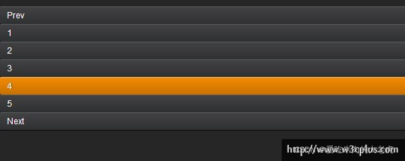
这很显然不是我们需要的效果,接下来我们分几种方案来制作:
2.2 各个不同方式居中
2.2.1 margin和width实现水平居中
第一种方法是最古老的实现方案,也是大家最常见的方案,在分页容器上定义一个宽度,然后配合margin的左右值为auto实现效果:
.pagination {
  width: 293px;
  margin-left: auto;
  margin-right: auto;}.pagination li {
  line-height: 25px;display: inline;
  float: left;
  margin: 0 5px;}.pagination a {
  display: block;
  color: #f2f2f2;
  text-shadow: 1px 0 0 #101011;
  padding: 0 10px;
  border-radius: 2px;
  box-shadow: 0 1px 0 #5a5b5c inset,0 1px 0 #080808;
  background: linear-gradient(top,#434345,#2f3032);}.pagination a:hover {
  text-decoration: none;
  box-shadow: 0 1px 0 #f9bd71 inset,0 1px 0 #0a0a0a;
  background: linear-gradient(top,#f48b03,#c87100);}
代码中绿色部分是为了实现分页居中效果而添加的代码。(下文中没有特殊声明,绿色部分代码表示新增加的代码。),先来看看效果:
效果是让我们实现了,但其扩展性那就不一定强了。示例中只显示了五页和向前向后的七个显项,但往往我们很多情况下是不知道会有多少个分页项显示出来,而且也无法确定每个分页选项的宽度是多少,也就无法确认容器的宽度。
优点:实现方法简单易懂,浏览器兼容性强;
缺点:扩展性差,无法自适应未知项情况。
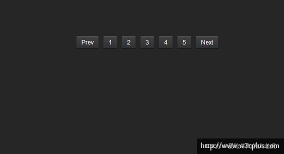
2.2.2 inline-block实现水平居中方法
inline-block属性是无法让元素水平居中,关键之处要在元素的父容器中设置text-align的属性为center,这样才能达到效果:
.pagination {
  text-align: center;
  font-size: 0;
  letter-spacing: -4px;
  word-spacing: -4px;}.pagination li {
  line-height: 25px;
  margin: 0 5px;display: inline-block;
  *display: inline;
  zoom:1;
  letter-spacing: normal;
  word-spacing: normal;
  font-size: 12px;}.pagination a {
  display: block;
  color: #f2f2f2;
  text-shadow: 1px 0 0 #101011;
  padding: 0 10px;
  border-radius: 2px;
  box-shadow: 0 1px 0 #5a5b5c inset,0 1px 0 #080808;
  background: linear-gradient(top,#434345,#2f3032);}.pagination a:hover {
  text-decoration: none;
  box-shadow: 0 1px 0 #f9bd71 inset,0 1px 0 #0a0a0a;
  background: linear-gradient(top,#f48b03,#c87100);}
效果如下:

这个方法相对来说也是简单易懂,但使用了inline-block解决了水平居中的问题
做点:简单易懂,扩展性强;
缺点:需要额外处理inline-block的浏览器兼容性。
2.2.3 浮动实现水平居中的方法
刚看到标题,大家可能会感到很意外,元素都浮动了,他还能水平居中?大家都知道,浮动要么靠左、要么靠右,还真少见有居中的。其实略加处理就有了。
.pagination {
  float: left;
  width: 100%;
  overflow: hidden;
  position: relative;}.pagination ul {
  clear: left;
  float: left;
  position: relative;
  left: 50%;/*整个分页向右边移动宽度的50%*/
  text-align: center;}.pagination li {
  line-height: 25px;
  margin: 0 5px;
  display: block;
  float: left;
  position: relative;
  right: 50%;/*将每个分页项向左边移动宽度的50%*/}.pagination a {
  display: block;
  color: #f2f2f2;
  text-shadow: 1px 0 0 #101011;
  padding: 0 10px;
  border-radius: 2px;
  box-shadow: 0 1px 0 #5a5b5c inset,0 1px 0 #080808;
  background: linear-gradient(top,#434345,#2f3032);}.pagination a:hover {
  text-decoration: none;
  box-shadow: 0 1px 0 #f9bd71 inset,0 1px 0 #0a0a0a;
  background: linear-gradient(top,#f48b03,#c87100);}
效果如下所示:

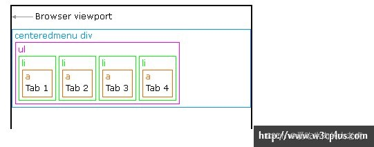
这种方法实现和前面的与众不同,使用了浮动配合position定位实现。下面简单的介绍了一下这种方法实现原理。
大家都知道div是一个块元素,其默认的宽度就是100%,如图所示:

如果div设置了浮动之后,他的内容有多宽度就会撑开有多大的容器(除显式设置元素宽度值之外),这也是我们实现让分页导航居中的关键所在:

接下来使用传统的制作方法,我们会让导航浮动到左边,而且每个分页项也进行浮动,就如下图所示一样:
现在要想的办法是让分页导航居中的效果了,在这里是通过position:relative属性实现,首先在列表项“ul”上向右移动50%(left:50%;),看到如下图所示:
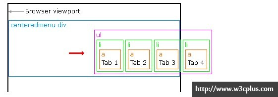
如上图所示一样,整个分页向右移动了50%的距离,紧接着我们在li上也定义position:relative属性,但其移动的方向和列表“ul”移动的方向刚好是反方向,而其移动的值保持一致:
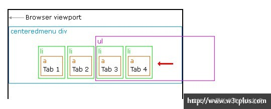
这样一来就实现了float浮动居中的效果。
优点:兼容性强,扩展性强;
缺点:实现原理较复杂。
2.2.4 绝对定位实现水平居中
绝对定位实现水平居中,我想大家也非常的熟悉了,并且用得一定不少,早期是这样使用的:
.ele {
        position: absolute;
        width: 宽度值;
        left: 50%;
        margin-left: -(宽度值/2);}
但这种实现我们有一个难题,我并不知道元素的宽度是多少,这样也就存在如方法一所说的难题,但我们可以借助方法三做一点变通:
.pagination {
  position: relative;}.pagination ul {
  position: absolute;
  left: 50%;}.pagination li {
  line-height: 25px;
  margin: 0 5px;
 float: left;
  position: relative;/*注意,这里不能是absolute,大家懂的*/
  right: 50%;}.pagination a {
  display: block;
  color: #f2f2f2;
  text-shadow: 1px 0 0 #101011;
  padding: 0 10px;
  border-radius: 2px;
  box-shadow: 0 1px 0 #5a5b5c inset,0 1px 0 #080808;
  background: linear-gradient(top,#434345,#2f3032);}.pagination a:hover {
  text-decoration: none;
  box-shadow: 0 1px 0 #f9bd71 inset,0 1px 0 #0a0a0a;
  background: linear-gradient(top,#f48b03,#c87100);}
优点:扩展性强,兼容性强;
缺点:理解性难。
2.2.5 CSS3的flex实现水平居中方法
CSS3的flex是一个很强大的功能,她能让我们的布局变得更加灵活与方便,唯一的就是目前浏览器的兼容性较差。那么第五种方法,我们就使用flex来实现
.pagination {
  display: -webkit-box;
  -webkit-box-orient: horizontal;
  -webkit-box-pack: center;
  display: -moz-box;
  -moz-box-orient: horizontal;
  -moz-box-pack: center;
  display: -o-box;
  -o-box-orient: horizontal;
  -o-box-pack: center;
  display: -ms-box;
  -ms-box-orient: horizontal;
  -ms-box-pack: center;
  display: box;
  box-orient: horizontal;
  box-pack: center;}.pagination li {
  line-height: 25px;
  margin: 0 5px;float: left;}.pagination a {
  display: block;
  color: #f2f2f2;
  text-shadow: 1px 0 0 #101011;
  padding: 0 10px;
  border-radius: 2px;
  box-shadow: 0 1px 0 #5a5b5c inset,0 1px 0 #080808;
  background: linear-gradient(top,#434345,#2f3032);}.pagination a:hover {
  text-decoration: none;
  box-shadow: 0 1px 0 #f9bd71 inset,0 1px 0 #0a0a0a;
  background: linear-gradient(top,#f48b03,#c87100);}
优点:实现便捷,扩展性强
缺点:兼容性差。
2.2.6 CSS3的fit-content实现水平居中方法
fit-content是CSS中给width属性新加的一个属性值,配合margin可以让我轻松的实现水平居中的效果:
.pagination ul {
  width: -moz-fit-content;
  width:-webkit-fit-content;
  width: fit-content;
  margin-left: auto;
  margin-right: auto;}.pagination li {
  line-height: 25px;
  margin: 0 5px;float: left;}.pagination a {
  display: block;
  color: #f2f2f2;
  text-shadow: 1px 0 0 #101011;
  padding: 0 10px;
  border-radius: 2px;
  box-shadow: 0 1px 0 #5a5b5c inset,0 1px 0 #080808;
  background: linear-gradient(top,#434345,#2f3032);}.pagination a:hover {
  text-decoration: none;
  box-shadow: 0 1px 0 #f9bd71 inset,0 1px 0 #0a0a0a;
  background: linear-gradient(top,#f48b03,#c87100);}
优点:简单易懂,扩展性强;
缺点:浏览器兼容性差

为开发者提供学习成长、分享交流、生态实践、资源工具等服务,帮助开发者快速成长。
更多推荐


 11
11 0
0- 0


 已为社区贡献18条内容

所有评论(0)