

关键代码
html
<!-- 轮播图开始-->
<div id="header" class="carousel slide">
<!-- 轮播(Carousel)指标 -->
<ol class="carousel-indicators">
<li data-target="#header" data-slide-to="0" class="active"></li>
<li data-target="#header" data-slide-to="1"></li>
<li data-target="#header" data-slide-to="2"></li>
</ol>
<div id="" class="carousel slide">
<!-- 轮播(Carousel)指标 -->
<ol class="carousel-indicators">
<li data-target="#header" data-slide-to="0" class="active"></li>
<li data-target="#header" data-slide-to="1"></li>
<li data-target="#header" data-slide-to="2"></li>
</ol>
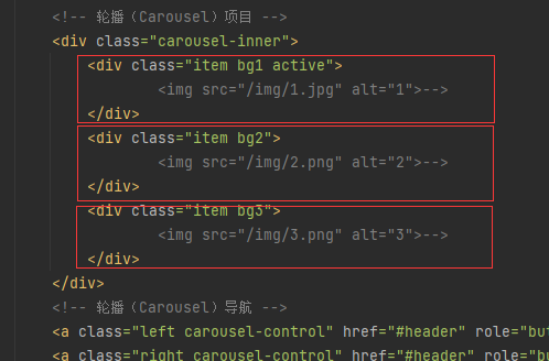
<!-- 轮播(Carousel)项目 -->
<div class="carousel-inner">
<div class="item bg1 active">
<!-- <img src="/img/1.jpg" alt="1">-->
</div>
<div class="item bg2">
<!-- <img src="/img/2.png" alt="2">-->
</div>
<div class="item bg3">
<!-- <img src="/img/3.png" alt="3">-->
</div>
</div>
<!-- 轮播(Carousel)导航 -->
<a class="left carousel-control" href="#header" role="button" data-slide="prev">
<span class="glyphicon glyphicon-chevron-left" aria-hidden="true"></span>
<span class="sr-only">上一条</span>
</a>
<a class="right carousel-control" href="#header" role="button" data-slide="next">
<span class="glyphicon glyphicon-chevron-right" aria-hidden="true"></span>
<span class="sr-only">下一条</span>
</a>
</div>
<!-- 轮播图结束-->
</div>
css
#header .item{
width:100%;
height: 20em;
min-height:100px;
max-height:500px;
}
#header .bg1{
background: url("/img/1.jpg") no-repeat center fixed;
background-size: cover;
}
#header .bg2{
background: url("/img/2.png") no-repeat center fixed;
background-size: cover;
}
#header .bg3{
background: url("/img/3.png") no-repeat center fixed;
background-size: cover;
}
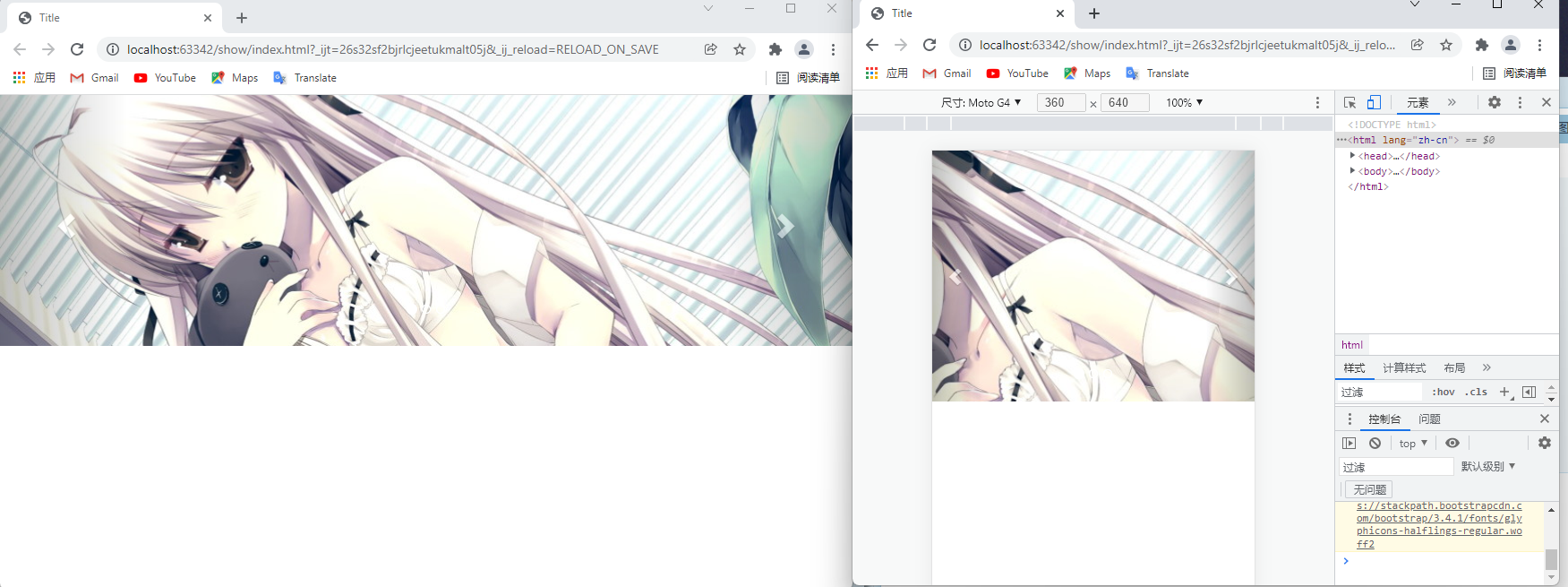
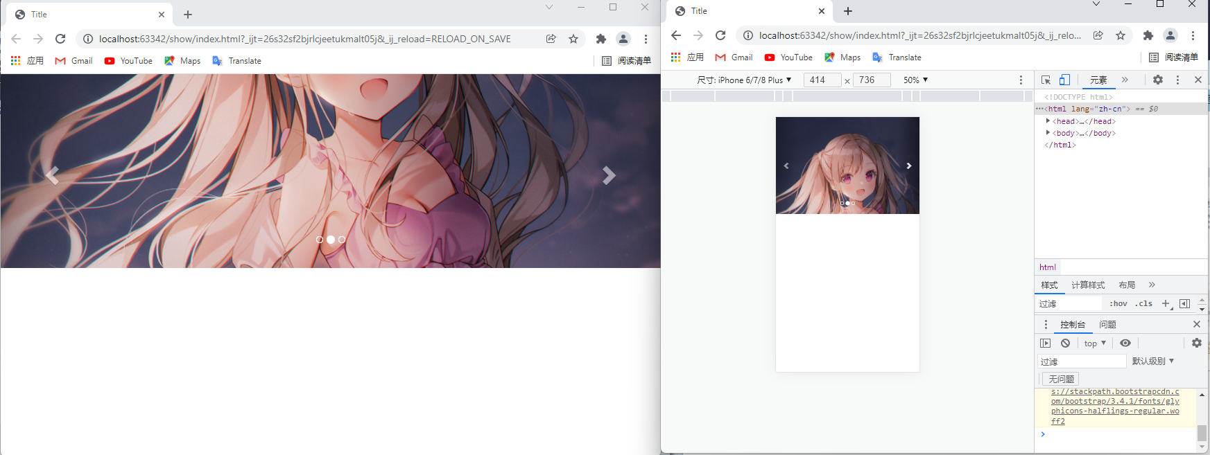
效果图
问题分析
情况说明
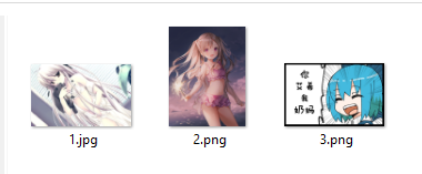
我的轮播图要插入的图片,有一张比较特殊,没错,就是2号图,他是竖屏的。
而我正在使用Bootstrap3(作业要求)制作轮播图。
如果不做调整的话,轮播图到2号时,轮播图区域高度会增加,然后到3号,高度又减小……
我想要的效果是:
1.图片铺满轮播图的框框
2.图片高度统一
方法探索
我很自然想到了css设置背景的方法:
background: url("url") no-repeat center fixed;
但是现在用的是img,我应该怎么去设置img呢?似乎不太方便。
如你所见,3张图分别在3个div里面
切换的时候其实是div之间的切换
所以我可不可以去掉img呢?图片显示的话,就给div设置背景。
于是有了这些:
#header .item{
width:100%;
height: 20em;
min-height:100px;
max-height:500px;
}
#header .bg1{
background: url("/img/1.jpg") no-repeat center fixed;
}
#header .bg2{
background: url("/img/2.png") no-repeat center fixed;
}
#header .bg3{
background: url("/img/3.png") no-repeat center fixed;
}
但是有个问题,这个图片他没有铺满。而我想要他铺满,且不能变形。
所以考虑设置background-size
#header .bg1{
background: url("/img/1.jpg") no-repeat center fixed;
background-size: cover;
}
#header .bg2{
background: url("/img/2.png") no-repeat center fixed;
background-size: cover;
}
#header .bg3{
background: url("/img/3.png") no-repeat center fixed;
background-size: cover;
}
为什么我写是cover而不是100%呢?
从我自己测试来看,设置100%的话,宽度是100%,高度容易出现空白区域。
从cover的效果来看:cover能让背景图“紧贴”“盒子”边缘
下面是菜鸟教程上的说明:
cover会保持图像的纵横比并将图像缩放成将完全覆盖背景定位区域的最小大小。
contain:此时会保持图像的纵横比并将图像缩放成将适合背景定位区域的最大大小。
好,最终就得到了这套解决方案。
或许会有更好的办法的。欢迎留言讨论。


 已为社区贡献10条内容
 免费领云主机


 华为云 x DeepSeek:AI驱动云上应用创新


所有评论(0)