Vue移动端项目中px转rem的两种方法
1)使用lib-flexible动态设置REM基准值(html标签的字体大小)安装依赖yarn add amfe-flexible// 或者nmp i amfe-flexible然后在main.js中引入加载执行该模块import 'amfe-flexible'最后测试:在浏览器中切换不同设备尺寸,观察html标签font-size的变化。2)使用postcss-pxtorem将px转为rem。安
·
1)使用lib-flexible动态设置REM基准值(html标签的字体大小)
安装依赖
	yarn add amfe-flexible
	// 或者
	npm i amfe-flexible
然后在main.js中引入加载执行该模块
import 'amfe-flexible'
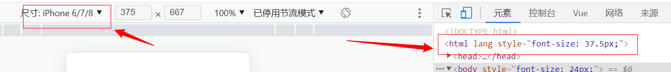
最后测试:在浏览器中切换不同设备尺寸,观察html标签font-size的变化。成功后,以后的单位直接写px即可。
2)使用postcss-pxtorem将px转为rem。
安装依赖
	yarn add postcss-pxtorem -D
	// 或者
	npm i postcss-pxtorem -D
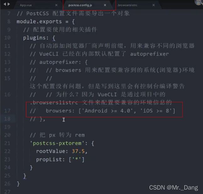
然后在项目根目录中创建postcss.config.js文件
// postcss.config.js
module.exports = {
plugins: {
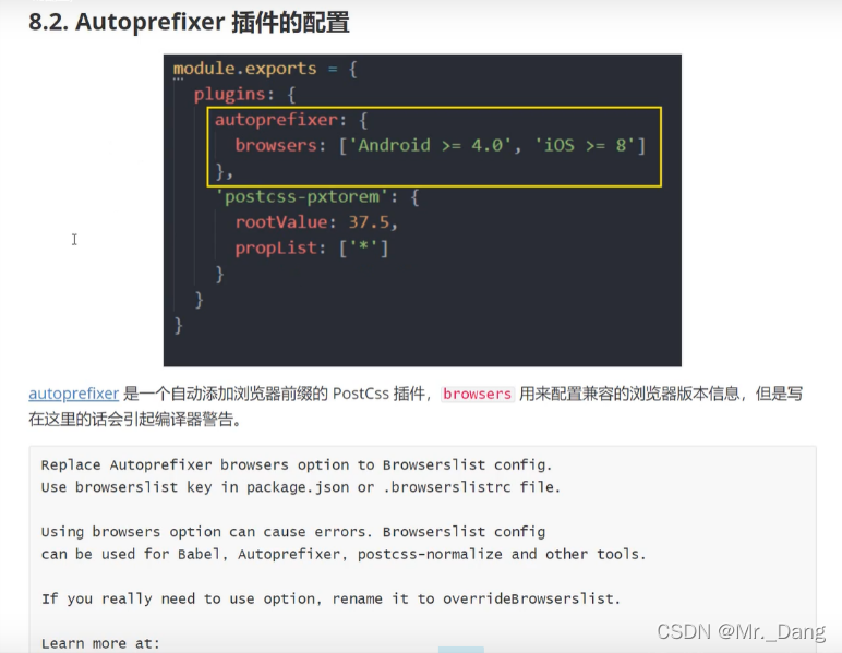
'postcss-pxtorem': {
rootValue: 37.5, // 此设计稿尺寸为375px
propList: ['*'],
},
},
};
如果设计稿的尺寸不是 375,而是 750 或其他大小,可以将 rootValue 配置调整为:
	// postcss.config.js
	module.exports = {
	  plugins: {
	    // postcss-pxtorem 插件的版本需要 >= 5.0.0
	    'postcss-pxtorem': {
	      rootValue({ file }) {
	        return file.indexOf('vant') !== -1 ? 37.5 : 75;
	      },
	      propList: ['*'],
	    },
	  },
	};
配置完成后,重新Vue启动服务
最后测试:刷新页面,审查元素样式表是否已将px转换为rem。
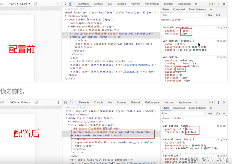
自定义的也会生效
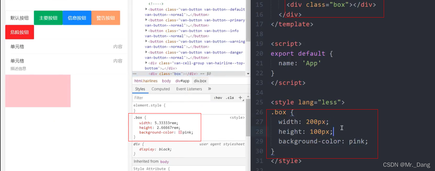
【注意】如果写的是行内样式,则不会生效
扩展

为开发者提供学习成长、分享交流、生态实践、资源工具等服务,帮助开发者快速成长。
更多推荐


 5
5 0
0- 0


 已为社区贡献2条内容

所有评论(0)