纯 CSS 实现打字机效果
纯 CSS 实现打字机效果先看效果预备知识在学习这个需要了解两个新的 CSS 知识ch 单位ch 是一个相对长度单位, 表示数字 0 的宽度.steps 函数这时 CSS 动画中 animation-timing-function 表示动画进行的一个函数. 它接收两个参数,第一个参数是数字 n, 表示将整个动画分 n 步执行完, 每步耗时相同.第二个参数可选. 待研究????HTML<div
·
纯 CSS 实现打字机效果
先看效果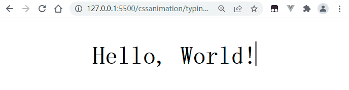
预备知识
在学习这个需要了解两个新的 CSS 知识
ch单位ch是一个相对长度单位, 表示数字0的宽度.steps函数
这时CSS动画中animation-timing-function表示动画进行的一个函数. 它接收两个参数,- 第一个参数是数字
n, 表示将整个动画分n步执行完, 每步耗时相同. - 第二个参数可选. 待研究😅
- 第一个参数是数字
HTML
<div class="container flex">
   <div class="content">
     Hello, World!
   </div>
 </div>
CSS
-
初始化样式, 定义水平垂直剧中布局
- 🎤解释
1: 使用monospace等宽字体. 实现打字机效果就是控制内容一个字接着一个字的出现, 通过将文本宽度从0开始每次增加一个字的宽度来实现效果, 所以就要求所有的出现的字体宽度必须相同
* { margin: 0; padding: 0; font-family: monospace, sans-serif; font-weight: bold; } .flex { display: flex; justify-content: center; align-items: center; } .container { height: 100vh; background-color: #fff;; } - 🎤解释
-
定义动画
- 🎤解释
2:Hello, World!加标点和空格一共13个字, 所以要整个动画分13步完成. - 🎤解释
3forwards表示动画执行完停在最后一步 - 🎤解释
4:white-space: nowrap;表示阻止文本换行. 由于在块盒子宽度较小的情况下, 浏览器会在中间的空格处换行, 所以要阻止这种行为, 并设置隐藏超出的内容, 如果不阻止换行, 效果如下 
@keyframes content-slide-in { from { width: 0; } to { width: 13ch; } } .content { animation: content-slide-in 2s steps(13) forwards; overflow: hidden; white-space: nowrap; position: relative; } - 🎤解释
-
使用
::after伪元素设置闪烁的光标, 其实光标就是伪元素的右border. 并设置absolute定位. 这里可以优化的部分是在内容全部展示之前, 将光标动画时常设置为2/13s, 内容展示完再恢复为1s..content::after { content: ''; position: absolute; right: 0; height: 16px; animation: sprinkle-bling 1s steps(2) infinite; } @keyframes sprinkle-bling { from { border-right: 1px solid transparent; } to { border-right: 1px solid #000; } }
完整代码
<!DOCTYPE html>
<html lang="en">
<head>
  <meta charset="UTF-8">
  <meta http-equiv="X-UA-Compatible" content="IE=edge">
  <meta name="viewport" content="width=device-width, initial-scale=1.0">
  <title>Typing</title>
  <link rel="stylesheet" href="style.css">
</head>
<body>
  <div class="container flex">
    <div class="content">
      Hello, World!
    </div>
  </div>
</body>
</html>
* {
  margin: 0;
  padding: 0;
  font-family: monospace, sans-serif;
  font-weight: bold;
}
.flex {
  display: flex;
  justify-content: center;
  align-items: center;
}
.container {
  height: 100vh;
  background-color: #fff;;
}

.content {
  animation: content-slide-in 2s steps(13) forwards;
  overflow: hidden;
  white-space: nowrap;
  position: relative;
}

.content::after {
  content: '';
  position: absolute;
  right: 0;
  height: 16px;
  animation: sprinkle-bling .5s steps(2) infinite;
}

@keyframes content-slide-in {
  from {
    width: 0;
  }
  to {
    width: 13ch;
  }
}

@keyframes sprinkle-bling {
  from {
    border-right: 1px solid transparent;
  }
  to {
    border-right: 1px solid #000;
  }
}

华为开发者空间,是为全球开发者打造的专属开发空间,汇聚了华为优质开发资源及工具,致力于让每一位开发者拥有一台云主机,基于华为根生态开发、创新。
更多推荐


 4
4 0
0- 0


 已为社区贡献3条内容

所有评论(0)