Echarts bar 柱状图超详细实战
在最近的项目中,有可视化图表的需求,第一时间就想到了Echarts和Hightcharts。要用到的可视化图表都是比较常见的,Echarts文档和实例都比较全面,而且还是中文的,方便阅读,于是选择了Echarts。Echarts的图表样式如果是自用,肯定是没啥问题的,但是 UI 肯定是不满意的,于是进行了一系列的样式调整…安装及配置前端框架为easywebpack-vue,使用的Echarts版本
原文地址:https://juejin.cn/post/6999630442362044447
在最近的项目中,有可视化图表的需求,第一时间就想到了Echarts和Hightcharts。
要用到的可视化图表都是比较常见的,Echarts文档和实例都比较全面,而且还是中文的,方便阅读,于是选择了Echarts。
Echarts的图表样式如果是自用,肯定是没啥问题的,但是 UI 肯定是不满意的,于是进行了一系列的样式调整…
安装及配置
前端框架为easywebpack-vue,使用的Echarts版本为^5.0.1
Echarts 官方文档: https://echarts.apache.org/zh/index.html
安装 Echarts
npm install echarts --save
全局引入 Echarts
在 main.js 加入如下代码:
import * as echarts from "echarts";
Vue.prototype.$echarts = echarts;
按需引入 Echarts
(1)新增 echarts.js 文件
// 引入 echarts 核心模块,核心模块提供了 echarts 使用必须要的接口
import * as echarts from "echarts/core";

// 引入各种图表,图表后缀都为 Chart
import { BarChart, LineChart, PieChart } from "echarts/charts";

// 引入提示框,标题,直角坐标系等组件,组件后缀都为 Component
import {
  TitleComponent,
  TooltipComponent,
  ToolboxComponent,
  GridComponent,
  LegendComponent,
  AxisPointerComponent,
  DatasetComponent,
} from "echarts/components";

// 引入 Canvas 渲染器,注意引入 CanvasRenderer 或者 SVGRenderer 是必须的一步
import { SVGRenderer } from "echarts/renderers";

// 注册必须的组件
echarts.use([
  BarChart,
  LineChart,
  PieChart,

  TitleComponent,
  TooltipComponent,
  ToolboxComponent,
  GridComponent,
  LegendComponent,
  AxisPointerComponent,
  DatasetComponent,

  SVGRenderer,
]);

export default echarts;
(2)在 main.js 文件中引入
import echarts from "./utils/echarts";
Vue.prototype.$echarts = echarts;
使用举例
<template>
<div id="charts" style="width: 600px; height: 400px"></div>
</template>
<script>
import * as R from "ramda";
export default {
mounted() {
this.initCharts();
},
methods: {
initCharts() {
let charts = this.$echarts.init(document.getElementById("charts"));
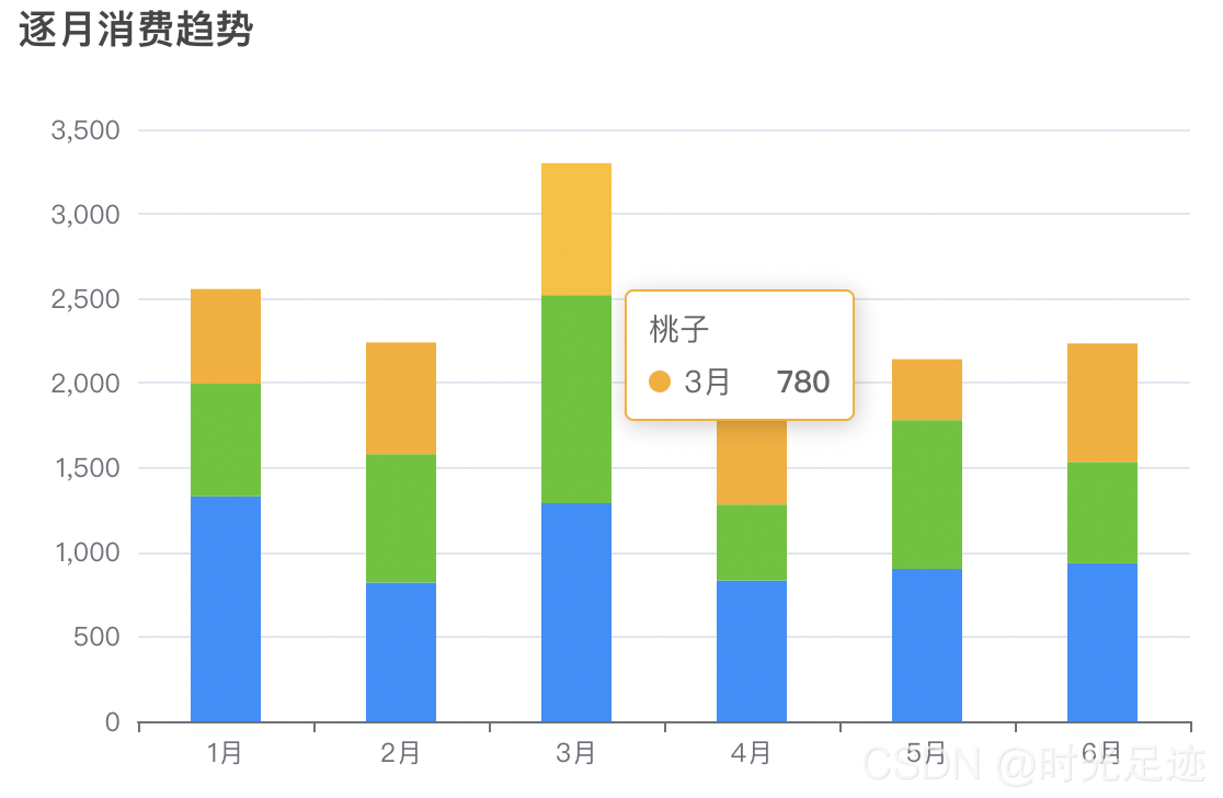
let option = {
title: {
text: "逐月消费趋势", // 标题
subtext: "柱状图", // 副标题
},
xAxis: {
type: "category",
},
yAxis: {
type: "value",
},
color: ["#1890ff", "#52c41a", " #faad14"], // 柱状图颜色
dataset: {
source: [
// 数据源
["1月", 1330, 666, 560],
["2月", 820, 760, 660],
["3月", 1290, 1230, 780],
["4月", 832, 450, 890],
["5月", 901, 880, 360],
["6月", 934, 600, 700],
],
},
series: [
// 图标列设置
{ type: "bar", stack: "total", name: "苹果" },
{ type: "bar", stack: "total", name: "梨子" },
{ type: "bar", stack: "total", name: "桃子" },
],
tooltip: {
// 提示框组件
},
};
charts.setOption(option);
},
},
};
</script>
<style lang="scss" scoped></style>
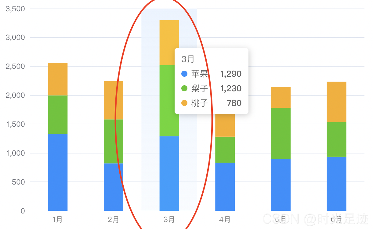
原始效果展示:
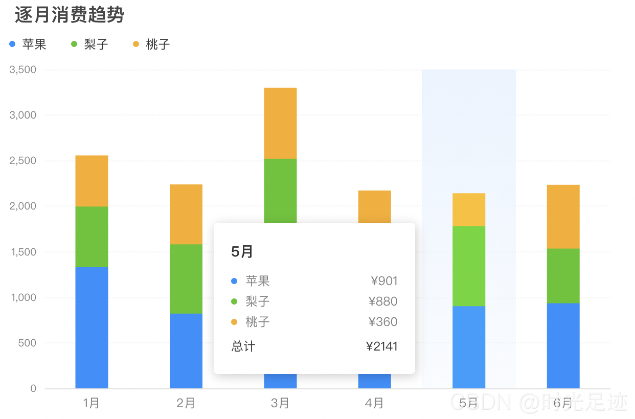
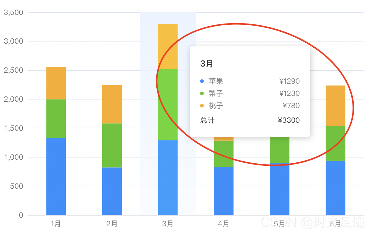
UI 要求的目标效果展示:
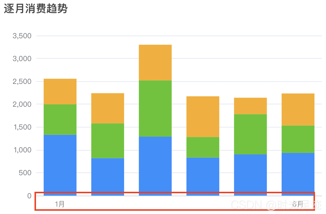
横向柱状图
x 轴基础样式
基础设置如下所示,可设置刻度和轴线相关的属性
xAxis: {
  type: "category",
  boundaryGap: true, // 坐标轴两边留白策略,默认为true
  axisTick: { // 刻度
    show: false,
  },
  axisLabel: { // 刻度标签
    color: "#808080",
    fontSize: 12,
    margin: 8, // 刻度标签与轴线之间的距离
    interval: "auto", // x轴标签显示间隔,自动
  },
  axisLine: { // 轴线
    lineStyle: {
      color: "#c3c3c3",
      width: 0.5,
    },
  },
  splitLine: { // 分割线
    show: false,
    interval: "auto",
  },
  splitArea: { // 分割区域
    show: false,
    areaStyle: {},
  },
},
最大和最小刻度标签
主要属性是interval,要设置的足够大,比正常展示的刻度个数大一些,就能实现只展示最大和最小刻度标签
xAxis: {
  axisLabel: {
    // interval: "auto",
    interval: 50, // 只显示最大和最小坐标
    showMinLabel: true, // 显示最小刻度标签
    showMaxLabel: true, // 显示最大刻度标签
  }
}
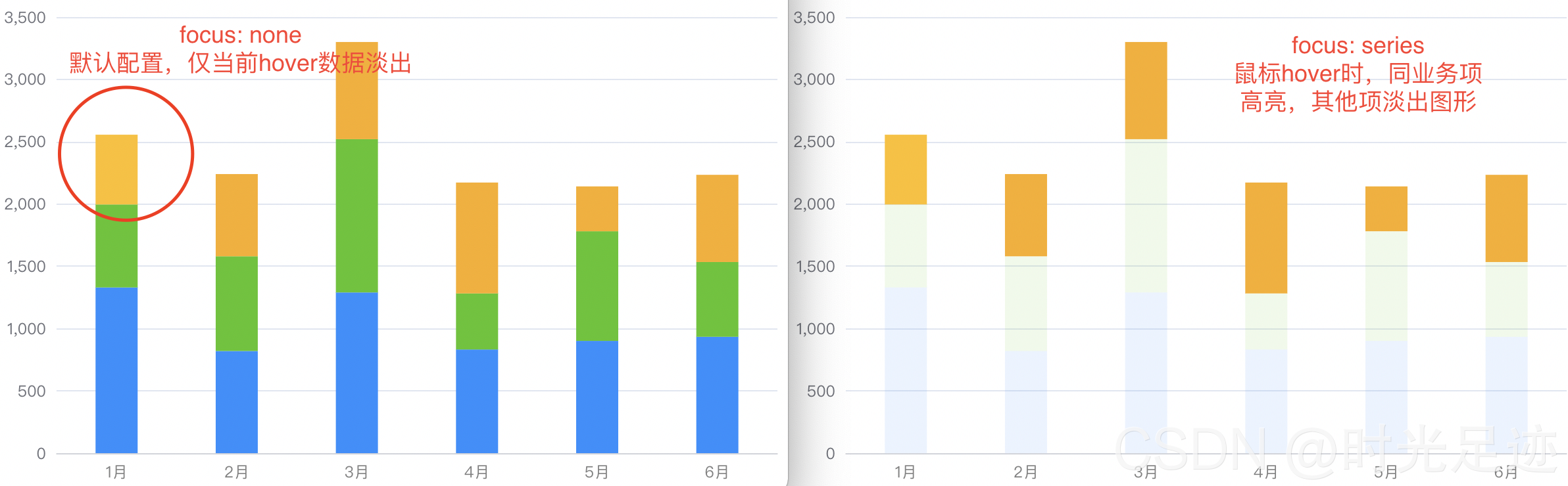
series 数据列悬浮高亮
const stackBarSeries = {
  type: "bar", // 柱状图
  barWidth: 32, // 柱体宽度
  stack: "total", // 数据堆叠
  showBackground: false, // 是否显示柱条背景色
  // 高亮的图形样式和标签样式
  emphasis: {
    // 鼠标hover时,同业务项高亮,其他项淡出图形
    focus: "series",
    // 默认配置,仅当前hover数据淡出
    // focus: "none",
  },
};

let option = {
  series: R.map(
    (o) =>
      R.merge(stackBarSeries, {
        name: o,
      }),
    ["苹果", "梨子", "桃子"]
  ),
};
坐标指示器背景渐变色
主要是设置tooltip提示框组件的trigger,让 x 轴悬浮触发;然后设置xAxis的坐标指示器axisPointer,指示器遮罩样式shadowStyle可以设置渐变色
let option = {
  tooltip: {
    // 提示框组件
    trigger: "axis", // 坐标轴触发
  },
  xAxis: {
    // 坐标轴指示器
    axisPointer: {
      type: "shadow",
      // 坐标轴指示器的 z 值,控制图形的前后顺序
      z: 1,
      // 指示器遮罩样式
      shadowStyle: {
        // 解决hover背景色渐变问题
        color: {
          type: "linear",
          x: 0,
          y: 0,
          x2: 0,
          y2: 1,
          colorStops: [
            {
              offset: 0,
              color: "rgba(234,244,255,1)", // 0% 处的颜色
            },
            {
              offset: 1,
              color: "rgba(234,244,255,0.3)", // 100% 处的颜色
            },
          ],
          global: false, // 缺省为 false
        },
        // 设置背景色及阴影
        // color: "rgba(234,244,255,1)",
        // opacity: 1,
        // shadowColor: "rgba(0, 0, 0, 0.5)",
        // shadowBlur: 10,
        // shadowOffsetX: 10,
        // shadowOffsetY: 10,
      },
    },
  },
};
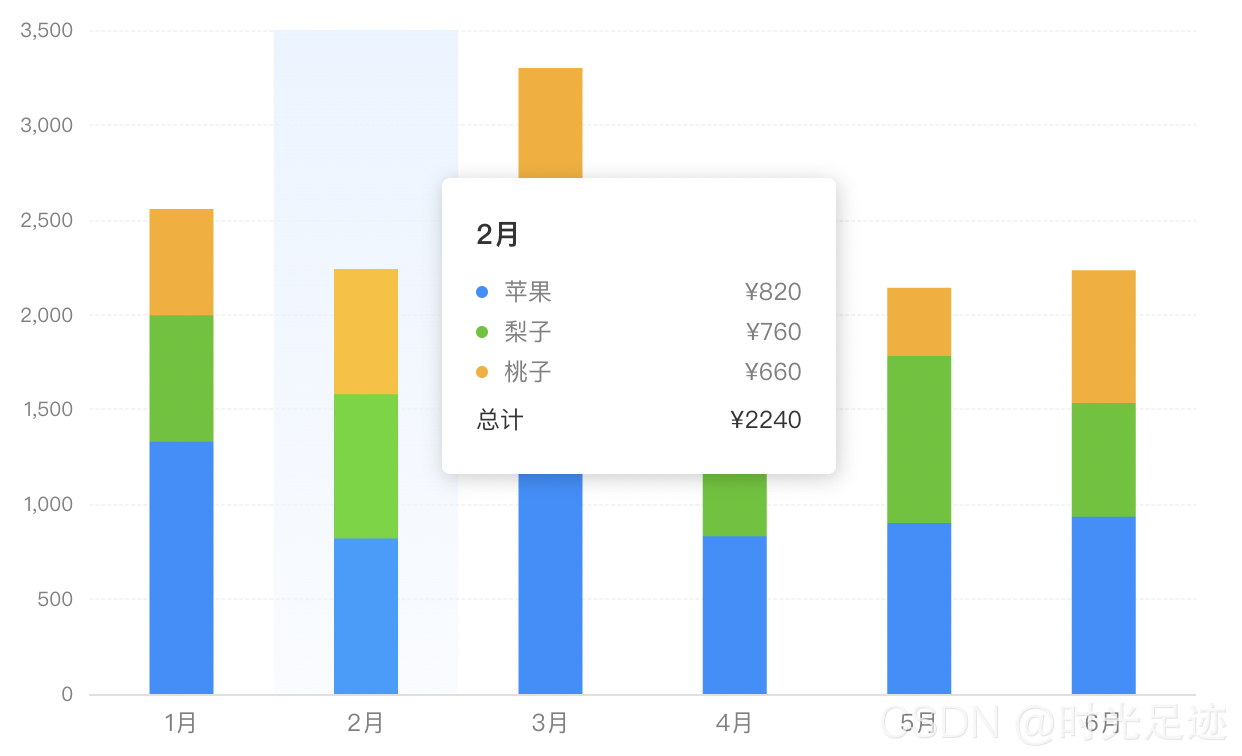
tooltip 提示框自定义样式
tooltip默认的样式或者值可能不符合开发的要求,可以使用formatter函数自定义处理
let option = {
  tooltip: {
    // 提示框组件
    trigger: "axis", // 坐标轴触发
    padding: [20, 16, 12, 16],
    backgroundColor: "#fff",
    alwaysShowContent: false,
    formatter: function(params) {
      let html = `<div style="height:auto;width: 163px;">
          <div style="font-size:14px;font-weight:bold;color:#333;margin-bottom:16px;line-height:1;">
            ${params[0].axisValue}
          </div>
          ${params
            .map(
              (
                item
              ) => `<div style="font-size:12px;color:#808080;margin-bottom:8px;display:flex;align-items:center;line-height:1;">
                <span style="display:inline-block;margin-right:8px;border-radius:6px;width:6px;height:6px;background-color:${
                  item.color
                };"></span>
                ${item.seriesName}
                <span style="flex:1;text-align:right;">¥${item.value[
                  item.encode.y[0]
                ] || 0}</span>
              </div>`
            )
            .join("")}
            <div style="display:flex;align-items:center;justify-content:space-between;font-size:12px;color:#333;padding-top:4px;margin-bottom:8px;line-height:1;">
            <span>总计</span>
            <span>¥${R.reduceRight(
              R.add,
              0,
              R.drop(1, params[0].value || [])
            )}</span>
          </div>
        </div>`;
      return html;
    },
  },
};
y 轴基础样式
let option = {
  yAxis: {
    type: "value",
    minInterval: 100,
    nameGap: 8,
    axisLabel: {
      color: "#808080",
      fontSize: 10,
      // formatter: (value) => {
      //   return moneyFormatValue(value);
      // },
    },
    splitLine: {
      lineStyle: {
        type: "dashed",
        color: "#ebebeb",
        width: 0.5,
      },
    },
  },
};
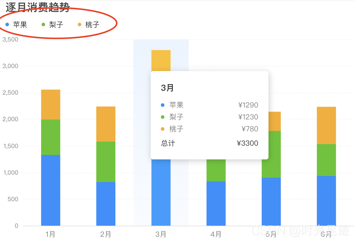
legend 图例样式自定义
let option = {
  grid: {
    left: 0,
    right: 12,
    bottom: 0,
    top: 68,
    containLabel: true,
  },
  // 图例设置
  legend: {
    top: 32,
    left: -5,
    icon: "circle",
    itemHeight: 6, // 修改icon图形大小
    itemGap: 24,
    textStyle: {
      fontSize: 12,
      color: "#333",
      padding: [0, 0, 0, -8], // 修改文字和图标距离
    },
  },
};
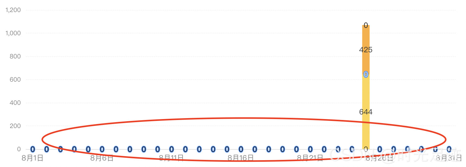
解决堆叠图数据为0的问题
const stackBarSeries = {
  type: "bar",
  label: {
    show: true,
    // 当数据为0时不显示,不然会出现加粗0标识
    formatter: function(params) {
      if (params.value > 0) {
        return params.value;
      } else {
        return "";
      }
    },
  },
};
动态更新数据和样式
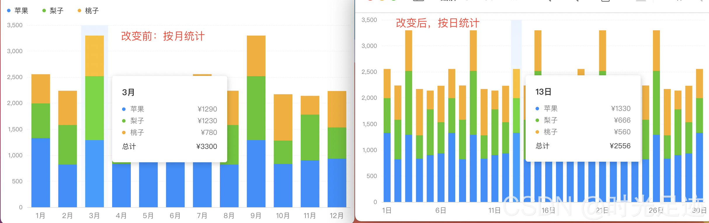
实现数据按月统计和按日统计的动态切换。按月统计时,每个月数据都会展示,x 轴显示 12 个标签;按日统计时,x 轴不完全显示所有标签,间隔显示,而且柱状体的宽度也会变化。主要是采用的是setOption方法。
官方文档[setOption]:https://echarts.apache.org/zh/api.html#echartsInstance.setOption
<script>
  import * as R from "ramda";

  const source1 = [
    ["1月", 1330, 666, 560],
    ["2月", 820, 760, 660],
    ......
    ["11月", 901, 880, 360],
    ["12月", 934, 600, 700],
  ];
  const source2 = [
    ["1日", 1330, 666, 560],
    ["2日", 820, 760, 660],
    ......
    ["29日", 934, 600, 700],
    ["30日", 1330, 666, 560],
  ];

  // 具体配置如之前所示,详细省略,只做基本示例展示
  const initOption = {
    ...
    dataset: { source: source1 },
  };

  export default {
    data() {
      return {
        charts: null,
        isDaily: false,
      };
    },
    mounted() {
      this.charts = this.$echarts.init(
        document.getElementById("barCharts"),
        null,
        {
          renderer: "svg",
        }
      );
      this.charts.setOption(R.clone(initOption));
    },
    methods: {
      handleSource() {
        this.isDaily = !this.isDaily;
        this.charts.setOption(
          R.mergeDeepRight(initOption, {
            dataset: {
              source: this.isDaily ? source2 : source1,
            },
            xAxis: {
              axisLabel: {
                interval: this.isDaily ? 4 : "auto",
              },
            },
            series: R.map(
              (o) => ((o.barWidth = this.isDaily ? 12 : 24), o),
              initOption.series
            ),
          }),
          true
        );
        this.charts.resize();
      },
    },
  };
</script>
解决 echarts 宽高自适应问题
在 web 项目中做图表时,图表的宽高不是固定的,需要随着浏览器宽度高度自适应,使用的方法就是resize。如果有多个图表,需要同时进行resize处理。
<script>
  export default {
    mounted() {
      window.addEventListener("resize", this.handleResize, false);
    },
    destroyed() {
      window.removeEventListener("resize", this.handleResize);
    },
    methods: {
      handleResize() {
        const _this = this;
        const timer = setTimeout(() => {
          _this.lineCharts.resize();
          _this.barCharts.resize();
        }, 500);
        // 清除定时器
        this.$once("hook:beforeDestroy", () => {
          setTimeout(timer);
        });
      },
    },
  };
</script>

为开发者提供学习成长、分享交流、生态实践、资源工具等服务,帮助开发者快速成长。
更多推荐


 5
5 0
0- 0


 已为社区贡献2条内容

所有评论(0)