CSS三角形
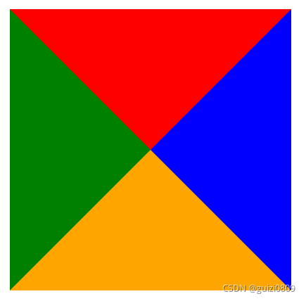
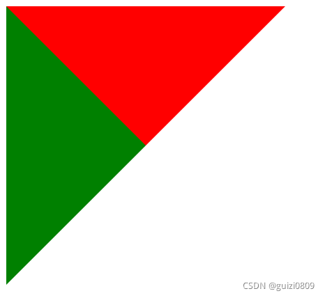
一、css三角形的原理将一个div的宽度和高度设置为0,然后设置边框样式.triangle{width: 0;height: 0;border-top: 100px solid red;border-right: 100px solid blue;border-bottom: 100px solid orange;border-left: 100px solid green;}得到一个由四个三角形
一、css三角形的原理
将一个div的宽度和高度设置为0,然后设置边框样式
.triangle{
    width: 0;
    height: 0;
    border-top: 100px solid red;
    border-right: 100px solid blue;
    border-bottom: 100px solid orange;
    border-left: 100px solid green;
}
得到一个由四个三角形组合形成的正方形
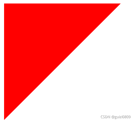
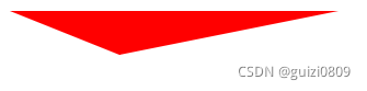
将对应位置的边框颜色设置为透明transparent,就会形成三角形
.triangle-down {
	width: 0;
	height: 0;
	border-top: 100px solid red;
	border-right: 100px solid transparent;
	border-bottom: 100px solid transparent;
	border-left: 100px solid transparent;
}
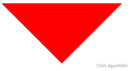
规律:三角形指向的反方向的颜色设置为你想要的,其他方向设置为transperent透明。比如你想要一个三角形,且方向指向右边,那么将三角形指向的反方向也就是border-left设置为不透明的颜色,其他边框方向设置为透明,就可以得到。因为边框实际就是正方形的四条边框。
三角形指向的反方向不好记忆,推荐使用原理(四个三角形组合形成的正方形)来记忆。
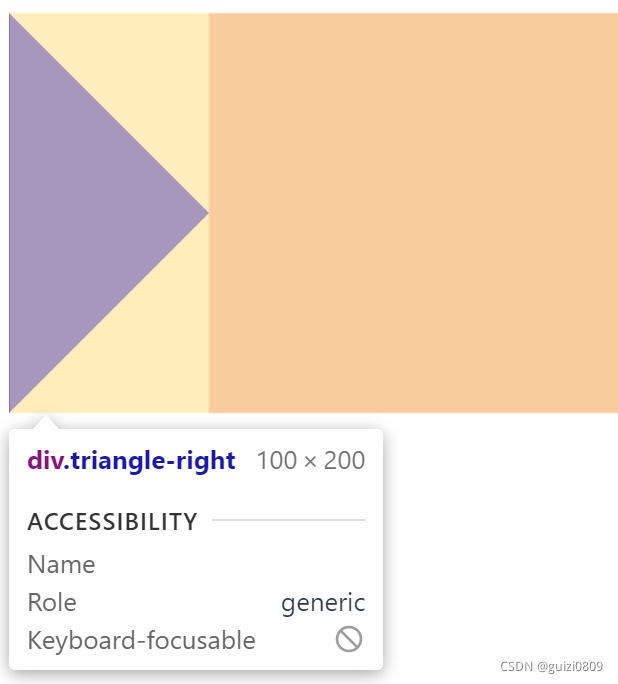
.triangle-right {
	width: 0;
	height: 0;
	border-top: 100px solid transparent;
	border-right: 100px solid transparent;
	border-bottom: 100px solid transparent;
	border-left: 100px solid blue;
}
/* 推荐以下简洁的写法,全部设置为透明,在单独设置某一方向的边框颜色 */
.triangle-right {
	width: 0;
	height: 0;
	border: 100px solid transparent;
	border-left-color: blue;	/* 设置正方形左边框颜色不为透明 */
}
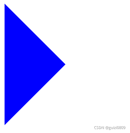
弊端:以上的写法,三角形实际占据的还是一个正方形
解决办法:三角形指向的方向不设置边框
.triangle-right {
	width: 0;
	height: 0;
	border: 100px solid transparent;
	border-left-color: blue;
	border-right: none;
}
二、补充
.triangle{
    width: 0;
    height: 0;
    border-top: 100px solid red;
    border-right: 100px solid blue;
    border-bottom: 100px solid orange;
    border-left: 100px solid green;
}
我们将上述正方形的蓝色块和橘色块设置为透明
.triangle{
    width: 0;
    height: 0;
    border-top: 100px solid red;
    border-right: 100px solid transparent;
    border-bottom: 100px solid transparent;
    border-left: 100px solid green;
}
我们将他们设置为同一种颜色
.triangle{
    width: 0;
    height: 0;
    border-top: 100px solid red;
    border-right: 100px solid transparent;
    border-bottom: 100px solid transparent;
    border-left: 100px solid red;
}
规律:相当于在正方形中左上角的三角形,我们只需给左边框和上边框设置颜色,其他边框设置透明。比如我们需要一个右下角的三角形,只需要给右边框和下边框设置颜色。该三角形不会占据多余空间,可以采用简洁的写法。
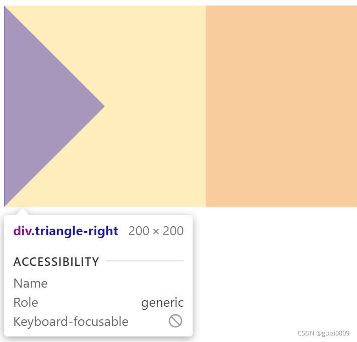
.triangle-right-down {
	width: 0;
	height: 0;
	border: 100px solid transparent;
	border-right-color: blue;
	border-bottom-color: blue;
}
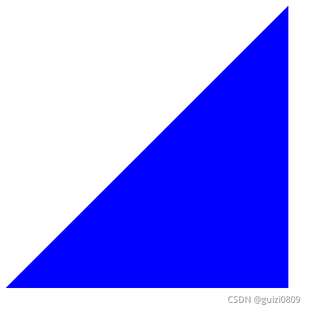
以上都是等腰三角形。如果我们想要其他类型的三角形呢?道理是一样的,给边框设置不同的宽度即可。
.triangle{
	width: 0;
	height: 0;
	border-top: 20px solid red;
	border-right: 100px solid transparent;
	border-bottom: 100px solid transparent;
	border-left: 50px solid transparent;
}
我们还可以配合旋转,翻转等css属性得到更多类型的三角形。另外还可以使用两个三角形重叠位置偏移形成三角形边框或者阴影。

华为开发者空间,是为全球开发者打造的专属开发空间,汇聚了华为优质开发资源及工具,致力于让每一位开发者拥有一台云主机,基于华为根生态开发、创新。
更多推荐


 3
3 0
0- 0


 已为社区贡献4条内容

所有评论(0)