关于Echarts漏斗图
Echarts漏斗图使用心得体会
·
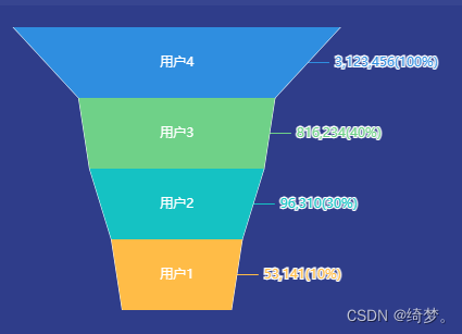
实现的效果:
主要实现了漏斗图内和外侧同时能显示内容。
代码:
<template>
  <div>
    <div ref="chart" style="width: 100%; height: 260px"></div>
  </div>
</template>

<script>
import * as echarts from 'echarts'

export default {
  name: 'Funnel',
  data () {
    return{}
  },
  mounted () {

    this.echartsInit()
  },
  methods: {
    echartsInit () {
      const chartDom = this.$refs.chart
      const myChart = echarts.init(chartDom)
      const option = {
        tooltip: {
          trigger: 'item',
          formatter: '{b} : {c}%'
        },
        labelLine: {
          show:true
         },
        series: [
            {
             name: '漏斗',  //名字
            type: 'funnel', //echarts类型
            top: 0,
            bottom: 0,
            left:-60,// 距左侧的距离
            width: '90%',  //宽
            height:'100%',  //高
            min: 0,  //
            max: 100,
            minSize: '20%', //漏斗最小值的宽度
            maxSize: '60%', //漏斗最大值的宽度
            sort: 'descending', // 金字塔形:'ascending',  漏斗图形:'descending'
            gap: 0,  //图例之间的间隔
            color: ['rgba(255,188,71,1)', 'rgba(21,194,195,1)', 'rgba(111,209,136,1)', 'rgba(47,142,224,1)'],  //每一层的颜色
   label: {//漏斗外部显示的
              position: 'right',  //位置
              formatter: '{b}({c}%)', //显示的内容
              fontStyle: 'normal',
               fontSize:16,
               textBorderColor:'#000',
            },         emphasis: {  //鼠标移入数据项的tooltip设置
           show: false
        },
      data: [
        { value: 10, name: '53,141' },
        { value: 30, name: '96,310' },
        { value: 40, name: '816,234' },
        { value: 100, name: '3,123,456' },
      ]
    },
    {
          name: '漏斗',
            type: 'funnel',
            top: 0,
            bottom: 0,
            left:-60,
            width: '90%',
            height:'100%',
            min: 0,
            max: 100,
            minSize: '20%',
            maxSize: '60%',
            sort: 'descending',
            gap: 0,
            color: ['rgba(255,188,71,1)','rgba(21,194,195,1)','rgba(111,209,136,1)','rgba(47,142,224,1)'],
      label: {  //设置字体放在漏斗内部
        position: 'inside',
        formatter: '{b}',
        color: '#fff'
      },
      emphasis: {
        label: {
          fontSize: 14   //鼠标移入字体变大 显示toolList
        }
      },
      itemStyle: {
        opacity: 1,//图形透明度
        borderColor: '#fff', //图形边框颜色
        borderWidth: 0//图形边框宽度
      },
      data: [   //我的数据是根据需求自己设置的name
        { value: 10, name: '用户1' },
        { value: 30, name: '用户2' },
        { value: 40, name: '用户3' },
        { value: 100, name: '用户4' },
      ],
       z: 100
    }
        ]
      };
      option && myChart.setOption(option);
    }
  }
}
</script>
为开发者提供学习成长、分享交流、生态实践、资源工具等服务,帮助开发者快速成长。
更多推荐


 3
3 0
0- 0


 已为社区贡献1条内容

所有评论(0)