Vue业务组件封装(二)Form表单
封装组件的基本方法就是通过props和emit进行父子组件的传值和通信。利用插槽、组件等增加组件的可扩展性和复用性。Form表单包含 输入框, 单选框, 下拉选择, 多选框 等用户输入的组件。使用表单,可以收集、验证和提交数据。表单常用的地方是在搜索、信息提交、内容编辑以及新增。搜索表单编辑表单这里以最基本的Form代码为例进行分析:基本表单根据基本的Form代码,我们可以知道:通过分析Form代
前言
这个系列主要是分享自己在工作中常用到的业务组件,以及如何对这些组件进行有效的封装和封装的思路。注:都是基于element ui进行二次封装。
封装组件的基本方法就是通过props和emit进行父子组件的传值和通信。利用插槽、组件等增加组件的可扩展性和复用性。
Form组件介绍
Form表单包含 输入框, 单选框, 下拉选择, 多选框 等用户输入的组件。使用表单,可以收集、验证和提交数据。
表单常用的地方是在搜索、信息提交、内容编辑以及新增。
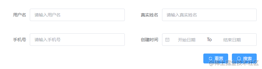
搜索表单
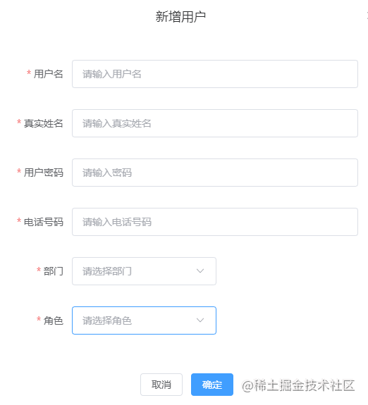
编辑表单
Form组件封装思路
了解element Form组件代码
这里以最基本的Form代码为例进行分析:
<template>
  <el-form label-width="120px" ref="ruleFormRef" :model="ruleForm" :rules="rules">
    <el-form-item label="Activity name">
      <el-input v-model="form.name" />
    </el-form-item>
    <el-form-item label="Activity zone">
      <el-select v-model="form.region" placeholder="please select your zone">
        <el-option label="Zone one" value="shanghai" />
        <el-option label="Zone two" value="beijing" />
      </el-select>
    </el-form-item>
    <el-form-item>
      <el-button type="primary" @click="onSubmit">Create</el-button>
      <el-button>Cancel</el-button>
    </el-form-item>
  </el-form>
</template>
const form = reactive({
  name: '',
  region: ''
})

基本表单
根据基本的Form代码,我们可以知道:
- 整个Form表单数据绑定在el-form上::model=“form”,form就是表单的数据对象。
- 表单里面的每一项是放在el-form-item标签里面,放入我们想渲染出来的组件,如输入框,单选等。
- 每个el-form-item中可以绑定了prop、label、rules等属性,我们可以在配置文件中配置对应属性的值进行绑定。
Form组件如何去封装
通过分析Form代码我们可以通过一个配置文件去遍历得到el-form-item,然后在el-form-item上面绑定我们需要的属性就可以得到我们想要的表单。
代码实现
配置文件
我们可以在页面文件夹下面新建一个文件夹config用于存放页面需要的各种配置文件,在里面新建我们表单的配置文件formConfig.ts:
import { IForm } from '@/components/Form/types'
import { rules } from '@/utils/validator'
export const modalConfig: IForm = {
  formItems: [
    {
      field: 'name',
      label: '用户名',
      placeholder: '请输入用户名',
      type: 'input',
      rule: [{ required: true, message: 'Please input name', trigger: 'blur' }]
    },
    {
      field: 'realname',
      type: 'input',
      label: '真实姓名',
      placeholder: '请输入真实姓名',
      rule: [
        { required: true, message: 'Please input realname', trigger: 'blur' }
      ]
    },
    {
      field: 'password',
      type: 'password',
      label: '用户密码',
      placeholder: '请输入密码',
      isHidden: false,
      rule: [
        { required: true, message: 'Please input password', trigger: 'blur' }
      ]
    },
    {
      field: 'cellphone',
      type: 'input',
      label: '电话号码',
      placeholder: '请输入电话号码',
      rule: [
        {
          required: true,
          message: '请输入正确手机号码',
          validator: (rule: any, value: any) => /^1\d{10}$/.test(value)
        }
      ]
    },
    {
      field: 'departmentId',
      type: 'select',
      label: '部门',
      placeholder: '请选择部门',
      options: [],
      rule: [
        {
          required: true,
          message: 'Please input departmentId',
          trigger: 'change'
        }
      ]
    },
    {
      field: 'roleId',
      type: 'select',
      label: '角色',
      placeholder: '请选择角色',
      options: [],
      rule: [
        { required: true, message: 'Please input roleId', trigger: 'change' }
      ]
    }
  ],
  labelWidth: '80px',
  colLayout: {
    xl: 5,
    lg: 8,
    md: 12,
    sm: 24,
    xs: 24
  }
}
formItems里面每一项就对应表单里的每一个el-form-item,里面的属性绑定到el-form-item上。
- field:必填,表示的是我们提交时的key,要与接口提供的字段名一致。
- type:必填,表示我们显示表单的种类。
- label:表单的标签文本。
- placeholder:输入框显示提示文案。
- options:选项,如select里面的options。
- rule:表单的校验规则,如果不是必填就不用写。
- labelWidth:表单label的宽度。
- colLayout:表单的布局,这里做了一个响应式设置。
还可以设置一些其他属性,具体根据实际业务需求。
新建LForm组件
我们在components文件夹下新建一个LForm表示我们封装的Form组件。基于El-Form组件的基本代码,我们写下LTable下代码内容:
<template>
<div class="form-container">
  <el-form
    :label-width="labelWidth"
    class="form-content"
    :size="size"
    ref="ruleFormRef"
    :model="modelValue"
  >
    <el-row>
      <template v-for="item in formItems" :key="item.label">
        <el-col v-bind="colLayout">
          <el-form-item
            v-bind='item'
          >
            <!-- 输入框 -->
            <template v-if="item.type === 'input'">
              <el-input
                :placeholder="item.placeholder"
                clearable
                :model-value="modelValue[`${item.field}`]"
                @update:modelValue="handleValueChange($event, item.field)"
              />
            </template>
            <!-- 密码输入框 -->
            <template v-if="item.type === 'password'">
              <el-input
                type="password"
                show-password
                :placeholder="item.placeholder"
                :model-value="modelValue[`${item.field}`]"
                @update:modelValue="handleValueChange($event, item.field)"
              />
            </template>
            <!-- 日期范围 -->
            <template v-if="item.type === 'dateRange'">
              <el-date-picker
                range-separator="To"
                v-bind="item.otherOptions"
                :model-value="modelValue[`${item.field}`]"
                @update:modelValue="handleValueChange($event, item.field)"
              />
            </template>
            <!-- 日期时间
            <template v-if="item.type === 'date'">
              <el-date-picker
                v-bind="item.otherOptions"
                :model-value="modelValue[`${item.field}`]"
                @update:modelValue="handleValueChange($event, item.field)"
              />
            </template> -->
            <!-- 下拉框 -->
            <template v-if="item.type === 'select'">
              <el-select
                clearable
                :placeholder="item.placeholder"
                :model-value="modelValue[`${item.field}`]"
                @update:modelValue="handleValueChange($event, item.field)"
                v-bind="item.otherOptions"
              >
                <el-option
                  v-for="optionItem in item.options"
                  :label="optionItem.label"
                  :value="optionItem.value"
                  :key="optionItem.label"
                />
              </el-select>
            </template>
            <!-- 切换 -->
            <template v-if="item.type === 'switch'">
              <el-switch
                :model-value="modelValue[`${item.field}`]"
                @update:modelValue="handleValueChange($event, item.field)"
              />
            </template>
            <!-- 多选 -->
            <template v-if="item.type === 'checkbox'">
              <el-checkbox
                v-if="item.otherOptions && item.otherOptions.showAll"
                v-model="checkAll"
                :indeterminate="isIndeterminate"
                @change="
                  (val) => handleCheckAllChange(val, item.field, item.options)
                "
                >Check all</el-checkbox
              >
              <el-checkbox-group
                :model-value="modelValue[`${item.field}`]"
                @update:modelValue="handleValueChange($event, item.field)"
                @change="(val) => handleCheckedChange(val, item.options)"
              >
                <el-checkbox
                  v-for="optionItem in item.options"
                  :key="optionItem.label"
                  :label="optionItem.value"
                  name="type"
                  >{{ optionItem.label }}
                </el-checkbox>
              </el-checkbox-group>
            </template>
            <!-- 自定义多选 -->
            <template v-if="item.type === 'customCheckBox'">
              <div class="customCheckBox">
                <div
                  class="customCheckBox-group"
                  v-for="_item in item.options"
                  :key="_item.label"
                >
                  <div style="text-align: left">{{ _item.label }}</div>
                  <el-checkbox-group
                    :model-value="modelValue[`${item.field}`]"
                    @update:modelValue="handleValueChange($event, item.field)"
                  >
                    <el-checkbox
                      :label="optionItem.value"
                      name="type"
                      v-for="optionItem in _item.itemOptions"
                      :key="optionItem.label"
                      >{{ optionItem.label }}
                    </el-checkbox>
                  </el-checkbox-group>
                </div>
              </div>
            </template>
            <!-- 单选 -->
            <template v-if="item.type === 'radio'">
              <el-radio-group
                :model-value="modelValue[`${item.field}`]"
                @update:modelValue="handleValueChange($event, item.field)"
              >
                <el-radio
                  :label="optionItem.value"
                  v-for="optionItem in item.options"
                  :key="optionItem.label"
                >
                  {{ optionItem.label }}
                </el-radio>
              </el-radio-group>
            </template>
            <!-- 文本框 -->
            <template v-if="item.type === 'textarea'">
              <el-input
                type="textarea"
                :model-value="modelValue[`${item.field}`]"
                @update:modelValue="handleValueChange($event, item.field)"
              />
            </template>
            <!-- 图片上传 -->
            <template v-if="item.type === 'uploadImg'">
              <el-upload
                class="avatar-uploader"
                action="https://jsonplaceholder.typicode.com/posts/"
                :show-file-list="false"
                :on-success="handleAvatarSuccess"
                :before-upload="
                  (rawFile) => beforeAvatarUpload(rawFile, item.otherOptions)
                "
              >
                <template #tip>
                  <div class="el-upload__tip" v-if="item.otherOptions.tip">
                    {{ item.otherOptions.tip }}
                  </div>
                </template>
                <img v-if="imageUrl" :src="imageUrl" class="avatar" />
                <el-icon v-else class="avatar-uploader-icon"
                  ><Plus
                /></el-icon>
              </el-upload>
            </template>
            <!-- 文件上传 -->
            <template v-if="item.type === 'uploadFile'">
              <el-upload
                ref="uploadRef"
                class="file-uploader"
                action="https://jsonplaceholder.typicode.com/posts/"
                :limit="1"
                :on-remove="handleRemove"
                :on-success="handleFileSuccess"
                :on-exceed="handleExceed"
                :before-upload="beforeFileUpload"
              >
                <el-button>选择上传文件</el-button>
                <template #tip>
                  <div class="el-upload__tip" v-if="item.otherOptions.tip">
                    {{ item.otherOptions.tip }}
                  </div>
                </template>
              </el-upload>
            </template>
          </el-form-item>
        </el-col>
      </template>
    </el-row>
  </el-form>
</div>
</template>
<script setup lang="ts">
import { ref } from 'vue'
import type { FormInstance } from 'element-plus'
import { IFormItem, IOptions } from '../types'
import { useUploadImg } from '../hooks/use-uploadImg'
import { useUploadFile } from '../hooks/use-uploadFile'
const ruleFormRef = ref<FormInstance>()
type propsType = {
  modelValue: Record<string, any>
  formItems: IFormItem[]
  labelWidth?: string
  colLayout?: Record<string, any>
  formItemStyle?: Record<string, any>
  size?: string
}
const props = withDefaults(defineProps<propsType>(), {
  labelWidth: '80px',
  colLayout: () => ({
    xl: 6,
    lg: 8,
    md: 12,
    sm: 24,
    xs: 24
  }),
  formItemStyle: () => ({ padding: '20px 40px', marginBottom: 0 }),
  size: 'default'
})
const emit = defineEmits(['update:modelValue'])

// 表单内容变化回调
const handleValueChange = (value: any, field: any) => {
  console.log('=============', value)
  emit('update:modelValue', { ...props.modelValue, [field]: value })
}
// 上传图片逻辑
const [imageUrl, beforeAvatarUpload, handleAvatarSuccess] = useUploadImg(
  props,
  handleValueChange
)
// 上传文件逻辑
const [
  uploadRef,
  handleRemove,
  beforeFileUpload,
  handleFileSuccess,
  handleExceed
] = useUploadFile(props, handleValueChange)
// 表格提交:编辑/新增
const submitForm = async () => {
  await ruleFormRef.value?.validate((valid) => valid)
}
defineExpose({
  submitForm
})
const checkAll = ref(false)
const isIndeterminate = ref(true)
const handleCheckAllChange = (
  val: boolean,
  field: string,
  options: IOptions[]
) => {
  isIndeterminate.value = false
  const checkList = val ? options.map((item) => item.value) : []
  handleValueChange(checkList, field)
}
const handleCheckedChange = (value: string[], options: IOptions[]) => {
  const checkedCount = value.length
  checkAll.value = checkedCount === options.length
  isIndeterminate.value = checkedCount > 0 && checkedCount < options.length
}
</script>
modelValue为双向绑定数据对象,通过modelValue[${item.field}]进行数据双向绑定。表单改变时调用handleValueChange方法更新数据到父组件,然后在父组件进行提交。
上传组件逻辑相对麻烦,这里将他们分别用hook进行了抽离:
use-uploadFile.ts:
import { ref } from 'vue'
import type { UploadProps, UploadRawFile, UploadInstance } from 'element-plus'
import { ElMessage, genFileId } from 'element-plus'
type fn = (value: any, field: string) => void

export const useUploadFile = (props: any, handleValueChange: fn) => {
  const uploadRef = ref<UploadInstance>()
  // 文件移除
  const handleRemove: UploadProps['onRemove'] = (file, uploadFiles) => {
    handleValueChange('', 'file')
  }
  // 在 before-upload 钩子中限制用户上传文件的格式和大小
  const beforeFileUpload: UploadProps['beforeUpload'] = (
    rawFile: UploadRawFile
  ) => {
    if (props.type && !props.type.includes(rawFile.type as any)) {
      const formatStr = props.type.join(',')
      ElMessage.error(`File must be ${formatStr} format`)
      return false
    } else if (props.size && rawFile.size / 1024 / 1024 > props.size) {
      ElMessage.error(`File size can not exceed ${props.size}MB!`)
      return false
    }
    return true
  }
  // 文件上传成功时的钩子
  const handleFileSuccess: UploadProps['onSuccess'] = (
    response,
    uploadFile
  ) => {
    handleValueChange(uploadFile.raw, 'file')
  }
  // 文件替换
  const handleExceed: UploadProps['onExceed'] = (files: File[]) => {
    console.log(uploadRef.value, 'upload.value')
    uploadRef.value && uploadRef.value.clearFiles()
    const file = files[0] as UploadRawFile
    file.uid = genFileId()
    uploadRef.value && uploadRef.value.handleStart(file)
  }
  return [
    uploadRef,
    handleRemove,
    beforeFileUpload,
    handleFileSuccess,
    handleExceed
  ]
}
use-uploadImg.ts:
import { ref, toRefs } from 'vue'
import type { UploadProps, UploadRawFile, UploadFile } from 'element-plus'
import { ElMessage } from 'element-plus'
type fn = (value: any, field: string) => void
export const useUploadImg = (props: any, handleValueChange: fn) => {
  const { modelValue } = toRefs(props)
  const imageUrl = ref(modelValue.value.img)
  // 图片上传
  // 在 before-upload 钩子中限制用户上传文件的格式和大小
  const beforeAvatarUpload = (rawFile: UploadRawFile, otherOptions: any) => {
    if (otherOptions.type && !otherOptions.type.includes(rawFile.type as any)) {
      const formatStr = otherOptions.type.join(',')
      ElMessage.error(`Avatar picture must be ${formatStr} format`)
      return false
    } else if (props.size && rawFile.size / 1024 / 1024 > otherOptions.size) {
      ElMessage.error(`Avatar picture size can not exceed ${props.size}MB!`)
      return false
    }
    return true
  }
  // 上传成功时的钩子
  const handleAvatarSuccess: UploadProps['onSuccess'] = (
    response,
    uploadFile: UploadFile
  ) => {
    handleValueChange(uploadFile.raw, 'img')
    imageUrl.value = URL.createObjectURL(uploadFile.raw as any)
  }
  return [imageUrl, beforeAvatarUpload, handleAvatarSuccess]
}
hooks文件将我们组件需要用到的方法和属性进行返回。
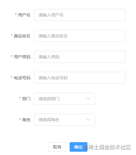
效果
总结
Form组件的封装思路就是通过配置文件生成一个基本的表单,然后配合数据的双向绑定得到我们提交的数据。
exceed ${props.size}MB!`)
return false
}
return true
}
// 上传成功时的钩子
const handleAvatarSuccess: UploadProps[‘onSuccess’] = (
response,
uploadFile: UploadFile
) => {
handleValueChange(uploadFile.raw, ‘img’)
imageUrl.value = URL.createObjectURL(uploadFile.raw as any)
}
return [imageUrl, beforeAvatarUpload, handleAvatarSuccess]
}
hooks文件将我们组件需要用到的方法和属性进行返回。

[外链图片转存中...(img-jmfo1oPW-1656318443637)]

效果

### 总结

Form组件的封装思路就是通过配置文件生成一个基本的表单,然后配合数据的双向绑定得到我们提交的数据。

为开发者提供学习成长、分享交流、生态实践、资源工具等服务,帮助开发者快速成长。
更多推荐


 9
9 0
0- 0


 已为社区贡献9条内容

所有评论(0)