css实现卡片翻转效果
css实现卡片翻转效果效果图源码html<div class="wrap"><div class="box1"><div class="box">春</div><div class="mask">生机勃勃</div></div><div class="box1">&l
·
css实现卡片翻转效果
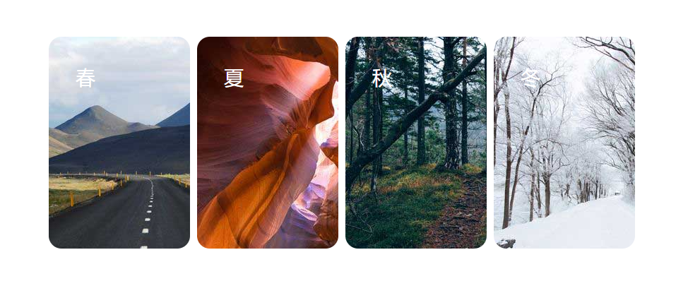
效果图
源码
- html
 <div class="wrap">
        <div class="box1">
            <div class="box">春</div>
            <div class="mask">生机勃勃</div>
        </div>
        <div class="box1">
            <div class="box">夏</div>
            <div class="mask">烈日炎炎</div>
        </div>
        <div class="box1">
            <div class="box">秋</div>
            <div class="mask">硕果累累</div>
        </div>
         <div class="box1">
            <div class="box">冬</div>
            <div class="mask">银装素裹</div>
        </div>
    </div>
- css
   <style>
        .wrap {
            width: 840px;
            height: 300px;
            /* background-color: sandybrown; */
            position: relative;
            margin: 0 auto;
            margin-top: 100px;
        }

        .box1 {
            width: 200px;
            height: 300px;
            /* background-color: salmon; */
            float: left;
            margin: 0 5px 0 5px;
            border-radius: 18px;
        }

        .box1:nth-child(1) .box{
            background-image: url(./img/01.jpg);
        }

        .box1:nth-child(2) .box{
            background-image: url(./img/02.jpg);
        }

        .box1:nth-child(3) .box{
            background-image: url(./img/03.jpg);
        }

        .box1:nth-child(4) .box{
            background-image: url(./img/04.jpg);
        }
        .box{
            width: 200px;
            height: 300px;
            box-sizing: border-box;
            font-size: 28px;
            border-radius: 18px;
            color: #fff;
            padding: 38px 0 0 38px;
            position: absolute;
            perspective: 1000px;
            transition: 0.5s ease-in-out;
        }
        .mask{
            width: 200px;
            height: 300px;
            background-color: #000;
            border-radius: 18px;
            color: #fff;
            font-size: 30px;
            text-align: center;
            line-height: 300px;
            font-family: '微软雅黑';
            font-weight: bold;
            position: absolute;
            backface-visibility:hidden;
            perspective: 1000px;
            transform: rotateY(-180deg);
            transition: 0.5s ease-in-out;
        }
        .box1:hover .box{
            transform: rotateY(-180deg);
        }
        .box1:hover .mask{
            transform: rotateY(-360deg);
        }
        .box1:nth-child(1) .mask{
            color: teal;
        }
        .box1:nth-child(2) .mask{
            color: red;
        }
        .box1:nth-child(3) .mask{
            color: orangered;
        }
        .box1:nth-child(4) .mask{
            color: white;
        }
    </style>
原理:这个卡片翻转效果是利用背面的内容一开始就先翻转180度,等正面翻转的时候背面再翻转360度,这样子背面翻转到面对屏幕的时候内容却就不会是反的了。
涉及属性
- perspective
主要用来表示3D元素距离视图的距离,单位是像素,定义在父元素上,子元素就会获得透视效果。
perspective: npx; 元素距离视图的距离,以像素计。(默认值:none,与0相同)
perspective 属性只影响 3D 转换元素。
-backface-visibility:hidden;
backface-visibility 属性定义当元素不面向屏幕时是否可见。
如果在旋转元素不希望看到其背面时,使用该属性。 - transform;rotateY(); ——沿着y轴进行3d旋转。
rotate(angle) 定义 2D 旋转,在参数中规定角度。
rotate3d(x,y,z,angle) 定义 3D 旋转。
rotateX(angle) 定义沿着 X 轴的 3D 旋转。
rotateY(angle) 定义沿着 Y 轴的 3D 旋转。
rotateZ(angle) 定义沿着 Z 轴的 3D 旋转。 - backface-visibility:hidden;
backface-visibility 属性定义当元素不面向屏幕时是否可见。
如果在旋转元素不希望看到其背面时,使用该属性。 - transition——transition是一个简写属性,用来设置四个属性:transition-property(名称), transition-duration(时间), transition-timing-function(速度曲线), transition-delay(延迟),过渡时间必须设置,否则不会产生过渡效果。
- transition-timing-function:
- linear(匀速)
- ease(默认.慢速开始,加快,慢速结束)
- ease-in(慢速开始)|ease-out(慢速结束)
- ease-in-out(慢速开始,慢速结束)
- cubic-bezier(n,n,n,n)贝赛尔曲线 自定义,n的值可为0~1

为开发者提供学习成长、分享交流、生态实践、资源工具等服务,帮助开发者快速成长。
更多推荐


 9
9 0
0- 0


 已为社区贡献1条内容

所有评论(0)