flex布局之多行多列
1、三行三列,边距都是20px,每个box宽高都是200px使用flex布局,给外层盒子宽高都设置成640px(200*3+20*2),在使用align-content: space-between和justify-content: space-between即可,代码如下:<style>*{padding:0;margin: 0;}html,body{width: 100%;heig
1、三行三列,边距都是20px,每个box宽高都是200px
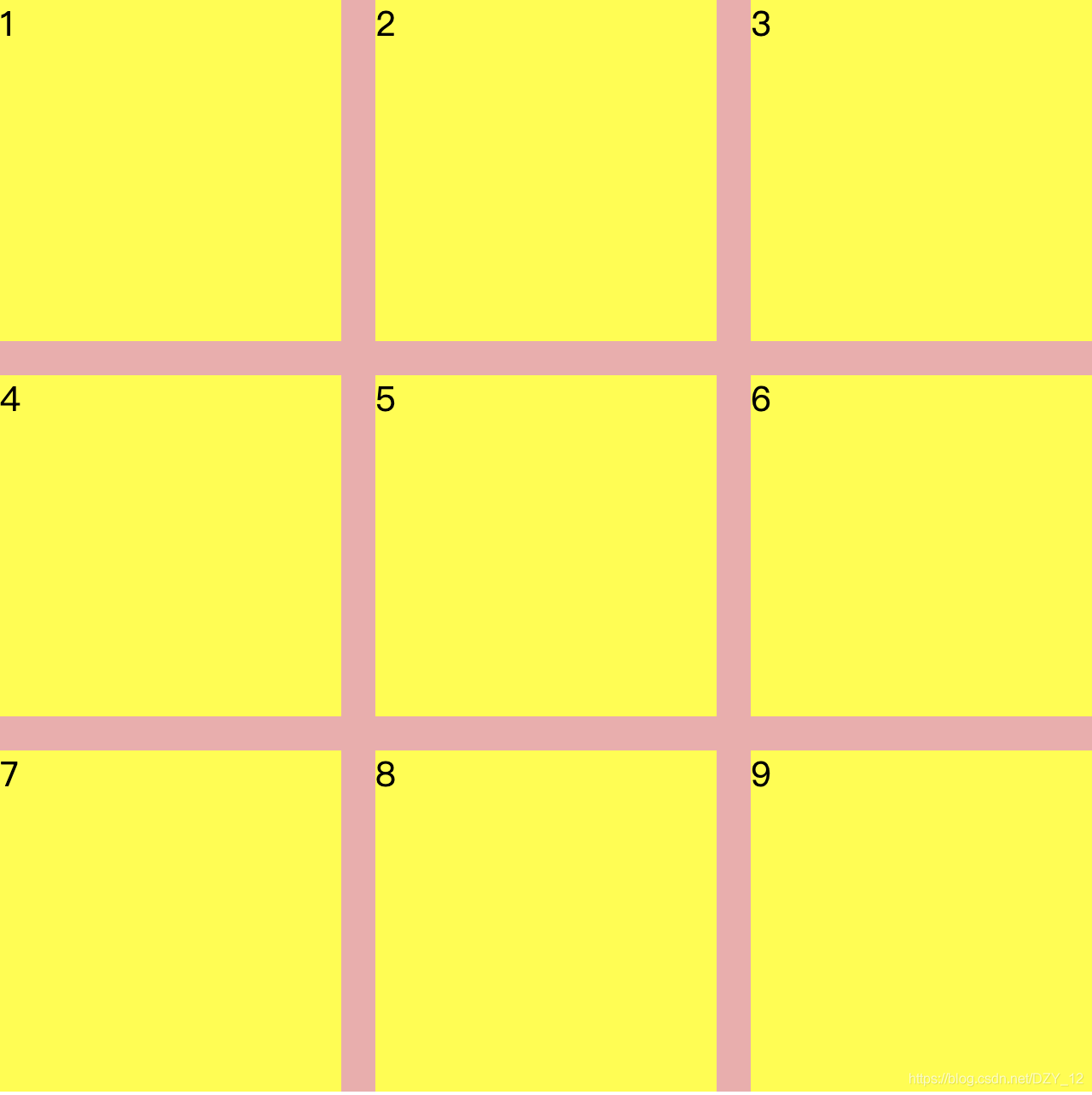
使用flex布局,给外层盒子宽高都设置成640px(200*3+20*2),在使用align-content: space-between和justify-content: space-between即可,代码如下:
<style>
 *{
    padding:0;
    margin: 0;
  }
  html,body{
    width: 100%;
    height: 100%;
  }
  .box{
    width: 640px;
    background: rgb(243, 171, 171);
    height: 640px;
    display: flex;
    flex-wrap: wrap;
    align-content: space-between;
    justify-content: space-between;
  }
  .Abox{
    background: yellow;
    width: 200px;
    height: 200px;
  }
</style>
<body>
    <div class="box">
      <div class="Abox">1</div>
      <div class="Abox">2</div>
      <div class="Abox">3</div>
      <div class="Abox">4</div>
      <div class="Abox">5</div>
      <div class="Abox">6</div>
      <div class="Abox">7</div>
      <div class="Abox">8</div>
      <div class="Abox">9</div>
    </div>
</body>
2、多行三列,边距都是20px,每个box宽高都是200px,高度自适应内容
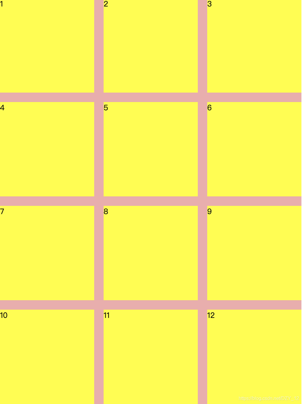
还是使用align-content: space-between和justify-content: space-between,高度有js计算得出,在设置到dom上:
<style>
 *{
    padding:0;
    margin: 0;
  }
  html,body{
    width: 100%;
    height: 100%;
  }
  .box{
    width: 640px;
    background: rgb(243, 171, 171);
    /* height: 640px; */
    display: flex;
    flex-wrap: wrap;
    align-content: space-between;
    justify-content: space-between;
  }
  .Abox{
    background: yellow;
    width: 200px;
    height: 200px;
  }
</style>
<body>
    <div class="box">
      <div class="Abox">1</div>
      <div class="Abox">2</div>
      <div class="Abox">3</div>
      <div class="Abox">4</div>
      <div class="Abox">5</div>
      <div class="Abox">6</div>
      <div class="Abox">7</div>
      <div class="Abox">8</div>
      <div class="Abox">9</div>
      <div class="Abox">10</div>
      <div class="Abox">11</div>
      <div class="Abox">12</div>
    </div>
</body>
<script>
  let parentDom = document.querySelector('.box');
  let children = parentDom.children;
  let rowNums = Math.ceil(children.length / 3);
  parentDom.style.height = rowNums * 200 + (rowNums - 1) * 20 + 'px';
</script>
3、三行多列,边距都是20px,每个box宽高都是200px,宽度自适应内容
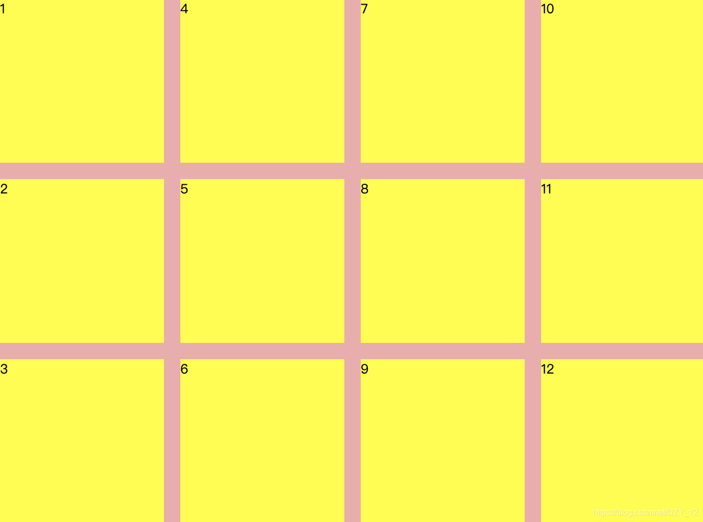
法一:
还是使用align-content: space-between和justify-content: space-between,此时宽度由内容决定,所以可以通过js计算并动态设置宽度:
<style>
*{
padding:0;
margin: 0;
}
html,body{
width: 100%;
height: 100%;
}
.box{
background: rgb(243, 171, 171);
height: 640px;
display: flex;
flex-wrap: wrap;
flex-direction: column;
align-content: space-between;
justify-content: space-between;
}
.Abox{
background: yellow;
width: 200px;
height: 200px;
}
</style>
<body>
<div class="box">
<div class="Abox">1</div>
<div class="Abox">2</div>
<div class="Abox">3</div>
<div class="Abox">4</div>
<div class="Abox">5</div>
<div class="Abox">6</div>
<div class="Abox">7</div>
<div class="Abox">8</div>
<div class="Abox">9</div>
<div class="Abox">10</div>
<div class="Abox">11</div>
<div class="Abox">12</div>
</div>
</body>
<script>
let parentDom = document.querySelector('.box');
let children = parentDom.children;
let columnNums = Math.ceil(children.length / 3);
parentDom.style.width = columnNums * 200 + (columnNums - 1) * 20 + 'px';
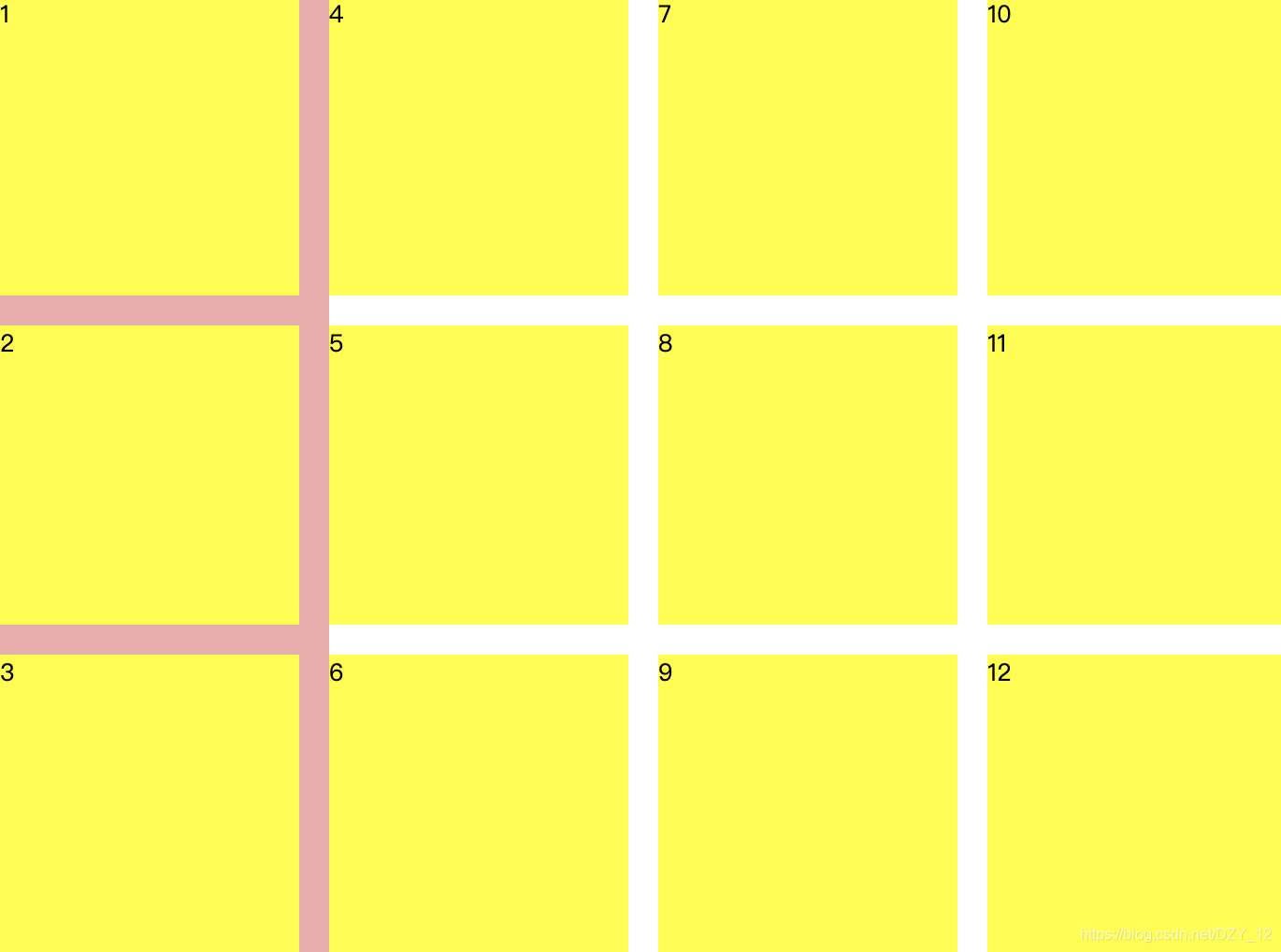
</script>法二:
主轴使用justify-content: space-between,交叉轴使用align-content: flex-start,此时右边距有margin控制,不使用js控制父盒子宽度,width设置成fit-content:
效果如下,此时父盒子的宽度只有一列子元素的宽度,之前也遇到过这个问题,就是flex-direction: column时,子元素多列的宽度不能撑开父元素的宽度,故此方案不行。
4、三行三列,边距都是20px,每个box宽高都是200px,高度自适应内容,子元素不能铺满
用了问题二的方法,发现最后一行不够三个中间会留出空位,并不是我们想要的效果:
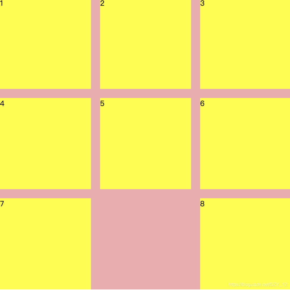
法一:
用不显示的div填充,进行占位:
<style>
  *{
     padding:0;
     margin: 0;
   }
   html,body{
     width: 100%;
     height: 100%;
   }
   .box{
     width: 640px;
     height: 640px;
     background: rgb(243, 171, 171);
     display: flex;
     flex-wrap: wrap;
     align-content: space-between;
     justify-content: space-between;
   }
   .Abox{
     background: yellow;
     width: 200px;
     height: 200px;
   }
 </style>
 <body>
     <div class="box">
       <div class="Abox">1</div>
       <div class="Abox">2</div>
       <div class="Abox">3</div>
       <div class="Abox">4</div>
       <div class="Abox">5</div>
       <div class="Abox">6</div>
       <div class="Abox">7</div>
       <div class="Abox">8</div>
     </div>
 </body>
 <script>
   let parentDom = document.querySelector('.box');
   let children = parentDom.children;
   let n = children.length % 3;
   // 不能铺满
   if (n) {
      while (3 - n > 0) {
        let div = document.createElement('div');
        div.className = 'Abox';
        div.style.visibility = 'hidden';
        parentDom.appendChild(div);
        n++;
      }
   }
 </script>
效果如下:
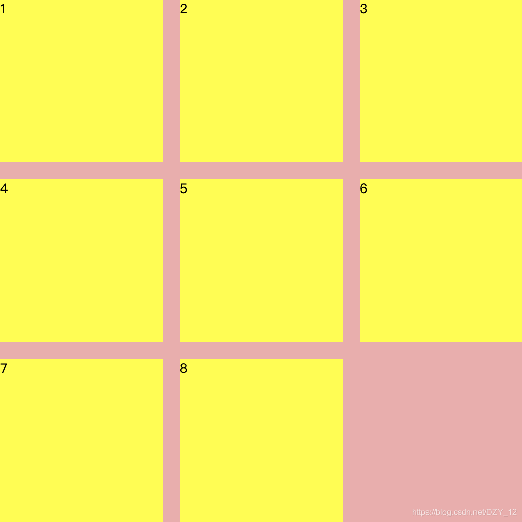
法二:
主轴使用justify-content: flex-start,交叉轴使用align-content: space-between,右边距用margin设置,最后一列nth-child(3n)不设置右边距:
<style>
  *{
     padding:0;
     margin: 0;
   }
   html,body{
     width: 100%;
     height: 100%;
   }
   .box{
     width: 640px;
     background: rgb(243, 171, 171);
     height: 640px;
     display: flex;
     flex-wrap: wrap;
     align-content: space-between;
     justify-content: flex-start;
   }
   .Abox{
     background: yellow;
     width: 200px;
     height: 200px;
     margin-right: 20px;
   }
   .Abox:nth-child(3n) {
      margin: 0;
   }
 </style>
 <body>
     <div class="box">
       <div class="Abox">1</div>
       <div class="Abox">2</div>
       <div class="Abox">3</div>
       <div class="Abox">4</div>
       <div class="Abox">5</div>
       <div class="Abox">6</div>
       <div class="Abox">7</div>
       <div class="Abox">8</div>
     </div>
 </body>
另外,上边1、2、3这些能铺满的情况也能用法二的方法实现。

为开发者提供学习成长、分享交流、生态实践、资源工具等服务,帮助开发者快速成长。
更多推荐


 6
6 0
0- 0


 已为社区贡献3条内容

所有评论(0)