echarts折线图、柱状图中显示X,Y轴的自定义内容
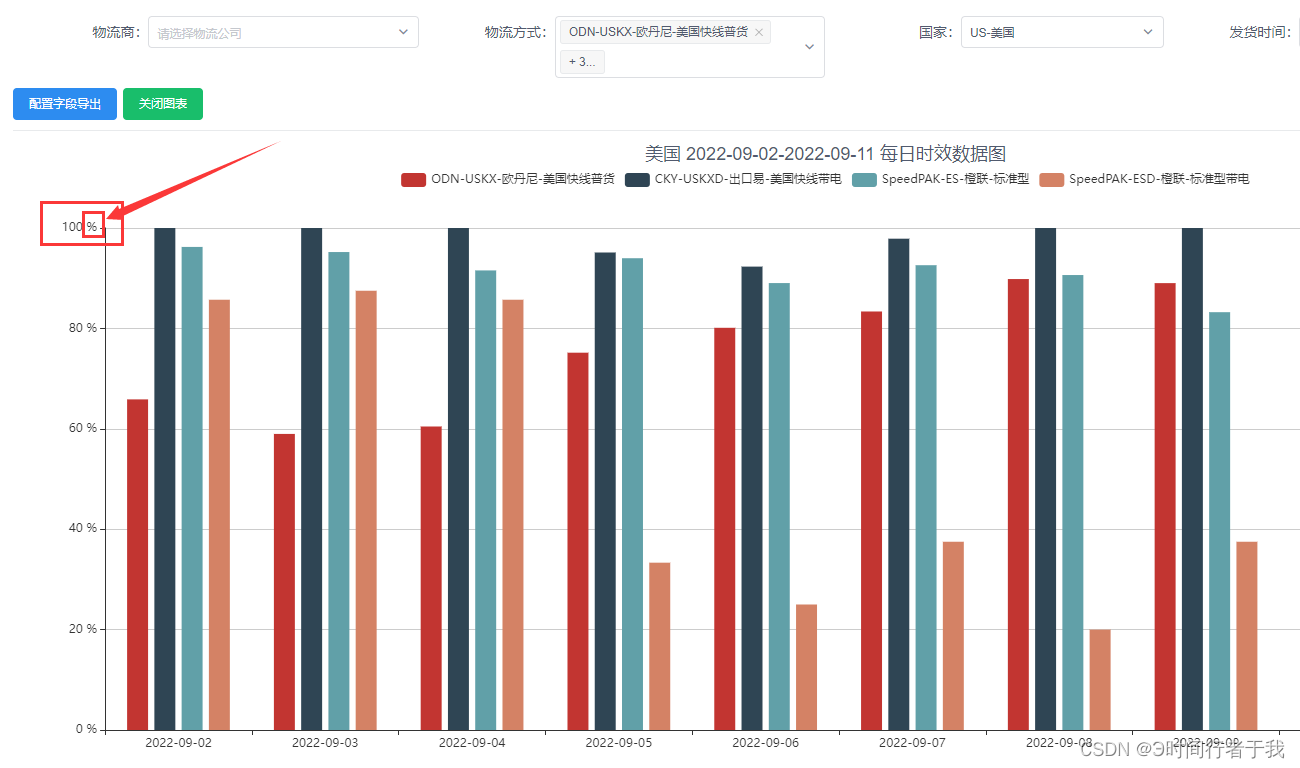
echarts折线图、柱状图中显示X,Y轴的自定义内容,如添加百分比等情况
·
echarts折线图、柱状图中显示X,Y轴的自定义内容,如添加百分比等情况
局部代码
以y轴为例,x轴则是相反
Y轴
yAxis: {
    type: 'value',
    min: 0,// 最小值0
    max: 100, // 最大值100
    axisLabel: { //添加这一段
      formatter: '{value} %'
    }
  },
X轴
xAxis: {
    type: 'value',
    axisLabel: { //添加这一段
      formatter: '{value} %'
    }
  },
全部代码
setChart(isArray, LoadTime) { // echarts图表
    const option = {
      tooltip: {},
      legend: {
        show: true
      },
      grid: {
        left: '3%',
        right: '4%',
        bottom: '3%',
        containLabel: true
      },
      toolbox: {
        show: false,
        feature: {
          dataView: {
            readOnly: true
          }
        }
      },
      xAxis: {
        type: 'category',
        data: LoadTime
      },
      yAxis: {
        type: 'value',
        min: 0,
        max: 100,
        axisLabel: {
          formatter: '{value} %' // ******在这里***********
        }
      },
      series: isArray,
      barCategoryGap: '30%'
    }

为开发者提供学习成长、分享交流、生态实践、资源工具等服务,帮助开发者快速成长。
更多推荐


 0
0 0
0- 0


 已为社区贡献11条内容

所有评论(0)