vue开发项目(PC端和移动端共用一套代码)(二)
vue开发PC端和移动端共用一套代码,通过屏幕宽度大小来判断显示pc端样式还是移动端样式。
在 https://blog.csdn.net/qq_39480297/article/details/125785301?spm=1001.2014.3001.5501一文中,采用路由控制,加载PC端代码还是移动端代码。本文采用,通过屏幕宽度大小来判断加载相应端的代码。
1、必备条件
首先,创建一个新的vue项目。
2、配置
2.1、创建新的界面
① 创建 src/views/index/index.vue
② 在src/router/index.js中设置
const routes = [
  {
    path: '/',
    name: 'Home',
    component: Home
  },
  {
    path: '/about',
    name: 'About',
    // route level code-splitting
    // this generates a separate chunk (about.[hash].js) for this route
    // which is lazy-loaded when the route is visited.
    component: () => import(/* webpackChunkName: "about" */ '../views/About.vue')
  }, {
    path: '/index',
    name: 'Index',
    component: () =>
      import(/* webpackChunkName: "about" */ '../views/index')
  }
]
③ 在App.vue中设置
<template>
  <div id="app" :class="[device]">
    <div id="nav">
      <router-link to="/">Home</router-link> |
      <router-link to="/about">About</router-link> |
      <router-link to="/index">测试</router-link>
    </div>
    <router-view/>
  </div>
</template>
2.1、适配
① src/views/index/路径下,创建pc/index.vue、m/index.vue

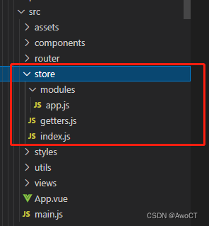
② 设置store,在src/store中,目录如下:
index.js
import Vue from 'vue'
import Vuex from 'vuex'
import getters from './getters'

Vue.use(Vuex)

const modulesFiles = require.context('./modules', true, /\.js$/)

// you do not need `import app from './modules/app'`
// it will auto require all vuex module from modules file
const modules = modulesFiles.keys().reduce((modules, modulePath) => {
  // set './app.js' => 'app'
  const moduleName = modulePath.replace(/^\.\/(.*)\.\w+$/, '$1')
  const value = modulesFiles(modulePath)
  modules[moduleName] = value.default
  return modules
}, {})

const store = new Vuex.Store({
  modules,
  getters
})
export default store
app.js
const state = {
  device: 'pc' // 默认是PC端,====》 PC端:pc、移动端:m
}

const mutations = {
  SET_DEVICE: (state, device) => {
    state.device = device
  }
}

const actions = {
  setDevice ({ commit }, device) {
    commit('SET_DEVICE', device)
  }
}

export default {
  namespaced: true,
  state,
  mutations,
  actions
}
getters.js
const getters = {
  device: state => state.app.device
}
export default getters
③ 在src/views/index/index.vue中,通过判断store中的device,选择加载pc或m。
<template>
  <div>
    <mobile v-if="device == 'm'" />
    <pc v-if="device == 'pc'"/>
  </div>
</template>
<script>
import { mapGetters } from 'vuex'
import pc from './pc'
import mobile from './m'
export default {
  components: {
    pc,
    mobile
  },
  data () {
    return {}
  },
  computed: {
    ...mapGetters(['device'])
  }
}
</script>
④ 在App.vue中,通过检测屏幕变化,设置当前设备应采用pc端还是移动端。
<template>
  <div id="app">
    <div id="nav">
      <router-link to="/">Home</router-link> |
      <router-link to="/about">About</router-link> |
      <router-link to="/index">测试</router-link>
    </div>
    <router-view/>
  </div>
</template>

<script>
import { mapGetters } from 'vuex'
import { throttle } from '@/utils'
export default {
  computed: {
    ...mapGetters(['device'])
  },
  created () {
    // resize节流
    this.resizeChange = throttle(this.resizeChange, 200)
    this.resizeChange()
    window.addEventListener('resize', this.resizeChange, false)
  },
  methods: {
    resizeChange () {
      console.log(document.documentElement.clientWidth)
      if (document.documentElement.clientWidth > 1000) { // 默认设置当屏幕宽度 > 1000 时,为PC端
        this.$store.dispatch('app/setDevice', 'pc')
      } else { // 默认设置当屏幕宽度 <= 1000 时,为移动端
        this.$store.dispatch('app/setDevice', 'm')
      }
    }
  },
  destroyed () {
    window.removeEventListener('resize', this.resizeChange, false)
  }
}
</script>
上述代码中,throttle节流方法,可以使用框架,也可以自定义,本文中使用自定义,在src/utils/index.js中,添加
export function throttle (func, wait, options) {
let context
let args
let result
var timeout = null
var previous = 0
if (!options) options = {}
var later = function () {
previous = options.leading === false ? 0 : new Date().getTime()
timeout = null
result = func.apply(context, args)
if (!timeout) context = args = null
}
return function () {
var now = new Date().getTime()
if (!previous && options.leading === false) previous = now
var remaining = wait - (now - previous)
context = this
args = arguments
if (remaining <= 0 || remaining > wait) {
if (timeout) {
clearTimeout(timeout)
timeout = null
}
previous = now
result = func.apply(context, args)
if (!timeout) context = args = null
} else if (!timeout && options.trailing !== false) {
timeout = setTimeout(later, remaining)
}
return result
}
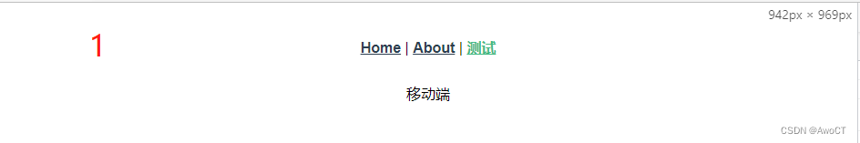
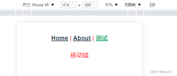
}运行结果如下:
pc:

移动端:

⑤ css适配
1、修改App.vue
2、创建src/styles/,目录如下:

styles/m/index.less
.m {
  font-size: 20px;
  color: red;
}
styles/pc/index.less
.pc {
  font-size: 50px;
  color: blue;
}
styles/index.less
@import "./m/index.less";
@import "./pc/index.less";
3、在main.js中引入css

这样,css样式也可以进行pc、移动端适配
运行结果如下:
移动端:
pc端:

备注:后期也可设置pc端使用px布局,移动端使用rem来布局

为开发者提供学习成长、分享交流、生态实践、资源工具等服务,帮助开发者快速成长。
更多推荐


 8
8 0
0- 0


 已为社区贡献2条内容

所有评论(0)