uniapp:uni-combox下拉选中之后下拉框只有被选中项 问题解决
关于uni-combox的基础用法在此处不赘述,下面是官网上给出的示例:选中之后必须手动清空了输入框内容才可以再次选择其他选项,非常不方便去插件市场看了下有基于uniui实现的,突发奇想,我们也可以自己改呀~查看uni-combox的组件,修改原代码。实现效果如下:如果对下拉选择功能要求不是很多的,可以采用以下代码(复制直接替换掉uni-combox.vue的代码):<template>
·
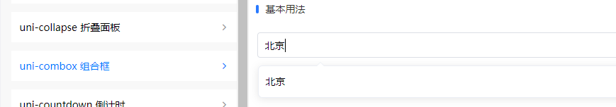
关于uni-combox的基础用法在此处不赘述,下面是官网上给出的示例:
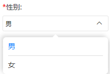
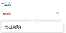
选中之后必须手动清空了输入框内容才可以再次选择其他选项,非常不方便
去插件市场看了下有基于uniui实现的,突发奇想,我们也可以自己改呀~
查看uni-combox的组件,修改原代码。
实现效果如下:
如果对下拉选择功能要求不是很多的,可以采用以下代码(复制直接替换掉uni-combox.vue的代码):
<template>
	<view class="uni-combox">
		<view v-if="label" class="uni-combox__label" :style="labelStyle">
			<text>{{label}}</text>
		</view>
		<view class="uni-combox__input-box">
			<input class="uni-combox__input" type="text" :placeholder="placeholder" v-model="inputVal" @input="onInput" @focus="onFocus" @blur="onBlur" />
			<uni-icons class="uni-combox__input-arrow" :type="showSelector ? 'arrowup' : 'arrowdown'" size="14" @click="toggleSelector"></uni-icons>
			<view class="uni-combox__selector" v-if="showSelector">
				<scroll-view scroll-y="true" class="uni-combox__selector-scroll">
					<view class="uni-combox__selector-empty" v-if="filterCandidatesLength === 0">
						<text>{{emptyTips}}</text>
					</view>
					<view class="uni-combox__selector-item" v-for="(item,index) in newSelectorCandidates" :key="index" @click="onSelectorClick(index)">
						<text :class="inputVal === item ? 'select-item' : ''">{{item}}</text>
					</view>
				</scroll-view>
			</view>
		</view>
	</view>
</template>

<script>
	/**
	 * Combox 组合输入框
	 * @description 组合输入框一般用于既可以输入也可以选择的场景
	 * @tutorial https://ext.dcloud.net.cn/plugin?id=1261
	 * @property {String} label 左侧文字
	 * @property {String} labelWidth 左侧内容宽度
	 * @property {String} placeholder 输入框占位符
	 * @property {Array} candidates 候选项列表
	 * @property {String} emptyTips 筛选结果为空时显示的文字
	 * @property {String} value 组合框的值
	 */
	export default {
		name: 'uniCombox',
		emits: ['input', 'update:modelValue'],
		props: {
			label: {
				type: String,
				default: ''
			},
			labelWidth: {
				type: String,
				default: 'auto'
			},
			placeholder: {
				type: String,
				default: ''
			},
			candidates: {
				type: Array,
				default () {
					return []
				}
			},
			emptyTips: {
				type: String,
				default: '无匹配项'
			},
			// #ifndef VUE3
			value: {
				type: [String, Number],
				default: ''
			},
			// #endif
			// #ifdef VUE3
			modelValue: {
				type: [String, Number],
				default: ''
			},
			// #endif
		},
		data() {
			return {
				showSelector: false,
				inputVal: ''
			}
		},
		computed: {
			labelStyle() {
				if (this.labelWidth === 'auto') {
					return {}
				}
				return {
					width: this.labelWidth
				}
			},
			filterCandidates() {
				return this.candidates.filter((item) => {
					return item.toString().indexOf(this.inputVal) > -1
				})
			},
			filterCandidatesLength() {
				return this.filterCandidates.length
			},
			newSelectorCandidates() {
				return this.filterCandidatesLength ? this.candidates : []
			}
		},
		watch: {
			// #ifndef VUE3
			value: {
				handler(newVal) {
					this.inputVal = newVal
				},
				immediate: true
			},
			// #endif
			// #ifdef VUE3
			modelValue: {
				handler(newVal) {
					this.inputVal = newVal
				},
				immediate: true
			},
			// #endif
		},
		methods: {
			toggleSelector() {
				this.showSelector = !this.showSelector
			},
			onFocus() {
				this.showSelector = true
			},
			onBlur() {
				setTimeout(() => {
					this.showSelector = false
				}, 153)
			},
			onSelectorClick(index) {
				// this.inputVal = this.filterCandidates[index]
				this.inputVal = this.candidates[index]
				this.showSelector = false
				this.$emit('input', this.inputVal)
				this.$emit('update:modelValue', this.inputVal)
			},
			onInput() {
				setTimeout(() => {
					this.$emit('input', this.inputVal)
					this.$emit('update:modelValue', this.inputVal)
				})
			}
		}
	}
</script>

<style scoped>
	.uni-combox {
		/* #ifndef APP-NVUE */
		display: flex;
		/* #endif */
		height: 40px;
		flex-direction: row;
		align-items: center;
	}

	.uni-combox__label {
		font-size: 16px;
		line-height: 22px;
		padding-right: 10px;
		color: #999999;
	}

	.uni-combox__input-box {
		position: relative;
		/* #ifndef APP-NVUE */
		display: flex;
		/* #endif */
		flex: 1;
		flex-direction: row;
		align-items: center;
	}

	.uni-combox__input {
		flex: 1;
		font-size: 16px;
		height: 22px;
		line-height: 22px;
	}

	.uni-combox__input-arrow {
		padding: 10px;
	}

	.uni-combox__selector {
		/* #ifndef APP-NVUE */
		box-sizing: border-box;
		/* #endif */
		position: absolute;
		top: 42px;
		left: 0;
		width: 100%;
		background-color: #FFFFFF;
		border-radius: 6px;
		box-shadow: #DDDDDD 4px 4px 8px, #DDDDDD -4px -4px 8px;
		z-index: 2;
	}

	.uni-combox__selector-scroll {
		/* #ifndef APP-NVUE */
		max-height: 200px;
		box-sizing: border-box;
		/* #endif */
	}

	.uni-combox__selector::before {
		/* #ifndef APP-NVUE */
		content: "";
		/* #endif */
		position: absolute;
		width: 0;
		height: 0;
		border-bottom: solid 6px #FFFFFF;
		border-right: solid 6px transparent;
		border-left: solid 6px transparent;
		left: 50%;
		top: -6px;
		margin-left: -6px;
	}

	.uni-combox__selector-empty,
	.uni-combox__selector-item {
		/* #ifndef APP-NVUE */
		display: flex;
		cursor: pointer;
		/* #endif */
		line-height: 36px;
		font-size: 14px;
		text-align: center;
		border-bottom: solid 1px #DDDDDD;
		margin: 0px 10px;
	}
	.select-item{
		color: #1e74ff;
	}

	.uni-combox__selector-empty:last-child,
	.uni-combox__selector-item:last-child {
		/* #ifndef APP-NVUE */
		border-bottom: none;
		/* #endif */
	}
</style>
其中,修改时疑惑的点,下拉框右侧的向上和向下的小图标,并不是 top 和 bottom,而是 arrowup 和 arrowdown,在uni-icons里没有找到对应的小图标。
原因:后面发现,uni-icons官网示例的图标名称和uni-icons组件中icons.js中的名称部分对应不起来,官网示例的top,在icons.js中是没有的。算是官网的bug吧

为开发者提供学习成长、分享交流、生态实践、资源工具等服务,帮助开发者快速成长。
更多推荐


 8
8 0
0- 0


 已为社区贡献3条内容

所有评论(0)