css动画与渐变案例,使用动画和渐变做一个背景动态网页
css动画与渐变案例,使用动画和渐变做一个背景动态网页主要是渐变和动画效果,使用渐变来设置背景颜色,再配合background-position属性改变背景的大小,配合动画展示出一个背景在改变的效果。字体 设置-webkit-background-clip: text;后设置颜色为透明,再重复上面的东西达成字体渐变的 效果。泡泡是一个径向渐变配合动画,设置动画延时不同产生的依次漂浮向上的效果。
目录
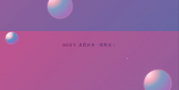
一,效果展示
使用渐变和动画来制作这样的一个动态背景的页面。
分别设置了背景,字体和泡泡的漂浮动画,使得整个页面展示出一个颜色一直改变的效果。
二,背景颜色的渐变与动画
1.背景颜色渐变
设置背景从右下角到左上角一个蓝色到粉色的线性渐变。
 body{
            background-image:linear-gradient(-45deg, #2177b8 0%,#c35691 100%);
        }
效果:
2.背景颜色的动态改变
使用动画让背景改变,把背景的宽高设置变成300%,使用background-position属性和动画来改变背景的宽高,从而达到背景改变的效果。可以设置不同的背景尺寸使动画不同。
body{
            background-image:linear-gradient(-45deg, #2177b8 0%,#c35691 100%);
            background-size: 300% 300%;
            animation: zi 15s infinite both linear;
        }
@keyframes zi{
0%{
background-position: 300% 300%;
}
33%{
background-position: 0% 300%;
}
66%{
background-position: 300% 0%;
}
100%{
background-position: 300% 300%;
}
}三,字体样式与颜色的改变
1.字体样式的引入
在网络上下载字体样式的压缩包,解压后使用@font-face来引用它,font-family: a;来设置它的名字,src:url来引用它的路径。
在设置文字的样式时,直接font-family: a;
@font-face{
font-family: a;
src: url(./0928img/ZhanKuXiaoLOGOTi/ZhanKuXiaoLOGOTi-2.otf);
}
2.设置字体颜色透明与背景
设置-webkit-background-clip: text;裁剪字体,然后设置字体颜色为透明。
-webkit-background-clip: text;
color: transparent;设置背景颜色渐变,背景大小设置为300%
background-image:linear-gradient(-45deg, #084a7d 0%,#88084c 100%);
background-size: 300% 300%;设置背景动画并且引用动画。
 @keyframes zi{
            0%{
                background-position: 300% 300%;
            }
            33%{
                background-position: 0% 300%;
            }
            66%{
                background-position: 300% 0%;
            }
            100%{
                background-position: 300% 300%;
            }
        }
animation: zi 6s infinite both linear;
3.字体设置源码
.qq{
font-size: 35px;
width: 450px;
margin: 0 auto;
font-family: a;
-webkit-background-clip: text;
color: transparent;
background-image:linear-gradient(-45deg, #084a7d 0%,#88084c 100%);
background-size: 300% 300%;
animation: zi 6s infinite both linear;
}
@keyframes zi{
0%{
background-position: 300% 300%;
}
33%{
background-position: 0% 300%;
}
66%{
background-position: 300% 0%;
}
100%{
background-position: 300% 300%;
}
}
@font-face{
            font-family: a;
            src: url(./0928img/ZhanKuXiaoLOGOTi/ZhanKuXiaoLOGOTi-2.otf);
}四,背景泡泡的漂浮动画效果
1.使用径向渐变制作泡泡
宽高为100px,在距离左上角20px的位置设置渐变中心,依次是白色,粉色,蓝色和紫色,这样看起来泡泡是在左上角收到光源照射,并设置阴影,光照效果和光晕使泡泡效果更加美观逼真。
width: 100px;
height: 100px;
border-radius: 50%;
background-image: radial-gradient(at 20px 20px,white 0%,#f0ccd5 25%, #5a93cb 45%, #cf3ebe 100%);
box-shadow: 0px 0px 8px 0px pink;
2.泡泡漂浮动画
@keyframes run{
0%{
transform: translate(0px, 400px);
}
100%{
transform: translate(0px, -1500px);
}
}
.kuai1{
z-index: -1;
position: absolute;
top: 600px;
left: 50px;
width: 100px;
height: 100px;
border-radius: 50%;
background-image: radial-gradient(at 20px 20px,white 0%,#f0ccd5 25%, #5a93cb 45%, #cf3ebe 100%);
box-shadow: 0px 0px 8px 0px pink;
animation: run 3s linear infinite;
animation-delay: -1s;
}使用定位,把泡泡定位在页面下面位置,动画开始位置设置在页面下面400px的位置,使泡泡从页面下面飘出来,更加美观。
因为要设置多个泡泡向上漂浮的动画,所以设置泡泡的尺寸,位置,动画延时时间都不一样。
在最后给出不同泡泡的源码。
五,总结与源码
总结:
主要是渐变和动画效果,使用渐变来设置背景颜色,再配合background-position属性改变背景的大小,配合动画展示出一个背景在改变的效果。
字体 设置-webkit-background-clip: text;后设置颜色为透明,再重复上面的东西达成字体渐变的 效果。
泡泡是一个径向渐变配合动画,设置动画延时不同产生的依次漂浮向上的效果。
css样式:
* {
padding: 0;
margin: 0;
box-sizing: border-box;
}
body,
html {
margin: 0;
height: 100%;
display: flex;
align-items: center;
justify-content: center;
overflow: hidden;
/* background-color: #222; */
}
body{
background-image:linear-gradient(-45deg, #2177b8 0%,#c35691 100%);
background-size: 300% 300%;
animation: zi 15s infinite both linear;
}
.qq{
font-size: 35px;
width: 450px;
margin: 0 auto;
font-family: a;
 -webkit-background-clip: text;
            color: transparent;
 background-image:linear-gradient(-45deg, #084a7d 0%,#88084c 100%);
            background-size: 300% 300%;
animation: zi 6s infinite both linear;
}
@keyframes zi{
            0%{
                background-position: 300% 300%;
            }
            33%{
                background-position: 0% 300%;
            }
            66%{
                background-position: 300% 0%;
            }
            100%{
                background-position: 300% 300%;
            }
        }
@font-face{
font-family: a;
src: url(./0928img/ZhanKuXiaoLOGOTi/ZhanKuXiaoLOGOTi-2.otf);
}
.kuai1{
z-index: -1;
position: absolute;
top: 600px;
left: 50px;
width: 100px;
height: 100px;
border-radius: 50%;
background-image: radial-gradient(at 20px 20px,white 0%,#f0ccd5 25%, #5a93cb 45%, #cf3ebe 100%);
            box-shadow: 0px 0px 8px 0px pink;
animation: run 3s linear infinite;
animation-delay: -1s;
}
.kuai2{
z-index: -1;
position: absolute;
top: 600px;
left: 400px;
width: 200px;
height: 200px;
border-radius: 50%;
background-image: radial-gradient(at 20px 20px,white 0%,#F9ACBE 25%, #7DA0C3 45%, #C754BA 100%);
box-shadow: 0px 0px 14px 0px pink;
animation: run 3s linear infinite;
animation-delay: -1.5s;
}
.kuai3{
z-index: -1;
position: absolute;
top: 600px;
left: 600px;
width: 50px;
height: 50px;
border-radius: 50%;
background-image: radial-gradient(at 20px 20px,white 0%,#F9ACBE 25%, #7DA0C3 45%, #C754BA 100%);
box-shadow: 0px 4px 8px 0px pink;
animation: run 3s linear infinite;
animation-delay: -2.5s;
}
.kuai4{
z-index: -1;
position: absolute;
top: 600px;
left: 800px;
width: 150px;
height: 150px;
border-radius: 50%;
background-image: radial-gradient(at 20px 20px,white 0%,#F9ACBE 25%, #7DA0C3 45%, #C754BA 100%);
box-shadow: 0px 0px 6px 0px pink;
animation: run 3s linear infinite;
animation-delay: -2s;
}
.kuai5{
position: absolute;
top: 600px;
left: 1200px;
width: 220px;
height: 220px;
border-radius: 50%;
background-image: radial-gradient(at 20px 20px,white 0%,#F9ACBE 25%, #7DA0C3 45%, #C754BA 100%);
box-shadow: 0px 0px 16px 0px pink;
animation: run 3s linear infinite;
animation-delay: -0.5s;
}
 @keyframes run{
            0%{
                transform: translate(0px, 400px);
            }

            100%{
                transform: translate(0px, -1500px);

            }
}html5:
 <div class="qq">QQ音乐 清晨的第一缕阳光!</div>
    <div class="pao kuai1"></div>
    <div class="pao kuai2"></div>
    <div class="pao kuai3"></div>
    <div class="pao kuai4"></div>
    <div class="pao kuai5"></div>
感谢各位的观看,如有帮助,不胜感激,如有不足,请多批评。

为开发者提供学习成长、分享交流、生态实践、资源工具等服务,帮助开发者快速成长。
更多推荐


 15
15 0
0- 0


 已为社区贡献3条内容

所有评论(0)