[Vue2]AntDesignVue基于Select封装「多选 + 二级级联+ 可自定义添加item 组件」
[Vue2]AntDesignVue基于Select封装「多选 + 二级级联+ 可自定义添加item 组件」
·
需求场景
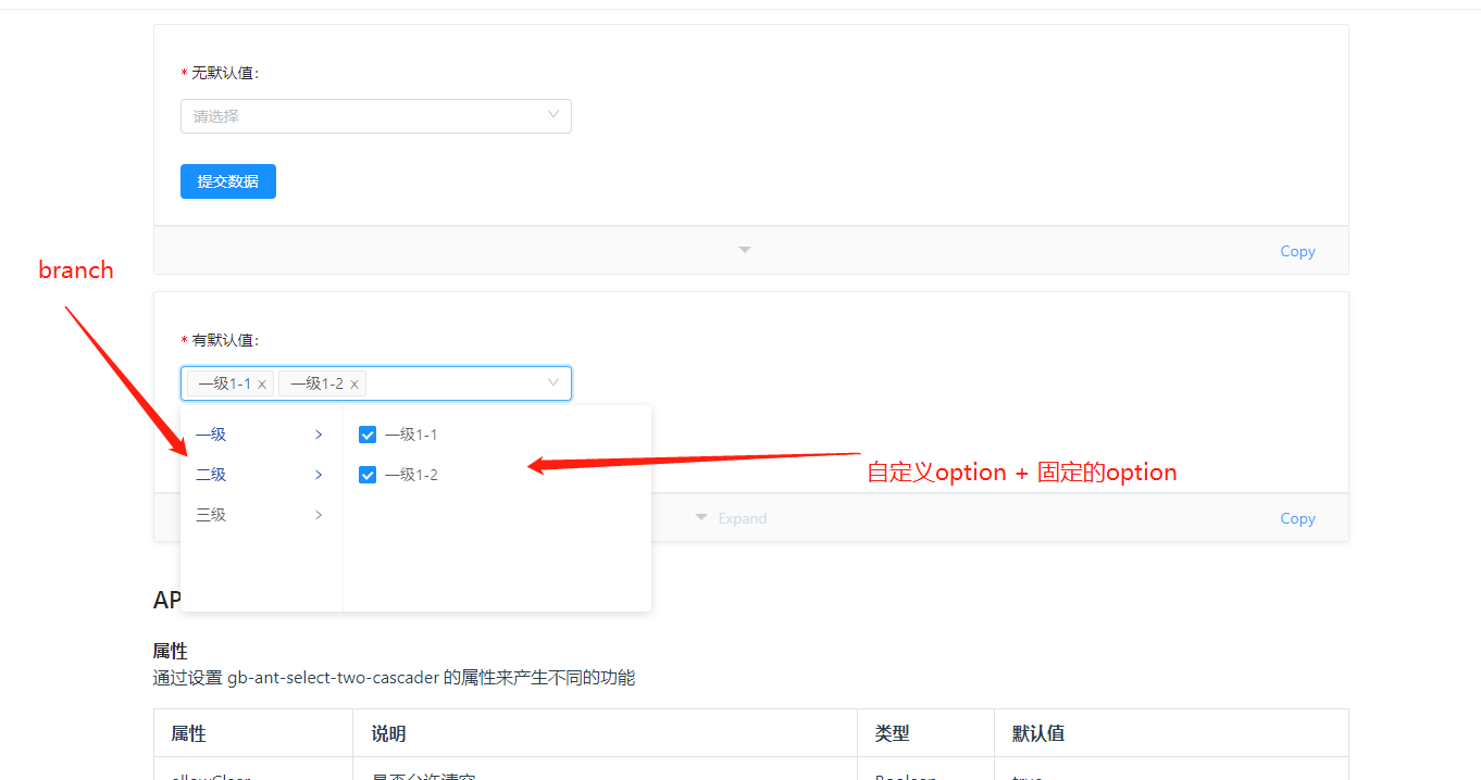
在一个下拉选择框中,一个branch对应多个编译命令option, option1和option2是每个branch都固定拥有的选项,同时支持多选,例如最后选择的结果如下:
{
	"branch1": ["option1", "option2", "option31", "option41"],
    "branch2": ["option1", "option2", "option32", "option42"],
    "branch2": ["option1", "option2", "option33", "option43"],
    ......
}
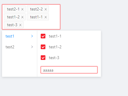
ui示意图如下
AntDesignVue官网
第一反应都是去官网看看有没有现成的轮子可用,但官方给出的组件功能还是不够强大,需要基于官方组件进行二次封装。
doit-ui-web
doit-ui-web基于AntDesignVue封装了很多业务常用的组件
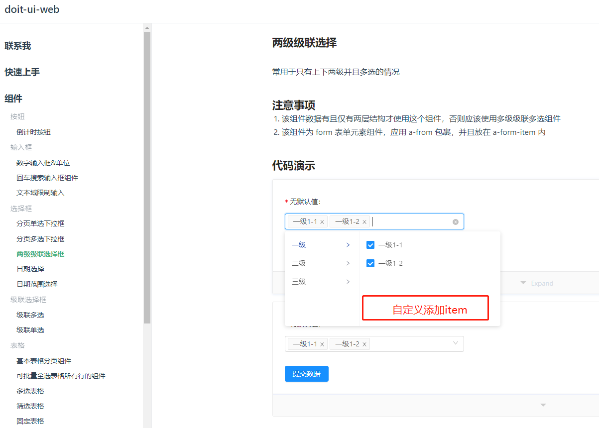
http://my.h5house.com/component/select/two_cascader.html
在这里找到了一个最贴近业务的组件,只是可惜少了一个自定义添加item的功能,而且doit-ui-web文档中并未。
那就基于AntDesignVue自己封装吧…
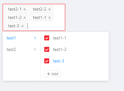
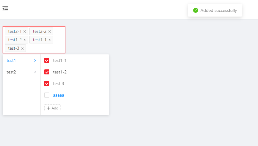
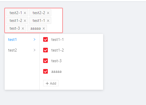
实现效果
example.vue
<template>
  <cascader-select
    :options="items"
    v-model="initData"
    style="width: 200px;"
  ></cascader-select>
</template>
<script>
import CascaderSelect from '@/components/CascaderSelect'
export default {
  components: {
    CascaderSelect
  },
  data: () => ({
    initData: null,
    items: [
      {
        label: 'test1',
        value: 'test1',
        children: [
          {
            label: 'test1-1',
            value: 'test1-1'
          },
          {
            label: 'test1-2',
            value: 'test1-2'
          }
        ]
      },
      {
        label: 'test2',
        value: 'test2',
        children: [
          {
            label: 'test2-1',
            value: 'test2-1'
          },
          {
            label: 'test2-2',
            value: 'test2-2'
          }
        ]
      }
    ]
  }),
  methods: {
    // It's for asyncApi
    // (itemVal: {label:string, value:string}) => Promise
    addHandler (itemVal) {
      const backItem = {
        label: itemVal + '_' + new Date().getTime(),
        value: itemVal + '_' + new Date().getTime()
      }
      return new Promise((resolve) => {
        setTimeout(() => {
          resolve(backItem)
        }, 2000)
      })
      // return Promise.resolve(backItem)
      // return Promise.reject(new Error('Insert failed'))
    }
  },
  watch: {
    initData (val) {
      console.log('selectedVal>>>', val)
    }
  }
}
</script>
源代码
CascaderSelect.vue
<template>
  <div class="ant-cascader-select">
    <a-select
      v-model="curVal"
      mode="multiple"
      ref="selector"
      dropdownClassName="ant-cascader-select-drop"
      :dropdownMatchSelectWidth="false"
      :open="menuVisible"
      @focus="openMenu"
      @blur="closeMenu"
      style="width: 100%"
      :allowClear="allowClear"
      :placeholder="placeholder"
      :size="size"
      :disabled="disabled"
      :defaultOpen="defaultOpen"
      :suffixIcon="suffixIcon"
      :removeIcon="removeIcon"
      :clearIcon="clearIcon"
      :maxTagCount="maxTagCount"
      :maxTagPlaceholder="maxTagPlaceholder"
      :maxTagTextLength="maxTagTextLength"
      :optionLabelProp="optionLabelProp"
      :optionFilterProp="optionFilterProp"
    >
      <div slot="dropdownRender">
        <!-- cascader-two-leval -->
        <!-- cascader-parent -->
        <a-col>
          <a-list size="small" :data-source="listData" :split="false">
            <a-list-item
              slot="renderItem"
              slot-scope="item, index"
              @click="() => handleClick(item, index)"
              :class="{active: activeIdx === index }"
            >
              <span>{{ item[optionName] }}</span>
              <a-icon type="right" />
            </a-list-item>
          </a-list>
        </a-col>
        <!-- cascader-child -->
        <a-col>
          <a-list size="small" :data-source="childList" :split="false">
            <a-list-item slot="renderItem" slot-scope="item, index" @click="() => handleClick(item, index)">
              <a-checkbox :checked="getChecked(item)"></a-checkbox>
              <span>{{ item[optionName] }}</span>
            </a-list-item>
            <!-- add -->
            <div slot="footer">
              <!-- input-add -->
              <a-input
                v-if="addVisible && !addWithModal"
                ref="input"
                type="text"
                size="small"
                v-model="newItemName"
                @keyup.enter="handleInputConfirm"
                @focus="openMenu"
                @blur="initMenu"
                autoFocus
                :disabled="confirmLoading"
              >
                <a-icon slot="suffix" type="loading" v-show="confirmLoading"/>
              </a-input>
              <!-- modal-add -->
              <a-modal
                v-model="addVisible"
                :title="getI18nText('addNew')"
                @ok="handleOk"
                :afterClose="() => initMenu(true)"
                v-if="addWithModal"
              >
                <a-form :label-col="{ span: 5 }" :wrapper-col="{ span: 16 }">
                  <a-form-item :label="getI18nText('newName')">
                    <a-input v-model="newItemName"/>
                  </a-form-item>
                </a-form>
                <template slot="footer">
                  <a-button key="back" @click="handleCancel">
                    {{ getI18nText('cancel') }}
                  </a-button>
                  <a-button key="submit" type="primary" :loading="confirmLoading" @click="handleOk">
                    {{ getI18nText('confirm') }}
                  </a-button>
                </template>
              </a-modal>
              <!-- add-btn -->
              <a-tag v-if="!addVisible" style="background: #fff; borderStyle: dashed;" @click="showInput">
                <a-icon type="plus" /> {{ getI18nText('add') }}
              </a-tag>
            </div>
          </a-list>
        </a-col>
      </div>
    </a-select>
  </div>
</template>
<script>
// default props by ant-design-vue
import { SelectProps } from 'ant-design-vue/es/select/index'
const metaProps = {
  // only one level is supported by now
  options: {
    required: true,
    type: Array,
    default: () => []
  },
  // function for async data
  asyncAddHandler: {
    required: false,
    type: Function,
    default: null
  },
  // whether you want to add with modal,default is false
  addWithModal: {
    required: false,
    type: Boolean,
    default: false
  }
}
export default {
  props: {
    ...metaProps,
    ...SelectProps
  },
  model: {
    prop: 'value',
    event: 'change'
  },
  data: () => ({
    listData: [],
    curVal: [],
    activeIdx: 0,
    addVisible: false,
    newItemName: '',
    confirmLoading: false,
    i18nObj: {
      zh: {
        add: '新增',
        cancel: '取消',
        confirm: '确认',
        addNew: '新建',
        newName: '名称',
        addSuccess: '添加成功',
        addCommon: '添加失败:该选项已存在',
        addEmpty: '添加失败:名称为必填项',
        addFail: '添加失败:',
        apiFail: '接口错误'
      },
      en: {
        add: 'Add',
        cancel: 'Cancel',
        confirm: 'Confirm',
        addNew: 'Add new',
        newName: 'Name',
        addSuccess: 'Added successfully',
        addCommon: 'Failed to add: the option already exists',
        addEmpty: 'Failed to add: name is required',
        addFail: 'Add failed:',
        apiFail: 'Interface error'
      }
    },
    menuVisible: false,
    isAdding: false // distinguish whether the operation is for adding
  }),
  methods: {
    handleClick (option, index) {
      const val = option[this.optionValue]
      const isParent = option.children && option.children.length
      if (isParent) {
        // get the active list's data
        this.activeIdx = index
      } else {
        // change the model's data
        if (this.curVal.includes(val)) {
          const curIdx = this.curVal.findIndex((item) => {
            return val === item
          })
          this.curVal.splice(curIdx, 1)
        } else {
          this.curVal.push(val)
        }
      }
      // keep menu display
      this.$refs.selector.focus()
    },
    handleAdd () {
      this.addVisible = true
    },
    asyncAdd () {
      this.confirmLoading = true
      this.asyncAddHandler(this.newItemName).then((item) => {
        this.confirmLoading = false
        this.closeAdd(true)
        // 将选项添加到列表中
        this.addItem(item)
      }, (error) => {
        this.confirmLoading = false
        this.$message.error(this.getI18nText('addFail') + (error || this.getI18nText('apiFail')))
      })
    },
    localAdd () {
      const item = this.createLocalItem()
      if (item) {
        this.addItem(item)
      } else {
        this.$message.error(this.getI18nText('addCommon'))
      }
      this.closeAdd(true)
    },
    handleOk () {
      if (this.newItemName) {
        if (typeof this.asyncAddHandler === 'function') {
          this.asyncAdd()
        } else {
          this.localAdd()
        }
      } else {
        this.$message.error(this.getI18nText('addEmpty'))
      }
    },
    createLocalItem () {
      const values = this.childList.map((item) => {
        return item[this.optionValue]
      })
      if (values.includes(this.newItemName)) {
        return false
      } else {
        return {
        [this.optionName]: this.newItemName,
        [this.optionValue]: this.newItemName
      }
      }
    },
    addItem (item) {
      this.$message.success(this.getI18nText('addSuccess'))
      this.listData[this.activeIdx]['children'].push(item)
    },
    initMenu (afterClose) {
      if ((this.addVisible || (afterClose && !this.isAdding)) && !this.confirmLoading) {
        // TODO:whether we want to close the menu after we close the container for add
        // should:
        // this.closeAdd()
        // this.closeMenu()
        // should not:
        this.closeAdd(true)
      } else {
        this.isAdding = false
      }
    },
    handleCancel () {
      this.isAdding = false
      this.addVisible = false
    },
    getI18nText (key) {
      return this.i18nObj[this.isZh ? 'zh' : 'en'][key]
    },
    setList (val) {
      this.listData = val
    },
    getChecked (item) {
      return this.curVal.includes(item[this.optionValue])
    },
    handleInputConfirm () {
      this.handleOk()
    },
    showInput () {
      this.addVisible = true
    },
    closeAdd (needFocus) {
      this.newItemName = ''
      this.addVisible = false
      this.isAdding = false
      if (needFocus) {
        this.$refs.selector.focus()
      }
    },
    openMenu () {
      this.menuVisible = true
    },
    closeMenu () {
      if (!this.addVisible) {
        this.menuVisible = false
      }
    },
    setValue (val) {
      this.curVal = val || []
    }
  },
  computed: {
    childList () {
      return this.listData[this.activeIdx]['children']
    },
    curLang () {
      return this.$i18n && this.$i18n.locale || 'zh-CN'
    },
    isZh () {
      return this.curLang === 'zh-CN'
    },
    optionName () {
      return this.optionLabelProp || 'label'
    },
    optionValue () {
      return this.optionFilterProp || 'value'
    }
  },
  watch: {
    options: {
      handler: 'setList',
      immediate: true
    },
    curVal (val) {
      this.$emit('change', val)
    },
    value: {
      handler: 'setValue',
      immediate: true
    }
  }
}
</script>
index.css
.ant-cascader-select-drop {
  display: flex;
  z-index: 100;
}
.ant-cascader-select-drop .ant-list-something-after-last-item .ant-spin-container > .ant-list-items > .ant-list-item:last-child {
  border-bottom: none;
}
.ant-cascader-select-drop .ant-select-dropdown-content {
  width: 100%;
  display:flex;
}
.ant-cascader-select-drop .ant-select-dropdown-content .ant-col:first-child {
  min-width: 120px;
}
.ant-cascader-select-drop .ant-select-dropdown-content .ant-col + .ant-col {
  border-left: 1px solid #e8e8e8;
  flex: 1;
  min-width: 220px;
}
.ant-cascader-select-drop .ant-select-dropdown-content .ant-col:last-child li{
  justify-content: flex-start;
}
.ant-cascader-select-drop .ant-select-dropdown-content .ant-col:last-child li .ant-checkbox-wrapper{
  margin-right: 12px;
}
.ant-cascader-select-drop .ant-list-items .ant-list-item {
  padding-left:12px;
  padding-right:12px;
  cursor: pointer;
}
.ant-cascader-select-drop .ant-list-items .ant-list-item > span {
  white-space: nowrap;
}
.ant-cascader-select-drop .ant-list-footer .ant-tag {
  margin-left: 12px;
  cursor: pointer;
}
.ant-cascader-select-drop .ant-list-footer .ant-input {
  margin-left: 12px;
  width: calc(100% - 24px)!important;
}
.ant-cascader-select-drop .ant-list-footer .ant-input + .ant-input-suffix{
  margin-right: 6px;
}
.ant-cascader-select-drop .ant-list-footer .ant-input + .ant-input-suffix i{
  color: #1890ff;
}
.ant-cascader-select-drop .ant-list-items .ant-list-item:hover, .ant-cascader-select-drop .ant-list-items .ant-list-item.active {
  color: #1890ff;
}

.ant-cascader-select-drop .ant-list-items .ant-list-item:hover i, .ant-cascader-select-drop .ant-list-items .ant-list-item.active i{
  color: #1890ff;
}
.ant-cascader-select-drop .ant-list-items .ant-list-item i{
  font-size: 10px;
  color: #7d8292;
  margin-left: 6px;
}
index.js
import CascaderSelect from './CascaderSelect'
// component style
import './index.css'
export default CascaderSelect

为开发者提供学习成长、分享交流、生态实践、资源工具等服务,帮助开发者快速成长。
更多推荐


 5
5 0
0- 0


 已为社区贡献9条内容

所有评论(0)