解决uni-app官方弹框popup关闭不了问题;/pages/extUI/popup/popup;uni-app弹框popup打开调用事件。unin-app弹框封装;

官方uni-app的弹框popup模板问题:
官方的弹框示例页面在 /pages/extUI/popup/popup
1.官方是没有在引入的组件上写@close关闭弹窗方法的 需要自己加
2.官方是点击确认时候 立即就关闭弹框了 但是loading还在
原因是子组件小程序 立即就触发关闭事件了 改成在父级的loading消失后关闭即可

3.官方的popup弹框 自动打开后 关闭不了 只需要将38行代码 before-close属性值改成 false 即可

4.弹框子组件 不是页面 故没有自己的 onLoad 和 onShow 方法,
同时ta自己的 created 方法在已进入到父级页面时候就已经触发了
(问题是可能有需求是,点击弹框后,拿父级参数掉接口获取数据展示)
(如果写在子组件弹框的created 没父级参数 且一进入父级页面就掉接口了)
(那么就需要找到一个点击打开弹框时候,必须调用的方法,在里面掉接口)
详细见第三个按钮 每次点击打开时候触发first掉接口

5.如果是tabBar A页面 弹框打开后 未关闭 就点击另一个tabBar B页面
然后再切换A页面 你会发现弹框还是打开的 所以需要我们在A页面
hide隐藏时候判断 如果存在未关闭的弹框 就调用取消按钮 关闭掉

6.官方的popup弹框 点击确定时候 虽然有loading
但是此时仍然可以点击取消按钮 或者点击弹框下的页面内容
解决思路:点击确认时候添加uni-popup遮罩层
问题见下图:

修改封装后:

弹框点击确认未添加遮罩层:导致loading时候仍然可以点击取消按钮

点击去人添加遮罩层后:

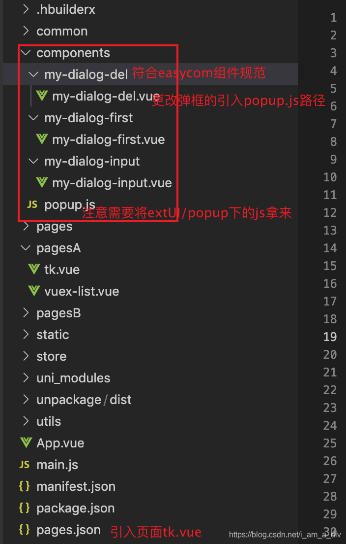
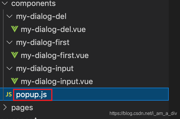
注意:只是封装了三个弹框 可以直接复制这三个子组件进行使用,需要更改popup.js的引入路径
1.弹框页面 tk.vue:
<template>
  <view>
    官方uni-app的弹框popup模板问题:
    <br />官方的弹框示例页面在 /pages/extUI/popup/popup

    1.官方是没有在引入的组件上写@close关闭弹窗方法的 需要自己加<br />

    2.官方是点击确认时候 立即就关闭弹框了 但是loading还在
    <br />原因是子组件小程序 立即就触发关闭事件了
    改成在父级的loading消失后关闭即可 <br />

    3.官方的popup弹框 自动打开后<br />
    关闭不了 只需要将38行代码 before-close属性值改成 false 即可<br />

    4.弹框子组件 不是页面 故没有自己的 onLoad 和 onShow 方法,
    <br />同时ta自己的 created 方法在已进入到父级页面时候就已经触发了
    <br />(问题是可能有需求是,点击弹框后,拿父级参数掉接口获取数据展示)
    <br />(如果写在子组件弹框的created 没父级参数 且一进入父级页面就掉接口了)
    <br />(那么就需要找到一个点击打开弹框时候,必须调用的方法,在里面掉接口)
    <br />详细见第三个按钮 每次点击打开时候触发first掉接口 <br />

    5.如果是tabBar
    A页面 弹框打开后 未关闭 就点击另一个tabBar B页面 <br />然后再切换A页面
    你会发现弹框还是打开的 所以需要我们在A页面 <br />hide隐藏时候判断
    如果存在未关闭的弹框 就调用取消按钮 关闭掉<br />

    6.官方的popup弹框 点击确定时候 虽然有loading<br />
    但是此时仍然可以点击取消按钮 或者点击弹框下的页面内容<br />
    解决思路:点击确认时候添加uni-popup遮罩层<br />

    <button class="button" type="primary" @click="confirmDialog">
      <text class="button-text">输入对话框</text>
    </button>
    <uni-popup id="dialogInput" ref="dialogInput" type="dialog" @change="change">
      <!-- 官方是没有在引入的组件上写@close关闭弹窗方法的  需要自己加 -->
      <my-dialog-input mode="input" title="输入内容" value="对话框预置提示内容!" placeholder="请输入内容" @close="nodialoginput" @confirm="dialogInputConfirm"></my-dialog-input>
    </uni-popup>

    <button class="button" type="primary" @click="openDel">
      <text class="button-text">删除对话框</text>
    </button>
    <uni-popup id="mydialogdel" ref="mydialogdel" type="dialog" @change="change">
      <my-dialog-del mode="input" title="输入内容" value="对话框预置提示内容!" placeholder="请输入内容" @close="nodialogdel" @confirm="yesdialogdel"></my-dialog-del>
    </uni-popup>

    <button class="button" type="primary" @click="openFirst">
      <text class="button-text">每次点击打开时候触发first掉接口</text>
    </button>
    <uni-popup id="mydialogfirst" ref="mydialogfirst" type="dialog" @change="change">
      <!-- 需要给子组件设置ref 才能获取到子组件的方法 才能触发 first -->
      <my-dialog-first ref="myselffirst" mode="input" title="输入内容" value="对话框预置提示内容!" placeholder="请输入内容" @close="nodialogfirst" @confirm="yesdialogfirst"></my-dialog-first>
    </uni-popup>

    <button type="primary" @click="openzhezhaoceng">解决loading...时候仍可点击问题</button>
    <uni-popup id="mydialogdel2" ref="mydialogdel2" type="dialog" @change="change">
      <my-dialog-del mode="input" title="输入内容" value="对话框预置提示内容!" placeholder="请输入内容" @close="nodialogdel2" @confirm="yesdialogdel2"></my-dialog-del>
    </uni-popup>
    <!-- 多加一个遮罩层 并且使遮罩层全屏 -->
    <uni-popup id="zhezhaoceng" ref="zhezhaoceng" type="dialog" @change="change">
      <view class="all-box">
      </view>
    </uni-popup>

    <uni-link href="https://uniapp.dcloud.io/component/?id=easycom%e7%bb%84%e4%bb%b6%e8%a7%84%e8%8c%83" text="点击查看 具体解决 打开弹框触发first方法"></uni-link>
  </view>
</template>

<script>
// 子组件符合easycom组件规范 故不需引入 直接使用即可 easycom组件规范:https://uniapp.dcloud.io/component/?id=easycom%e7%bb%84%e4%bb%b6%e8%a7%84%e8%8c%83
export default {
  data () {
    return {
      delId: null,
      a: ""
    }
  },
  onHide () {
    // 隐藏时候判断 如果存在未关闭的弹框 就调用取消按钮 关闭掉
    if (this.$refs['dialogInput']) {
      this.$refs['dialogInput'].close()
    }
    if (this.$refs['mydialogdel']) {
      this.nodialogdel()
    }
    if (this.$refs['mydialogfirst']) {
      this.nodialogfirst()
    }
  },
  methods: {
    // 以下三个方法是按钮一:提交信息弹框
    confirmDialog () {
      this.$refs.dialogInput.open()
    },
    //  输入对话框的确定事件
    dialogInputConfirm (done) {
      uni.showLoading({
        title: '3秒后会关闭',
      })
      console.log(done)
      setTimeout(() => {
        this.$refs.dialogInput.close()
        uni.hideLoading()
        // 关闭窗口后,恢复默认内容
      }, 3000)
    },
    nodialoginput () {
      // 调用子级的弹框关闭窗口方法后,恢复默认内容
      this.$refs.dialogInput.close()
    },

    // 以下三个方法是按钮二:删除弹框封装
    openDel () {
      this.$refs.mydialogdel.open()
    },
    yesdialogdel (done) {
      uni.showLoading({
        title: '3秒后会关闭',
      })
      console.log('点击确认传递的参数', done)
      setTimeout(() => {
        //   调用删除的接口
        this.delId = done.id
        uni.hideLoading()
        // 调用子级的弹框关闭窗口方法后,恢复默认内容
        this.$refs.mydialogdel.close()
        this.delId = null
      }, 3000)
    },
    nodialogdel () {
      // 调用子级的弹框关闭窗口方法后,恢复默认内容
      this.$refs.mydialogdel.close()
      this.delId = null
    },

    // 以下三个方法是按钮三:触发打开弹框的初始化
    openFirst () {
      console.log('点击了父级的打开按钮')
      this.$refs.mydialogfirst.open()

      this.$refs.myselffirst.first()
    },
    yesdialogfirst (done) {
      uni.showLoading({
        title: '3秒后会关闭',
      })
      console.log('点击确认传递的参数', done)
      setTimeout(() => {
        //   调用删除的接口
        this.delId = done.id
        uni.hideLoading()
        // 调用子级的弹框关闭窗口方法后,恢复默认内容
        this.$refs.mydialogfirst.close()
        this.delId = null
      }, 3000)
    },
    nodialogfirst () {
      // 调用子级的弹框关闭窗口方法后,恢复默认内容
      this.$refs.mydialogfirst.close()
      this.delId = null
    },

    // 以下三个方法是按钮四:添加遮罩层处理
    openzhezhaoceng () {
      this.$refs.mydialogdel2.open()
    },
    yesdialogdel2 (done) {
      // 再点击确认的时候 打开遮罩层
      this.$refs.zhezhaoceng.open()

      uni.showLoading({
        title: '3秒后会关闭',
      })
      setTimeout(() => {
        //   调用删除的接口
        this.delId = done.id
        uni.hideLoading()
        //loading消失 就去掉遮罩层
        this.$refs.zhezhaoceng.close()

        // 调用子级的弹框关闭窗口方法后,恢复默认内容
        this.$refs.mydialogdel2.close()
        this.delId = null
      }, 3000)
    },
    nodialogdel2 () {
      // 调用子级的弹框关闭窗口方法后,恢复默认内容
      this.$refs.mydialogdel2.close()
      this.delId = null
    },

    /**
     * popup 状态发生变化触发
     * @param {Object} e
     */
    change (e) {
      console.log('popup ' + e.type + ' 状态', e.show)
    },
  },
}
</script>

<style lang="less" scoped>
button {
  margin-top: 20rpx;
}

.all-box {
  width: -webkit-calc(~"100vw") !important;
  width: -moz-calc(~"100vw") !important;
  width: calc(~"100vw") !important;
  height: -webkit-calc(~"100vh") !important;
  height: -moz-calc(~"100vh") !important;
  height: calc(~"100vh") !important;
}
</style>
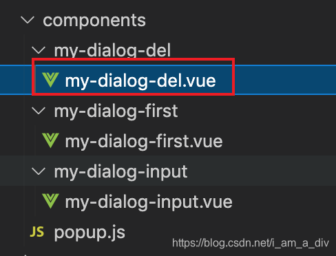
2.子组件删除弹框
<template>
  <view class="uni-popup-dialog">
    <view class="del-content">您确定删除该条数据吗?</view>
    <view class="uni-dialog-button-group">
      <view class="uni-dialog-button" @click="closeDialog">
        <text class="uni-dialog-button-text">取消</text>
      </view>
      <view class="uni-dialog-button uni-border-left" @click="onOk">
        <text class="uni-dialog-button-text uni-button-color">确定</text>
      </view>
    </view>

  </view>
</template>

<script>
import popup from '../popup.js'
/**
 * PopUp 弹出层-对话框样式
 * @description 弹出层-对话框样式
 * @tutorial https://ext.dcloud.net.cn/plugin?id=329
 * @property {String} value input 模式下的默认值
 * @property {String} placeholder input 模式下输入提示
 * @property {String} type = [success|warning|info|error] 主题样式
 *  @value success 成功
 * 	@value warning 提示
 * 	@value info 消息
 * 	@value error 错误
 * @property {String} mode = [base|input] 模式、
 * 	@value base 基础对话框
 * 	@value input 可输入对话框
 * @property {String} content 对话框内容
 * @property {Boolean} beforeClose 是否拦截取消事件
 * @event {Function} confirm 点击确认按钮触发
 * @event {Function} close 点击取消按钮触发
 */

export default {
  name: "uniPopupDialog",
  mixins: [popup],
  props: {
    value: {
      type: [String, Number],
      default: ''
    },
    placeholder: {
      type: [String, Number],
      default: '请输入内容'
    },
    type: {
      type: String,
      default: 'error'
    },
    mode: {
      type: String,
      default: 'base'
    },
    title: {
      type: String,
      default: '提示'
    },
    content: {
      type: String,
      default: ''
    },
    beforeClose: {
      type: Boolean,
      default: false
    }
  },
  data() {
    return {
      dialogType: 'error',
      focus: false,
      val: ""
    }
  },
  watch: {
    type(val) {
      this.dialogType = val
    },
    mode(val) {
      if (val === 'input') {
        this.dialogType = 'info'
      }
    },
    value(val) {
      this.val = val
    }
  },
  created() {
    // 对话框遮罩不可点击
    this.popup.disableMask()
    // this.popup.closeMask()
    if (this.mode === 'input') {
      this.dialogType = 'info'
      this.val = this.value
    } else {
      this.dialogType = this.type
    }
  },
  mounted() {
    this.focus = true
  },
  methods: {
    /**
     * 点击确认按钮
     */
    onOk() {
      if (this.mode === 'input') {
        // this.$emit('confirm', this.val)
        // 点击确定传递的值
        console.log(1111);
        this.$emit('confirm', { id: 11 })
      } else {
        this.$emit('confirm')
      }
      // 这个是真正的关闭弹框操作 --- 原生是打开的 我们需要手动注释掉
      // if (this.beforeClose) return
      // this.popup.close()
    },
    /**
     * 点击取消按钮
     */
    closeDialog() {
      this.$emit('close')
      // 这个是真正的关闭弹框操作 --- 原生是打开的 我们需要手动注释掉
      // if (this.beforeClose) return
      // this.popup.close()
    },
    // 这个是原生调用真证的关闭的方法  -------我们在父级里来调用------已完成确认和取消时候关闭弹框
    close() {
      this.popup.close()
    }
  }
}
</script>

<style lang="scss" scoped>
.uni-popup-dialog {
  width: 300px;
  border-radius: 15px;
  background-color: #fff;
}

.uni-dialog-title {
  /* #ifndef APP-NVUE */
  display: flex;
  /* #endif */
  flex-direction: row;
  justify-content: center;
  padding-top: 15px;
  padding-bottom: 5px;
}

.uni-dialog-title-text {
  font-size: 16px;
  font-weight: 500;
}

.uni-dialog-content {
  /* #ifndef APP-NVUE */
  display: flex;
  /* #endif */
  flex-direction: row;
  justify-content: center;
  align-items: center;
  padding: 5px 15px 15px 15px;
}

.uni-dialog-content-text {
  font-size: 14px;
  color: #6e6e6e;
}

.uni-dialog-button-group {
  /* #ifndef APP-NVUE */
  display: flex;
  /* #endif */
  flex-direction: row;
  border-top-color: #f5f5f5;
  border-top-style: solid;
  border-top-width: 1px;
}

.uni-dialog-button {
  /* #ifndef APP-NVUE */
  display: flex;
  /* #endif */

  flex: 1;
  flex-direction: row;
  justify-content: center;
  align-items: center;
  height: 45px;
}

.uni-border-left {
  border-left-color: #f0f0f0;
  border-left-style: solid;
  border-left-width: 1px;
}

.uni-dialog-button-text {
  font-size: 14px;
}

.uni-button-color {
  color: #007aff;
}

.uni-dialog-input {
  flex: 1;
  font-size: 14px;
  border: 1px #eee solid;
  height: 40px;
  padding: 0 10px;
  border-radius: 5px;
  color: #555;
}

.uni-popup__success {
  color: #4cd964;
}

.uni-popup__warn {
  color: #f0ad4e;
}

.uni-popup__error {
  color: #dd524d;
}

.uni-popup__info {
  color: #909399;
}
</style>

<style lang="less" scoped>
.del-content {
  padding: 50rpx;
  text-align: center;
}
</style>
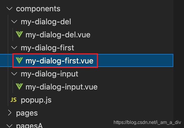
3.子组件触发first弹框: 参考另一篇触发时机
<template>
  <view class="uni-popup-dialog">
    <view class="del-content">在first()方法内做初始化或者掉接口获取数据展示</view>
    <view class="uni-dialog-button-group">
      <view class="uni-dialog-button" @click="closeDialog">
        <text class="uni-dialog-button-text">取消</text>
      </view>
      <view class="uni-dialog-button uni-border-left" @click="onOk">
        <text class="uni-dialog-button-text uni-button-color">确定</text>
      </view>
    </view>

  </view>
</template>

<script>
import popup from '../popup.js'
/**
 * PopUp 弹出层-对话框样式
 * @description 弹出层-对话框样式
 * @tutorial https://ext.dcloud.net.cn/plugin?id=329
 * @property {String} value input 模式下的默认值
 * @property {String} placeholder input 模式下输入提示
 * @property {String} type = [success|warning|info|error] 主题样式
 *  @value success 成功
 * 	@value warning 提示
 * 	@value info 消息
 * 	@value error 错误
 * @property {String} mode = [base|input] 模式、
 * 	@value base 基础对话框
 * 	@value input 可输入对话框
 * @property {String} content 对话框内容
 * @property {Boolean} beforeClose 是否拦截取消事件
 * @event {Function} confirm 点击确认按钮触发
 * @event {Function} close 点击取消按钮触发
 */

export default {
  name: "uniPopupDialog",
  mixins: [popup],
  props: {
    value: {
      type: [String, Number],
      default: ''
    },
    placeholder: {
      type: [String, Number],
      default: '请输入内容'
    },
    type: {
      type: String,
      default: 'error'
    },
    mode: {
      type: String,
      default: 'base'
    },
    title: {
      type: String,
      default: '提示'
    },
    content: {
      type: String,
      default: ''
    },
    beforeClose: {
      type: Boolean,
      default: false
    }
  },
  data() {
    return {
      dialogType: 'error',
      focus: false,
      val: ""
    }
  },
  watch: {
    type(val) {
      this.dialogType = val
    },
    mode(val) {
      if (val === 'input') {
        this.dialogType = 'info'
      }
    },
    value(val) {
      this.val = val
    }
  },
  onLoad(options) {
    console.log('子组件弹框的 onLoad');
  },
  onShow() {
    console.log('子组件弹框的 onShow');
  },
  created() {
    console.log('子组件弹框的 created');
    // 对话框遮罩不可点击
    this.popup.disableMask()
    // this.popup.closeMask()
    if (this.mode === 'input') {
      this.dialogType = 'info'
      this.val = this.value
    } else {
      this.dialogType = this.type
    }
  },
  mounted() {
    this.focus = true
  },
  methods: {
    // 这个方法只有每次点击打开弹框时候才会触发---相当于自己的一个created---在这个方法内做初始化
    first() {
      uni.showToast({
        title: '打开就触发first',
        icon: 'success',
        mask: true
      })
    },
    /**
     * 点击确认按钮
     */
    onOk() {
      if (this.mode === 'input') {
        // this.$emit('confirm', this.val)
        // 点击确定传递的值
        console.log(1111);
        this.$emit('confirm', { id: 11 })
      } else {
        this.$emit('confirm')
      }
      // 这个是真正的关闭弹框操作 --- 原生是打开的 我们需要手动注释掉
      // if (this.beforeClose) return
      // this.popup.close()
    },
    /**
     * 点击取消按钮
     */
    closeDialog() {
      this.$emit('close')
      // 这个是真正的关闭弹框操作 --- 原生是打开的 我们需要手动注释掉
      // if (this.beforeClose) return
      // this.popup.close()
    },
    // 这个是原生调用真证的关闭的方法  -------我们在父级里来调用------已完成确认和取消时候关闭弹框
    close() {
      this.popup.close()
    }
  }
}
</script>

<style lang="scss" scoped>
.uni-popup-dialog {
  width: 300px;
  border-radius: 15px;
  background-color: #fff;
}

.uni-dialog-title {
  /* #ifndef APP-NVUE */
  display: flex;
  /* #endif */
  flex-direction: row;
  justify-content: center;
  padding-top: 15px;
  padding-bottom: 5px;
}

.uni-dialog-title-text {
  font-size: 16px;
  font-weight: 500;
}

.uni-dialog-content {
  /* #ifndef APP-NVUE */
  display: flex;
  /* #endif */
  flex-direction: row;
  justify-content: center;
  align-items: center;
  padding: 5px 15px 15px 15px;
}

.uni-dialog-content-text {
  font-size: 14px;
  color: #6e6e6e;
}

.uni-dialog-button-group {
  /* #ifndef APP-NVUE */
  display: flex;
  /* #endif */
  flex-direction: row;
  border-top-color: #f5f5f5;
  border-top-style: solid;
  border-top-width: 1px;
}

.uni-dialog-button {
  /* #ifndef APP-NVUE */
  display: flex;
  /* #endif */

  flex: 1;
  flex-direction: row;
  justify-content: center;
  align-items: center;
  height: 45px;
}

.uni-border-left {
  border-left-color: #f0f0f0;
  border-left-style: solid;
  border-left-width: 1px;
}

.uni-dialog-button-text {
  font-size: 14px;
}

.uni-button-color {
  color: #007aff;
}

.uni-dialog-input {
  flex: 1;
  font-size: 14px;
  border: 1px #eee solid;
  height: 40px;
  padding: 0 10px;
  border-radius: 5px;
  color: #555;
}

.uni-popup__success {
  color: #4cd964;
}

.uni-popup__warn {
  color: #f0ad4e;
}

.uni-popup__error {
  color: #dd524d;
}

.uni-popup__info {
  color: #909399;
}
</style>

<style lang="less" scoped>
.del-content {
  padding: 50rpx;
  text-align: center;
}
</style>
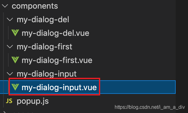
4.子组件提交信息弹框:
<template>
  <view class="uni-popup-dialog">
    <view class="uni-dialog-title">
      <text class="uni-dialog-title-text" :class="['uni-popup__'+dialogType]">{{title}}</text>
    </view>
    <view v-if="mode === 'base'" class="uni-dialog-content">
      <slot>
        <text class="uni-dialog-content-text">{{content}}</text>
      </slot>
    </view>
    <view v-else class="uni-dialog-content">
      <slot>
        <input class="uni-dialog-input" v-model="val" type="text" :placeholder="placeholder">
      </slot>
    </view>
    <!-- 自己添加的 -->
    <view class="li">
      <view class="left-box">用户名:</view>
      <input class="uni-dialog-input right-box" v-model="username" type="text" :placeholder="placeholder">
    </view>
    <view class="li">
      <view class="left-box">手机号:</view>
      <input class="uni-dialog-input right-box" v-model="usertel" type="text" :placeholder="placeholder">
    </view>
    <view class="uni-dialog-button-group">
      <view class="uni-dialog-button" @click="closeDialog">
        <text class="uni-dialog-button-text">取消</text>
      </view>
      <view class="uni-dialog-button uni-border-left" @click="onOk">
        <text class="uni-dialog-button-text uni-button-color">确定</text>
      </view>
    </view>

  </view>
</template>

<script>
import popup from '../popup.js'
/**
 * PopUp 弹出层-对话框样式
 * @description 弹出层-对话框样式
 * @tutorial https://ext.dcloud.net.cn/plugin?id=329
 * @property {String} value input 模式下的默认值
 * @property {String} placeholder input 模式下输入提示
 * @property {String} type = [success|warning|info|error] 主题样式
 *  @value success 成功
 * 	@value warning 提示
 * 	@value info 消息
 * 	@value error 错误
 * @property {String} mode = [base|input] 模式、
 * 	@value base 基础对话框
 * 	@value input 可输入对话框
 * @property {String} content 对话框内容
 * @property {Boolean} beforeClose 是否拦截取消事件
 * @event {Function} confirm 点击确认按钮触发
 * @event {Function} close 点击取消按钮触发
 */

export default {
  name: "uniPopupDialog",
  mixins: [popup],
  props: {
    value: {
      type: [String, Number],
      default: ''
    },
    placeholder: {
      type: [String, Number],
      default: '请输入内容'
    },
    type: {
      type: String,
      default: 'error'
    },
    mode: {
      type: String,
      default: 'base'
    },
    title: {
      type: String,
      default: '提示'
    },
    content: {
      type: String,
      default: ''
    },
    beforeClose: {
      type: Boolean,
      default: false
    },

  },
  data() {
    return {
      dialogType: 'error',
      focus: false,
      val: "",

      username: '',
      usertel: '',
    }
  },
  watch: {
    type(val) {
      this.dialogType = val
    },
    mode(val) {
      if (val === 'input') {
        this.dialogType = 'info'
      }
    },
    value(val) {
      this.val = val
    }
  },
  created() {
    // 对话框遮罩不可点击
    this.popup.disableMask()
    // this.popup.closeMask()
    if (this.mode === 'input') {
      this.dialogType = 'info'
      this.val = this.value
    } else {
      this.dialogType = this.type
    }
  },
  mounted() {
    this.focus = true
  },
  methods: {
    /**
     * 点击确认按钮
     */
    onOk() {
      if (this.mode === 'input') {
        this.$emit('confirm', { val: this.val, username: this.username, usertel: this.usertel })
      } else {
        this.$emit('confirm')
      }
      // 这个是真正的关闭弹框操作 --- 原生是打开的 我们需要手动注释掉
      // if (this.beforeClose) return
      // this.popup.close()
    },
    /**
     * 点击取消按钮
     */
    closeDialog() {
      this.$emit('close')
      // 这个是真正的关闭弹框操作 --- 原生是打开的 我们需要手动注释掉
      // if (this.beforeClose) return
      // this.popup.close()
    },
    close() {
      this.popup.close()
    }
  }
}
</script>

<style lang="scss" scoped>
.uni-popup-dialog {
  width: 300px;
  border-radius: 15px;
  background-color: #fff;
}

.uni-dialog-title {
  /* #ifndef APP-NVUE */
  display: flex;
  /* #endif */
  flex-direction: row;
  justify-content: center;
  padding-top: 15px;
  padding-bottom: 5px;
}

.uni-dialog-title-text {
  font-size: 16px;
  font-weight: 500;
}

.uni-dialog-content {
  /* #ifndef APP-NVUE */
  display: flex;
  /* #endif */
  flex-direction: row;
  justify-content: center;
  align-items: center;
  padding: 5px 15px 15px 15px;
}

.uni-dialog-content-text {
  font-size: 14px;
  color: #6e6e6e;
}

.uni-dialog-button-group {
  /* #ifndef APP-NVUE */
  display: flex;
  /* #endif */
  flex-direction: row;
  border-top-color: #f5f5f5;
  border-top-style: solid;
  border-top-width: 1px;
}

.uni-dialog-button {
  /* #ifndef APP-NVUE */
  display: flex;
  /* #endif */

  flex: 1;
  flex-direction: row;
  justify-content: center;
  align-items: center;
  height: 45px;
}

.uni-border-left {
  border-left-color: #f0f0f0;
  border-left-style: solid;
  border-left-width: 1px;
}

.uni-dialog-button-text {
  font-size: 14px;
}

.uni-button-color {
  color: #007aff;
}

.uni-dialog-input {
  flex: 1;
  font-size: 14px;
  border: 1px #eee solid;
  height: 40px;
  padding: 0 10px;
  border-radius: 5px;
  color: #555;
}

.uni-popup__success {
  color: #4cd964;
}

.uni-popup__warn {
  color: #f0ad4e;
}

.uni-popup__error {
  color: #dd524d;
}

.uni-popup__info {
  color: #909399;
}
</style>
<style lang="less" scoped>
.li {
  overflow: hidden;
  display: flex;
  padding: 5px 15px 15px 15px;
  height: 120rpx;
  line-height: 120rpx;
  .left-box {
    width: 120rpx;
    font-size: 28rpx;
  }
  .right-box {
    flex: 1;
  }
}
</style>
5.弹框必须引入的popup.js
export default {
	data() {
		return {

		}
	},
	created(){
		this.popup = this.getParent()
	},
	methods:{
		/**
		 * 获取父元素实例
		 */
		getParent(name = 'uniPopup') {
			let parent = this.$parent;
			let parentName = parent.$options.name;
			while (parentName !== name) {
				parent = parent.$parent;
				if (!parent) return false
				parentName = parent.$options.name;
			}
			return parent;
		},
	}
}
以上代码可以直接复制使用,但是前提是uni-app的项目,且组件的引入要正确!

为开发者提供学习成长、分享交流、生态实践、资源工具等服务,帮助开发者快速成长。
更多推荐


 0
0 0
0- 0


 已为社区贡献30条内容

所有评论(0)