Vue2对话框(Dialog)
整体样式模仿ant-design-vue Modal样式,同时阴影覆盖浏览器窗口
·
可自定义设置以下属性:
- 标题(title),string | slot
- 内容(content),string | slot
- 宽度(width),默认640px
- 高度(height),默认480px
- 是否允许切换全屏,允许后右上角会出现一个按钮(switchFullscreen),默认false
- 取消按钮文字(cancelText),默认‘取消’
- 确认按钮文字(okText),默认‘确定’
- 是否显示底部按钮(footer),默认true
- 对话框水平居中还是固定高度水平居中(center),默认true
- 固定高度水平居中时,距顶部高度(top),默认 100px
- 加载中(loading),默认false
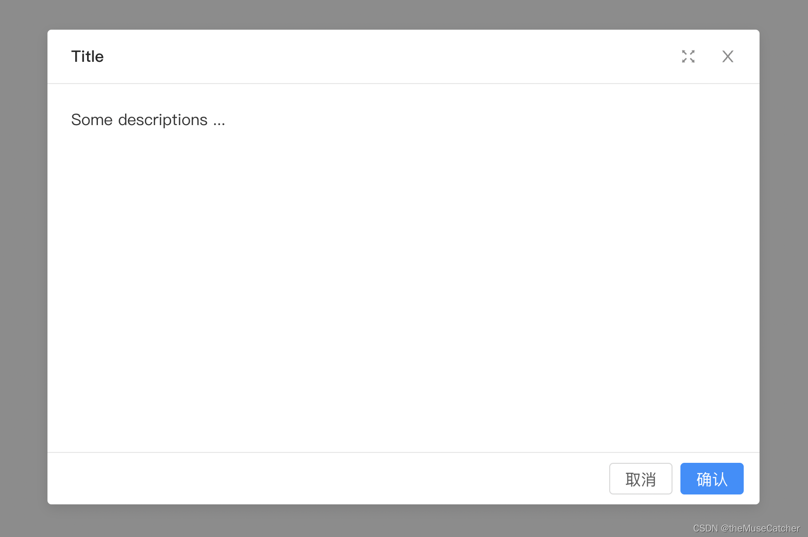
效果如下图所示:(整体样式模仿ant-design-vue Modal,同时阴影覆盖浏览器窗口)

①创建组件Dialog.vue:
<template>
  <transition>
    <div class="m-dialog-mask" v-show="visible" @click.self="onBlur">
      <div :class="['m-dialog', center ? 'relative-hv-center' : 'top-center']" :style="`width: ${dialogWidth}; height: ${dialogHeight}; top: ${!center ? top + 'px':'50%'}`">
        <div class="m-dialog-content" :class="{loading: loading}">
          <div class="m-spin-dot" v-show="loading">
            <span class="u-dot-item"></span>
            <span class="u-dot-item"></span>
            <span class="u-dot-item"></span>
            <span class="u-dot-item"></span>
          </div>
          <svg @click="onFullScreen" v-show="!fullScreen&&switchFullscreen" class="u-screen" viewBox="64 64 896 896" data-icon="fullscreen" aria-hidden="true" focusable="false"><path d="M290 236.4l43.9-43.9a8.01 8.01 0 0 0-4.7-13.6L169 160c-5.1-.6-9.5 3.7-8.9 8.9L179 329.1c.8 6.6 8.9 9.4 13.6 4.7l43.7-43.7L370 423.7c3.1 3.1 8.2 3.1 11.3 0l42.4-42.3c3.1-3.1 3.1-8.2 0-11.3L290 236.4zm352.7 187.3c3.1 3.1 8.2 3.1 11.3 0l133.7-133.6 43.7 43.7a8.01 8.01 0 0 0 13.6-4.7L863.9 169c.6-5.1-3.7-9.5-8.9-8.9L694.8 179c-6.6.8-9.4 8.9-4.7 13.6l43.9 43.9L600.3 370a8.03 8.03 0 0 0 0 11.3l42.4 42.4zM845 694.9c-.8-6.6-8.9-9.4-13.6-4.7l-43.7 43.7L654 600.3a8.03 8.03 0 0 0-11.3 0l-42.4 42.3a8.03 8.03 0 0 0 0 11.3L734 787.6l-43.9 43.9a8.01 8.01 0 0 0 4.7 13.6L855 864c5.1.6 9.5-3.7 8.9-8.9L845 694.9zm-463.7-94.6a8.03 8.03 0 0 0-11.3 0L236.3 733.9l-43.7-43.7a8.01 8.01 0 0 0-13.6 4.7L160.1 855c-.6 5.1 3.7 9.5 8.9 8.9L329.2 845c6.6-.8 9.4-8.9 4.7-13.6L290 787.6 423.7 654c3.1-3.1 3.1-8.2 0-11.3l-42.4-42.4z"></path></svg>
          <svg @click="onFullScreen" v-show="fullScreen&&switchFullscreen" class="u-screen" viewBox="64 64 896 896" data-icon="fullscreen-exit" aria-hidden="true" focusable="false"><path d="M391 240.9c-.8-6.6-8.9-9.4-13.6-4.7l-43.7 43.7L200 146.3a8.03 8.03 0 0 0-11.3 0l-42.4 42.3a8.03 8.03 0 0 0 0 11.3L280 333.6l-43.9 43.9a8.01 8.01 0 0 0 4.7 13.6L401 410c5.1.6 9.5-3.7 8.9-8.9L391 240.9zm10.1 373.2L240.8 633c-6.6.8-9.4 8.9-4.7 13.6l43.9 43.9L146.3 824a8.03 8.03 0 0 0 0 11.3l42.4 42.3c3.1 3.1 8.2 3.1 11.3 0L333.7 744l43.7 43.7A8.01 8.01 0 0 0 391 783l18.9-160.1c.6-5.1-3.7-9.4-8.8-8.8zm221.8-204.2L783.2 391c6.6-.8 9.4-8.9 4.7-13.6L744 333.6 877.7 200c3.1-3.1 3.1-8.2 0-11.3l-42.4-42.3a8.03 8.03 0 0 0-11.3 0L690.3 279.9l-43.7-43.7a8.01 8.01 0 0 0-13.6 4.7L614.1 401c-.6 5.2 3.7 9.5 8.8 8.9zM744 690.4l43.9-43.9a8.01 8.01 0 0 0-4.7-13.6L623 614c-5.1-.6-9.5 3.7-8.9 8.9L633 783.1c.8 6.6 8.9 9.4 13.6 4.7l43.7-43.7L824 877.7c3.1 3.1 8.2 3.1 11.3 0l42.4-42.3c3.1-3.1 3.1-8.2 0-11.3L744 690.4z"></path></svg>
          <svg @click="onClose" class="u-close" viewBox="64 64 896 896" data-icon="close" aria-hidden="true" focusable="false"><path d="M563.8 512l262.5-312.9c4.4-5.2.7-13.1-6.1-13.1h-79.8c-4.7 0-9.2 2.1-12.3 5.7L511.6 449.8 295.1 191.7c-3-3.6-7.5-5.7-12.3-5.7H203c-6.8 0-10.5 7.9-6.1 13.1L459.4 512 196.9 824.9A7.95 7.95 0 0 0 203 838h79.8c4.7 0 9.2-2.1 12.3-5.7l216.5-258.1 216.5 258.1c3 3.6 7.5 5.7 12.3 5.7h79.8c6.8 0 10.5-7.9 6.1-13.1L563.8 512z"></path></svg>
          <div class="m-dialog-header">
            <slot name="title">
              <div class="u-head">{{ title }}</div>
            </slot>
          </div>
          <div class="m-dialog-body" :style="`height: calc(${dialogHeight} - ${footer ? '158px':'103px'});`">
            <slot>{{ content }}</slot>
          </div>
          <div class="m-dialog-footer" v-show="footer">
            <button class="u-cancel" @click="onCancel">{{ cancelText }}</button>
            <button class="u-confirm" @click="onConfirm">{{ okText }}</button>
          </div>
        </div>
      </div>
    </div>
  </transition>
</template>
<script>
export default {
  name: 'Dialog',
  props: {
    title: { // 标题 string | slot
      type: String,
      default: '提示'
    },
    content: { // 内容 string | slot
      type: String,
      default: ''
    },
    width: { // 宽度,默认640
      type: Number,
      default: 640
    },
    height: { // 高度,默认480
      type: Number,
      default: 480
    },
    switchFullscreen: { // 是否允许切换全屏,允许后右上角会出现一个按钮
      type: Boolean,
      default: false
    },
    cancelText: { // 取消按钮文字
      type: String,
      default: '取消'
    },
    okText: { // 确认按钮文字
      type: String,
      default: '确定'
    },
    footer: { // 是否显示底部按钮,默认显示
      type: Boolean,
      default: true
    },
    center: { // 水平垂直居中:true  固定高度水平居中:false
      type: Boolean,
      default: true
    },
    top: { // 固定高度水平居中时,距顶部高度
      type: Number,
      default: 100
    },
    loading: { // 加载中
      type: Boolean,
      default: false
    },
    visible: { // 对话框是否可见
      type: Boolean,
      default: false
    }
  },
  data () {
    return {
      fullScreen: false
    }
  },
  computed: {
    dialogWidth () {
      if (this.fullScreen) {
        return '100%'
      } else {
        return this.width + 'px'
      }
    },
    dialogHeight () {
      if (this.fullScreen) {
        return '100vh'
      } else {
        return this.height + 'px'
      }
    }
  },
  watch: {
    visible (to) {
      if (!to) { // 重置全屏显示
        this.fullScreen = false
      }
    }
  },
  methods: {
    onBlur () {
      if (this.loading) {
        this.$emit('close')
      }
    },
    onFullScreen () {
      this.fullScreen = !this.fullScreen
    },
    onClose () {
      this.$emit('close')
    },
    onCancel () {
      this.$emit('cancel')
    },
    onConfirm () {
      this.$emit('ok')
    }
  }
}
</script>
<style lang="less" scoped>
@themeColor: #1890FF;
.v-enter-active, .v-leave-active {
  transition: opacity 0.3s ease;
}
.v-enter, .v-leave-to {
  opacity: 0;
}
.flex-hv-center { // 水平垂直居中方法①:弹性布局,随内容增大高度,并自适应水平垂直居中
  display: flex;
  justify-content: center;
  align-items: center;
}
.relative-hv-center { // 水平垂直居中方法②:相对定位,随内容增大高度,并自适应水平垂直居中
  position: relative;
  top: 50%;
  transform: translateY(-50%);
  -ms-transform: translateY(-50%);; /* IE 9 */
  -webkit-transform: translateY(-50%); /* Safari and Chrome */
}
.top-center { // 相对定位,固定高度,始终距离视图顶端100px
  position: relative;
  // top: 100px;
}
.m-dialog-mask {
  position: fixed;
  top: 0;
  right: 0;
  bottom: 0;
  left: 0;
  width: 100%;
  height: 100%;
  z-index: 10000;
  background: rgba(0,0,0,0.45);
  .m-dialog {
    margin: 0 auto;
    transition: all .3s ease;
    .m-spin-dot { // 绝对定位,并设置水平垂直居中
      position: absolute;
      display: inline-block;
      right: 0;
      left: 0;
      top: 0;
      bottom: 0;
      margin: auto;
      width: 24px;
      height: 24px;
      transform: rotate(45deg);
      -ms-transform: rotate(45deg); /* Internet Explorer */
      -moz-transform: rotate(45deg); /* Firefox */
      -webkit-transform: rotate(45deg); /* Safari 和 Chrome */
      -o-transform: rotate(45deg); /* Opera */
      animation: rotate 1.2s linear infinite;
      -webkit-animation: rotate 1.2s linear infinite;
      @keyframes rotate {
        100% {transform: rotate(405deg);}
      }
      .u-dot-item { // 单个圆点样式
        position: absolute;
        width: 8px;
        height: 8px;
        background: @themeColor;
        border-radius: 50%;
        opacity: .3;
        animation: spinMove 1s linear infinite alternate;
        -webkit-animation: spinMove 1s linear infinite alternate;
        @keyframes spinMove {
          100% {opacity: 1;}
        }
      }
      .u-dot-item:first-child {
        top: 0;
        left: 0;
      }
      .u-dot-item:nth-child(2) {
        top: 0;
        right: 0;
        animation-delay: .4s;
        -webkit-animation-delay: .4s;
      }
      .u-dot-item:nth-child(3) {
        bottom: 0;
        right: 0;
        animation-delay: .8s;
        -webkit-animation-delay: .8s;
      }
      .u-dot-item:last-child {
        bottom: 0;
        left: 0;
        animation-delay: 1.2s;
        -webkit-animation-delay: 1.2s;
      }
    }
    .loading { // 加载过程背景虚化
      background: rgb(248, 248, 248) !important;
      pointer-events: none; // 屏蔽鼠标事件
    }
    .m-dialog-content {
      position: relative;
      background: #fff;
      border-radius: 4px;
      box-shadow: 0 4px 12px rgba(0,0,0,.1);
      .u-screen {
        .u-close();
        right: 64px;
      }
      .u-close {
        width: 16px;
        height: 16px;
        position: absolute;
        top: 19px;
        right: 24px;
        fill: rgba(0,0,0,.45);
        cursor: pointer;
        transition: fill .3s;
        &:hover {
          fill: rgba(0,0,0,.75);
        }
      }
      .m-dialog-header {
        height: 22px;
        padding: 16px 24px;
        color: rgba(0,0,0,.65);
        border-radius: 4px 4px 0 0;
        border-bottom: 1px solid #e8e8e8;
        .u-head {
          margin: 0;
          color: rgba(0,0,0,.85);
          font-weight: 500;
          font-size: 16px;
          line-height: 22px;
          word-wrap: break-word;
        }
      }
      .m-dialog-body {
        padding: 24px;
        font-size: 16px;
        line-height: 1.5;
        word-wrap: break-word;
        overflow: auto;
        transition: all .3s;
      }
      .m-dialog-footer {
        padding: 10px 16px;
        text-align: right;
        border-top: 1px solid #e8e8e8;
        .u-cancel {
          height: 32px;
          line-height: 32px;
          padding: 0 15px;
          font-size: 16px;
          border-radius: 4px;
          color: rgba(0,0,0,.65);
          background: #fff;
          border: 1px solid #d9d9d9;
          cursor: pointer;
          transition: all .3s cubic-bezier(.645,.045,.355,1);
          &:hover {
            color: #40a9ff;
            border-color: #40a9ff;
          }
          &:focus {
            color: #096dd9;
            border-color: #096dd9;
          }
        }
        .u-confirm {
          margin-left: 8px;
          height: 32px;
          line-height: 32px;
          padding: 0 15px;
          font-size: 16px;
          border-radius: 4px;
          background: @themeColor;
          border: 1px solid @themeColor;
          color: #fff;
          transition: all .3s cubic-bezier(.645,.045,.355,1);
          cursor: pointer;
          &:hover {
            color: #fff;
            background: #40a9ff;
            border-color: #40a9ff;
          }
          &:focus {
            background: #096dd9;
            border-color: #096dd9;
          }
        }
      }
    }
  }
}
</style>
②使用Dialog组件弹出对话框:
<Dialog
  :title="title"
  :width="720"
  :height="480"
  :content="content"
  :footer="footer"
  cancelText="取消"
  okText="确认"
  switchFullscreen
  @close="onClose"
  @cancel="onCancel"
  @ok="onConfirm"
  :center="center"
  :top="100"
  :loading="loading"
  :visible="visible">
  <template #title>
    <p class="u-title">Title</p>
  </template>
  <p>Bla bla ...</p>
  <p>Bla bla ...</p>
  <p>Bla bla ...</p>
</Dialog>
import Dialog from '@/components/Dialog'
components: {
    Dialog
},
data () {
    return {
        visible: false,
	    content: ''
    }
},
methods: {
    onDialog (content) { // 调用Dialog弹出对话框
      this.content = 'Some descriptions ...'
      this.visible = true
    },
    onClose () { // 关闭dialog
      this.visible = false
    },
    onCancel () { // “取消”按钮回调
      this.visible = false
    },
    onConfirm () { // “确定”按钮回调
      this.visible = false
    }
}
为开发者提供学习成长、分享交流、生态实践、资源工具等服务,帮助开发者快速成长。
更多推荐


 8
8 0
0- 0


 已为社区贡献17条内容

所有评论(0)