echarts实现进度条样式的柱状图
echarts实现进度条样式的柱状图
·
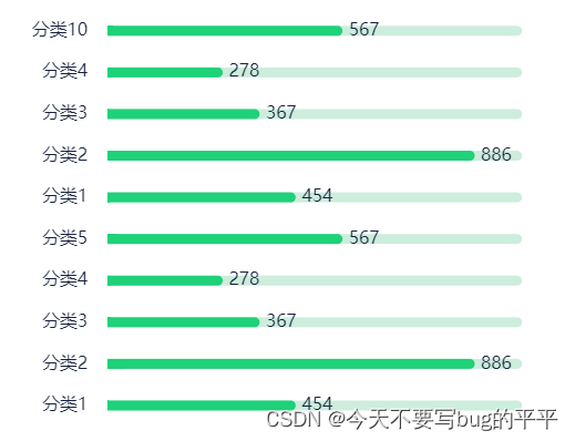
想要实现进度条样式的柱状图,需要对官网的柱状图进行改造配置,官网有开发文档,配置各个属性,大家可以多看看。实现如图效果:
代码如下:
//data中定义:
//    downLoadChartsData: {
//        seriesData: [454, 886, 367, 278, 567, 454, 886, 367, 278, 567],
//        yAxisData: ['分类1', '分类2', '分类3', '分类4', '分类5', '分类1', '分类2', '分类3', '分类4', '分类10'],
//        yDataMax: 1000,
 //       yDataMin: 0
//      }

// 方法体中代码
 let myChart2 = this.$echarts.init(document.getElementById('commentChart'))
      let option2 = {
        textStyle: {
          // fontSize: arr.initHeight,
          color: '#17233D'// 字体颜色
        },
        tooltip: {
          // 悬停指示
          trigger: 'item',
          formatter: '{b}  <b>{c}</b>',
          backgroundColor: '#FFFFFF',
          textStyle: {
            fontSize: 14,
            padding: 20,
            color: '#515A6E'// 字体颜色
          }
          //   formatter: function (params) {
          //      return params[0].name + ': ' + params[0].value+"%";
          //   },
        },
        yAxis: {
          data: this.downLoadChartsData.yAxisData,
          axisTick: { // x轴刻度线
            show: false
          },
          splitLine: { // 网格线
            show: false
          },
          axisLine: { // 坐标轴线
            show: false
          },
          axisLabel: { // 调整文字倾斜角度(rotate=xxx)和颜色
            interval: 0,
            margin: 16,
            textStyle: {
              color: '#17233D',
              fontSize: 14
            }
          }
        },
        xAxis: {
          show: false,
          max: this.downLoadChartsData.yDataMax,
          min: this.downLoadChartsData.yDataMin,
          position: 'right'
        },
        grid: {
          left: 24,
          right: 24,
          bottom: 16,
          top: 24,
          containLabel: true
        },
        series: [{
          name: '收缴率',
          type: 'bar',
          stack: '使用情况',
          data: this.downLoadChartsData.seriesData,
          barWidth: 8, // 柱图宽度
          barGap: 36, // 柱图之间的间距
          // 标签
          label: {
            normal: {
              show: true,
              fontSize: 14,
              position: 'right',
              // offset: [450, 0],
              formatter: '{c}' // 模板变量有 {a}、{b}、{c}、{d},分别表示系列名,数据名,数据值,百分比。{d}数据会根据value值计算百分比
            }
          },
          showBackground: true,
          backgroundStyle: {
            color: '#CDEDDD',
            barBorderRadius: [0, 100, 100, 0]
          },
          itemStyle: {
            normal: {
              color: '#1FD178',
              // 设置柱子圆角
              barBorderRadius: [0, 100, 100, 0]
            }
          },
          markPoint: {
            symbol: 'pin', // 标记类型
            symbolSize: 10, // 图形大小
            itemStyle: {
              normal: {
                borderColor: 'green',
                borderWidth: 1, // 标注边线线宽,单位px,默认为1
                label: {
                  show: true,
                  fontSize: 14
                }
              }
            }
          }
        },
        {
          name: '',
          type: 'bar',
          stack: '使用情况',
          // data: [100, 100, 100, 100, 100],
          itemStyle: {
            barBorderRadius: [0, 100, 100, 0] // 统一设置四个角的圆角大小
          }
        }
        ]
      }
      myChart2.setOption(option2)
希望对你有帮助~

为开发者提供学习成长、分享交流、生态实践、资源工具等服务,帮助开发者快速成长。
更多推荐


 3
3 0
0- 0


 已为社区贡献2条内容

所有评论(0)