CSS元素上下左右居中的几种方式
CSS元素上下左右居中的几种方式
·
CSS元素上下左右居中的几种方式
假设以以下父子元素实现上下左右居中为例:
<div class='father'>
	<div class='son'>
	</div>
</div>

<style>
.father{
	width: 200px;
    height: 200px;
}
.son{
	width: 100px;
    height: 100px;
}
</style>
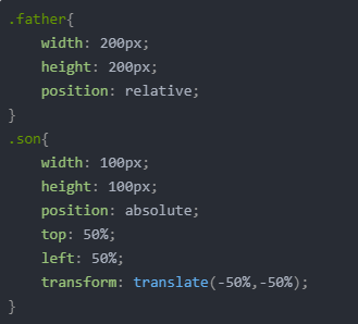
方式一
这个方法比较推荐,就算父元素宽高不确定也能实现垂直水平居中效果,但由于使用了css3的新属性,在低版本ie浏览器下是不兼容的(不会还有人用ie叭,不会叭,不会叭)。
.father{
	width: 200px;
    height: 200px;
    position: relative;
}
.son{
	width: 100px;
    height: 100px;
    position: absolute;
    top: 50%;
    left: 50%;
    transform: translate(-50%,-50%);
}
方式二
与方法一类似,但父元素需要确认宽高,子元素通过绝对定位,top、left分别设为50%,然后通过设置margin-top、margin-left值为宽度的一半(负数),就可以成功实现垂直水平居中了。
.father{
	width: 200px;
    height: 200px;
    position: relative;
}
.son{
	width: 100px;
    height: 100px;
  	position: absolute;
    left: 50%;
    top:50%;
    margin-left: -50px;
    margin-top: -50px;
}
方式三
这个方法,不仅能在内部宽度不确定时发挥作用,还能兼容各种主流浏览器,看上去似乎很完美,但事实上,当我们的需求改为:宽度随内部文字自适应 ,即宽度未设置时,这种方法就无法满足需求了,原因是left、right设为0后,inner在宽度未设置时将占满父元素的宽度。
.father{
	width: 200px;
    height: 200px;
    position: relative;
}
.son{
	width: 100px;
    height: 100px;
  	position: absolute;
    margin: auto;
    left: 0;
    right: 0;
    top: 0;
    bottom: 0;
}
方式四
使用flex布局,这种方法也是比较推荐,代码量相比其他方式更少,但ie兼容差。
.father{
	width: 200px;
    height: 200px;
    display: flex;
    justify-content:center;
    align-items:center;
}
.son{
	width: 100px;
    height: 100px;
}

华为开发者空间,是为全球开发者打造的专属开发空间,汇聚了华为优质开发资源及工具,致力于让每一位开发者拥有一台云主机,基于华为根生态开发、创新。
更多推荐


 3
3 0
0- 0


 已为社区贡献1条内容

所有评论(0)