vue 通用弹框封装(van-popup为vant框架基础组件,el-dialog为element组件)
通用弹框封装
·
注意:
没有安装vant或element会运行不了,需按提示安装vant 或element
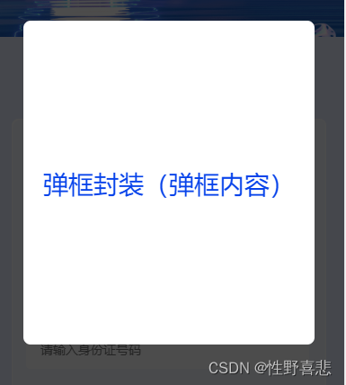
vant-popup效果图(用于手机端):
组件com-select-time.vue(需要安装vant,所有页面可引用此组件)
<template>
  <div class="com-select-time">
    <van-popup class="popup-style" v-model="showSelectTime">
      <div class="select-time-panel">弹框封装(弹框内容)</div>
    </van-popup>
  </div>
</template>

<script>
export default {
  props: {
    value: {
      type: Boolean,
      default: true,
    },
  },
  components: {},
  data() {
    return {};
  },
  computed: {
    // 监测弹框是否显示

    showSelectTime: {
      get() {
        return this.value;
      },
      set(val) {
        this.$emit('input', val);
      },
    },
  },
  watch: {},
  methods: {},
  created() {},
  mounted() {},
  beforeCreate() {},
  beforeMount() {},
  beforeUpdate() {},
  updated() {},
  beforeDestroy() {},
  destroyed() {},
  activated() {},
};
</script>
<style  scoped>
.popup-style {
  background-color: transparent;
}
.select-time-panel {
  width: 324px;
  height: 360px;
  background: #ffffff;
  border-radius: 8px;
  display: flex;
  align-items: center;
  justify-content: center;
  font-size: 28px;
  font-family: PingFangSC-Medium, PingFang SC;
  font-weight: 500;
  color: #0743ea;
}
</style>
页面引用 com-select-time.vue组件
<template>
  <div class="check-in-information com-purple-bg">
//默认显示,点击关闭
<div @click="hiddenDialog"></div>
 //组件
   <com-select-time v-model="showSelectTime"></com-select-time>
  </div>
</template>
<script>
export default {
 components: {

    'com-select-time': () => import('@/pages/fbec-hotel/components/com-select-time.vue'),//引入弹框组件
  },
  data() {
    return {
      showSelectTime:true,//控制弹框显示关闭

    };
  },
methods: {
  hiddenDialog(){
     this.showSelectTime=false
}
}
};
</script>
效果图(用于电脑端):

end-of-evaluation-dialog.vue组件(需要安装element,所有页面可引用此组件)
<template>
  <div class="end-of-evaluation-dialog">
    <el-dialog
      title=""
      :visible.sync="endVisible"
      :showEnd="showEnd"
      @close="$emit('update:showEnd', false)"
      width="18%"
      style="margin-top: 20vh"
    >
      <div class="flex-column-center-center">
        <div class="jtl-dialog-icon">
          <i class="el-icon-warning"></i>
        </div>
        <div class="reminder-text">温馨提示</div>
        <div class="end-of-evaluation">参评报名已结束,可联系主办方参会</div>
      </div>
      <div class="flex-center-center">
        <span slot="footer" class="dialog-footer">
          <el-button type="primary" @click="endVisible = false"
            >我知道了</el-button
          >
        </span>
      </div>
    </el-dialog>
  </div>
</template>

<script>
export default {
  name: "end-of-evaluation-dialog",
  props: {
    showEnd: {
      type: Boolean,
      default: false,
    },
  },
  components: {},
  data() {
    return {
      endVisible: this.showEnd,
    };
  },
  computed: {},
  watch: {
    showEnd() {
      this.endVisible = this.showEnd;
    },
  },
  methods: {},
  created() {},
  mounted() {},
  beforeCreate() {},
  beforeMount() {},
  beforeUpdate() {},
  updated() {},
  beforeDestroy() {},
  destroyed() {},
  activated() {},
};
</script>
<style lang='scss' scoped>
.end-of-evaluation-dialog {
  .el-dialog__headerbtn {
    font-size: 0.3rem !important;
  }
  .jtl-dialog-icon {
    .el-icon-warning {
      color: #0743ea;
      font-size: 0.36rem;
    }
  }

  .reminder-text {
    font-size: 0.2rem;
    font-family: PingFangSC-Medium, PingFang SC;
    font-weight: 500;
    color: rgba(0, 0, 0, 0.85);
    line-height: 0.22rem;
    margin: 0.16rem 0 0.12rem 0;
  }
  .end-of-evaluation {
    font-size: 0.18rem;
    font-family: PingFangSC-Regular, PingFang SC;
    font-weight: 400;
    color: #666666;
    line-height: 0.22rem;
    margin-bottom: 0.37rem;
    white-space: nowrap;
  }
  .el-button--primary {
    background-color: #0743ea;
    border-color: #0743ea;
  }
}
</style>
页面引用 end-of-evaluation-dialog.vue组件:
<template>
  <div class="check-in-information com-purple-bg">
//默认关闭弹框,点击显示
<div @click="showDialog"></div>
 //组件
  <end-of-evaluation-dialog class="pc-el"  :showEnd.sync="showEnd"></end-of-evaluation-dialog>
  </div>
</template>
<script>
export default {
 components: {

    'end-of-evaluation-dialog': () => import('@/components/golden/end-of-evaluation-dialog.vue'),//引入弹框组件
  },
  data() {
    return {
      showEnd:false,//控制弹框显示关闭

    };
  },
methods: {
  showDialog(){
     this.showEnd=true
}
}
};
</script>
为开发者提供学习成长、分享交流、生态实践、资源工具等服务,帮助开发者快速成长。
更多推荐


 3
3 0
0- 0


 已为社区贡献4条内容

所有评论(0)