CSS实现元素水平垂直居中的各种方法
在设计网页页面的过程中,总会有将元素或者文字进行水平或者垂直居中的要求,各种CSS样式调整,搞的头都大了。这里将会介绍CSS中几种常用到的水平垂直居中的方法,希望能够对你有所帮助。...
关于 CSS 如何将元素进行水平垂直居中的几种常用方法
前言
在设计网页页面的过程中,总会有将元素或者文字进行水平或者垂直居中的要求,各种CSS样式调整,搞的头都大了。这里将会介绍 CSS 中几种常用到的水平垂直居中的方法,希望能够对你有所帮助。
接下来出现的CSS代码如无详细说明均使用以下Html代码:
<body>
    <div id="father">
        <!-- 父元素只做参照作用 -->
        <div id="son">
            居中示例
        </div>
    </div>
</body>
一、CSS实现水平居中
对于行内元素,CSS实现水平居中的方法如下:
text-align:center;对于块级元素,CSS实现水平居中的方法主要有以下几种:
1、通过绝对定位
对于父元素和子元素的宽度都确定的情况,可以通过设置父元素position:absolute,子元素给剩余宽度一半的margin-left实现CSS水平居中。
#father{
            background-color: aqua;
            width: 200px;
            height: 200px;
            /* 通过绝对定位实现水平居中 */
            position: absolute;
        }
        #son{
            background-color: aquamarine;
            width: 100px;
            height: 100px;
            /* 让子元素左边与父元素的最左侧相距50%((200-100)/2) */
            margin-left: 50px;
        }
2、通过 display:table-cell 和 margin-left
如果父元素和子元素的宽度都确定的情况,也可以使用display:table-cell和margin-left实现CSS水平居中;此时,父元素display:table-cell,子元素给剩余宽度一半的margin-left。
#father{
            background-color: aqua;
            width: 200px;
            height: 200px;
            /* 通过 display:table-cell 和 margin-left 实现水平居中 */
            display: table-cell;
        }
        #son{
            background-color: aquamarine;
            width: 100px;
            height: 100px;
            /* 让子元素左边与父元素的最左侧相距50%((200-100)/2) */
            margin-left: 50px;
        }
再次提醒:以上两种方法只适用于父元素和子元素的宽度都确定的情况!
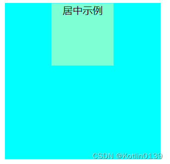
3、使用 margin 和 text-align 属性
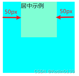
当父元素有指定宽度和长度时,可以通过“margin: 0 auto; text-align: center”实现CSS水平居中。
#father{
            background-color: aqua;
            /* 父元素的width和height必须指定 */
            width: 500px;
            height: 100px;
        }
        #son{
            background-color: aquamarine;
            width: 100px;
            height: 100px;
            /* 通过margin+text-align实现水平居中 */
            margin: 0 auto;
            text-align: center;
        }
结果图如下:
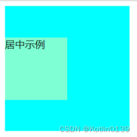
4、通过 display:flex
如果浏览器兼容flexbox的话,可以通过“display:flex”实现CSS水平居中。
#father{
            background-color: aqua;
            /* width: 500px;
            height: 100px; */
            /* 父元素 display:flex */
            display: flex;
            flex-direction: column;
        }
        #son{
            background-color: aquamarine;
            width: 100px;
            height: 100px;
            /* 子元素 align-self:center */
            align-self: center;
        }
结果图如下:
5、通过transform属性
不推荐使用这种方法,因为transform属性在各个浏览器中的表现行为不一致,可能会出现奇怪的兼容问题。
#father{
            background-color: aqua;
            height: 250px;
            width: 250px;
            position: relative;

        }
        #son{
            background-color: aquamarine;
            width: 100px;
            height: 100px;
            text-align: center;
            position: absolute;
            left: 50%;
            top: 20%;
            transform: translate(-50%,-50%);
        }
二、CSS实现垂直居中
1、块级元素
对于块级元素的布局,垂直居中和水平居中类似,对于水平居中适用的大多对于垂直居中也适用:
#father{
            background-color: aqua;
            width: 200px;
            height: 200px;
            /* 通过绝对定位实现垂直居中 */
            position: absolute;
        }
        #son{
            background-color: aquamarine;
            width: 100px;
            height: 100px;
            /* 让子元素顶部与父元素的顶部相距50%((200-100)/2) */
            margin-top: 50px;
        }
#father{
background-color: aqua;
width: 200px;
height: 200px;
/* 通过 display:table-cell 和 margin-top 实现垂直居中 */
display: table-cell;
}
#son{
background-color: aquamarine;
width: 100px;
height: 100px;
/* 让子元素顶部与父元素的顶部相距50%((200-100)/2) */
margin-left: 50px;
}
#father{
            background-color: aqua;
            /* width: 100px; */
            height: 500px;
            /* 父元素 display:flex */
            display: flex;
        }
        #son{
            background-color: aquamarine;
            width: 100px;
            height: 100px;
            /* 子元素 margin: auto 0 */
            margin: auto 0;
            /* 子元素 align-self: center 也可以实现 */
            align-self: center;
        }
#father{
            background-color: aqua;
            width: 300px;
            height: 300px;
            position: relative;
        }
        #son{
            background-color: aquamarine;
            width: 100px;
            height: 100px;
            position: absolute;
            left: 50%;
            top: 50%;
            transform: translate(-50%,-50%);
        }
2、行内元素
对于行内元素(行内块元素同理),可以通过verticle-align:middle实现CSS垂直居中。
#father{
            background-color: aqua;
            width: 300px;
            height: 300px;
            line-height: 300px;
        }
        #father img{
            width: 100px;
            height: 100px;
            vertical-align: middle;
        }
<body>
<div id="father">
<!-- 父元素只做参照作用 -->
<!-- <div id="son">
块级元素不能用此方法
</div> -->
<img src="./Koishi.jpg" alt="">
</div>
</body>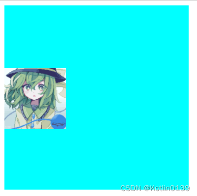
#father{
            background-color: aqua;
            width: 300px;
            height: 300px;
            display:table;
        }
        #child{
            display: table-cell;
            vertical-align: middle;
        }
<body>
<div id="father">
<!-- 父元素只做参照作用 -->
<!-- <div id="son">
块级元素不能用此方法
</div> -->
<p id="child">居中示例</p>
</div>
</body>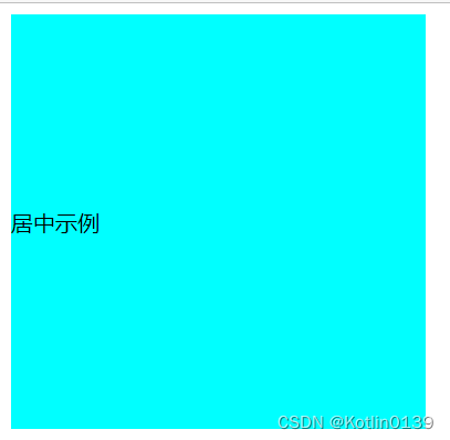
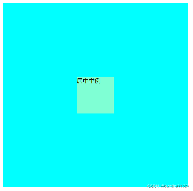
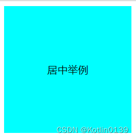
三、CSS实现水平垂直居中
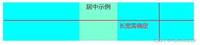
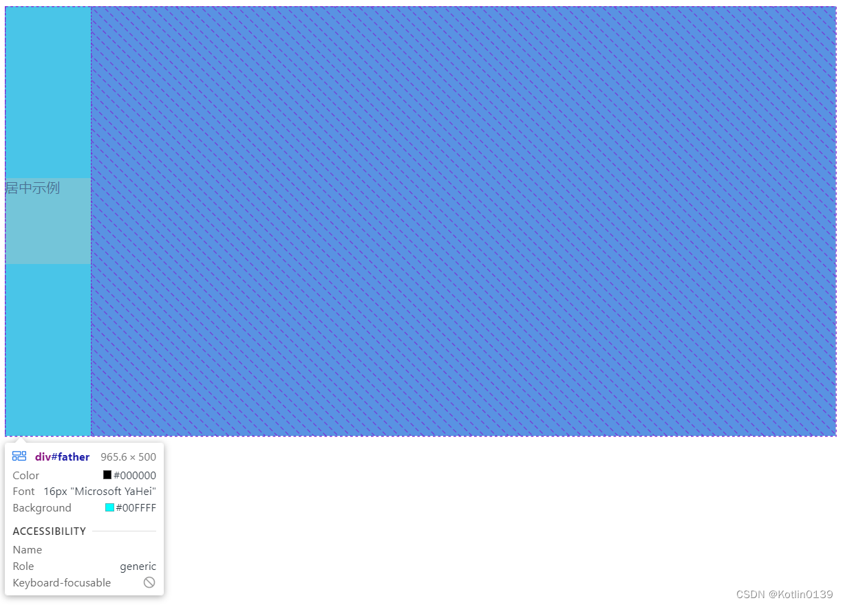
要想实现元素在水平和垂直都处于居中的位置,最简单粗暴的方法就是在之前水平/垂直居中的情况下实现另一个方向的居中。这里介绍一下CSS中几种常用到的水平垂直居中的方法。
1、使用 margin:auto
当元素有给定的高度以及宽度的时候,使用 margin: auto; 元素仅会水平居中,并不会进行垂直居中。此时就需要设置元素的 position 为 absolute,父级元素的 position 为 relative,同时元素的上下左右都需要设置为 0,即可实现水平垂直均为居中。
#father{
            background-color: aqua;
            width: 500px;
            height: 500px;
            position: relative;
        }
        #son{
            background-color: aquamarine;
            width: 100px;
            height: 100px;
            margin: auto;
            position: absolute;
            top: 0;
            left: 0;
            right: 0;
            bottom: 0;
        }
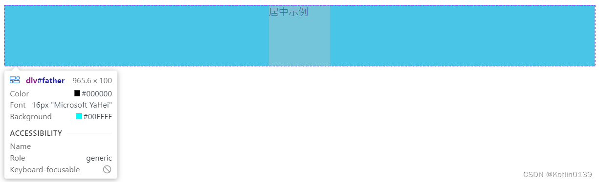
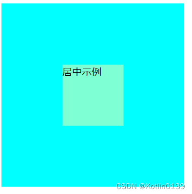
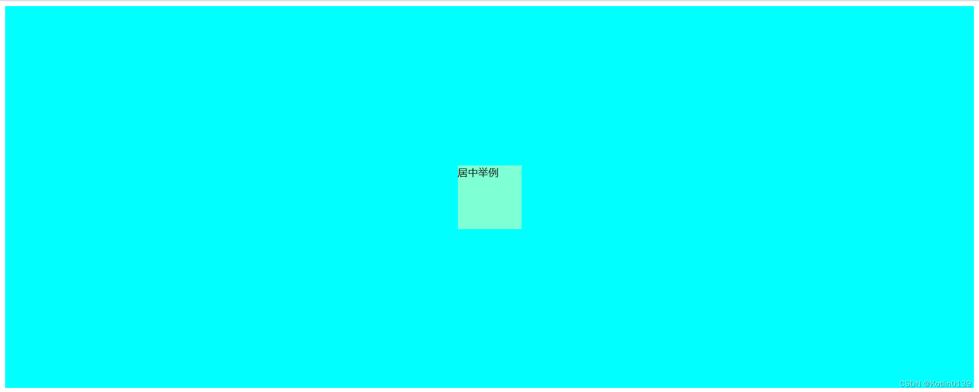
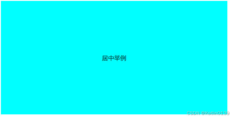
2、使用 Flex 布局
在不清楚父元素的长宽的情况下可以通过弹性布局来设置水平垂直居中,需要设置父级元素 display:flex 、水平布局 justify-content 以及垂直布局 align-items两个属性。
#father{
            background-color: aqua;
            height: 600px;
            display: flex;
            justify-content: center;
            align-items: center;
        }
        #son{
            background-color: aquamarine;
            width: 100px;
            height: 100px;
        }
以上是元素的水平垂直居中常见用法,在实际操作中,将文字进行水平垂直居中也是一个常见的需求。下面介绍的是如何通过CSS实现文字水平垂直居中:
3、文本水平对齐和行高
可以通过设置 text-align 和 line-height 实现文字水平垂直居中:
#father{
            background-color: aqua;
            width: 200px;
            height: 200px;
        }
        #son{
            text-align: center;
            line-height: 200px;
        }
也可以通过网格布局 grid 来实现文字水平垂直居中,这种方法有两种实现方式:对元素本身属性进行设置,或者在父级元素中设置grid。
#father{
            background-color: aqua;
            width: 600px;
            height: 300px;
            display: grid;
            /* 在父级元素中设置grid */
            align-items: center;
            justify-content: center
        }
        #son{
            /* 对元素本身属性进行设置 */
            /* align-self: center;
            justify-content: center;
            margin: auto; */
        }
总结
以上就是常见的CSS实现水平垂直居中的方法,限于笔者水平,本文介绍的居中方法并非全部,如有补充或者指正欢迎在评论区进行交流。

为开发者提供学习成长、分享交流、生态实践、资源工具等服务,帮助开发者快速成长。
更多推荐


 8
8 0
0- 0


 已为社区贡献1条内容

所有评论(0)