Html+CSS垂直居中的N种方法(大全)
利用元素 position: absolute 和 margin: auto实现垂直居中,适用于父子盒子里。代码:利用绝对定位百分比 50% 来实现,然后再用负的 margin-top 和 margin-left 来进行简单的位移即可。适用于父子盒子里。代码:使用 CSS3 的一个计算函数来进行计算即可;方法与上面类似。适用于父子盒子里。了解calc的用法具体参考:CSS calc()函数的用法代
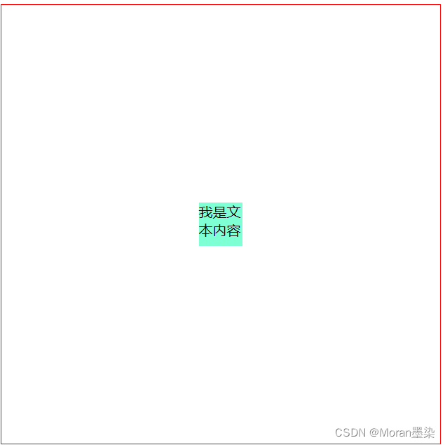
1. absolute + margin auto
利用元素 position: absolute 和 margin: auto实现垂直居中,适用于父子盒子里。
代码:
    .parent{
        position: relative;
        width: 500px;
        height: 500px;
        border: 1px solid red;
    }
    .child{
        background-color: aquamarine;
        width: 50px;
        height: 50px;
        /* 主要代码 */
        position: absolute;
        top :0;
        bottom: 0;
        left: 0;
        right: 0;
        margin: auto;
    }
2.absolute + -margin
利用绝对定位百分比 50% 来实现,然后再用负的 margin-top 和 margin-left 来进行简单的位移即可。适用于父子盒子里。
代码:
    .parent{
        position: relative;
        width: 500px;
        height: 500px;
        border: 1px solid red;
    }
    .child{
        background-color: aquamarine;
        width: 100px;
        height: 100px;
        /* 主要代码 */
        position:absolute;
        top: 50%; left: 50%;
        margin-top: -50px;  //这里返回的是自身宽度的一半
        margin-left: -50px; //这里返回的是自身高度的一半
    }

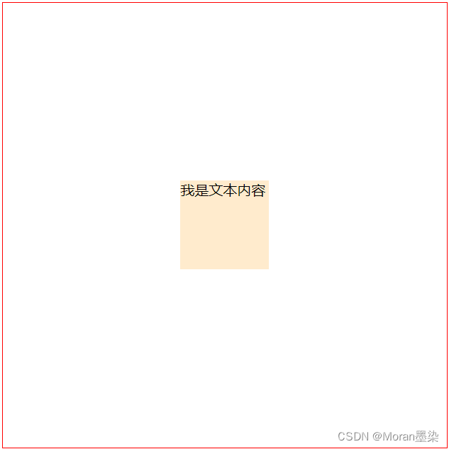
3. absolute + calc
使用 CSS3 的一个计算函数来进行计算即可;方法与上面类似。适用于父子盒子里。
了解calc的用法具体参考:CSS calc()函数的用法
代码:
    .parent{
        position: relative;
        width: 500px;
        height: 500px;
        border: 1px solid red;
    }
    .child{
        background-color: blanchedalmond;
        width: 100px;
        height: 100px;
        /* 主要代码 */
        position:absolute;
        top: calc(50% - 50px);  //这里减去的是自身宽度的一半
        left: calc(50% - 50px);  //这里减去的是自身高度的一半
    }
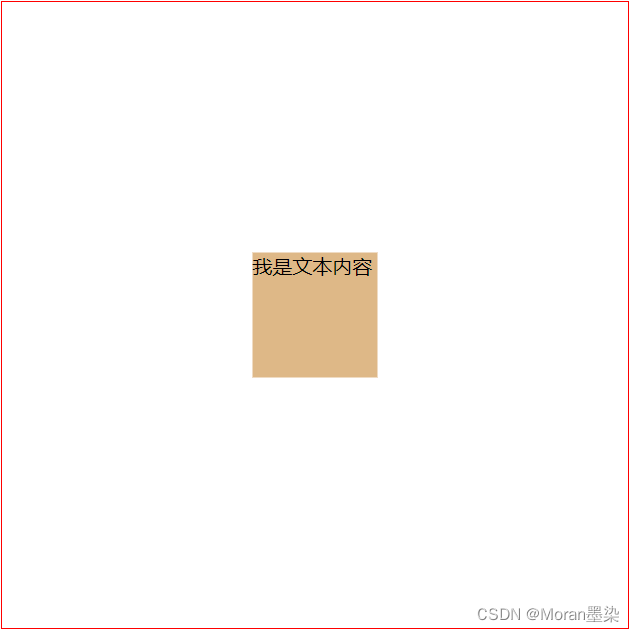
4. absolute + transform
利用 CSS3 的新特性 transform;因为 transform 的 translate 属性值如果是一个百分比,那么这个百分比将是基于自身的宽高计算出来的。适用于父子盒子里。
代码:
    .parent{
        position: relative;
        width: 500px;
        height: 500px;
        border: 1px solid red;
    }
    .child{
        background-color: burlywood;
        width: 100px;
        height: 100px;
        /* 主要代码 */
        position:absolute;
        top: 50%;
        left: 50%;
        transform: translate(-50%, -50%);   //横纵各返回自身宽度的50%
    }
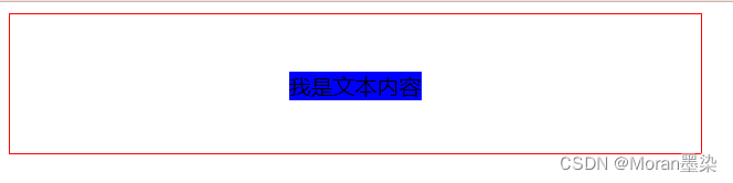
5. line-height + vertical-align
把当前元素设置为行内元素,然后通过设置父元素的 text-align: center; 实现水平居中;同时通过设置当前元素的 vertical-align: middle; 来实现垂直居中;最后设置当前元素的 line-height: initial; 来继承父元素的line-height。
具体参考:css之 vertical-align用法详解
代码:
    .parent{
        width: 500px;
        border: 1px solid red;
        line-height: 100px;
        /* 主要代码 */
        text-align: center;
    }
    .child{
        background-color: blue;
        /* 主要代码 */
        display: inline-block;
        vertical-align: middle;
        line-height: initial;
    }
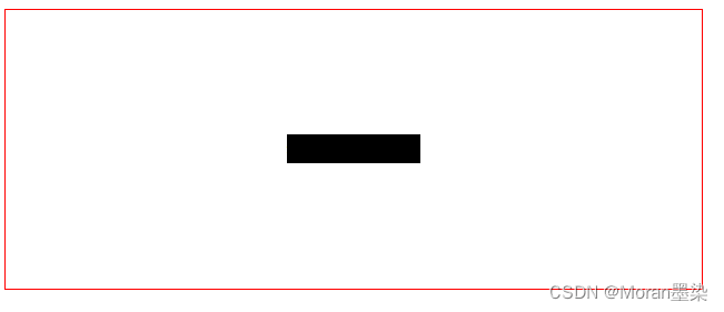
6.flex 布局
要说现在较为流行和使用较多的布局方案,那么非 flex 莫属了。
代码:
    .parent{
        width: 500px;
        height: 200px;
        border: 1px solid red;
        /* 主要代码 */
        display: flex;
        justify-content: center;
        align-items: center;
    }
    .child{
        background-color: black;
    }
justify-content 表示:设置或检索弹性盒子元素在主轴(横轴)方向上的对齐方式;
align-items 表示:定义 flex 子项在 flex 容器的当前行的侧轴(纵轴)方向上的对齐方式。
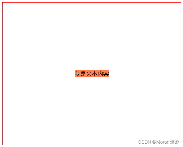
7.flex + margin auto
代码:
    .parent{
        width: 500px;
        height: 400px;
        border: 1px solid red;
        /* 主要代码 */
        display: flex;

    }
    .child{
        background-color: coral;
        /* 主要代码 */
        margin: auto;
    }
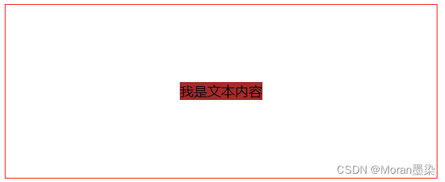
8.grid 网格布局
grid 布局相信大家在实际项目中用的较少,主要是该布局实在是太超前,导致了兼容性不是那么理想,但是不可否认的是 grid 的能力在 css 布局中绝对是一个质的飞越。
CSS Grid 包含与 Flexbox 几乎相同的对齐选项,因此我们可以在 grid-container 上优雅的实现。
具体参考:grid布局
代码:
    .parent{
        width: 500px;
        height: 200px;
        border: 1px solid red;
        /* 主要代码 */
        display: grid;
        align-items: center;
        justify-content: center;

    }
    .child{
        background-color: brown;
    }
或者我们同样这样写:
    .parent{
        width: 500px;
        height: 200px;
        border: 1px solid red;
        /* 主要代码 */
        display: grid;

    }
    .child{
        background-color: brown;
        align-self: center;
        justify-self: center;
    }

为开发者提供学习成长、分享交流、生态实践、资源工具等服务,帮助开发者快速成长。
更多推荐


 11
11 0
0- 0


 已为社区贡献4条内容

所有评论(0)