vant实现Select效果--单选和多选
vue项目无论是用element中的Select选择器,还是使用公司维护的组件,都可以轻松实现单选和多选的需求,但在移动端使用vant时,找了几遍发现居然没有提供Select组件,这里提供了基于popup和cell、field封装的select单选、多选组件。...
vue项目无论是用element中的Select选择器,还是使用公司维护的组件,都可以轻松实现单选和多选的需求,但在移动端使用vant时,找了几遍发现居然没有提供Select组件,下面提供对单选和多选组件的封装。
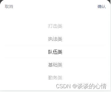
单选效果:
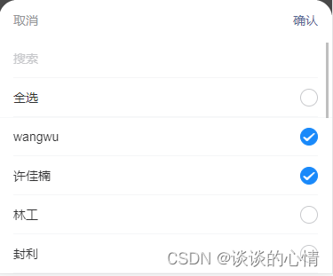
多选效果:
1、封装单选组件(VanFieldSelectPicker)
<template>
  <div class="dh-field">
    <div class=" van-hairline--bottom">
      <van-field
        v-model="resultLabel"
        v-bind="$attrs"
        readonly
        :is-link="$attrs.disabled === undefined"
        input-align="right"
        error-message-align='right'
        class="dh-cell"
        @click="showPopu($attrs.disabled)"
      />
      <van-popup v-model="show" position="bottom">
        <van-field v-if="isSearch" v-model="searchVal" input-align="left" placeholder="搜索" @input="search"/>
        <van-picker
          v-bind="$attrs"
          :columns="columnsData"
          show-toolbar
          @cancel="cancel"
          @confirm="onConfirm"
          @change="change"
          :value-key="this.option.label"
        />
      </van-popup>
    </div>
  </div>
</template>

<script>
export default {
  name: 'VanFieldSelectPicker',
  model: {
    prop: 'selectValue'
  },
  props: {
    columns: {
      type: Array,
      default: function () {
        return []
      }
    },
    selectValue: {
      type: [String, Number],
      default: ''
    },
    option: {
      type: Object,
      default: function () {
        return { label: 'label', value: 'value' }
      }
    },
    isSearch: {
      type: Boolean,
      default: false
    },
    offOption: { // 关闭option配置key-value;当数据是非集合的数组的时候,开启
      type: Boolean,
      default: false
    }
  },
  computed: {
    resultLabel: {
      get () {
        const res = this.columns.filter(item => {
          const data = this.offOption ? item : item[this.option.value]
          return data === this.resultValue
        })
        let label = ''
        if (res.length) {
          label = this.offOption ? res[0] : res[0][this.option.label]
        }

        return label
      },
      set () {

      }
    }
  },
  data () {
    return {
      show: false,
      searchVal: '',
      resultValue: this.selectValue,
      columnsData: []
    }
  },
  methods: {
    search (val) {
      if (val) {
        this.columnsData = this.columnsData.filter(item => {
          const data = this.offOption ? item : item[this.option.label]

          return data.indexOf(val) > -1
        })
      } else {
        this.columnsData = JSON.parse(JSON.stringify(this.columns))
      }
    },
    onConfirm (value, index) {
      const data = this.offOption ? value : value[this.option.value]

      this.resultValue = data
      this.show = !this.show
      this.$emit('confirm', value, index, this.resultValue)
    },
    change (val, index) {
      this.$emit('change', val, index, this.resultValue)
    },
    cancel (val, index) {
      this.show = !this.show
      this.$emit('cancel', val, index, this.resultValue)
    },
    showPopu (disabled) {
      this.columnsData = JSON.parse(JSON.stringify(this.columns))
      this.resultValue = this.selectValue
      if (disabled !== undefined && disabled !== false) {
        return false
      } else {
        this.show = !this.show
      }
    }
  },
  watch: {
    selectValue: function (newVal) {
      this.resultValue = newVal
    },
    resultValue (val) {
      this.searchVal = ''
      this.columnsData = JSON.parse(JSON.stringify(this.columns))
      this.$emit('input', val)
    }
  }
}
</script>

<style lang="scss" scoped>
  .dh-field {
    padding: 0;
    background:#fff;
    .dh-cell.van-cell {
      padding: 10px 0;
    }
    .dh-cell.van-cell--required::before {
      left: -8px;
    }
    .van-popup {
      border-radius: 20px 20px 0 0;
    }
  }
</style>
1.1 单选组件的使用
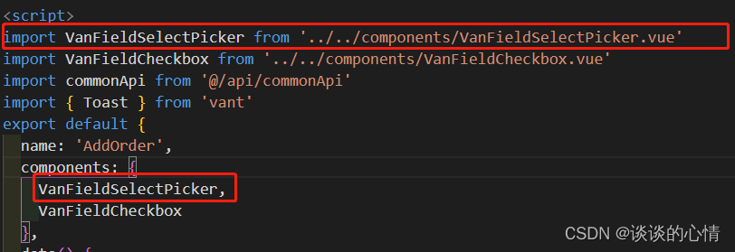
①使用到该组件的页面导入单选组件
② 在单选地方使用

<van-field-select-picker
v-model="orderType"
placeholder="请选择"
:columns="orderClassify"
:option="{label:'configName', value:'configCode'}"
@confirm="onOrderClassify"
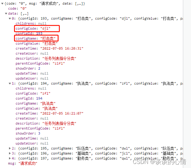
/>③orderClassify是后台返回的数据,{label:'configName', value:'configCode'} 对应选项的key-value,可以参考下面后台返回的数据
④单选事件 onOrderClassify 对应的方法
onOrderClassify(data1, index, data2) {
  // data1 当前这一条的obj数据
  // index 当前选择的索引
  // data2 当前这一条数据的value
  this.orderName = data1.configName
},
上面便是单选弹框的完整代码,下面开始多选组件的封装
2、封装多选组件(VanFieldCheckbox)
<template>
  <div class="dh-field">
    <div class="van-hairline--bottom">
      <van-field
        v-model="resultLabel"
        v-bind="$attrs"
        readonly
        :is-link="$attrs.disabled === undefined"
        error-message-align='right'
        input-align="right"
        class="dh-cell"
        @click="showPopu($attrs.disabled)"
      />
      <van-popup v-model="show" position="bottom" class="" >
        <div class="van-picker__toolbar">
          <button type="button" class="van-picker__cancel" @click="cancel">取消</button>
          <div class="van-ellipsis van-picker__title">{{$attrs.label}}</div>
          <button type="button" class="van-picker__confirm" @click="onConfirm">确认</button>
        </div>
        <div style="max-height:264px; overflow-y:auto;">
          <van-field v-if="isSearch" v-model="searchVal" input-align="left" placeholder="搜索" @input="search"/>
          <van-cell title="全选">
            <template #right-icon>
              <van-checkbox v-model="checkedAll" name="all" @click="toggleAll"/>
            </template>
          </van-cell>
          <van-checkbox-group ref="checkboxGroup" v-model="checkboxValue" @change="change">
            <van-cell-group>
              <van-cell
                v-for="(item, index) in columnsData"
                :key="item[option.value]"
                :title="item[option.label]"
                clickable
                @click="toggle(index)"
              >
                <template #right-icon>
                  <van-checkbox ref="checkboxes" :name="item[option.value]" />
                </template>
              </van-cell>
            </van-cell-group>
          </van-checkbox-group>
        </div>
      </van-popup>
    </div>
  </div>
</template>

<script>
export default {
  name: 'VanFieldCheckbox',
  model: {
    prop: 'selectValue'
  },
  props: {
    columns: {
      type: Array,
      default: function () {
        return []
      }
    },
    selectValue: {
      type: Array,
      default: function () {
        return []
      }
    },
    option: {
      type: Object,
      default: function () {
        return { label: 'label', value: 'value' }
      }
    },
    // 是否支持搜索
    isSearch: {
      type: Boolean,
      default: true
    }
  },
  computed: {
    resultLabel: {
      get () {
        const res = this.columns.filter(item => {
          return this.resultValue.indexOf(item[this.option.value]) > -1
        })
        const resLabel = res.map(item => {
          return item[this.option.label]
        })
        return resLabel.join(',')
      },
      set () {

      }
    }
  },
  data () {
    return {
      show: false,
      searchVal: '',
      columnsData: JSON.parse(JSON.stringify(this.columns)),
      checkboxValue: JSON.parse(JSON.stringify(this.selectValue)),
      checkedAll: false,
      resultValue: JSON.parse(JSON.stringify(this.selectValue))
    }
  },
  methods: {
    // 搜索
    search (val) {
      if (val) {
        this.columnsData = this.columnsData.filter(item => {
          return item[this.option.label].indexOf(val) > -1
        })
      } else {
        this.columnsData = JSON.parse(JSON.stringify(this.columns))
      }
    },
    getData (val) {
      const res = this.columnsData.filter(item => {
        return val.indexOf(item[this.option.value]) > -1
      })
      return res
    },
    onConfirm () {
      this.resultValue = this.checkboxValue
      this.show = !this.show
      this.$emit('confirm', this.resultValue, this.getData(this.resultValue))
    },
    change (val) {
      this.$emit('change', val, this.getData(this.resultValue))
    },
    cancel () {
      this.show = !this.show
      this.$emit('cancel', this.resultValue)
    },
    toggle (index) {
      this.$refs.checkboxes[index].toggle()
    },
    toggleAll (all) {
      this.$refs.checkboxGroup.toggleAll(this.checkedAll)
    },
    showPopu (disabled) {
      this.columnsData = JSON.parse(JSON.stringify(this.columns))
      this.checkboxValue = JSON.parse(JSON.stringify(this.selectValue))
      this.resultValue = JSON.parse(JSON.stringify(this.selectValue))
      if (disabled !== undefined && disabled !== false) {
        return false
      } else {
        this.show = !this.show
      }
    }
  },
  watch: {
    selectValue: function (newVal) {
      this.resultValue = newVal
    },
    resultValue (val) {
      this.searchVal = ''
      this.columnsData = JSON.parse(JSON.stringify(this.columns))
      this.$emit('input', val)
    },
    columnsData: {
      handler (val) {
        if (val.length && val.length === this.checkboxValue.length) {
          this.checkedAll = true
        } else {
          this.checkedAll = false
        }
      },
      immediate: true
    },
    checkboxValue: {
      handler (val) {
        if (val.length && val.length === this.columnsData.length) {
          this.checkedAll = true
        } else {
          this.checkedAll = false
        }
      },
      immediate: true
    }
  }
}
</script>

<style lang="scss" scoped>
.dh-field {
  padding: 0;
  background:#fff;
  .dh-cell.van-cell {
    padding: 10px 0;
  }
  .dh-cell.van-cell--required::before {
    left: -8px;
  }
  .van-popup {
    border-radius: 20px 20px 0 0;
  }
}
</style>
①使用到该组件的页面导入多选组件,和单选组件的导入一致,参考上面
② 在多选地方使用

<van-field-checkbox
v-model="checkedExecutors"
placeholder="请选择"
:columns="executor"
label-width="100"
:option="{label:'name', value:'userId'}"
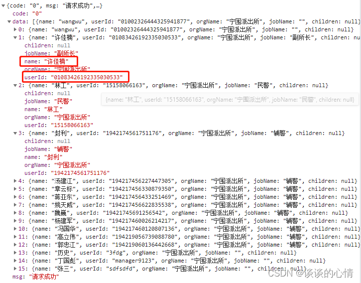
/>③executor是后台返回的数据,{label:'name', value:'userId'}对应选项的key-value,可以参考下面后台返回的数据
④多选事件上面我没用到,我是直接v-model绑定了选中的数据,如果需要在事件中额外处理数据,可以通过@confirm="onConfirm" 来绑定事件(正常获取值用不到,直接v-model即可)
onConfirm (data1, data2) {
    // data1 是当前选中数据的value的数组
    // data2 是当前选中数据的整个obj集合
},
以上便是基于popup和cell、field封装的select单选、多选组件的完整代码。

为开发者提供学习成长、分享交流、生态实践、资源工具等服务,帮助开发者快速成长。
更多推荐


 17
17 0
0- 0


 已为社区贡献4条内容

所有评论(0)