uni-app 自定义下拉选择列表
效果图:1.自定义组件ChoiceSelected.vue2.组件代码:<template name="ChoiceSelected"><!-- 自定义下拉选择框 start--><view class="selected-all"><view :class="isShowChoice ? 'drop-down-box-selected' : 'drop-
效果图:
1.自定义组件ChoiceSelected.vue
2.组件代码:
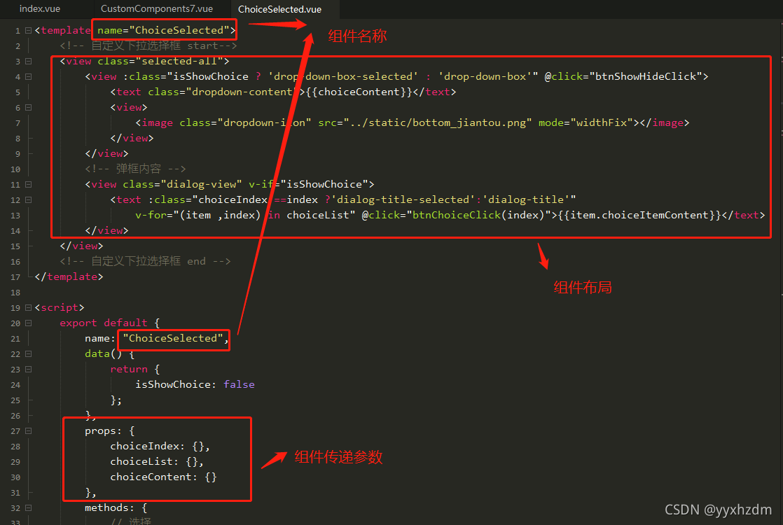
<template name="ChoiceSelected">
<!-- 自定义下拉选择框 start-->
<view class="selected-all">
<view :class="isShowChoice ? 'drop-down-box-selected' : 'drop-down-box'" @click="btnShowHideClick">
<text class="dropdown-content">{{choiceContent}}</text>
<view>
<image class="dropdown-icon" src="../static/bottom_jiantou.png" mode="widthFix"></image>
</view>
</view>
<!-- 弹框内容 -->
<view class="dialog-view" v-if="isShowChoice">
<text :class="choiceIndex ==index ?'dialog-title-selected':'dialog-title'"
v-for="(item ,index) in choiceList" @click="btnChoiceClick(index)">{{item.choiceItemContent}}</text>
</view>
</view>
<!-- 自定义下拉选择框 end -->
</template>
<script>
export default {
name: "ChoiceSelected",
data() {
return {
isShowChoice: false
};
},
props: {
choiceIndex: {},
choiceList: {},
choiceContent: {}
},
methods: {
// 选择
btnChoiceClick: function(position) {
var _this = this
// _this.choiceIndex = position
_this.isShowChoice = false
// _this.choiceContent = _this.choiceList[position].choiceItemContent
_this.$emit("onChoiceClick",position)
},
// 显示与隐藏选择内容
btnShowHideClick: function() {
var _this = this
if (_this.isShowChoice) {
_this.isShowChoice = false
} else {
_this.isShowChoice = true
}
},
}
}
</script>
<style>
/* end */
.dialog-title-selected {
color: white;
font-size: 30rpx;
padding-left: 20rpx;
padding-top: 6rpx;
padding-bottom: 6rpx;
padding-right: 15rpx;
background-color: #55ffff;
}
.dialog-title {
color: black;
font-size: 30rpx;
padding-left: 20rpx;
padding-top: 6rpx;
padding-bottom: 6rpx;
padding-right: 15rpx;
background-color: white;
}
.dialog-view {
display: flex;
flex-direction: column;
justify-content: center;
width: 100%;
border: 2rpx solid #F0AD4E;
box-sizing: border-box;
}
.dropdown-icon {
width: 30rpx;
height: 30rpx;
margin-left: 15rpx;
margin-right: 20rpx;
}
.dropdown-content {
color: black;
font-size: 30rpx;
padding-left: 20rpx;
padding-top: 5rpx;
padding-bottom: 5rpx;
flex-grow: 1;
}
.drop-down-box-selected {
display: flex;
flex-direction: row;
align-items: center;
min-height: 60rpx;
width: 100%;
border: 2rpx solid #F0AD4E;
box-sizing: border-box;
}
.drop-down-box {
display: flex;
flex-direction: row;
align-items: center;
min-height: 60rpx;
width: 100%;
border: 2rpx solid gray;
border-radius: 5rpx;
box-sizing: border-box;
}
.selected-all {
display: flex;
flex-direction: column;
justify-content: center;
width: 100%;
}
/* start */
</style>
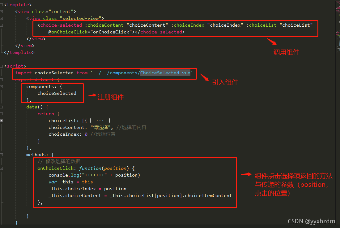
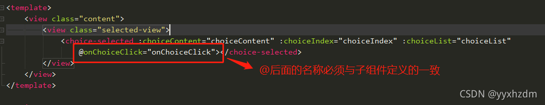
3.调用与注册组件
子组件中参数传递的方法
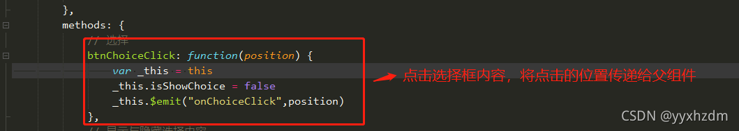
在子组件中的_this.$emit("onChoiceClick",position)必须与父vue中@调用名称一致。
参数说明:
| 属性 | 默认值/类型 | 说明 |
| isShowChoice | false/boolean | 是否显示下拉类表数据 |
| choiceIndex | 0/int | 下拉类表数据,选择位置 |
| choiceContent | “请选择”/String | 选择的内容 |
| choiceList | 自定义/数组 | 下拉类表数据 |
4.父vue的代码:
<template>
<view class="content">
<view class="selected-view">
<choice-selected :choiceContent="choiceContent" :choiceIndex="choiceIndex" :choiceList="choiceList"
@onChoiceClick="onChoiceClick"></choice-selected>
</view>
</view>
</template>
<script>
import choiceSelected from '../../components/ChoiceSelected.vue'
export default {
components: {
choiceSelected
},
data() {
return {
choiceList: [{
choiceItemId: "0",
choiceItemContent: "请选择"
},
{
choiceItemId: "P",
choiceItemContent: "苹果"
},
{
choiceItemId: "L",
choiceItemContent: "荔枝"
},
{
choiceItemId: "X",
choiceItemContent: "西瓜"
},
{
choiceItemId: "H",
choiceItemContent: "哈密瓜"
}
],
choiceContent: "请选择", //选择的内容
choiceIndex: 0 //选择位置
}
},
methods: {
// 修改选择的数据
onChoiceClick: function(position) {
console.log("+++++++" + position)
var _this = this
_this.choiceIndex = position
_this.choiceContent = _this.choiceList[position].choiceItemContent
},
}
}
</script>
<style>
.selected-view {
width: 80%;
margin-top: 15rpx;
}
.content {
display: flex;
flex-direction: column;
align-items: center;
width: 100%;
height: 100%;
background-color: white;
}
page {
height: 100%;
background-color: white;
}
</style>
以上就是完成自定义下拉列表组件的所有代码,有什么问题或需要改进的可以留言共同探讨...

华为开发者空间,是为全球开发者打造的专属开发空间,汇聚了华为优质开发资源及工具,致力于让每一位开发者拥有一台云主机,基于华为根生态开发、创新。
更多推荐


 7
7 0
0- 0


 已为社区贡献3条内容

所有评论(0)