css,html简单骰子/色子代码
简单代码,运用较少css,完整代码放在最后了嗷。最终效果: 思想:相当于给每个骰子里的点分块,再分别处理。(点也是一个块)如图,把每个骰子分成三个部分,分别处理。 分块后分别处理,比如:这样的块中的点可用水平方向居中样式:justify-content:center————————————————————————————————这样的块加两个点,用两端环绕justify-content:space
·
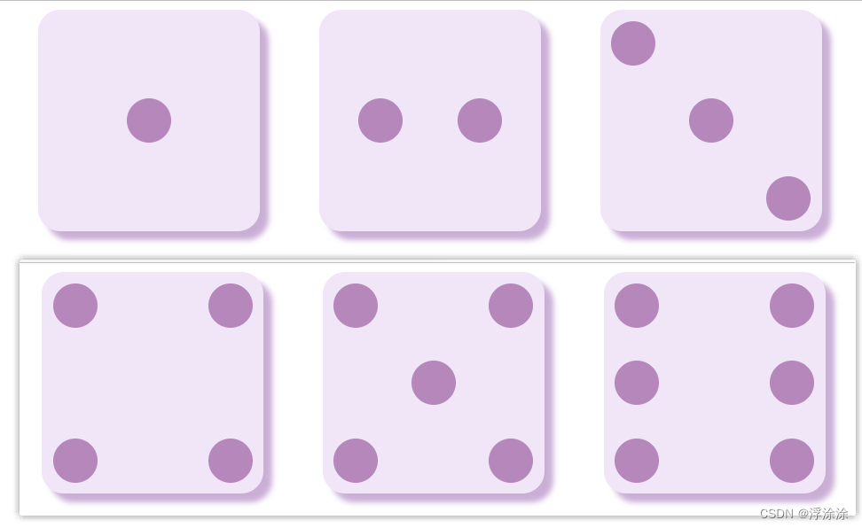
简单代码,运用较少css,完整代码放在最后了嗷。
最终效果:

思想:
相当于给每个骰子里的点分块,再分别处理。(点也是一个块)
如图,把每个骰子分成三个部分,分别处理。

分块后分别处理,比如:

这样的块中的点可用水平方向居中样式:
justify-content:center
————————————————————————————————

这样的块加两个点,用两端环绕
justify-content:space-around
————————————————————————————————


这两块分别用居左和居右即可
justify-content:left
justify-content:right
—————————————————————————————————

空白的地方用换行符占位就行
<br>
___________________________________________
最后简单设置一下样式和颜色就行,我知道我这颜色弄得有点花哨,大家根据自己喜好改一下就行哈。
运行后:

代码部分:
<!DOCTYPE html>
<!-- <html lang="en"> -->
<head>
    <meta charset="UTF-8">
    <meta http-equiv="X-UA-Compatible" content="IE=edge">
    <meta name="viewport" content="width=device-width, initial-scale=1.0">
    <title>骰子图</title>
    <style>
        .container{
            height: 200px;
            /* border: 5px solid rgba(150, 210, 145, 0.639); */
            /*在父容器中开启弹性布局*/
            /* flex 布局默认沿着主轴方向(水平向右的方向) */
            display: flex;
            /* 换行 */
            flex-wrap: wrap;
            /* 两端环绕 */
            justify-content: space-around;
            /* 在交叉轴(垂直方向)中心点位置对齐  */
            align-items: center;

        }
        .box{
            width: 200px;
            height: 200px;
            background-color: rgb(240, 230, 248);
            border-radius: 10%;
            box-shadow: 8px 8px 5px rgb(202, 174, 214);
            flex-direction: column;
            justify-content: space-between;
            display: flex;

        }
        .cir{

            height: 40px;
            width: 40px;
            border-radius:50%;
            background-color: rgb(182, 135, 186);
            box-shadow: none;
        }
        .box section{
            display: flex;
            padding: 10px;
        }

    </style>
</head>
<body>
    <div class="container">
        <div class="box">
            <!-- 点数1 -->
            <br>
            <section style="justify-content:center">
                <div class="cir"></div>
            </section>
            <br>
        </div>

        <div class="box">
            <!-- 点数2 -->
            <br>
            <section style="justify-content:space-around">
                <div class="cir"></div>
                <div class="cir"></div>
            </section>
            <br>
        </div>

        <div class="box">
            <!-- 点数3 -->
            <section style="justify-content:left">
                <div class="cir"></div>
            </section>
            <section style="justify-content:center">
                <div class="cir"></div>
            </section>
            <section style="justify-content:right">
                <div class="cir"></div>
            </section>
        </div>

        <div class="box">
            <!-- 点数4 -->
            <section style="justify-content:space-between ;">
                <div class="cir"></div>
                <div class="cir"></div>
            </section>
            <section style="justify-content:space-between ;">
                <div class="cir"></div>
                <div class="cir"></div>
            </section>
        </div>

        <div class="box">
            <!-- 点数5 -->
            <section style="justify-content:space-between ;">
                <div class="cir"></div>
                <div class="cir"></div>
            </section>
            <section style="justify-content:center;">
                <div class="cir"></div>
            </section>
            <section style="justify-content:space-between ;">
                <div class="cir"></div>
                <div class="cir"></div>
            </section>
        </div>

        <div class="box">
            <!-- 点数6 -->
            <section style="justify-content:space-between ;">
                <div class="cir"></div>
                <div class="cir"></div>
            </section>
            <section style="justify-content:space-between ;">
                <div class="cir"></div>
                <div class="cir"></div>
            </section>
            <section style="justify-content:space-between ;">
                <div class="cir"></div>
                <div class="cir"></div>
            </section>
        </div>
    </div>
</body>
</html>
华为开发者空间,是为全球开发者打造的专属开发空间,汇聚了华为优质开发资源及工具,致力于让每一位开发者拥有一台云主机,基于华为根生态开发、创新。
更多推荐


 26
26 0
0- 0


 已为社区贡献1条内容

所有评论(0)