Vue2通知提醒框(Notification)
可自定义设置以下属性:自动关闭的延时时长(duration),单位ms,默认4500ms消息从顶部弹出时,距离顶部的位置(top),单位像素px,默认24px消息从底部弹出时,距离底部的位置(bottom),单位像素px,默认24px弹出位置(placement),可选:左上topLeft,右上topRight(默认),左下bottomLeft,右下bottomRight
·
可自定义设置以下属性:
- 自动关闭的延时时长(duration),单位ms,默认4500ms
- 消息从顶部弹出时,距离顶部的位置(top),单位px,默认24px
- 消息从底部弹出时,距离底部的位置(bottom),单位px,默认24px
- 消息弹出位置(placement),可选:左上topLeft,右上topRight(默认),左下bottomLeft,右下bottomRight
调用时可选以下五个方法对应五种不同样式:
- this.$refs.notification.open(notification) // 默认使用
- this.$refs.notification.info(notification) // info调用
- this.$refs.notification.success(notification) // success调用
- this.$refs.notification.error(notification) // error调用
- this.$refs.notification.warn(notification) // warn调用
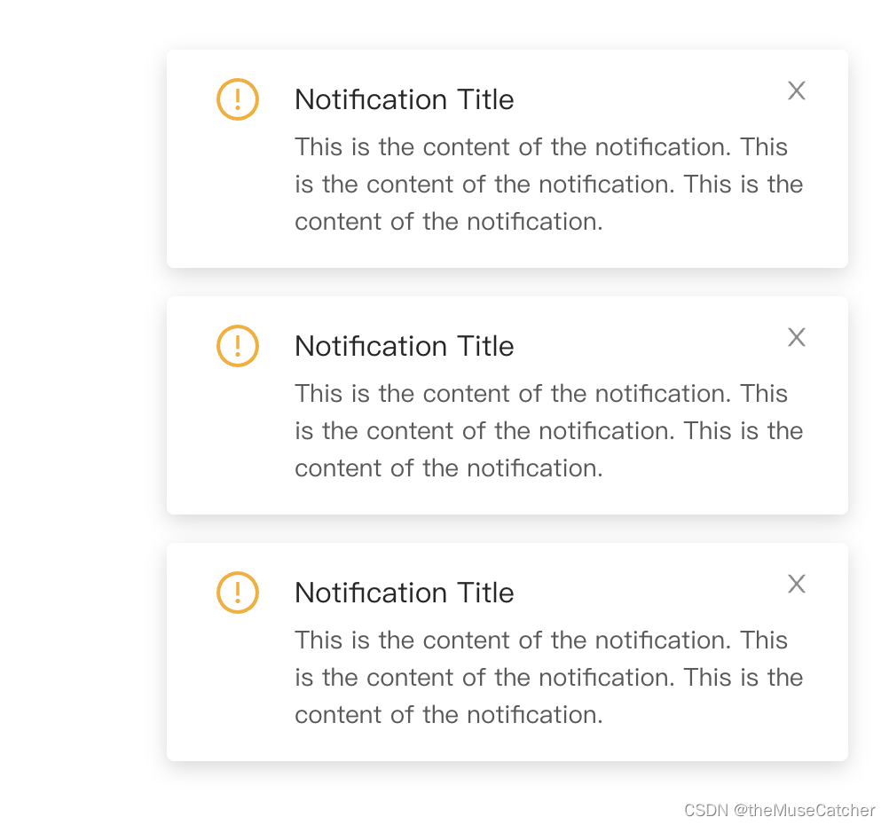
五种样式效果如下图:
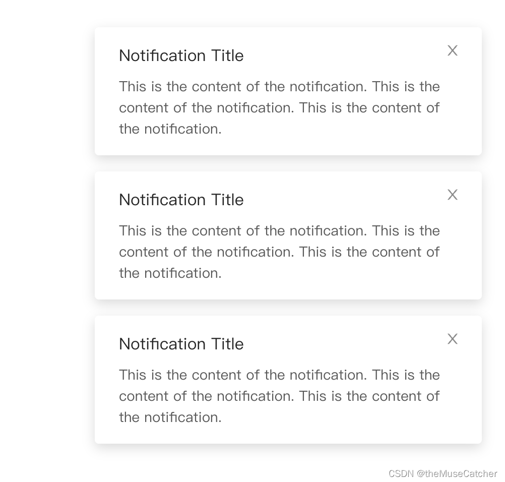
open()调用:
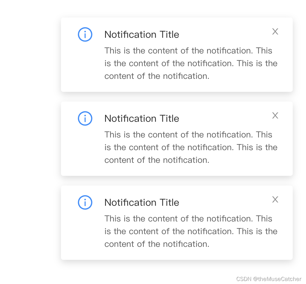
info()调用:
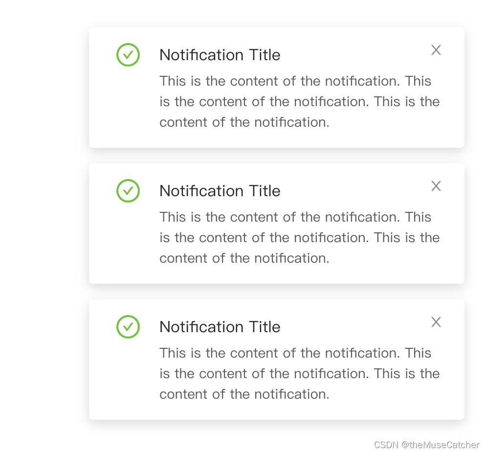
success()调用:
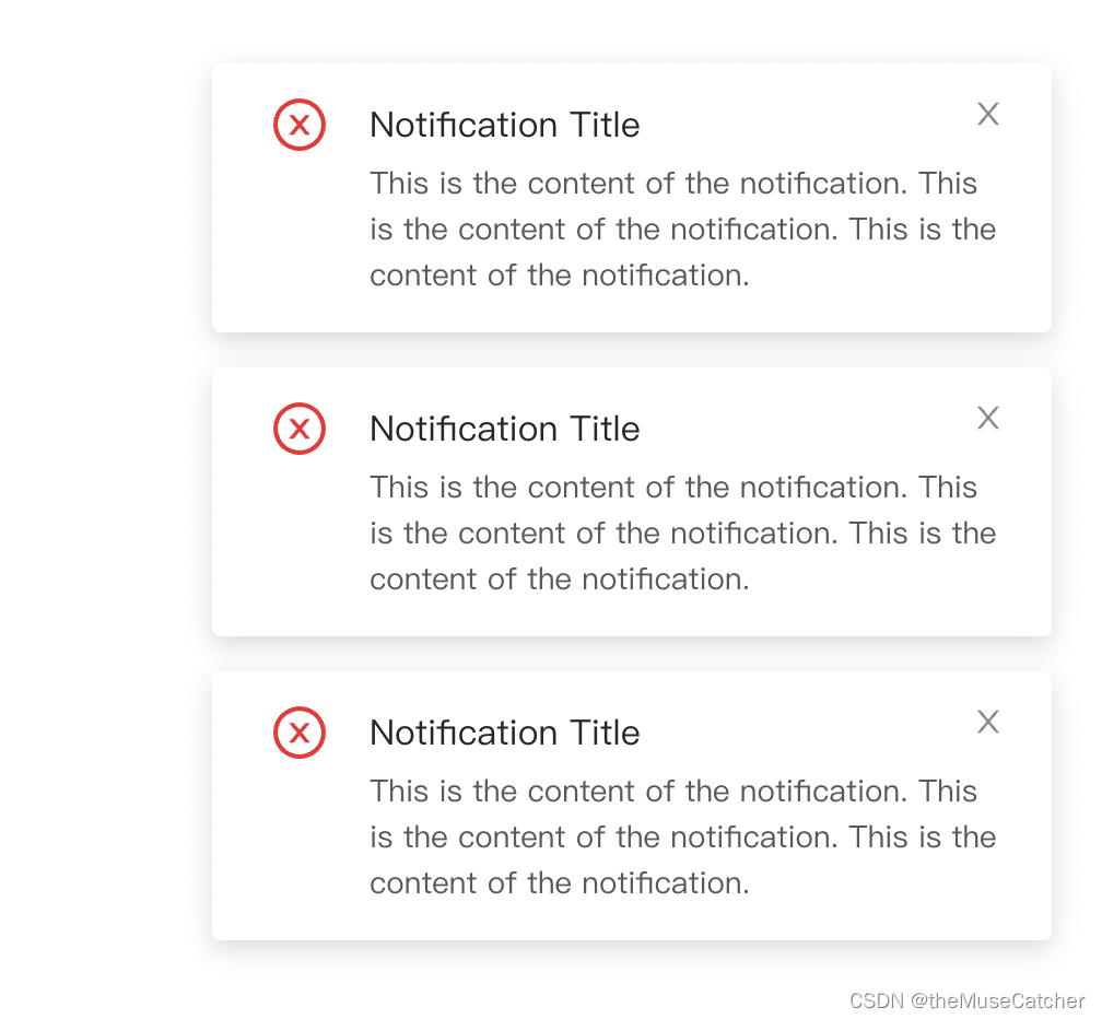
 error()调用:
 warn()调用:
①创建通知提醒框组件Notification:
<template>
  <div :class="['m-notification-wrap', placement]" :style="`top: ${placement.includes('top') ? top : ''}px; bottom: ${placement.includes('bottom') ? bottom : ''}px;`">
      <transition-group name="slide-fade" tag="div">
        <div
          class="m-notification"
          @mouseenter="onEnter(index)"
          @mouseleave="onLeave(index)"
          v-show="!hideIndex.includes(index)"
          v-for="(data, index) in notificationData"
          :key="`n${index}`">
          <svg class="u-status-svg" v-if="mode==='info'" :fill="colorStyle[mode]" viewBox="64 64 896 896" data-icon="info-circle" aria-hidden="true" focusable="false"><path d="M512 64C264.6 64 64 264.6 64 512s200.6 448 448 448 448-200.6 448-448S759.4 64 512 64zm0 820c-205.4 0-372-166.6-372-372s166.6-372 372-372 372 166.6 372 372-166.6 372-372 372z"></path><path d="M464 336a48 48 0 1 0 96 0 48 48 0 1 0-96 0zm72 112h-48c-4.4 0-8 3.6-8 8v272c0 4.4 3.6 8 8 8h48c4.4 0 8-3.6 8-8V456c0-4.4-3.6-8-8-8z"></path></svg>
          <svg class="u-status-svg" v-if="mode==='success'" :fill="colorStyle[mode]" viewBox="64 64 896 896" data-icon="check-circle" aria-hidden="true" focusable="false"><path d="M699 353h-46.9c-10.2 0-19.9 4.9-25.9 13.3L469 584.3l-71.2-98.8c-6-8.3-15.6-13.3-25.9-13.3H325c-6.5 0-10.3 7.4-6.5 12.7l124.6 172.8a31.8 31.8 0 0 0 51.7 0l210.6-292c3.9-5.3.1-12.7-6.4-12.7z"></path><path d="M512 64C264.6 64 64 264.6 64 512s200.6 448 448 448 448-200.6 448-448S759.4 64 512 64zm0 820c-205.4 0-372-166.6-372-372s166.6-372 372-372 372 166.6 372 372-166.6 372-372 372z"></path></svg>
          <svg class="u-status-svg" v-if="mode==='warn'" :fill="colorStyle[mode]" viewBox="64 64 896 896" data-icon="exclamation-circle" aria-hidden="true" focusable="false"><path d="M512 64C264.6 64 64 264.6 64 512s200.6 448 448 448 448-200.6 448-448S759.4 64 512 64zm0 820c-205.4 0-372-166.6-372-372s166.6-372 372-372 372 166.6 372 372-166.6 372-372 372z"></path><path d="M464 688a48 48 0 1 0 96 0 48 48 0 1 0-96 0zm24-112h48c4.4 0 8-3.6 8-8V296c0-4.4-3.6-8-8-8h-48c-4.4 0-8 3.6-8 8v272c0 4.4 3.6 8 8 8z"></path></svg>
          <svg class="u-status-svg" v-if="mode==='error'" :fill="colorStyle[mode]" viewBox="64 64 896 896" data-icon="close-circle" aria-hidden="true" focusable="false"><path d="M685.4 354.8c0-4.4-3.6-8-8-8l-66 .3L512 465.6l-99.3-118.4-66.1-.3c-4.4 0-8 3.5-8 8 0 1.9.7 3.7 1.9 5.2l130.1 155L340.5 670a8.32 8.32 0 0 0-1.9 5.2c0 4.4 3.6 8 8 8l66.1-.3L512 564.4l99.3 118.4 66 .3c4.4 0 8-3.5 8-8 0-1.9-.7-3.7-1.9-5.2L553.5 515l130.1-155c1.2-1.4 1.8-3.3 1.8-5.2z"></path><path d="M512 65C264.6 65 64 265.6 64 513s200.6 448 448 448 448-200.6 448-448S759.4 65 512 65zm0 820c-205.4 0-372-166.6-372-372s166.6-372 372-372 372 166.6 372 372-166.6 372-372 372z"></path></svg>
          <div :class="['u-title', {'mb4': mode!=='open', 'ml48': mode!=='open'}]">{{ data.title || '--' }}</div>
          <p :class="['u-description', {'ml48': mode!=='open'}]">{{ index + data.description || '--' }}</p>
          <svg class="u-close" @click="onHideNotification(index)" viewBox="64 64 896 896" data-icon="close" aria-hidden="true" focusable="false"><path d="M563.8 512l262.5-312.9c4.4-5.2.7-13.1-6.1-13.1h-79.8c-4.7 0-9.2 2.1-12.3 5.7L511.6 449.8 295.1 191.7c-3-3.6-7.5-5.7-12.3-5.7H203c-6.8 0-10.5 7.9-6.1 13.1L459.4 512 196.9 824.9A7.95 7.95 0 0 0 203 838h79.8c4.7 0 9.2-2.1 12.3-5.7l216.5-258.1 216.5 258.1c3 3.6 7.5 5.7 12.3 5.7h79.8c6.8 0 10.5-7.9 6.1-13.1L563.8 512z"></path></svg>
        </div>
      </transition-group>
  </div>
</template>
<script>
export default {
  name: 'Notification',
  props: {
    duration: { // 自动关闭的延时时长,单位ms,默认4500ms;设置null时,不自动关闭
      type: Number,
      default: 4500
    },
    top: { // 消息从顶部弹出时,距离顶部的位置,单位像素px
      type: Number,
      default: 24
    },
    bottom: { // 消息从底部弹出时,距离底部的位置,单位像素
      type: Number,
      default: 24
    },
    placement: { // 消息弹出位置,可选topLeft,topRight,bottomLeft,bottomRight
      type: String,
      default: 'topRight'
    }
  },
  data () {
    return {
      colorStyle: { // 颜色主题对象
        info: '#1890FF',
        success: '#52c41a',
        error: '#f5222d',
        warn: '#faad14'
      },
      mode: 'info', // 调用方法对应的样式主题
      resetTimer: null,
      hideIndex: [],
      hideTimers: [],
      notificationData: []
    }
  },
  computed: {
    clear () { // 所有提示是否已经全部变为false
      return this.hideIndex.length === this.notificationData.length
    }
  },
  watch: {
    clear (to, from) { // 所有提示都消失后重置
      if (!from && to) {
        this.resetTimer = setTimeout(() => {
          this.hideIndex.splice(0)
          this.notificationData.splice(0)
        }, 500)
      }
    }
  },
  methods: {
    onEnter (index) {
      clearTimeout(this.hideTimers[index])
      this.$set(this.hideTimers, index, null)
    },
    onLeave (index) {
      if (this.duration) {
        this.$set(this.hideTimers, index, setTimeout(() => {
          this.onHideNotification(index)
        }, this.duration))
      }
    },
    show (notification) {
      clearTimeout(this.resetTimer)
      this.notificationData.push(notification)
      this.hideTimers.push(null)
      const index = this.notificationData.length - 1
      if (this.duration) {
        this.$set(this.hideTimers, index, setTimeout(() => {
          this.onHideNotification(index)
        }, this.duration))
      }
    },
    open (notification) {
      this.mode = 'open'
      this.show(notification)
    },
    info (notification) {
      this.mode = 'info'
      this.show(notification)
    },
    success (notification) {
      this.mode = 'success'
      this.show(notification)
    },
    error (notification) {
      this.mode = 'error'
      this.show(notification)
    },
    warn (notification) {
      this.mode = 'warn'
      this.show(notification)
    },
    onHideNotification (index) {
      this.hideIndex.push(index)
      this.$emit('close')
    }
  }
}
</script>
<style lang="less" scoped>
// 渐变过渡效果
.fade-enter-active, .fade-leave-active {
  transition: opacity .3s;
}
.fade-enter, .fade-leave-to {
  opacity: 0;
}
// 滑动渐变过渡效果
.slide-fade-enter-active, .slide-fade-leave-active {
  transition: all .3s ease;
}
.slide-fade-enter, .slide-fade-leave-to {
  transform: translateX(408px);
  -ms-transform: translateX(408px); /* IE 9 */
  -webkit-transform: translateX(408px); /* Safari and Chrome */
  opacity: 0;
}
.topRight {
  margin-right: 24px;
  right: 0;
}
.topLeft {
  margin-left: 24px;
  left: 0;
}
.bottomRight {
  margin-right: 24px;
  right: 0;
}
.bottomLeft {
  margin-left: 24px;
  left: 0;
}
.m-notification-wrap {
  position: fixed;
  z-index: 999; // 突出显示该层级
  width: 384px;
  color: rgba(0,0,0,.65);
  font-size: 14px;
  .m-notification {
    margin-bottom: 16px;
    padding: 16px 24px;
    border-radius: 4px;
    box-shadow: 0 4px 12px rgba(0, 0, 0, 15%);
    line-height: 1.5;
    background: #fff;
    transition: all .3s;
    position: relative;
    .u-status-svg {
      width: 24px;
      height: 24px;
      display: inline-block;
      position: absolute;
      margin-left: 4px;
    }
    .u-title {
      padding-right: 24px;
      display: inline-block;
      margin-bottom: 8px;
      color: rgba(0,0,0,.85);
      font-size: 16px;
      line-height: 24px;
    }
    .u-description {
      font-size: 14px;
    }
    .mb4 {
      margin-bottom: 4px;
    }
    .ml48 {
      margin-left: 48px;
    }
    .u-close {
      display: inline-block;
      position: absolute;
      top: 21px;
      right: 24px;
      width: 14px;
      height: 14px;
      fill: rgba(0,0,0,.45);
      cursor: pointer;
      transition: fill .3s ease;
      &:hover {
        fill: rgba(0,0,0,.75);
      }
    }
  }
}
</style>
②在要使用的页面引入:
<Notification
      ref="notification"
      placement="topRight"
      :duration="null"
      :top="30"
      @close="onClose" />
import Notification from '@/components/Notification'
components: {
    Notification
}
onShowNotification () {
      const notification = {
        title: 'Notification Title',
        description: 'This is the content of the notification. This is the content of the notification. This is the content of the notification.'
      }
      this.$refs.notification.open(notification) // 默认使用
      // this.$refs.notification.info(notification) // info调用
      // this.$refs.notification.success(notification) // success调用
      // this.$refs.notification.error(notification) // error调用
      // this.$refs.notification.warn(notification) // warning调用
},
onClose () { // 点击默认关闭按钮时触发的回调函数
      console.log('关闭notification')
}
为开发者提供学习成长、分享交流、生态实践、资源工具等服务,帮助开发者快速成长。
更多推荐


 4
4 0
0- 0


 已为社区贡献21条内容

所有评论(0)