uniapp组件-uni-swipe-action滑动操作
目录一、基本用法二、使用变量控制SwipeAction的开启状态三、swipe-action 列表官方示例:https://ext.dcloud.net.cn/plugin?id=181禁止左右滑动,只需要在uni-swipe-action-item组件的属性上添加:disabled="true"即可一、基本用法1、直接使用组件<template><view><uni
·
目录
官方示例:https://ext.dcloud.net.cn/plugin?id=181
禁止左右滑动,只需要在uni-swipe-action-item组件的属性上添加 :disabled="true"即可
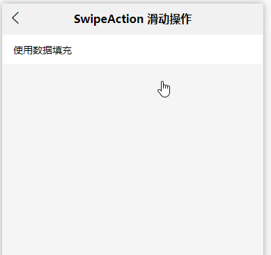
一、基本用法
1、直接使用组件
<template>
	<view>
		<uni-swipe-action>
			<uni-swipe-action-item :left-options="options2" :right-options="options1" @click="bindClick">
				<view class="content-box"><text>使用数据填充</text></view>
			</uni-swipe-action-item>
		</uni-swipe-action>
	</view>
</template>

<script>
export default {
	components: {},
	data() {
		return {
			options1: [
				{
					text: '取消置顶'
				}
			],
			options2: [
				{
					text: '取消',
					style: {
						backgroundColor: '#007aff'
					}
				},
				{
					text: '确认',
					style: {
						backgroundColor: '#dd524d'
					}
				}
			]
		};
	},
	methods: {
		bindClick(e) {
			uni.showToast({
				title: `点击了${e.position === 'left' ? '左侧' : '右侧'} ${e.content.text}按钮`,
				icon: 'none'
			});
		}
	}
};
</script>
<style>
.content-box {
	flex: 1;
	height: 44px;
	line-height: 44px;
	padding: 0 15px;
	position: relative;
	background-color: #fff;
	border: 1px solid #f5f5f5;
}
</style>
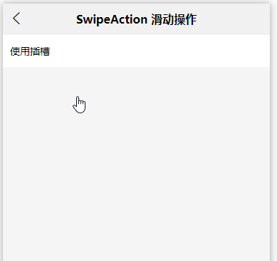
2、使用插槽自定义样式
<template>
	<view>
		<uni-swipe-action>
			<uni-swipe-action-item @click="bindClick">
				<template v-slot:left>
					<view class="slot-button">
						<text @click="bindClick({position:'left',content:{text:'置顶'}})">置顶</text>
					</view>
				</template>
				<view style="padding: 10px;background-color: white;">
					使用插槽
				</view>
				<template v-slot:right>
					<view class="slot-button">删除</view>
				</template>
			</uni-swipe-action-item>
		</uni-swipe-action>
	</view>
</template>

<script>
	export default {
		components: {},
		data() {
			return {
			};
		},
		methods:{
			bindClick(e) {
				uni.showToast({
					title: `点击了${e.position === 'left' ? '左侧' : '右侧'} ${e.content.text}按钮`,
					icon: 'none'
				});
			}
		}
	};
</script>
<style>
	.slot-button {
		display: flex;
		flex-direction: row;
		justify-content: center;
		align-items: center;
		padding: 0 20px;
		background-color: #ff5a5f;
	}
</style>
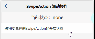
二、使用变量控制SwipeAction的开启状态
<template>
	<view>
		<button @click="setOpened">当前状态:{{isOpened}}</button>
		<uni-swipe-action>
			<uni-swipe-action-item :left-options="options" :right-options="options" :show="isOpened" :auto-close="false">
				<view class="content-box">
					<text>使用变量控制SwipeAction的开启状态</text>
				</view>
			</uni-swipe-action-item>
		</uni-swipe-action>
	</view>
</template>

<script>
	export default {
		components: {},
		data() {
			return {
				show: false,
				isOpened: 'none',
				options: [{
					text: 'haha'
				}]
			};
		},
		methods: {
			setOpened() {
				if (this.isOpened === 'none') {
					this.isOpened = 'left';
					return;
				}
				if (this.isOpened === 'left') {
					this.isOpened = 'right';
					return;
				}
				if (this.isOpened === 'right') {
					this.isOpened = 'none';
					return;
				}
			}
		}
	};
</script>
<style>
.content-box {
	flex: 1;
	height: 44px;
	line-height: 44px;
	padding: 0 15px;
	position: relative;
	background-color: #fff;
	border: 1px solid #f5f5f5;
}
</style>
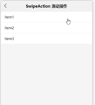
三、swipe-action 列表
<template>
	<view>
		<uni-swipe-action>
			<uni-swipe-action-item v-for="(item, index) in swipeList" :right-options="item.options" :key="item.id" @click="swipeClick($event, index)">
				<view class="content-box">
					<text>{{ item.content }}</text>
				</view>
			</uni-swipe-action-item>
		</uni-swipe-action>
	</view>
</template>

<script>
export default {
	components: {},
	data() {
		return {
			swipeList: [
				{
					id: 0,
					options: [
						{
							text: '添加',
							style: {
								backgroundColor: 'rgb(255,58,49)'
							}
						}
					],
					content: 'item1'
				},
				{
					id: 1,
					options: [
						{
							text: '置顶'
						},
						{
							text: '删除',
							style: {
								backgroundColor: 'rgb(255,58,49)'
							}
						}
					],
					content: 'item2'
				},
				{
					id: 2,
					options: [
						{
							text: '置顶'
						},
						{
							text: '标记为已读',
							style: {
								backgroundColor: 'rgb(254,156,1)'
							}
						},
						{
							text: '删除',
							style: {
								backgroundColor: 'rgb(255,58,49)'
							}
						}
					],
					content: 'item3'
				}
			]
		};
	},
	methods: {
		swipeClick(e, index) {
			let { content } = e;
			if (content.text === '删除') {
				uni.showModal({
					title: '提示',
					content: '是否删除',
					success: res => {
						if (res.confirm) {
							this.swipeList.splice(index, 1);
						} else if (res.cancel) {
							console.log('用户点击取消');
						}
					}
				});
			} else if (content.text === '添加') {
				if (this.swipeList.length < 6) {
					this.swipeList.push({
						id: new Date().getTime(),
						options: [
							{
								text: '置顶'
							},
							{
								text: '标记为已读',
								style: {
									backgroundColor: 'rgb(254,156,1)'
								}
							},
							{
								text: '删除',
								style: {
									backgroundColor: 'rgb(255,58,49)'
								}
							}
						],
						content: '新增' + new Date().getTime()
					});
					uni.showToast({
						title: `添加了一条数据`,
						icon: 'none'
					});
				} else {
					uni.showToast({
						title: `最多有六条数据`,
						icon: 'none'
					});
				}
			} else {
				uni.showToast({
					title: `点击了${e.content.text}按钮`,
					icon: 'none'
				});
			}
		}
	}
};
</script>
<style>
.content-box {
	flex: 1;
	height: 44px;
	line-height: 44px;
	padding: 0 15px;
	position: relative;
	background-color: #fff;
	border: 1px solid #f5f5f5;
}
</style>

华为开发者空间,是为全球开发者打造的专属开发空间,汇聚了华为优质开发资源及工具,致力于让每一位开发者拥有一台云主机,基于华为根生态开发、创新。
更多推荐


 14
14 0
0- 0


 已为社区贡献32条内容

所有评论(0)