css椭圆,椭圆边框
border-radius 允许你设置元素的外边框圆角。当使用一个半径时确定一个圆形,当使用两个半径时确定一个椭圆。这个圆与边框的交集形成圆角效果。css设置椭圆的方法:1、给元素添加“ {width:宽度值;height:高度值;}”样式,将元素设置为矩形;2、给矩形元素添加“ {border-radius:100%;}”圆角样式将其设置为椭圆即可。这种情况如果设置的高和宽是相等的,则图像为圆。
·
border-radius 允许你设置元素的外边框圆角。当使用一个半径时确定一个圆形,当使用两个半径时确定一个椭圆。这个圆与边框的交集形成圆角效果。
css设置椭圆的方法:
1、给元素添加“ {width:宽度值;height:高度值;}”样式,将元素设置为矩形;
2、给矩形元素添加“ {border-radius:100%;}”圆角样式将其设置为椭圆即可。这种情况如果设置的高和宽是相等的,则图像为圆。
border-radius 属性是一个最多可指定四个 border-*-radius 属性的复合属性
每个半径的四个值的顺序是:左上角,右上角,右下角,左下角。
如果省略左下角,右上角是相同的。如果省略右下角,左上角是相同的。如果省略右上角,左上角是相同的。
下面展示代码:
<!DOCTYPE html>
<html>
<head>
<meta charset="utf-8">
<style>
#example1 {
    border-radius: 50px/15px;
    background: #8AC007;
    padding: 20px;
    width: 200px;
    height: 150px;
}
#example2 {
    border-radius: 40px/50px;
    background: #8AC007;
    padding: 20px;
    width: 200px;
    height: 150px;
}

#example3 {
    border-radius: 100%;
    background: #8AC007;
    padding: 20px;
    width: 200px;
    height: 200px;
}
#example4 {
    border-radius: 50px 10px;
    background: #8AC007;
    padding: 20px;
    width: 200px;
    height: 200px;
}
#example5 {
    border-radius: 10px 50px;
    background: #8AC007;
    padding: 20px;
    width: 200px;
    height: 200px;
}
</style>
</head>
<body>

<p id="example1"></p>

<p id="example2"></p>

<p id="example3"></p>

<p id="example4"></p>

<p id="example5"></p>

</body>
</html>
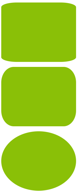

例一到例五结果如图所示主要就是了解前面所叙述的border-radius再加上练习即可。

华为开发者空间,是为全球开发者打造的专属开发空间,汇聚了华为优质开发资源及工具,致力于让每一位开发者拥有一台云主机,基于华为根生态开发、创新。
更多推荐


 5
5 0
0- 0


 已为社区贡献2条内容

所有评论(0)