
通过使用html的css样式来达到给背景色添加渐变色的效果
html设置颜色渐变的方法:首先创建一个HTML示例文件;然后使用div标签创建一个模块;接着在css标签内通过“id(colorchange)”来设置div样式;最后通过linear-gradient属性设置div,在前端网页开发的时候,往往会用到一些渐变色的效果,这样可以使得前端页面更加美观。那么这些渐变效果是如何用css代码实现出来的?本章就给大家带来css如何实现渐变效果? 第一份案例图及
第一步先写一个基础框架
<!DOCTYPE html>
<html>
	<head>
		<meta charset="utf-8">
		<title></title>
	</head>
	<body>
	</body>
</html>
第二步:接下来我们再里面写一些基本样式,方便我们看效果
<!DOCTYPE html>
<html>
	<head>
		<meta charset="utf-8">
		<title></title>
	</head>
	<style>
		div:first-of-type{
			width: 200px;
			height: 400px;
			background-color: antiquewhite;
			text-align: center;
			line-height: 400px;
		}

		div:last-of-type{
			width: 300px;
			height: 400px;
			background-color: aquamarine;
			text-align: center;
			line-height: 400px;
			float: right;
		}
	</style>
	<body>
			<div>我是第一个div</div>
			<div>我是第二个div</div>
	</body>
</html>
这里我直接添加了两个div,并且给两个div添加了基本的css样式,有问题请私信
第三步:准备工作已经做的差不多了,接下来我们开始演示
在演示开始之前我们先来认识一下实现渐变效果的一个属性 background: linear-gradient
这个是我们设置背景渐变色的关键属性,然后我们开始演示(这里我们通过修改第二个div)
第一种 如下
<!DOCTYPE html>
<html>
	<head>
		<meta charset="utf-8">
		<title></title>
	</head>
	<style>
		div:first-of-type{
			width: 200px;
			height: 400px;
			background-color: antiquewhite;
			text-align: center;
			line-height: 400px;
		}

		div:last-of-type{
			width: 300px;
			height: 400px;
			 background: linear-gradient(red,yellow);	/*变化在这里,background-color: aquamarine;这个是原本的 */
			text-align: center;
			line-height: 400px;
			float: right;
		}
	</style>
	<body>
			<div>我是第一个div</div>
			<div>我是第二个div</div>
	</body>
</html>
下方是效果图
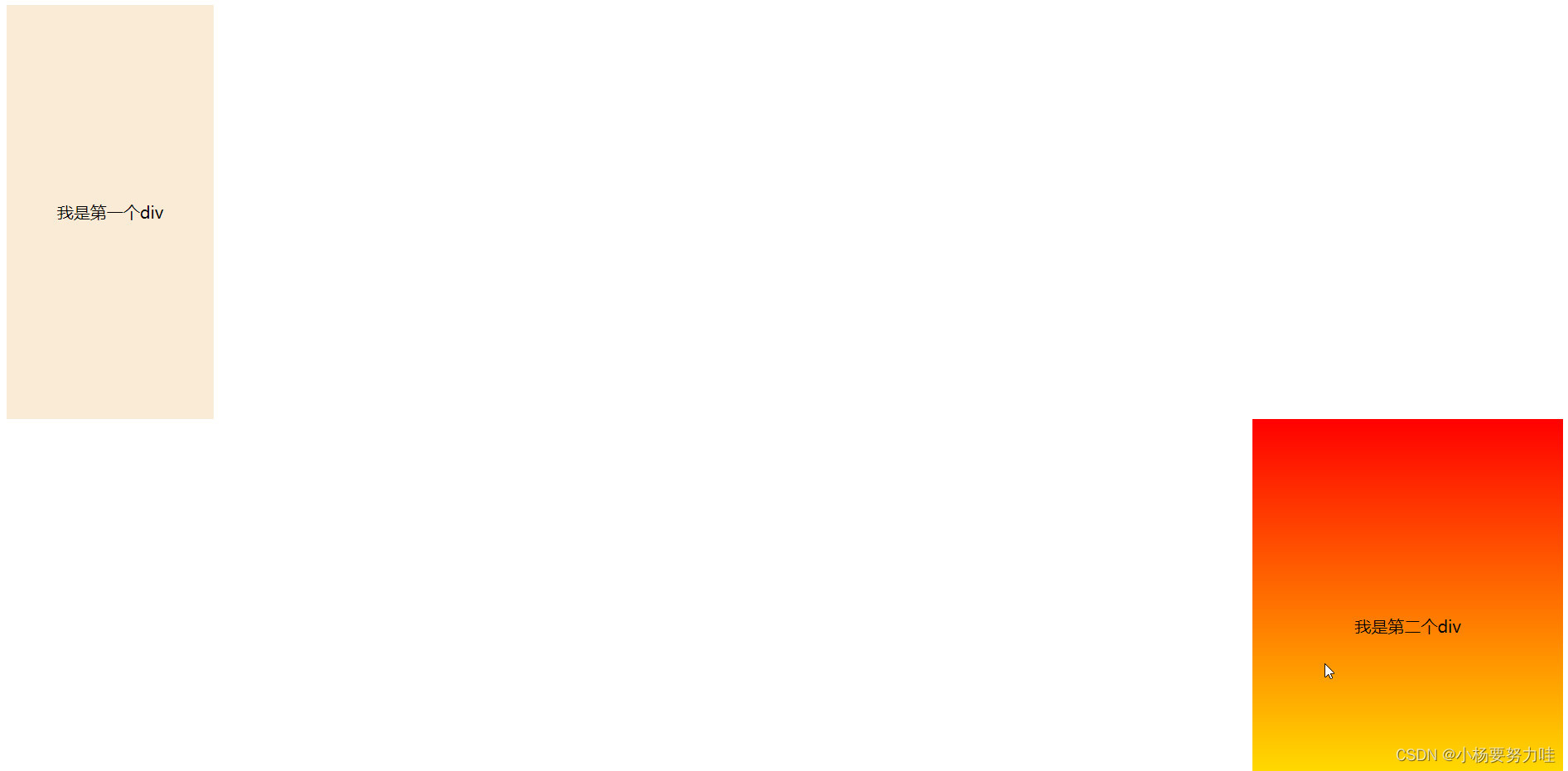
这里我们可以看到第二个div已经出现了渐变色的效果,background: linear-gradient()基本的语法就是在括号里加入你想实现渐变的颜色,用逗号连接
第二种(添加了一个to top(朝向哦))
<!DOCTYPE html>
<html>
	<head>
		<meta charset="utf-8">
		<title></title>
	</head>
	<style>
		div:first-of-type{
			width: 200px;
			height: 400px;
			background-color: antiquewhite;
			text-align: center;
			line-height: 400px;
		}

		div:last-of-type{
			width: 300px;
			height: 400px;
		    background: linear-gradient(to top, red,yellow);
			text-align: center;
			line-height: 400px;
			float: right;
		}
	</style>
	<body>
			<div>我是第一个div</div>
			<div>我是第二个div</div>
	</body>
</html>这里和上一个的区别就是添加了一个to top。下方是效果图
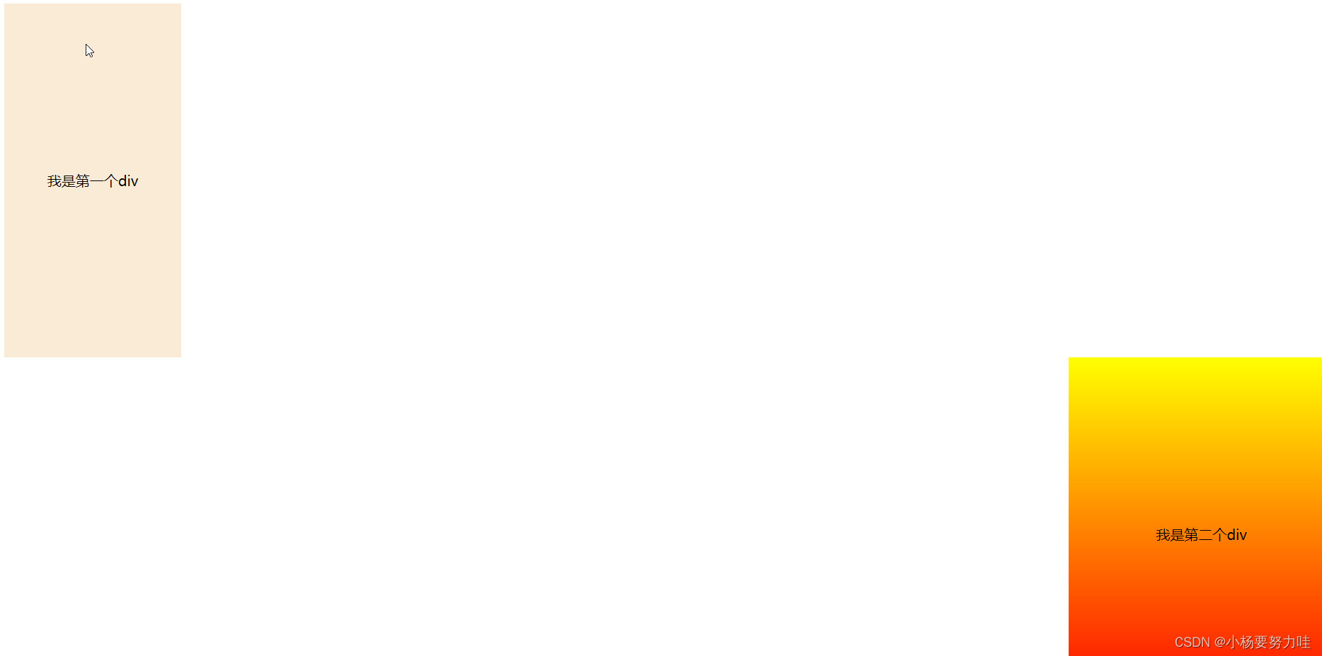
这里我们可以看见红色和黄色的位置换了,而原因就是因为设置了to top 改变了渐变的方向
第三种(这里我添加了一种颜色)
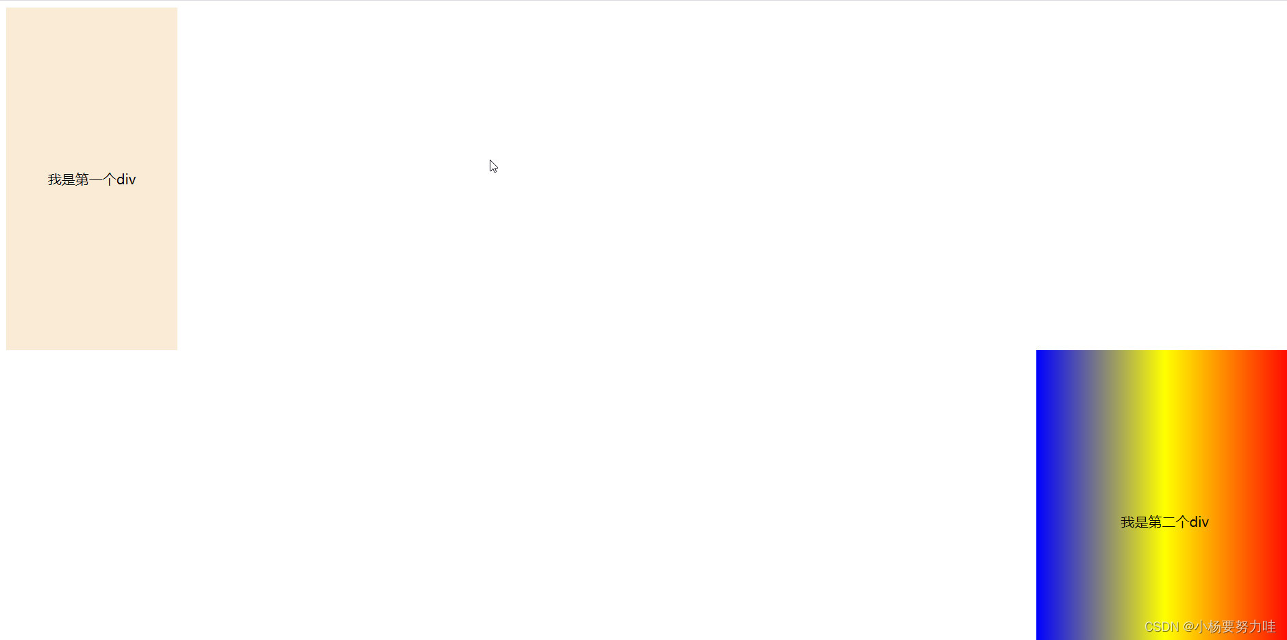
这里我们可以看见代码里我添加了方向to left 他颜色分布就是蓝,黄,红(这里单方向就不继续演示)
第四种(另一种角度)
<!DOCTYPE html>
<html>
	<head>
		<meta charset="utf-8">
		<title></title>
	</head>
	<style>
		div:first-of-type{
			width: 200px;
			height: 400px;
			background-color: antiquewhite;
			text-align: center;
			line-height: 400px;
		}

		div:last-of-type{
			width: 300px;
			height: 400px;
		    background: linear-gradient(to top right, red,yellow,blue);
			text-align: center;
			line-height: 400px;
			float: right;
		}
	</style>
	<body>
			<div>我是第一个div</div>
			<div>我是第二个div</div>
	</body>
</html>这里我们添加的方向是to top right ,那么他就会朝向右上方渐变
第五种
<!DOCTYPE html>
<html>
<head>
<meta charset="utf-8">
<title></title>
</head>
<style>
div:first-of-type{
width: 200px;
height: 400px;
background-color: antiquewhite;
text-align: center;
line-height: 400px;
}
div:last-of-type{
width: 300px;
height: 400px;
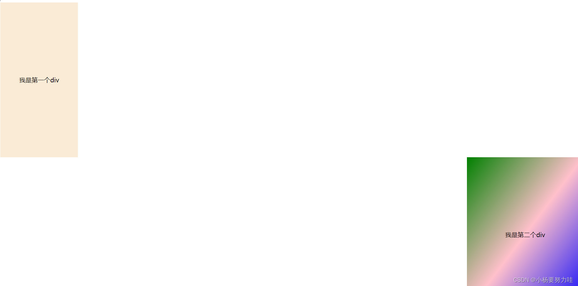
background: linear-gradient(to bottom right, green,pink,blue);
text-align: center;
line-height: 400px;
float: right;
}
</style>
<body>
<div>我是第一个div</div>
<div>我是第二个div</div>
</body>
</html>这里的方向是to bottom right ,那么他就会朝向右下方渐变
总结:添加渐变色必不可少的就是 background: linear-gradient 属性,其次就是如果你想设置某一方向渐变就在属性值里添加上方向记住是to 方向 方向(一个也可以)
悄悄话(这是1.0版本哦,后续还会继续更新完善)

为开发者提供学习成长、分享交流、生态实践、资源工具等服务,帮助开发者快速成长。
更多推荐


 26
26 0
0- 0


 已为社区贡献5条内容

所有评论(0)