element-ui中 Progress 圆形进度条 自定义文字 底色 圆角 文字颜色等修改
element-ui中Progress 圆形进度条 自定义文字 底色圆角文字颜色修改
·
vue中使用element-ui Progress 圆形进度条, 自定义文字 、底色、 圆角 、文字颜色等

1.圆形进度条底色修改,非底色修改官方文档中有说明。deep:样式穿透
    /deep/ .el-progress-circle__track {
      stroke: #EEEEEE;
    }
2.圆角修改 stroke-linecap=“square” ,stroke-linecp有三个值,分别为butt/round/square,默认值为round圆角模式
        <el-progress type="circle"  :percentage="25" :stroke-width="8"
         stroke-linecap="square" />
3.进度条中文字修改,有两种模式,如不需要添加复杂样式,可使用format属性自行添加样式
例:
  <el-progress type="circle"  :percentage="25" :stroke-width="8"
     stroke-linecap="square"  :format="format" />
methods: {
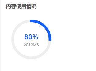
format(percentage) {
let tex = '2012MB'
return percentage + '%\n' + tex
},
}
 /deep/ .el-progress__text {
      white-space: pre;//使百分号与所添加文字换行
 }
4.如果需要给文字添加不同样式,需自定义文本内容
例:样式使用的less,可自行转换
      <div class="circleBox">
        <el-progress type="circle" :show-text="false" :percentage="25" :stroke-width="8"
        stroke-linecap="square" />
        <div class="textCenter">
          <div>80%</div>
          <span>2012MB</span>
        </div>
      </div>
    .circleBox {
      position: relative;
      text-align: center;
      width: 200px;
      margin: 40px 0;
      .circleCenter {
        position: absolute;
        top: 50%;
        left: 50%;
        transform: translate(-50%, -50%);
        div {
          font-size: 26px;
          color: #1360FB;
          font-weight: 600;
          margin-bottom: 5px;
        }
        span {
          font-size: 14px;
          color: #999999;
        }
      }
    }

为开发者提供学习成长、分享交流、生态实践、资源工具等服务,帮助开发者快速成长。
更多推荐


 11
11 0
0- 0


 已为社区贡献1条内容

所有评论(0)