html的文本框、按钮美化
input框和按钮美化input框美化按钮美化有时候一些后端人员,想写一个简单的表单验证的时候,前端美化问题是一个非常头疼的问题,我们直接用html的input标签和按钮会非常丑,这时候我们可以选择引入一些前端框架,例如:jQuery,layui等等,但是如果我们只是想做一个简单又好看的的表单验证,引用这些框架反而大材小用了,而且浪费内存,这时候小编就来给大家分享一个设置input属性非常实用的属
·
有时候一些后端人员,想写一个简单的表单验证的时候,前端美化问题是一个非常头疼的问题,我们直接用html的input标签和按钮会非常丑,这时候我们可以选择引入一些前端框架,例如:jQuery,layui等等,但是如果我们只是想做一个简单又好看的的表单验证,引用这些框架反而大材小用了,而且浪费内存,这时候小编就来给大家分享一个设置input属性非常实用的属性,不用引入框架也能设置出很好看的一些input框,按钮等组件,下面是效果图
input框美化
input框美化之后获得焦点之前: 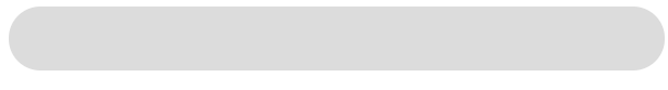
input框美化之后获得焦点之后: 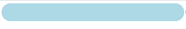
实现代码
主要通过设置input获得焦点之后的outline属性,来实现input框美化效果,下面是实现的 代码.
<!DOCTYPE html>
<html lang="en">
<head>
    <meta charset="UTF-8">
    <meta http-equiv="X-UA-Compatible" content="IE=edge">
    <meta name="viewport" content="width=device-width, initial-scale=1.0">
    <title>input框美化</title>
    <style>
        .inputText{
            width: 500px;
            height: 50px;
            line-height: 30px;
            font-size: 30px;
            padding-left: 30px;
            border-radius: 50px;
            background-color: gainsboro;
            border: none;
        }
        .inputText:focus{
            outline: none;//设置所有的轮廓属性为none
            background-color: lightblue;
        }
    </style>
</head>
<body>
    <input type="text" class="inputText">
</body>
</html>
按钮美化
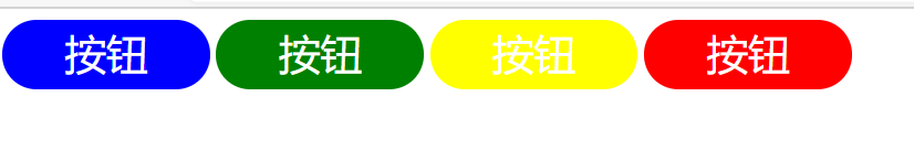
按钮效果图
<!DOCTYPE html>
<html lang="en">
<head>
    <meta charset="UTF-8">
    <meta http-equiv="X-UA-Compatible" content="IE=edge">
    <meta name="viewport" content="width=device-width, initial-scale=1.0">
    <title>按钮框美化</title>
    <style>
        .btn{
            width: 150px;
            height: 50px;
            border: none;
            background-color: green;
            line-height: 50px;
            font-size: 30px;
            text-align: center;
            color: white;
            border-radius: 50px;
        }
        .btn:focus{
            outline: none;
        }
        .btn-primary{
            background-color: blue;
        }
        .btn-success{
            background-color: green;
        }
        .btn-warning{
            background-color: yellow;
        }
        .btn-danger{
            background-color: red;
        }
    </style>
</head>
<body>
    <input type="button" value="按钮" class="btn btn-primary">
    <input type="button" value="按钮" class="btn btn-success">
    <input type="button" value="按钮" class="btn btn-warning">
    <input type="button" value="按钮" class="btn btn-danger">
</body>
</html>

为开发者提供学习成长、分享交流、生态实践、资源工具等服务,帮助开发者快速成长。
更多推荐


 8
8 0
0- 0


 已为社区贡献1条内容

所有评论(0)