漫天流星特效html和css动态效果(附代码)
漫天流星效果如下图:文件目录:html代码如下:index.html<!DOCTYPE html><html><head><meta charset="utf-8"><title>漫天流星雨</title><link rel="stylesheet" type="text/css" href="index.css"/&g
·
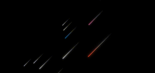
漫天流星
效果如下图:
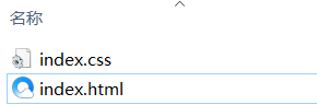
文件目录:
html代码如下:
index.html
<!DOCTYPE html>
<html>
	<head>
		<meta charset="utf-8">
		<title>漫天流星雨</title>
		<link rel="stylesheet" type="text/css" href="index.css"/>
	</head>
	<body>

		<div class="container">
			<div class="line" style="--color:#ec3e27;--x:3;--z:3;--d:1;"></div>
			<div class="line" style="--color:#fff;--x:3;--z:2;--d:2;"></div>
			<div class="line" style="--color:#fff;--x:4;--z:1;--d:3;"></div>
			<div class="line" style="--color:#fd79a8;--x:4;--z:0;--d:1;"></div>
			<div class="line" style="--color:#fff;--x:6;--z:-1;--d:2;"></div>
			<div class="line" style="--color:#0984e3;--x:6;--z:-2;--d:3;"></div>
			<div class="line" style="--color:#fff;--x:8;--z:-3;--d:1;"></div>
			<div class="line" style="--color:#fff;--x:10;--z:-4;--d:2;"></div>
			<div class="line" style="--color:#fff;--x:12;--z:-5;--d:3;"></div>
			<div class="line" style="--color:#fff;--x:14;--z:-6;--d:1;"></div>
			<div class="line" style="--color:#fff;--x:16;--z:-7;--d:2;"></div>
			<div class="line" style="--color:#fff;--x:18;--z:-8;--d:3;"></div>
			<div class="line" style="--color:#e056fd;--x:20;--z:-9;--d:1;"></div>


		</div>
	</body>
</html>
css代码如下:
index.css
:root {
	--background-color: #2c3e50;
	--border-color: #7591AD;
	--text-color: #34495e;
	--color1: #ec3e27;
	--color2: #fd79a8;
	--color3: #0984e3;
	--color4: #00b894;
	--color5: #fdcb6e;
	--color6: #e056fd;
	--color7: #F97F51;
	--color8: #BDC581;
}

* {
	margin: 0;
	padding: 0;
}

html {
	font-size: 14px;
}

body {
	width: 100vw;
	height: 100vh;
	background-color: var(--background-color);
	display: flex;
	justify-content: center;
	align-items: center;
	/* font-family: 'Times New Roman', Times, serif; */
}

.channel {
	position: absolute;
	width: 80%;
	text-align: center;
	top: 50%;
	left: 50%;
	transform: translate(-50%, -200px);
	font-size: 30px;
	font-weight: bold;
	color: #fff;
	z-index: 999;
}

.container {
	position: relative;
	width: 100vw;
	height: 100vh;
	background-color: #000;
	overflow: hidden;
	display: flex;
	justify-content: center;
	align-items: center;
	perspective: 800px;
	/* perspective-origin: left bottom; */
	transform-style: preserve-3d;

}

.line {
	position: absolute;
	width: 200px;
	height: 3px;
	border-radius: 3px;
	/* background-color: #fff; */
	background-image: linear-gradient(to right, var(--color), #ffffff50, transparent);
	animation: down 1s linear infinite both;
	animation-delay: calc(var(--d) * 0.3s);

}

.line::before,
.line::after {
	position: absolute;
	content: "";
	width: inherit;
	height: inherit;
	background-image: inherit;

}

.line::before {
	filter: blur(5px);
}

.line::after {
	filter: blur(10px);
}


@keyframes down {
	0% {
		transform: translateY(calc(var(--z) * 60px))
		translateZ(calc(var(--z) * 100px))
		rotate(-45deg)
		translateX(calc(var(--x) * 100px));
	}
	100% {
		transform: translateY(calc(var(--z) * 60px))
		 translateZ(calc(var(--z) * 100px))
		 rotate(-45deg)
		 translateX(calc(var(--x) * -100px));

	}
}


为开发者提供学习成长、分享交流、生态实践、资源工具等服务,帮助开发者快速成长。
更多推荐


 37
37 0
0- 0


 已为社区贡献8条内容

所有评论(0)