【PYTHON】绘制热力图SEABORN.HEATMAP
python程序中searborn热成像出图及参数及定义
根据excel或者csv文件读取到的数据转置为DataFrame格式后再使用的一种searborn库包。
示例代码:
"""此程序为linux系统运行,所读文件的分隔符与Windows有所区别"""

import pandas as pd
import seaborn as sns
import matplotlib.pyplot as plt

fon='/root/python/csv/附件1 弱覆盖栅格数据(筛选).csv'
df = pd.read_csv(fon)
df_array = df.pivot('x','y','traffic')  # 此处为所读文件字段名

# heatmap = sns.heatmap(df_array,vmin=0,vmax=500)
heatmap = sns.heatmap(df_array)
plt.show()
1. 参数详解
seaborn.heatmap()
seaborn.heatmap(data, vmin=None, vmax=None, cmap=None, center=None, robust=False, annot=None, fmt='.2g', annotkws=None, linewidths=0, linecolor='white', cbar=True, cbarkws=None, cbar_ax=None, square=False, ax=None, xticklabels=True, yticklabels=True, mask=None, **kwargs)
- data:矩阵数据集,可以使numpy的数组(array),如果是pandas的dataframe,则df的index/column信息会分别对应到heatmap的columns和rows
- vmax,vmin, 图例中最大值和最小值的显示值,没有该参数时默认不显示
- linewidths,热力图矩阵之间的间隔大小
- cmap,热力图颜色
- ax,绘制图的坐标轴,否则使用当前活动的坐标轴。
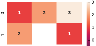
- annot,annotate的缩写,annot默认为False,当annot为True时,在heatmap中每个方格写入数据。
- annot_kws,当annot为True时,可设置各个参数,包括大小,颜色,加粗,斜体字等:
sns.heatmap(x, annot=True, ax=ax2, annot_kws={'size':9,'weight':'bold', 'color':'blue'})- fmt,格式设置,决定annot注释的数字格式,小数点后几位等;
- cbar : 是否画一个颜色条
cbar_kws : 颜色条的参数,关键字同 fig.colorbar,可以参考:matplotlib自定义colorbar颜色条-以及matplotlib中的内置色条。
mask,遮罩
使用小技巧:
(1)先用sns.set(font_scale)修改字体比例:
sns.set(font_scale=1.5)(2)再用plt.rc对全图字体进行统一修改:
plt.rc('font',family='Times New Roman',size=12)2. 颜色参数-cmap
cmap的参数如下:
Accent, Accent_r, Blues, Blues_r, BrBG, BrBG_r, BuGn, BuGn_r, BuPu, BuPu_r, CMRmap, CMRmap_r, Dark2, Dark2_r, GnBu(绿到蓝), GnBu_r, Greens, Greens_r, Greys, Greys_r, OrRd(橘色到红色), OrRd_r, Oranges, Oranges_r, PRGn, PRGn_r, Paired, Paired_r, Pastel1, Pastel1_r, Pastel2, Pastel2_r, PiYG, PiYG_r, PuBu, PuBuGn, PuBuGn_r, PuBu_r, PuOr, PuOr_r, PuRd, PuRd_r, Purples, Purples_r, RdBu, RdBu_r, RdGy, RdGy_r, RdPu, RdPu_r, RdYlBu, RdYlBu_r, RdYlGn, RdYlGn_r, Reds, Reds_r, Set1, Set1_r, Set2, Set2_r, Set3, Set3_r, Spectral, Spectral_r, Wistia(蓝绿黄), Wistia_r, YlGn, YlGnBu, YlGnBu_r, YlGn_r, YlOrBr, YlOrBr_r, YlOrRd(红橙黄), YlOrRd_r, afmhot, afmhot_r, autumn, autumn_r, binary, binary_r, bone, bone_r, brg, brg_r, bwr, bwr_r, cividis, cividis_r, cool, cool_r, coolwarm(蓝到红), coolwarm_r, copper(铜色), copper_r, cubehelix, cubehelix_r, flag, flag_r, gist_earth, gist_earth_r, gist_gray, gist_gray_r, gist_heat, gist_heat_r, gist_ncar, gist_ncar_r, gist_rainbow, gist_rainbow_r, gist_stern, gist_stern_r, gist_yarg, gist_yarg_r, gnuplot, gnuplot2, gnuplot2_r, gnuplot_r, gray, gray_r, hot, hot_r(红黄), hsv, hsv_r, icefire, icefire_r, inferno, inferno_r, jet, jet_r, magma, magma_r, mako, mako_r, nipy_spectral, nipy_spectral_r, ocean, ocean_r, pink, pink_r, plasma, plasma_r, prism, prism_r, rainbow, rainbow_r, rocket, rocket_r, seismic, seismic_r, spring, spring_r, summer (黄到绿), summer_r (绿到黄), tab10, tab10_r, tab20, tab20_r, tab20b, tab20b_r, tab20c, tab20c_r, terrain, terrain_r, twilight, twilight_r, twilight_shifted, twilight_shifted_r, viridis, viridis_r, vlag, vlag_r, winter, winter_r
示范如下:
cmap="hot":黄色到红色,数字越大,颜色越浅
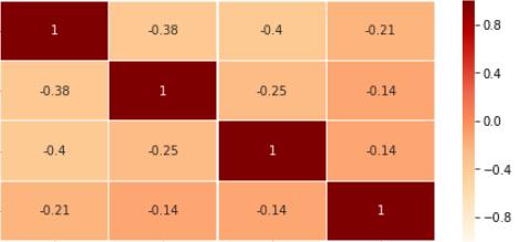
cmap="OrRd":深红色到浅红色,类似“Oranges”。
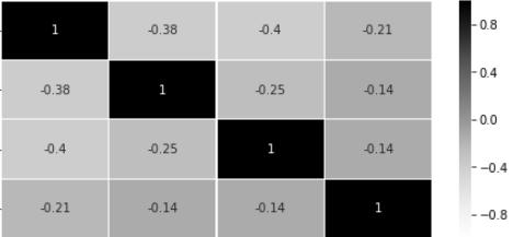
cmap="greys":灰色
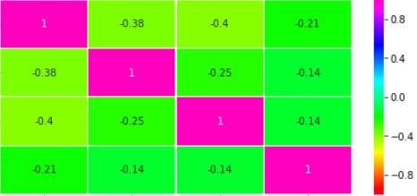
cmap="gist_rainbow":彩虹色
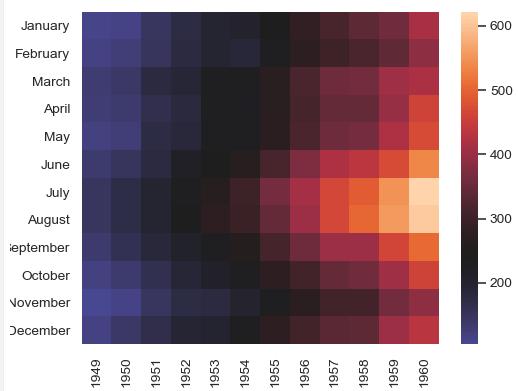
将colormap置于特定值的中心(参考链接):
>>> ax = sns.heatmap(flights, center=flights.loc["January", 1955])
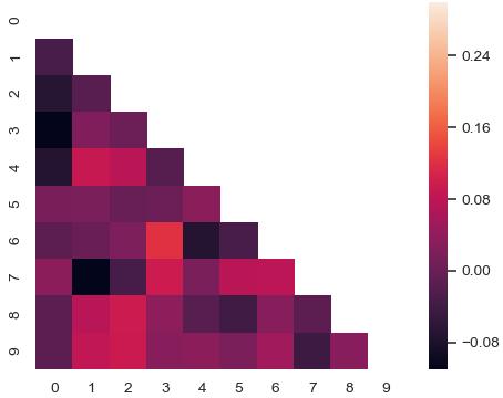
使用遮罩绘制矩阵中的一部分
-
>>> corr = np.corrcoef(np.random.randn(10, 200)) -
>>> mask = np.zeros_like(corr) -
>>> mask[np.triu_indices_from(mask)] = True -
>>> with sns.axes_style("white"): -
... ax = sns.heatmap(corr, mask=mask, vmax=.3, square=True)
np.zeros_like() 返回一个零数组,其形状和类型与给定的数组相同;
np.triu_indices_from(mask) 返回数组上三角形的索引。
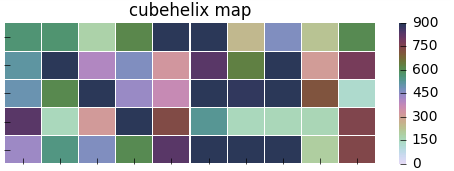
以下是一些网络上发现的配色好看的图:
原文链接: python如何实现可视化热力图-Python教程-PHP中文网
# cmap用cubehelix map颜色
cmap = sns.cubehelix_palette(start = 1.5, rot = 3, gamma=0.8, as_cmap = True)
sns.heatmap(pt, linewidths = 0.05, ax = ax1, vmax=900, vmin=0, cmap=cmap)
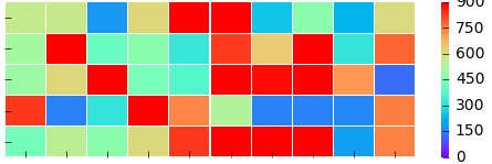
# cmap用matplotlib colormap
sns.heatmap(pt, linewidths = 0.05, ax = ax2, vmax=900, vmin=0, cmap='rainbow')
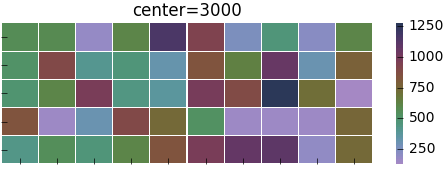
#center的用法(颜色)
f, (ax1,ax2) = plt.subplots(figsize = (6, 4),nrows=2)
cmap = sns.cubehelix_palette(start = 1.5, rot = 3, gamma=0.8, as_cmap = True)
sns.heatmap(pt, linewidths = 0.05, ax = ax1, cmap=cmap, center=None )
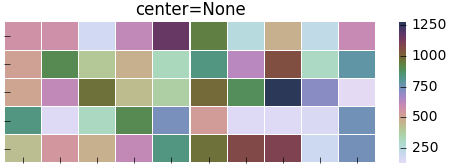
#设置x轴图例为空值ax1.set_ylabel('kind')
# 当center设置小于数据的均值时,生成的图片颜色要向0值代表的颜色一段偏移
sns.heatmap(pt, linewidths = 0.05, ax = ax2, cmap=cmap, center=200)
#robust的用法(颜色)
f, (ax1,ax2) = plt.subplots(figsize = (6,4),nrows=2)
cmap = sns.cubehelix_palette(start = 1.5, rot = 3, gamma=0.8, as_cmap = True)
sns.heatmap(pt, linewidths = 0.05, ax = ax1, cmap=cmap, center=None, robust=False )
sns.heatmap(pt, linewidths = 0.05, ax = ax2, cmap=cmap, center=None, robust=True )

#mask对某些矩阵块的显示进行覆盖
p2 = sns.heatmap(pt, ax=ax2, cmap=cmap, xticklabels=True, mask=(pt<800))
#mask对pt进行布尔型转化,结果为True的位置用白色覆盖
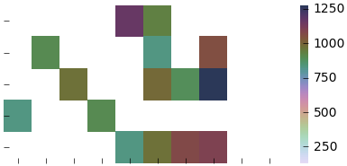
用mask实现:突出显示某些数据
sns.heatmap(x, mask=x < 1, ax=ax2, annot=True, annot_kws={"weight":"bold"}) #把小于1的区域覆盖掉
3. 个性化设置
个性化设置参考:Python - Seaborn可视化:图形个性化设置的几个小技巧
将x轴刻度放置在top位置的几种方法
-
# 将x轴刻度放置在top位置的几种方法 -
# ax.xaxis.set_ticks_position(‘top‘) -
ax.xaxis.tick_top() -
# ax.tick_params(axis=‘x‘,labelsize=6, colors=‘b‘, labeltop=True, labelbottom=False)
设置坐标轴刻度参数,”axis”不写的时候,默认是x轴和y轴的参数同时调整。
-
# 设置坐标轴刻度的字体大小 -
# matplotlib.axes.Axes.tick_params -
ax.tick_params(axis=‘y‘,labelsize=8) # y轴
旋转轴刻度上文字方向的两种方法
-
# 旋转轴刻度上文字方向的两种方法 -
ax.set_xticklabels(ax.get_xticklabels(), rotation=-90) -
# ax.set_xticklabels(corr.index, rotation=90)
更多请见:
设置Matplotlib颜色条大小以匹配图形(Set Matplotlib colorbar size to match graph)
4. 代码备份
'''
深入挖掘
'''
font = {'family': 'Times New Roman',
        'size': 12,
        }
sns.set(font_scale=1.2)
plt.rc('font',family='Times New Roman')


fig = plt.figure(figsize = (16, 12))
ax1=fig.add_subplot(2,1,1)
cor = SubShowFeatures01.corr()
mask = np.zeros_like(cor)
for i in range(len(mask)):
    for j in range(i+1, len(mask[0])):
        mask[i][j] = True

sns.heatmap(cor,linewidths = 0.05, ax=ax1, mask=mask, annot=True, annot_kws=font, vmax=1.0, vmin=-1.0, cmap='YlGnBu', center=0.5,
            cbar=True, robust=False)
ax1.set_title('User metric features', fontdict=font)

ax2=fig.add_subplot(2,1,2)
SubShowFeatures02 = pd.DataFrame({"Label":FerFeatures.Label, "PEM":FerFeatures.PEM, "PVAL":FerFeatures.PVAL, "NVAL":FerFeatures.NVAL,
                            "NEM":FerFeatures.NEM, "DEP":FerFeatures.DEP, "AGR":FerFeatures.AGR, "CONV":FerFeatures.CONV,
                            "Cold":FerFeatures.Cold, "Warm":FerFeatures.Warm, "Pleasure":FerFeatures.Pleasure,
                            "Arousal":FerFeatures.Arousal, "Dominance":FerFeatures.Dominance
                           })
cor = SubShowFeatures02.corr()
mask = np.zeros_like(cor)
for i in range(len(mask)):
    for j in range(i+1, len(mask[0])):
        mask[i][j] = True
sns.heatmap(cor,linewidths = 0.05, ax=ax2, mask=mask, annot=True, annot_kws=font, vmax=1.0, vmin=-1.0, cmap='YlOrRd', center=0)
ax2.set_title('User personality features', fontdict=font)

plt.show()
为开发者提供学习成长、分享交流、生态实践、资源工具等服务,帮助开发者快速成长。
更多推荐


 7
7 0
0- 0


 已为社区贡献2条内容

所有评论(0)