Python的数据科学函数包(三)——matplotlib(plt)
https://github.com/skyerhxx/01-/tree/master/%E6%B5%8B%E8%AF%95%E6%95%B0%E6%8D%AE
Matplotlib是Python最著名的2D绘图库
opencv要比PIL, plt的速度更快一些
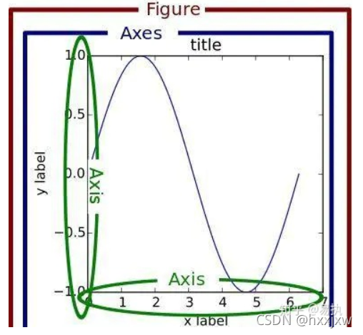
matplotlib中一张图的具体构造
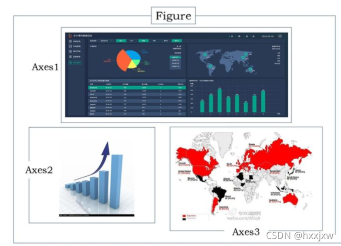
如果将Matplotlib绘图和我们平常画画相类比,可以把Figure想象成一张纸(一般被称之为画布),Axes代表的则是纸中的一片区域(当然可以有多个区域,这是后续要说到的subplots)
图例指的就是
0. matplotlib的两种绘图方式
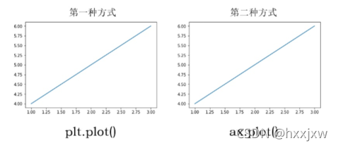
matplotlob有两种绘图方式,即 plt.plot()和ax.plot()
plt
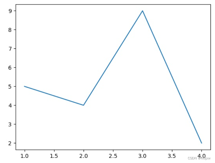
# 第一种方式
plt.figure()
plt.plot([1,2,3],[4,5,6])
plt.show()
即会画(1,4),(2,5),(3,6)三个点
ax
# 第二种方式
fig,axs = plt.subplots()
axs.plot([1,2,3],[4,5,6])
plt.show()
绘图效果如下
可以看到,不论是用
plt.plot()还是ax.plot(),结果都是一样的那区别在哪里?
从第一种方式的代码来看,先生成了一个
Figure画布,然后在这个画布上隐式生成一个画图区域进行画图。第二种方式同时生成了
Figure和axes两个对象,然后用ax对象在其区域内进行绘图如果从面向对象编程(对理解Matplotlib绘图很重要)的角度来看,显然第二种方式更加易于解释,生成的fig和ax分别对画布Figure和绘图区域Axes进行控制,第一种方式反而显得不是很直观,如果涉及到子图零部件的设置,用第一种绘图方式会很难受。
在实际绘图时,也更推荐使用第二种方式
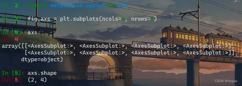
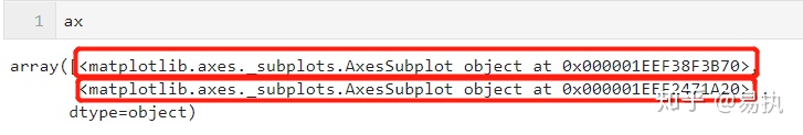
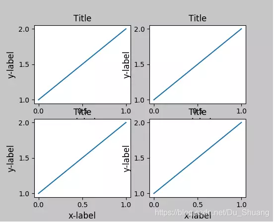
plt.subplots可以指定行数和列数
然后返回的axs就是一个矩阵,分别对应着2*4=8张图
然后比如想在[0,0]上画图的话就
axs[0][0].inshow()
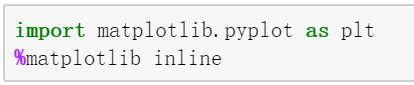
1、让matplotlib画的图在jupyter notebook中显示出来 %matplotlib inline
2、绘图
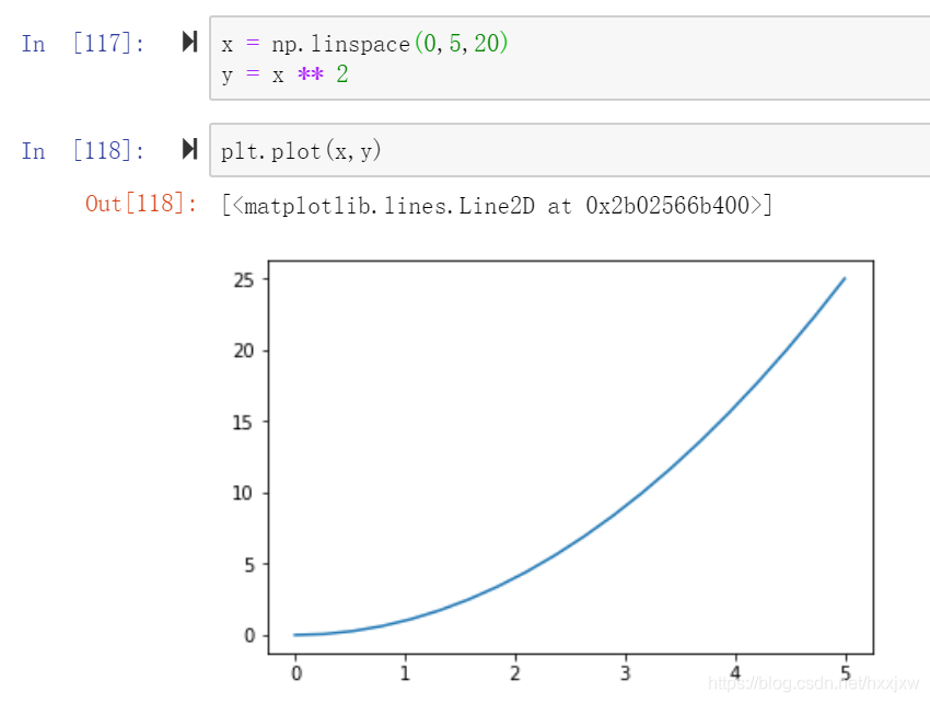
plt.plot(x,y)
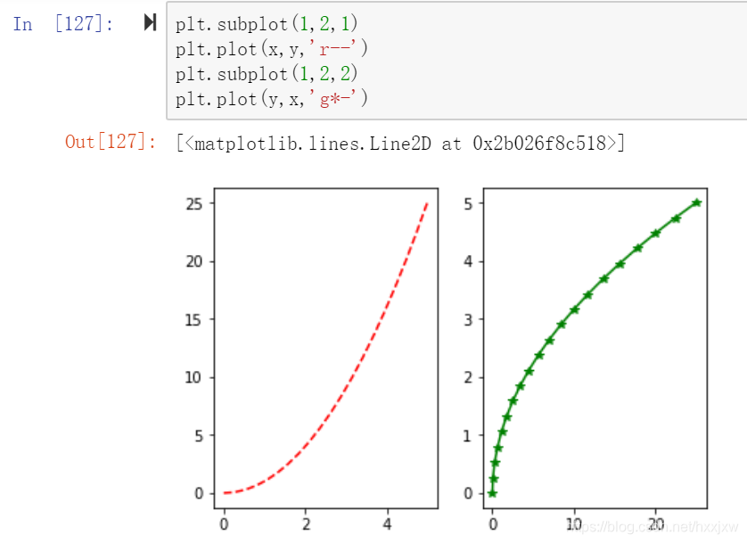
3、画多幅图/子图 sublplot
另一种方式
假如现在我要在一张纸上左边画一个折线图,右边画一个散点图,该如何画呢?
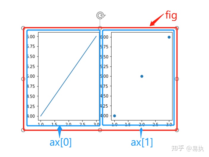
首先要有一个画布
Figure,其次,需要有两个区域Axes(等价于两个子图subplot)来画图# 生成画布和axes对象 # nrows=1和ncols=2分别代表1行和两列 fig,ax = plt.subplots(nrows=1,ncols=2) 或 fig,ax = plt.subplots(nrows=1,ncols=2, figsize=(50,30))子图控制大小的话用plt.figure(figsize=())是不管用的
因为这里有两个画图区域,所以
ax对应的是一个列表,存储了两个Axes对象。
然后分别控制左边和右边的绘图区域进行绘图
fig,ax = plt.subplots(nrows=1,ncols=2)
ax[0].plot([1,2,3],[4,5,6])
ax[1].scatter([1,2,3],[4,5,6])
其实到这里了也会发现,一个
Axes对象对应了一个subplot子图,这些个子图都是画在同一个画布Figure之上。子图调整间距/距离
#wspace 子图横向间距, hspace 代表子图间的纵向距离
plt.subplots_adjust(wspace=0, hspace=0)#调整子图间距设置坐标轴和标签的距离
plt.xlabel("特征",labelpad=8.5)即设置这块的距离
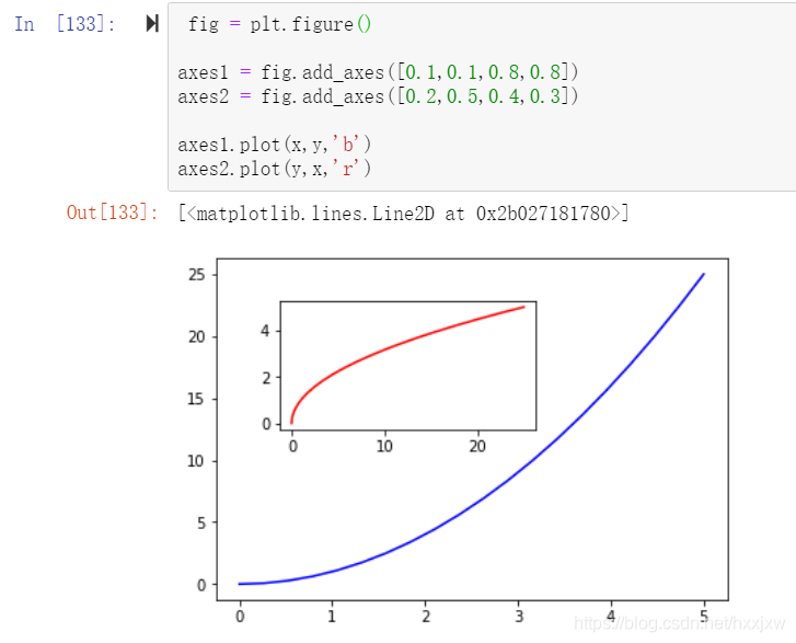
3. 一个画布上画多个图
plt.figure()是画布句柄
fig = plt.figure() 是在告诉你我准备画画了,现在已经有一块木头的画板已经立起来了
plt.figure(figsize=(a, b)) ,画布的长宽是a,b,单位是inch
axes1 = fig.add_axes([0.1,0.1,0.8,0.8]) 是说我在木头的画板上已经贴了一张纸了,这张纸距离左边框10%的单位,距离右边框,10%的单位,总长度80%的单位,总宽度80%的单位
axes2 = fig.add_axes([0.2,0.5,0.4,0.3]) 然后再贴第2张纸然后说每张纸上画什么
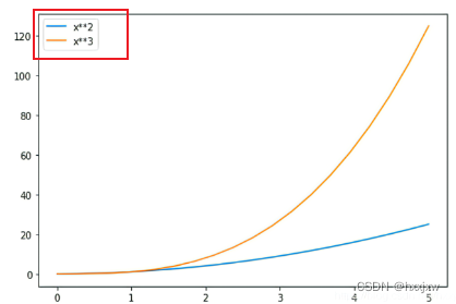
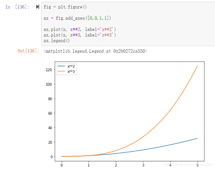
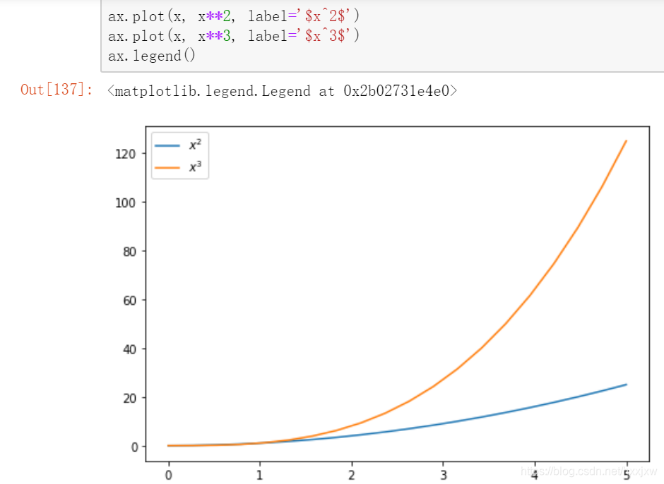
一张图上画多条线 + 图例
LaTex数学排版语言,python里面也能用
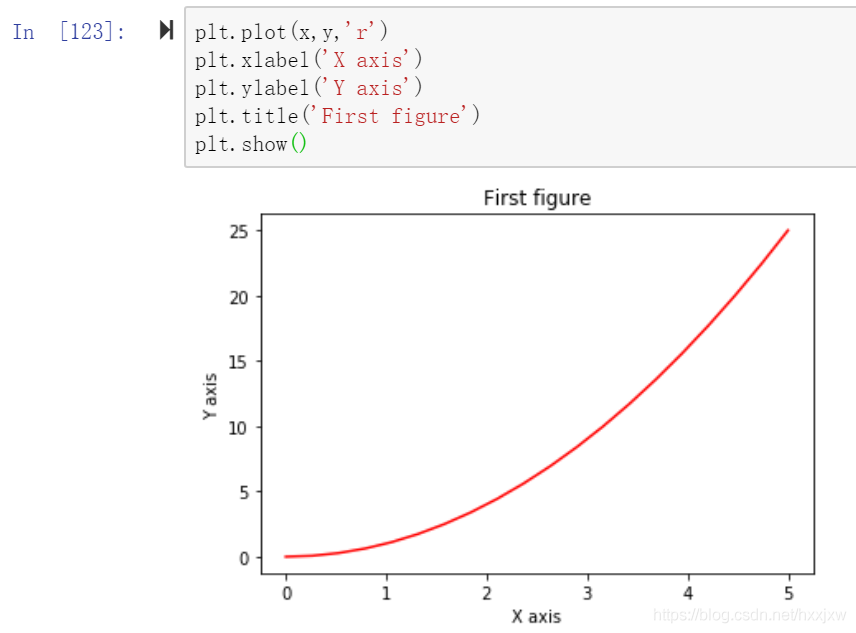
4. plt.title() 设置图像标题
plt.title('First figure')

plt.title('First figure', fontsize=10)
或者
设置主标题和子标题的话,好像只有ax的形式可以
fig,ax = plt.subplots(nrows=1,ncols=2)
fig.suptitle(i+'.jpg')  #设置整个图的主标题
ax[0].set_title('landmark')  #设置各个图的子标题
ax[0].imshow(plt.imread(dir_landmark+i+'.jpg'))
ax[1].set_title('benchmark')  #设置各个图的子标题
ax[1].imshow(plt.imread(dir_benchmark+i+'.jpg'))
将标题title放置在图下方
plt.title("your title name", y=-0.1)太长的话可以换行
plt.title("标题的第一行\n标题的第二行")子图设置主标题
plt.suptitle()
for i in range(1,5):
    # show top 12 feature maps
    plt.figure()
    for num in range(12):
        ax = plt.subplot(3, 4, num+1) #一共有3行4列,当前图画在第几张
        plt.imshow(layer_dict[i][0][0][num])
    plt.show()
    plt.suptitle(str(layer_dict[i][0][0].shape))
    plt.savefig(f"layer{i}_output.jpg")
title设置不同字体形式
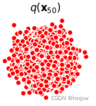
axs[j,k].set_title('$q(\mathbf{x}_{'+str(i*num_steps//num_shows)+'})$')5. plt.xlabel() / plt.ylabel() 设置x轴和y轴名称 / 坐标轴标签
横轴名称  plt.xlabel('X axis')
纵轴名称  plt.ylabel('Y axis')
如果是子图
横轴名称  ax.set_xlabel('X axis')
纵轴名称  ax.set_ylabel('Y axis')
太长的可以换行
横轴名称 ax.set_xlabel('X axis\ncolor')6. plt.plot(x,y,'r') 改变线条颜色
plt.plot(x,y,'r')6、plt读取图片
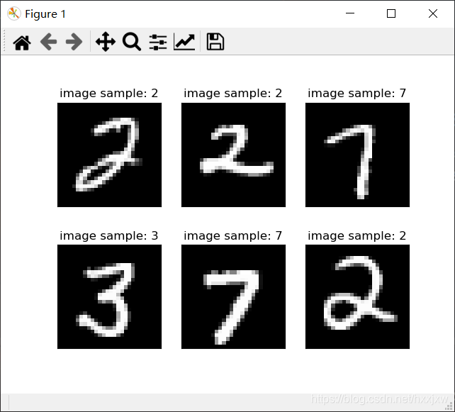
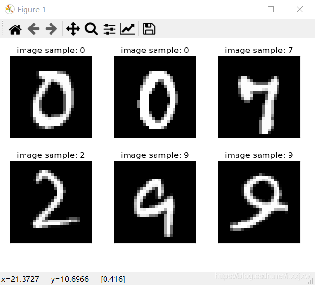
plt.imread("")6、plt.imshow() 显示图片
img的shape要是[h,w,c]
控制台打印出图像对象的信息,而图像没有显示
import matplotlib.pyplot as plt
plt.imshow(img)
图像显示,使用show函数解决
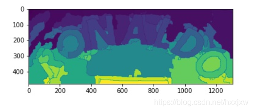
import matplotlib.pyplot as plt

plt.imshow(img)
plt.show()
plt.imshow()有一个cmap参数,即指定颜色映射规则。默认的cmap即颜料板是十色环
哪怕是单通道图,值在0-1之间,用plt.imshow()仍然可以显示彩色图,就是因为颜色映射的关系
而用cv2.imshow()就只能显示这样
而且可以直接用plt.imshow()显示PIL的图片
plt.imshow()显示的图片会自动带上图例等标注
显示灰度图
import matplotlib.pyplot as plt

plt.imshow(img, cmap='gray')
plt.show()
在同一个图中显示两张图片
plt.figure()
plt.subplot(1,2,1)
plt.imshow(plt.imread(dir_landmark+i+'.jpg'))
plt.subplot(1,2,2)
plt.imshow(plt.imread(dir_benchmark+i+'.jpg'))
或
fig,ax = plt.subplots(nrows=1,ncols=2)
ax[0].imshow(plt.imread(dir_landmark+i+'.jpg'))
ax[1].imshow(plt.imread(dir_benchmark+i+'.jpg'))
plt.savefig('middle_result/'+i+'.jpg', dpi=300)
dpi 确定了图形每英寸包含的像素数,图形尺寸相同的情况下, dpi 越高,则图像的清晰度越高
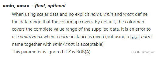
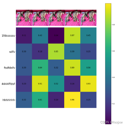
plt.imshow()可以通过vmin和vmax参数指定color的范围
如何使用matplotlib imshow()更改每个颜色的vmin和vmax - 程序员大本营 (pianshen.com)
像正常的话 plt.imshow(similarity)
如果是 plt.imshow(similarity, vmin=0.1, vmax=0.3)
比0.3大的一律按0.3的颜色来画; 比0.1小的一律按0.1的颜色来画
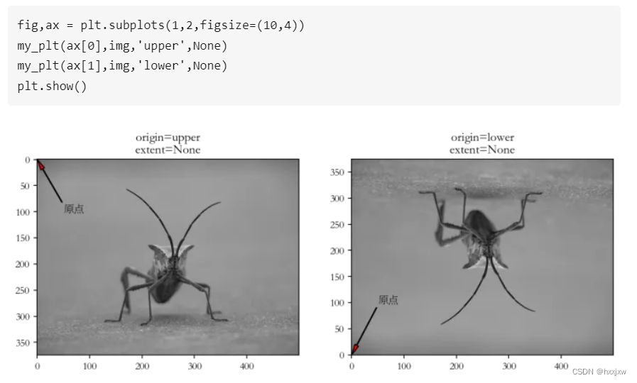
origin 和 extent 参数
imshow() 可以将图像的 2D 或 3D RGB(A) 数组映射到到 figure 的 axes 中,最终映射的方向由 origin 和 extent 参数控制.
origin 决定图的正常显示还是倒着显示。
- upper,图像正常显示,原点位置在左上角,默认。
- lower, 图像倒着显示,原点位置在左下角。
extent 参数把呈现出的图像的“左”、“右”、“下”、“上”,设定到特定的 axis 坐标上。
Matplotlib进阶教程(2.7)imshow 的 origin 与 extent 参数 - 知乎
7. plt.savefig() 保存图片
plt.savefig('img.jpg')也是会自动带上图例标注。如果是标准保存图片不要用这个操作
保存时设置分辨率
plt.savefig('img.jpg', dpi=300)未设置之前
设置了之后,清晰了很多
保存时设置大小
保存的时候可能会出现这种情况
这样的话需要设置一下图片大小才行。设置图片大小需要在plt.figure()的时候设定
fig = plt.figure(figsize=(13,10),dpi=90)
figsize的10,8单位是英尺(1英尺=30cm)
6、plt.plot()和plt.scatter()的区别,还有plt.figure(), plt.hist(), plt.imshow()
scatter绘制散点,plot绘制经过点的曲线。imshow()是显示图片
plt.figure() 定义画布大小
plt.hist() 绘制直方图
直方图是一种特殊的柱状图
将统计值的范围分段,即将整个值的范围分成一系列间隔,然后计算每个间隔中有多少值。
plt.hist(x, bins=None, range=None, density=None, weights=None, cumulative=False, bottom=None, histtype='bar', align='mid', orientation='vertical', rwidth=None, log=False, color=None, label=None, stacked=False, normed=None, *, data=None, **kwargs)
- x: 作直方图所要用的数据,必须是一维数组;多维数组可以先进行扁平化再作图;必选参数;
- bins: 直方图的柱数,即要分的组数,默认为10;
- range:元组(tuple)或None;剔除较大和较小的离群值,给出全局范围;如果为None,则默认为(x.min(), x.max());即x轴的范围;
- density:布尔值。如果为true,则返回的元组的第一个参数n将为频率而非默认的频数;
- weights:与x形状相同的权重数组;将x中的每个元素乘以对应权重值再计数;如果normed或density取值为True,则会对权重进行归一化处理。这个参数可用于绘制已合并的数据的直方图;
- cumulative:布尔值;如果为True,则计算累计频数;如果normed或density取值为True,则计算累计频率;
- bottom:数组,标量值或None;每个柱子底部相对于y=0的位置。如果是标量值,则每个柱子相对于y=0向上/向下的偏移量相同。如果是数组,则根据数组元素取值移动对应的柱子;即直方图上下便宜距离;
- histtype:{‘bar’, ‘barstacked’, ‘step’, ‘stepfilled’};'bar’是传统的条形直方图;'barstacked’是堆叠的条形直方图;'step’是未填充的条形直方图,只有外边框;‘stepfilled’是有填充的直方图;当histtype取值为’step’或’stepfilled’,rwidth设置失效,即不能指定柱子之间的间隔,默认连接在一起;
- align:{‘left’, ‘mid’, ‘right’};‘left’:柱子的中心位于bins的左边缘;‘mid’:柱子位于bins左右边缘之间;‘right’:柱子的中心位于bins的右边缘;
- orientation:{‘horizontal’, ‘vertical’}:如果取值为horizontal,则条形图将以y轴为基线,水平排列;简单理解为类似bar()转换成barh(),旋转90°;
- rwidth:标量值或None。柱子的宽度占bins宽的比例;
- log:布尔值。如果取值为True,则坐标轴的刻度为对数刻度;如果log为True且x是一维数组,则计数为0的取值将被剔除,仅返回非空的(frequency, bins, patches);
- color:具体颜色,数组(元素为颜色)或None。
- label:字符串(序列)或None;有多个数据集时,用label参数做标注区分;
- stacked:布尔值。如果取值为True,则输出的图为多个数据集堆叠累计的结果;如果取值为False且histtype=‘bar’或’step’,则多个数据集的柱子并排排列;
- normed: 是否将得到的直方图向量归一化,即显示占比,默认为0,不归一化;不推荐使用,建议改用density参数;
- edgecolor: 直方图边框颜色;
- alpha: 透明度;
返回值(用参数接收返回值,便于设置数据标签):
n:直方图向量,即每个分组下的统计值,是否归一化由参数normed设定。当normed取默认值时,n即为直方图各组内元素的数量(各组频数);
bins: 返回各个bin的区间范围;
patches:返回每个bin里面包含的数据,是一个list。
其他参数与plt.bar()类似。绘制直方图y轴用比例表示, 即绘制概率直方图
plt.hist(mat, bins=30, density=True)或
import numpy as np
import mmcv
import pickle
import matplotlib.pyplot as plt
from matplotlib.ticker import FuncFormatter

def to_percent(temp, position):
    return round(temp/625,2)

rico = np.load('mutual_info_rico.npy')
rico = rico.reshape(-1)
weights = np.ones_like(rico)
plt.hist(rico, bins=30)
plt.gca().yaxis.set_major_formatter(FuncFormatter(to_percent))
plt.title('rico')
plt.xlabel('PMI')
plt.savefig('rico.jpg')
7、plt.scatter 绘制散点图
matplotlib.pyplot.scatter(x, y, s=None, c=None, marker=None, cmap=None, norm=None, vmin=None,
vmax=None, alpha=None, linewidths=None, verts=None, edgecolors=None, hold=None, data=None, **kwargs)
- x, y → 散点的坐标
- s → 散点的面积
- c → 散点的颜色(默认值为蓝色,'b',其余颜色同plt.plot( ))
- marker → 散点样式(默认值为实心圆,'o',其余样式同plt.plot( ))
- alpha → 散点透明度([0, 1]之间的数,0表示完全透明,1则表示完全不透明)
- linewidths →散点的边缘线宽
- edgecolors → 散点的边缘颜色
plt.scatter(x,y,c = 'r',marker = 'o')使用句柄的话
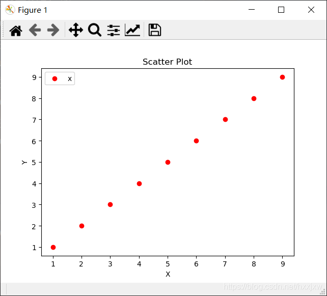
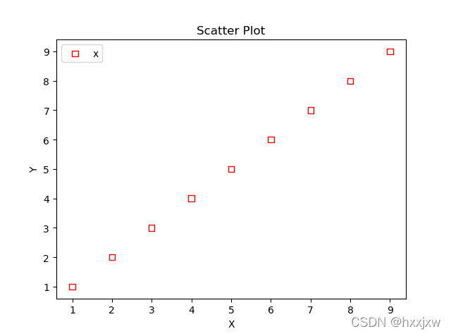
#导入必要的模块
import numpy as np
import matplotlib.pyplot as plt
#产生测试数据
x = np.arange(1,10)
y = x
fig = plt.figure()
ax1 = fig.add_subplot(111)
#设置标题
ax1.set_title('Scatter Plot')
#设置X轴标签
plt.xlabel('X')
#设置Y轴标签
plt.ylabel('Y')
#画散点图
ax1.scatter(x,y,c = 'r',marker = 'o')
#设置图标
plt.legend('x1')
#显示所画的图
plt.show()
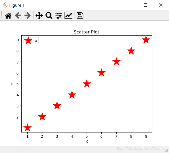
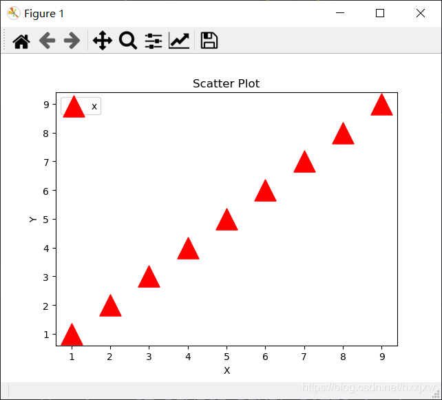
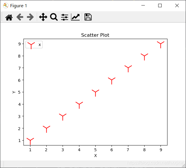
设置点的形状和大小
ax1.scatter(x,y,c = 'r',marker = '*',s=500)s是size,设置大小
ax1.scatter(x,y, c = 'r',marker = '^',s=500)
ax1.scatter(x,y, c = 'r',marker = '1',s=500)
设置空心的
ax1.scatter(x,y,c='none',marker = 's',edgecolors='r' )c是设置空心,edgecolors是边缘颜色
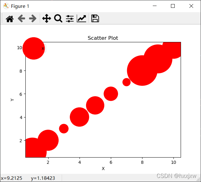
大小可以每个点不同
#导入必要的模块
import numpy as np
import matplotlib.pyplot as plt
import random
#产生测试数据
x = np.arange(1,11)
y = x
# sizes= 100*x
sizes = []
for i in range(10):
    sizes.append(random.randint(100,5000))
sizes = np.array(sizes)
fig = plt.figure()
ax1 = fig.add_subplot(111)
#设置标题
ax1.set_title('Scatter Plot')
#设置X轴标签
plt.xlabel('X')
#设置Y轴标签
plt.ylabel('Y')
#画散点图
ax1.scatter(x,y,c = 'r',marker = 'o', s=sizes)
#设置图标
plt.legend('x1')
#显示所画的图
plt.show()
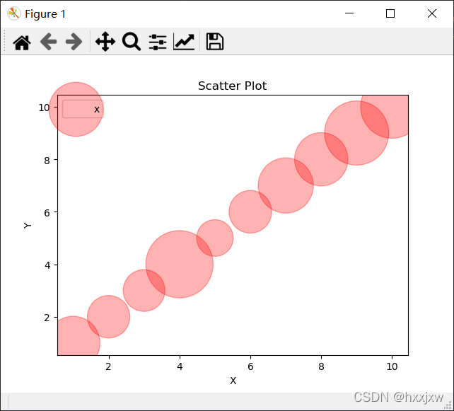
设置透明度
透明度只能整张图一样,不能单个点设置
#导入必要的模块
import numpy as np
import matplotlib.pyplot as plt
import random
#产生测试数据
x = np.arange(1,11)
y = x
# sizes= 100*x
sizes = []
for i in range(10):
    sizes.append(random.randint(100,5000))
sizes = np.array(sizes)
fig = plt.figure()
ax1 = fig.add_subplot(111)
#设置标题
ax1.set_title('Scatter Plot')
#设置X轴标签
plt.xlabel('X')
#设置Y轴标签
plt.ylabel('Y')
#画散点图
ax1.scatter(x,y,c = 'r',marker = 'o', s=sizes, alpha=0.3)
#设置图标
plt.legend('x1')
#显示所画的图
plt.show()
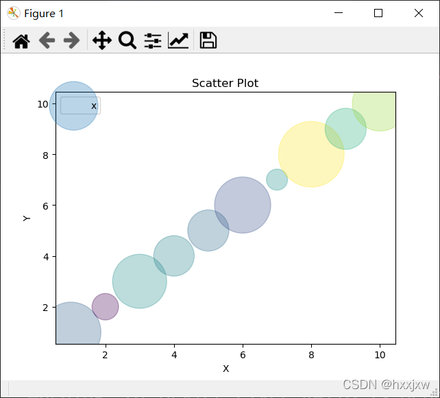
设置颜色
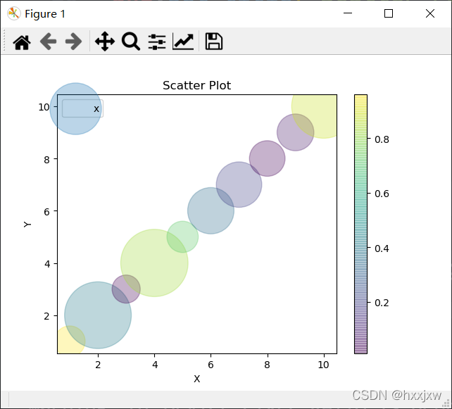
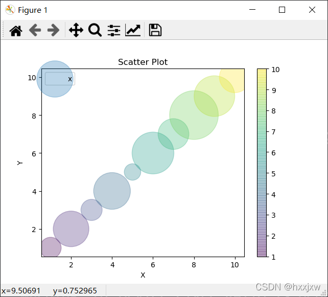
#导入必要的模块
import numpy as np
import matplotlib.pyplot as plt
import random
#产生测试数据
x = np.arange(1,11)
y = x
# sizes= 100*x
sizes = []
for i in range(10):
    sizes.append(random.randint(100,5000))
sizes = np.array(sizes)
colors = []
for i in range(10):
    colors.append(random.random())
colors = np.array(colors)
fig = plt.figure()
ax1 = fig.add_subplot(111)
#设置标题
ax1.set_title('Scatter Plot')
#设置X轴标签
plt.xlabel('X')
#设置Y轴标签
plt.ylabel('Y')
#画散点图
ax1.scatter(x,y,c = colors ,marker = 'o', s=sizes, alpha=0.3)

#设置图标
plt.legend('x1')
#显示所画的图
plt.show()
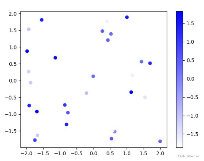
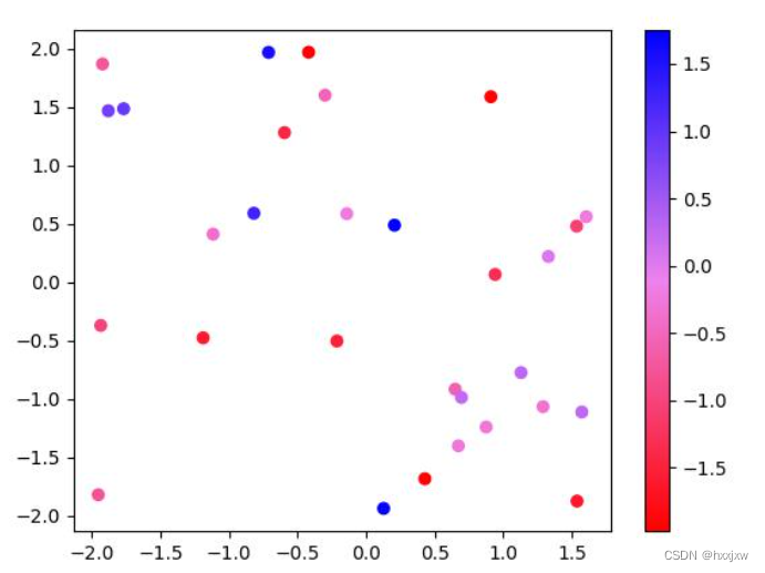
显示颜色条
#导入必要的模块
import numpy as np
import matplotlib.pyplot as plt
import random
#产生测试数据
x = np.arange(1,11)
y = x
# sizes= 100*x
sizes = []
for i in range(10):
    sizes.append(random.randint(100,5000))
sizes = np.array(sizes)
colors = []
for i in range(10):
    colors.append(random.random())
colors = np.array(colors)
fig = plt.figure()
ax1 = fig.add_subplot(111)
#设置标题
ax1.set_title('Scatter Plot')
#设置X轴标签
plt.xlabel('X')
#设置Y轴标签
plt.ylabel('Y')
#画散点图
im = ax1.scatter(x,y,c = colors ,marker = 'o', s=sizes, alpha=0.3)

fig.colorbar(im, ax=ax1); # 显示颜色条
#设置图标
plt.legend('x1')
#显示所画的图
plt.show()
会根据你的colors的范围来设定颜色
如 将c设置成y
marker类型查询
python 画散点图(marker 的主要类型查询)_qq_38573437的博客-CSDN博客
还可以自定义
【python】Matplotlib作图常用marker类型、线型和颜色 - 大大西瓜吃不饱 - 博客园
7. plt.plot() 画线(曲线)
plt.plot(x,y)
散点图的点用线连起来
实际上就是在散点图的基础上再画条线
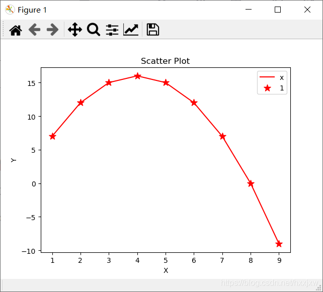
#导入必要的模块
import numpy as np
import matplotlib.pyplot as plt
#产生测试数据
x = np.arange(1,10,1)
# y = np.sin(x)
y = -x*x + 8*x
fig = plt.figure()
ax1 = fig.add_subplot(111)
#设置标题
ax1.set_title('Scatter Plot')
#设置X轴标签
plt.xlabel('X')
#设置Y轴标签
plt.ylabel('Y')
#画散点图
ax1.scatter(x,y, c = 'r',marker = '*',s=100)
ax1.plot(x,y,c='r')
#设置图标
plt.legend('x1')
#显示所画的图
plt.show()
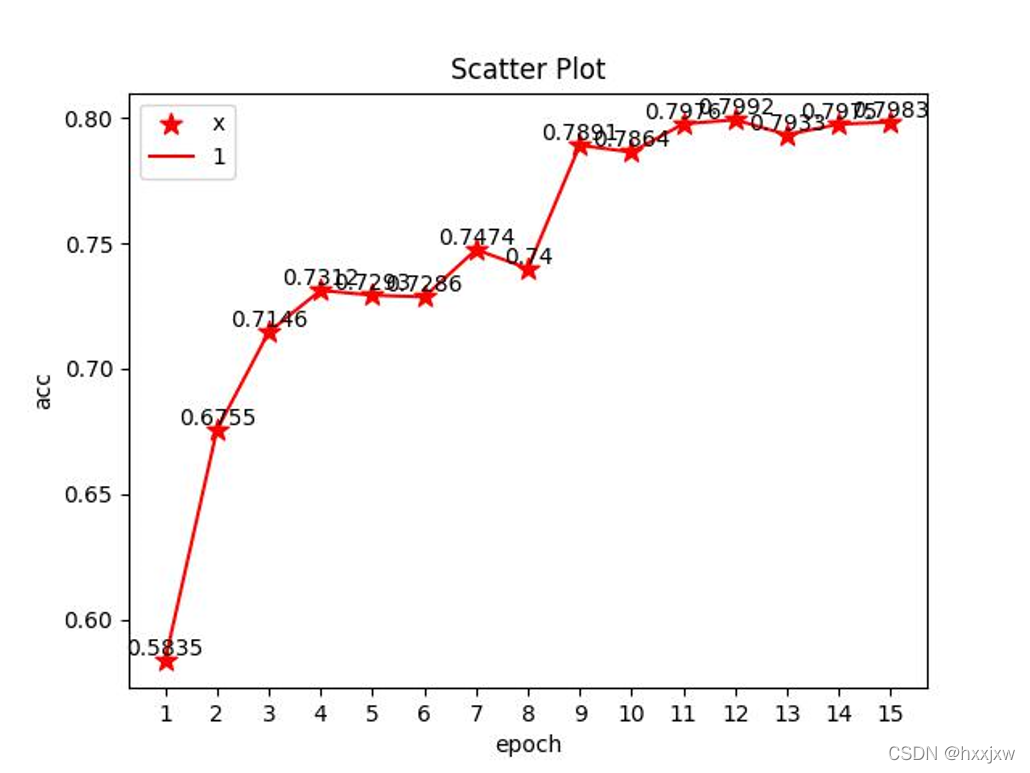
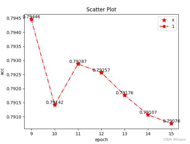
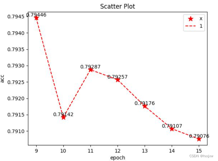
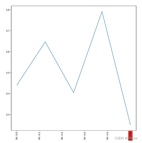
将值在点上都标出来
#导入必要的模块
import numpy as np
import matplotlib.pyplot as plt
#产生测试数据
x = np.arange(9,16,1)
# y = np.sin(x)
y = [0.7944621705455039, 0.79141717695884362, 0.79287417752001085, 0.79257105702939035, 0.79175957915541248, 0.79107081652914987, 0.79075600171433505]
fig = plt.figure()
ax1 = fig.add_subplot(111)
#设置标题
ax1.set_title('Scatter Plot')
#设置X轴标签
plt.xlabel('epoch')
#设置Y轴标签
plt.ylabel('acc')
#画散点图
ax1.scatter(x, y, color = 'r',marker = '*',s=100)
ax1.plot(x, y, color='r')
for a, b in zip(x, y):
    plt.text(a, b, round(b,5), ha='center', va='bottom', fontsize=10)
#设置图标
plt.legend('x1')
#显示所画的图
plt.savefig('lian.jpg')
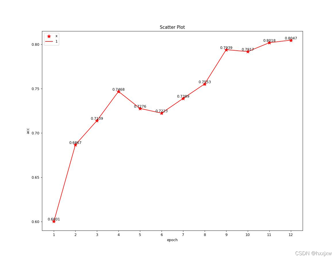
线的形式变化
#导入必要的模块
import numpy as np
import matplotlib.pyplot as plt
#产生测试数据
x = np.arange(9,16,1)
# y = np.sin(x)
y = [0.7944621705455039, 0.79141717695884362, 0.79287417752001085, 0.79257105702939035, 0.79175957915541248, 0.79107081652914987, 0.79075600171433505]
fig = plt.figure()
ax1 = fig.add_subplot(111)
#设置标题
ax1.set_title('Scatter Plot')
#设置X轴标签
plt.xlabel('epoch')
#设置Y轴标签
plt.ylabel('acc')
#画散点图
ax1.scatter(x, y, color = 'r', marker = '*',s=100)
ax1.plot(x, y, 'o-.', color='r', )  #画线
for a, b in zip(x, y):
    plt.text(a, b, round(b,5), ha='center', va='bottom', fontsize=10)
#设置图标
plt.legend('x1')
#显示所画的图
plt.savefig('lian.jpg')
#导入必要的模块
import numpy as np
import matplotlib.pyplot as plt
#产生测试数据
x = np.arange(9,16,1)
# y = np.sin(x)
y = [0.7944621705455039, 0.79141717695884362, 0.79287417752001085, 0.79257105702939035, 0.79175957915541248, 0.79107081652914987, 0.79075600171433505]
fig = plt.figure()
ax1 = fig.add_subplot(111)
#设置标题
ax1.set_title('Scatter Plot')
#设置X轴标签
plt.xlabel('epoch')
#设置Y轴标签
plt.ylabel('acc')
#画散点图
ax1.scatter(x, y, color = 'r', marker = '*',s=100)
ax1.plot(x, y, '--', color='r', )  #画线
for a, b in zip(x, y):
    plt.text(a, b, round(b,5), ha='center', va='bottom', fontsize=10)
#设置图标
plt.legend('x1')
#显示所画的图
plt.savefig('lian.jpg')
7. 绘制三维图
要用到Axes3D
from mpl_toolkits.mplot3d.axes3d.Axes3D
3D曲面图
from matplotlib import pyplot as plt
import numpy as np
from mpl_toolkits.mplot3d import Axes3D

fig = plt.figure()
ax = Axes3D(fig)
X = np.arange(-4, 4, 0.25)
Y = np.arange(-4, 4, 0.25)
X, Y = np.meshgrid(X, Y)
R = np.sqrt(X**2 + Y**2)
Z = np.sin(R)

# 具体函数方法可用 help(function) 查看,如:help(ax.plot_surface)
ax.plot_surface(X, Y, Z, rstride=1, cstride=1, cmap='rainbow')

plt.show()
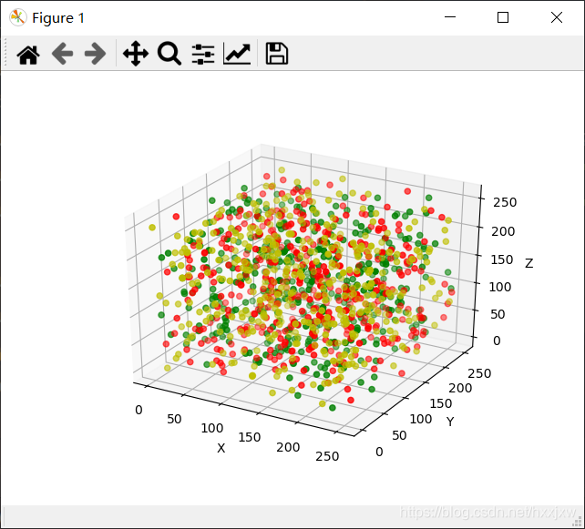
3D散点图
import numpy as np
import matplotlib.pyplot as plt
from mpl_toolkits.mplot3d import Axes3D

data = np.random.randint(0, 255, size=[40, 40, 40])

x, y, z = data[0], data[1], data[2]
ax = plt.subplot(111, projection='3d')  # 创建一个三维的绘图工程
#  将数据点分成三部分画,在颜色上有区分度
ax.scatter(x[:10], y[:10], z[:10], c='y')  # 绘制数据点
ax.scatter(x[10:20], y[10:20], z[10:20], c='r')
ax.scatter(x[30:40], y[30:40], z[30:40], c='g')

ax.set_zlabel('Z')  # 坐标轴
ax.set_ylabel('Y')
ax.set_xlabel('X')
plt.show()
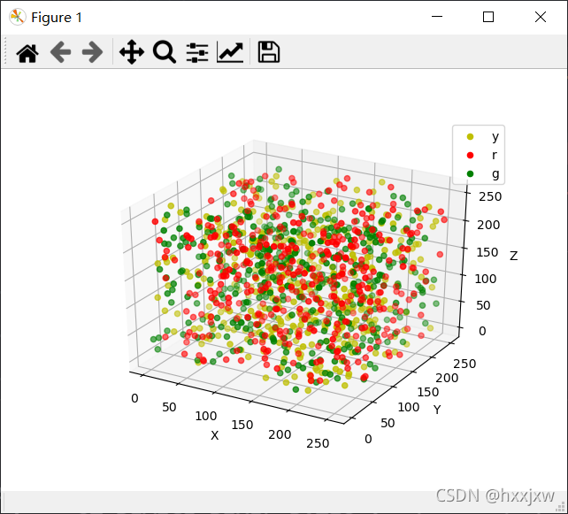
加上图例
添加图例的话,画图的时候就需要有label
同理,如果添加label,就必须也要有ax.legend()或plt.legend()这句话,否则lable显示不出来
import numpy as np
import matplotlib.pyplot as plt
from mpl_toolkits.mplot3d import Axes3D

data = np.random.randint(0, 255, size=[40, 40, 40])

x, y, z = data[0], data[1], data[2]
ax = plt.subplot(111, projection='3d')  # 创建一个三维的绘图工程
#  将数据点分成三部分画,在颜色上有区分度
ax.scatter(x[:10], y[:10], z[:10], c='y', label='y')  # 绘制数据点
ax.scatter(x[10:20], y[10:20], z[10:20], c='r', label='r')
ax.scatter(x[30:40], y[30:40], z[30:40], c='g', label='g')

ax.set_zlabel('Z')  # 坐标轴
ax.set_ylabel('Y')
ax.set_xlabel('X')
ax.legend()
plt.show()
8. 绘制柱状图
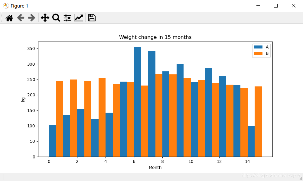
import matplotlib.pyplot as plt
import os

x1 = [0.25,1.25,2.25,3.25,4.25,5.25,6.25,7.25,8.25,9.25,10.25,11.25,12.25,13.25,14.25]
x2 = [0.75,1.75,2.75,3.75,4.75,5.75,6.75,7.75,8.75,9.75,10.75,11.75,12.75,13.75,14.75]
y1 = [102,134,154,122,143,243,355,342,276,299,241,287,260,231,100]
y2 = [244,250,245,256,234,241,230,267,266,255,248,239,233,221,227]

plt.figure(figsize=(10,5))
plt.bar(x1,y1,width = 0.5,label = 'A')
plt.bar(x2,y2,width = 0.5,label = 'B')
plt.title('Weight change in 15 months')
plt.xlabel('Month')
plt.ylabel('kg')
plt.legend()
plt.show()
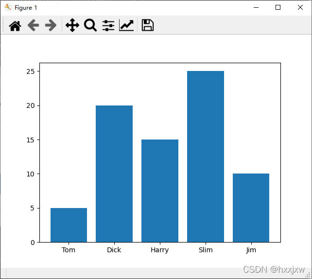
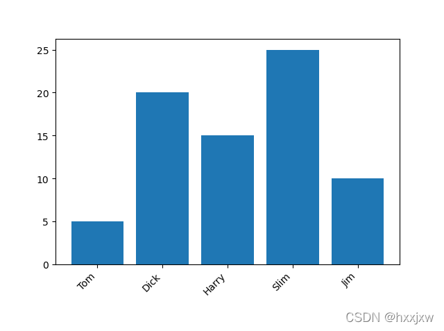
import matplotlib.pyplot as plt

data = [5, 20, 15, 25, 10]
labels = ['Tom', 'Dick', 'Harry', 'Slim', 'Jim']

plt.bar(range(len(data)), data, tick_label=labels)
plt.show()
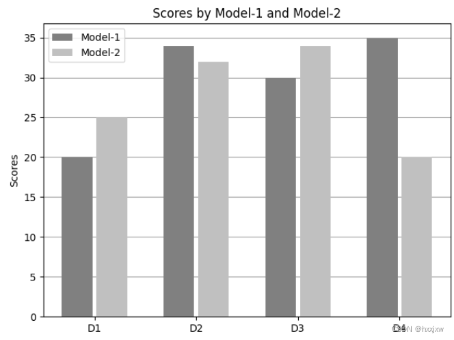
import matplotlib.pyplot as plt
import numpy as np

labels = ['D1', 'D2', 'D3', 'D4']
M1_means = [20, 34, 30, 35]
M2_means = [25, 32, 34, 20]

x = np.arange(len(labels))  # the label locations
width = 0.30  # the width of the bars

fig, ax = plt.subplots()
ax.grid(True, axis='y', color='#9E9E9E', clip_on=False)

rects1 = ax.bar(x - width/2 - 0.02, M1_means, width, color="gray", label='Model-1', zorder=10)
rects2 = ax.bar(x + width/2 + 0.02, M2_means, width, color="silver", label='Model-2', zorder=10)

# Add some text for labels, title and custom x-axis tick labels, etc.
ax.set_ylabel('Scores')
ax.set_title('Scores by Model-1 and Model-2')
ax.set_xticks(x, labels)
ax.legend()

# 条形图/柱状图最上方显示高度值
# ax.bar_label(rects1, padding=3)
# ax.bar_label(rects2, padding=3)
fig.tight_layout()
plt.savefig(f"output/result_2.png")
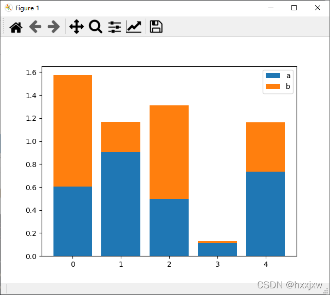
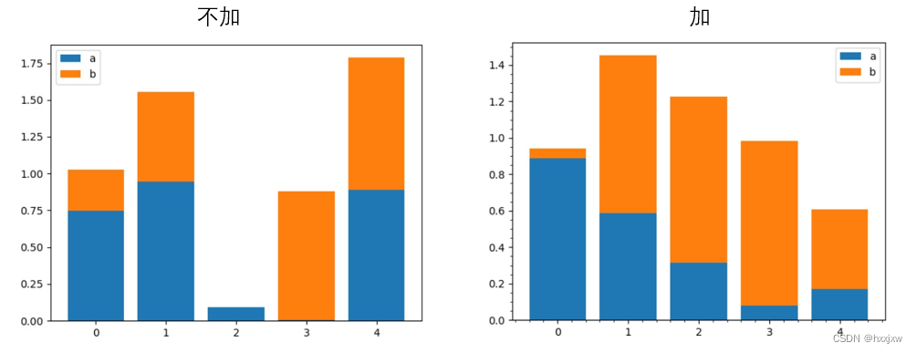
堆叠柱状图
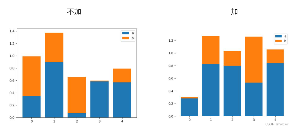
import numpy as np
import matplotlib.pyplot as plt

size = 5
x = np.arange(size)
a = np.random.random(size)
b = np.random.random(size)

plt.bar(x, a, label='a')
plt.bar(x, b, bottom=a, label='b')  #这样使得b在a上面
plt.legend()
plt.show()
画布的写法
import numpy as np
import matplotlib.pyplot as plt


fig,ax = plt.subplots()
size = 5
x = np.arange(size)
a = np.random.random(size)
b = np.random.random(size)

ax.bar(x, a, label='a')
ax.bar(x, b, bottom=a, label='b')
ax.legend()
plt.savefig('lian.jpg')
添加误差线
yerr
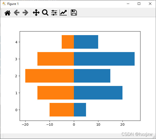
import matplotlib.pyplot as plt

labels = ['G1', 'G2', 'G3', 'G4', 'G5']
P1_means = [20, 35, 30, 35, 27]
P2_means = [25, 32, 34, 20, 25]
P1_std = [2, 3, 4, 1, 2]
P2_std = [3, 5, 2, 3, 3]
width = 0.35       # the width of the bars: can also be len(x) sequence

fig, ax = plt.subplots()

ax.bar(labels, P1_means, width, yerr=P1_std, label='Part-1')
ax.bar(labels, P2_means, width, yerr=P2_std, bottom=P1_means,
       label='Part-2')

ax.set_ylabel('Scores')
ax.set_title('Scores by Model-1 and Model-2')
ax.legend()
plt.savefig(f"output/result_3.png")
根据字典绘图
plt.bar(myDictionary.keys(), myDictionary.values(), width, color='g')柱状图上显示数值
就还是用plt.text实现
for a,b in zip(x,y):
    plt.text(a, b+0.05, '%.0f' % b, ha='center', va= 'bottom',fontsize=7)
plt.barh(range(len(res)), [i[1] for i in res], tick_label=[i[0] for i in res])
for idx, item in enumerate(res):
    plt.text(x = item[1]+ 10.0, y = idx, s = item[1], va= 'center', fontsize=7)
8、plt.xticks([]) / plt.yticks([]) 设置坐标轴刻度
设置X轴方法--刻度、标签
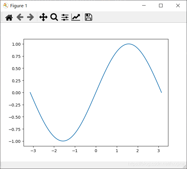
import numpy as np
import math
import matplotlib.pyplot as plt

x = np.linspace(-math.pi, math.pi,200)
y = np.sin(x)
plt.plot(x,y)
plt.show()
import numpy as np
import math
import matplotlib.pyplot as plt
x = np.linspace(-math.pi, math.pi,200)
y = np.sin(x)
plt.plot(x,y)
plt.xticks(np.arange(0, 1, step=0.2))
plt.show()
如果是这种情况
想让x轴都是整数的话
plt.plot(range(1, 20,1), lr)
是不行的,这样结果会和上图一样,这只是赋值了x轴的值,并没有设置x轴的值怎么显示
这样才行
plt.xticks(range(0, 20))设置字符串作为坐标轴刻度
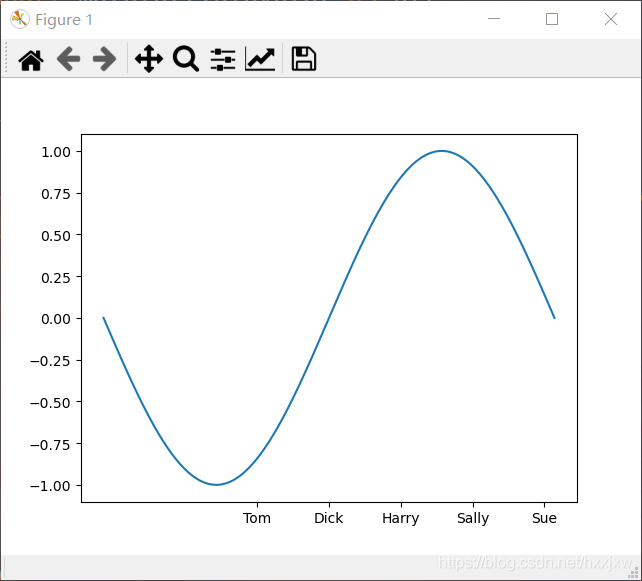
import numpy as np
import math
import matplotlib.pyplot as plt
x = np.linspace(-math.pi, math.pi,200)
y = np.sin(x)
plt.plot(x,y)
plt.xticks(np.arange(-1,4,1), ('Tom', 'Dick', 'Harry', 'Sally', 'Sue'))
plt.show()
取消坐标轴刻度
plt.xticks([])
plt.yticks([])
对于ax
ax.set_xticks([])
ax.set_yticks([])
或者
ax.axis('off')
9、plt.tight_layout()
tight_layout会自动调整子图参数,使之填充整个图像区域。这是个实验特性,可能在一些情况下不工作。它仅仅检查坐标轴标签、刻度标签以及标题的部分。
使用前
使用后
10、offsetbox(
AnnotationBbox)添加自定义的元素
将想要展示的元素(文字、图片等)放在这个offsetbox模块中,并使用根据坐标放在指定位置。
13、legend 添加图例
ax.legend()
或
plt.legend()
plt.text()是不能设置图例的
14、 plt.text() 添加文字/文本注释
plt.text(x,
	y,
	string,
	fontsize=15,
	verticalalignment="top",
	horizontalalignment="right"
)
参数:
- x,y:表示坐标值上的值
- string:表示说明文字
- fontsize:表示字体大小
- verticalalignment:垂直对齐方式 ,参数:[ ‘center’ | ‘top’ | ‘bottom’ | ‘baseline’ ]
- horizontalalignment:水平对齐方式 ,参数:[ ‘center’ | ‘right’ | ‘left’ ]
- xycoords选择指定的坐标轴系统:
- arrowprops #箭头参数,参数类型为字典dict
- bbox给标题增加外框 ,常用参数如下:
fontsize,style,ha,va参数分别是字号,字体,垂直对齐方式,水平对齐方式。
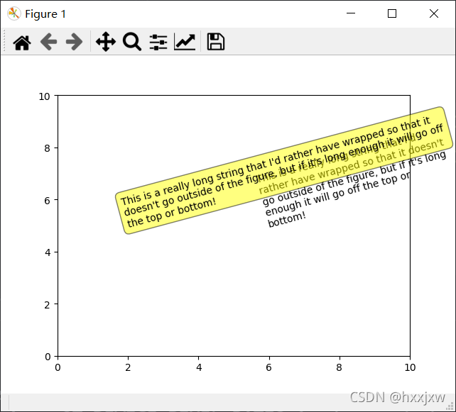
import matplotlib.pyplot as plt

fig = plt.figure()
plt.axis([0, 10, 0, 10])
t = "This is a really long string that I'd rather have wrapped so that it"\
    " doesn't go outside of the figure, but if it's long enough it will go"\
    " off the top or bottom!"
plt.text(6, 5, t, ha='left', rotation=15, wrap=True)
plt.text(2, 5, t, ha='left', rotation=15, wrap=True,  bbox=dict(boxstyle='round,pad=0.5', fc='yellow', ec='k',lw=1 ,alpha=0.5))
plt.show()
bbox增加外框的效果
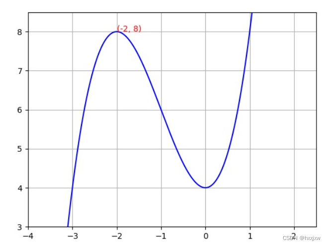
import numpy as np
import matplotlib.pyplot as plt

plt.figure()
m = np.arange(-100,100,0.001)
n =  m**3+3*m**2+4
plt.axis([-4,2.5,3,8.5])
plt.plot(m,n,color='b',linestyle='-')
plt.text(-2,8,(-2,8),color='r')
plt.grid(True)
plt.show()
plt.savefig('out.jpg')
还可以改变背景框的形状
import matplotlib.pyplot as plt

fig = plt.figure()
plt.axis([0, 10, 0, 10])
t = "This is a really long string that I'd rather have wrapped so that it"\
    " doesn't go outside of the figure, but if it's long enough it will go"\
    " off the top or bottom!"
plt.text(6, 5, t, ha='left', rotation=15, wrap=True)
plt.text(2, 5, t, ha='left', rotation=15, wrap=True,
        bbox=dict(
                    boxstyle='sawtooth,pad=1.5',
                    facecolor='#74C476', #填充色
                    edgecolor='b',#外框色
                    alpha=0.5, #框透明度
        )
)
plt.show()
plt.savefig('lian.jpg')
指向性注释文本
plt.annotate()s:str, 注释信息内容
xy:(float,float), 箭头点所在的坐标位置
xytext:(float,float), 注释内容的坐标位置
weight: str or int, 设置字体线型,其中字符串从小到大可选项有{'ultralight', 'light', 'normal', 'regular', 'book', 'medium', 'roman', 'semibold', 'demibold', 'demi', 'bold', 'heavy', 'extra bold', 'black'}
color: str or tuple, 设置字体颜色 ,单个字符候选项{'b', 'g', 'r', 'c', 'm', 'y', 'k', 'w'},也可以'black','red'等,tuple时用[0,1]之间的浮点型数据,RGB或者RGBA, 如: (0.1, 0.2, 0.5)、(0.1, 0.2, 0.5, 0.3)等
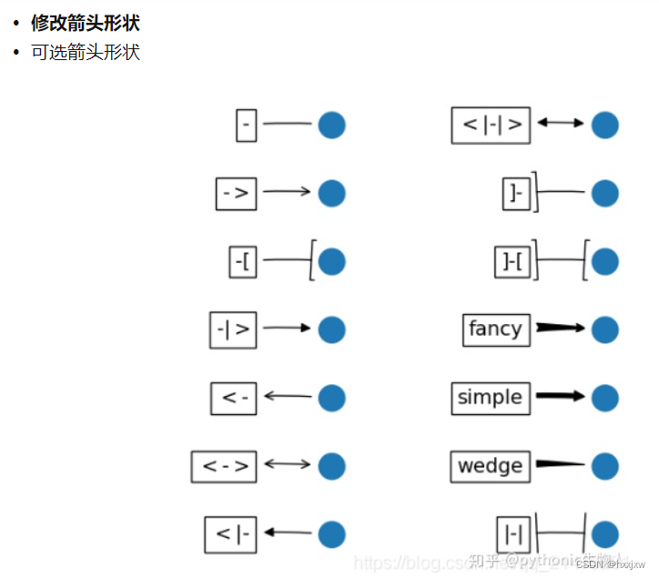
arrowprops:dict,设置指向箭头的参数,字典中key值有①arrowstyle:设置箭头的样式,其value候选项如'->','|-|','-|>',也可以用字符串'simple','fancy'等,详情见顶部的官方项目地址链接。
②connectionstyle:设置箭头的形状,为直线或者曲线,候选项有'arc3','arc','angle','angle3',可以防止箭头被曲线内容遮挡
③color:设置箭头颜色,见前面的color参数。
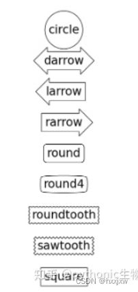
bbox:dict,为注释文本添加边框,其key有①boxstyle,其格式类似'round,pad=0.5',其可选项如下:
boxstyle详细设定
②facecolor(可简写为fc)设置背景颜色
③ edgecolor(可简写为ec)设置边框线条颜色
④lineweight(可简写为lw)设置边框线型粗细
⑤alpha设置透明度,[0,1]之间的小数,0代表完全透明,即类似③颜色设置无效
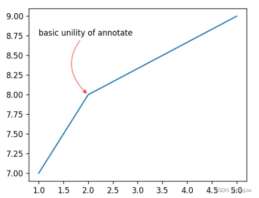
import numpy as np
import matplotlib.pyplot as plt

plt.figure()
m = np.arange(-100,100,0.001)
n =  m**3+3*m**2+4
plt.axis([-4,2.5,3,8.5])
plt.plot(m,n,color='b',linestyle='-')

plt.annotate(s='Look',xy=(0,4),xytext=(2,3),weight='bold',color='r',
 arrowprops=dict(arrowstyle='->',connectionstyle='arc3',color='c'),
 bbox=dict(boxstyle='round,pad=0.5', fc='yellow', ec='k',lw=1 ,alpha=0.4))
plt.grid(True)
plt.show()
plt.savefig('out.jpg')
设置不同形状格式
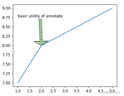
import numpy as np
import matplotlib.pyplot as plt

plt.figure(figsize=(5,4),dpi=120)
plt.plot([1,2,5],[7,8,9])

plt.annotate('basic unility of annotate',
             xy=(2, 8),#箭头末端位置
             xytext=(1.0, 8.75),#文本起始位置
             #箭头属性设置
            arrowprops=dict(facecolor='#74C476',
                            shrink=1,#箭头的收缩比
                            alpha=0.6,
                            width=7,#箭身宽
                            headwidth=40,#箭头宽
                            hatch='--',#填充形状
                            frac=0.8,#身与头比
                            #其它参考matplotlib.patches.Polygon中任何参数
                           ),
            )
plt.savefig('lian.jpg')
箭头弯曲
import numpy as np
import matplotlib.pyplot as plt

plt.figure(figsize=(5,4),dpi=120)
plt.plot([1,2,5],[7,8,9])

plt.annotate('basic unility of annotate',
             xy=(2, 8),
             xytext=(1.0, 8.75),
             arrowprops=dict(facecolor='#74C476',
                             alpha=0.6,
                             arrowstyle='-|>',
                             connectionstyle='arc3,rad=0.5',#有多个参数可选
                             color='r',
                            ),
            )
plt.show()
plt.savefig('lian.jpg')
matplotlib.pyplot.annotate — Matplotlib 3.5.2 documentation
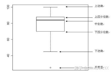
15. 箱型图(箱线图/盒图) boxplot
用作显示一组数据分散情况
箱线图的绘制方法是:先找出一组数据的上边缘、下边缘、中位数和两个四分位数;然后, 连接两个四分位数画出箱体;再将上边缘和下边缘与箱体相连接,中位数在箱体中间。
箱线图统计学知识
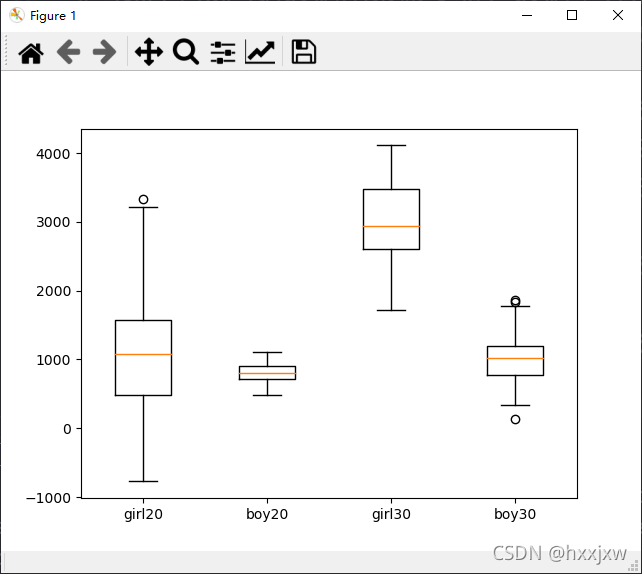
import numpy as np
import matplotlib.pyplot as plt

fig, ax = plt.subplots()      # 子图


# 封装一下这个函数,用来后面生成数据
def list_generator(mean, dis, number):
    return np.random.normal(mean, dis * dis, number)  # normal分布,输入的参数是均值、方差以及生成的数量


# 我们生成四组数据用来做实验,数据量分别为70-100
# 分别代表男生、女生在20岁和30岁的花费分布
girl20 = list_generator(1000, 29.2, 70)
boy20 = list_generator(800, 11.5, 80)
girl30 = list_generator(3000, 25.1056, 90)
boy30 = list_generator(1000, 19.0756, 100)

data = [girl20, boy20, girl30, boy30]   #data是list的list
ax.boxplot(data)
ax.set_xticklabels(["girl20", "boy20", "girl30", "boy30"])     # 设置x轴刻度标签
plt.show()
seaborn和颜色
[seaborn] seaborn学习笔记1-箱形图Boxplot_You and Me-CSDN博客_sns箱线图
16. plt.ion() 打开交互模式
在训练神经网络时,我们常常希望在图中看到loss减小的动态过程,这时我们可用plt.ion()函数打开交互式模式,在交互式模式下可动态地展示图像。
plt.ioff() 关闭交互模式
import matplotlib.pyplot as plt

x = list(range(1, 21))  # epoch array
loss = [2 / (i**2) for i in x]  # loss values array
plt.ion()
for i in range(1, len(x)):
    ix = x[:i]
    iy = loss[:i]
    plt.cla()
    plt.title("loss")
    plt.plot(ix, iy)
    plt.xlabel("epoch")
    plt.ylabel("loss")
    plt.pause(0.5)
plt.ioff()
plt.show()
这样就会动态显示曲线了
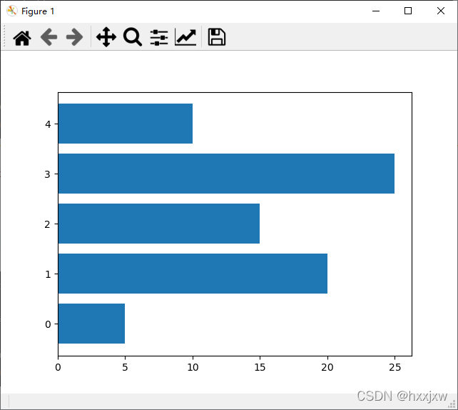
17. 条形图
import matplotlib.pyplot as plt

data = [5, 20, 15, 25, 10]

plt.barh(range(len(data)), data)
plt.show()
正负条形图
import numpy as np
import matplotlib.pyplot as plt

a = np.array([5, 20, 15, 25, 10])
b = np.array([10, 15, 20, 15, 5])

plt.barh(range(len(a)), a)
plt.barh(range(len(b)), -b)
plt.show()
18. plt.rcParams 使用rc配置文件来自定义图形的各种默认属性
称之为rc配置或rc参数。通过rc参数可以修改默认的属性,包括窗体大小、每英寸的点数、线条宽度、颜色、样式、坐标轴、坐标和网络属性、文本、字体等。
设置字体
plt.rcParams['font.sans-serif']='Times New Roman'设置中文显示
plt.rcParams['font.sans-serif']='SimHei'设置线条宽度
plt.rcParams['lines.linewidth'] = 3设置线条样式
plt.rcParams['lines.linestyle'] = '-.'设置图片像素
plt.rcParams['savefig.dpi'] = 300设置分辨率
plt.rcParams['figure.dpi'] = 300设置图片大小
plt.rcParams['figure.figsize'] = (10.0, 8.0) # set default size of plots19. 饼图
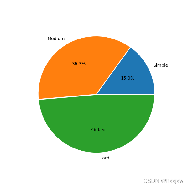
import matplotlib.pyplot as plt
plt.figure(figsize=(6,6))#将画布设定为正方形,则绘制的饼图是正圆
label=['Simple','Medium','Hard']#定义饼图的标签,标签是列表
explode=[0.01,0.01,0.01]#设定各项距离圆心n个半径
values=[289,699,935]
plt.pie(values,explode=explode,labels=label,autopct='%1.1f%%')#绘制饼图
plt.show()
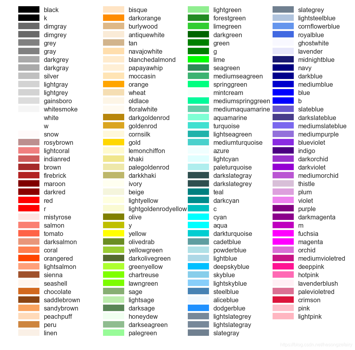
20. 常用颜色
21. 旋转标签
plt.gcf().autofmt_xdate()import matplotlib.pyplot as plt data = [5, 20, 15, 25, 10] labels = ['Tom', 'Dick', 'Harry', 'Slim', 'Jim'] plt.bar(range(len(data)), data, tick_label=labels) plt.gcf().autofmt_xdate(rotation=45) plt.show()
22. 填充指定区域 fill / fill_between
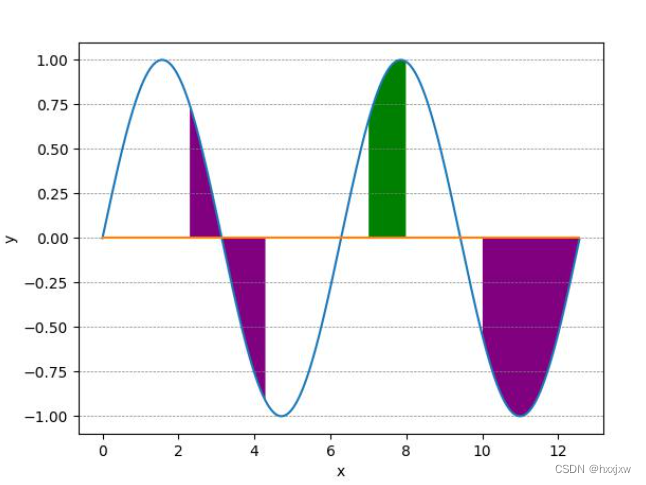
plt.fill_between() 填充两个函数之间的区域
import numpy as np import matplotlib.pyplot as plt # 生成模拟数据 x = np.arange(0.0, 4.0*np.pi, 0.01) y = np.sin(x) # 绘制正弦曲线 plt.plot(x, y) # 绘制基准水平直线 plt.plot((x.min(),x.max()), (0,0)) # 设置坐标轴标签 plt.xlabel('x') plt.ylabel('y') # 填充指定区域 plt.fill_between(x, y, where=(2.3<x) & (x<4.3) | (x>10), facecolor='purple') # 可以填充多次 plt.fill_between(x, y, where=(7<x) & (x<8), facecolor='green') plt.savefig("lian.jpg")
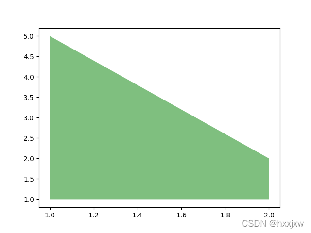
import matplotlib.pyplot as plt x=[1,2,2,1] y=[1,1,2,5] plt.fill(x, y,facecolor='g',alpha=0.5) plt.show()
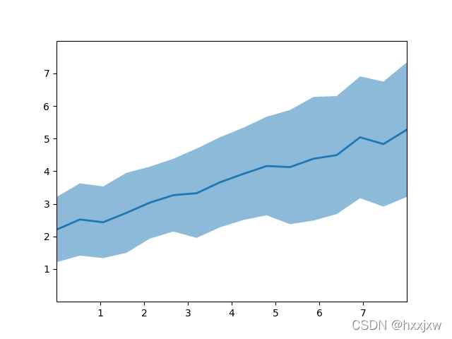
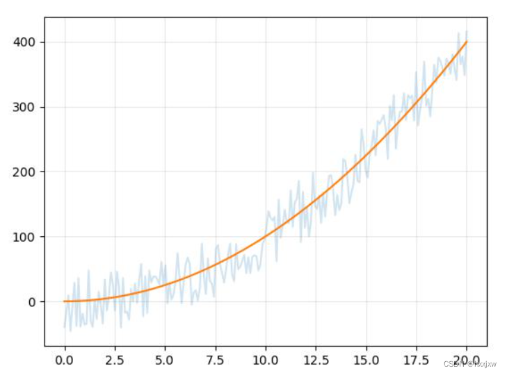
import matplotlib.pyplot as plt import numpy as np # plt.style.use('_mpl-gallery') # make data np.random.seed(1) x = np.linspace(0, 8, 16) y1 = 3 + 4*x/8 + np.random.uniform(0.0, 0.5, len(x)) y2 = 1 + 2*x/8 + np.random.uniform(0.0, 0.5, len(x)) # plot fig, ax = plt.subplots() ax.fill_between(x, y1, y2, alpha=.5, linewidth=0) ax.plot(x, (y1 + y2)/2, linewidth=2) ax.set(xlim=(0, 8), xticks=np.arange(1, 8), ylim=(0, 8), yticks=np.arange(1, 8)) plt.show()
这样子通常被用来画带方差的折线图
不过也都是调用fill_between实现的
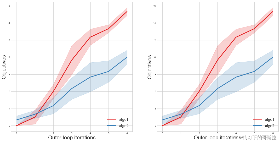
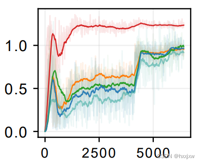
import numpy as np import matplotlib.pyplot as plt from matplotlib import pyplot plt.style.use('seaborn-whitegrid') palette = pyplot.get_cmap('Set1') font1 = {'family' : 'Times New Roman', 'weight' : 'normal', 'size' : 18, } fig=plt.figure(figsize=(20,10)) iters=list(range(7)) #这里随机给了alldata1和alldata2数据用于测试 alldata1=[]#算法1所有纵坐标数据 data=np.array([2,4,5,8,11,13,15])#单个数据 alldata1.append(data) data=np.array([2,3,6,12,13,13,15]) alldata1.append(data) data=np.array([2,2,7,9,13,14,16]) alldata1.append(data) alldata1=np.array(alldata1) alldata2=[]#算法2所有纵坐标数据 data=np.array([2,4,5,8,10,10,11])#单个数据 alldata2.append(data) data=np.array([3,3,3,6,7,8,10]) alldata2.append(data) data=np.array([3,3,5,5,6,7,9]) alldata2.append(data) alldata2=np.array(alldata2) for i in range(2): color=palette(0)#算法1颜色 ax=fig.add_subplot(1,2,i+1) avg=np.mean(alldata1,axis=0) std=np.std(alldata1,axis=0) r1 = list(map(lambda x: x[0]-x[1], zip(avg, std)))#上方差 r2 = list(map(lambda x: x[0]+x[1], zip(avg, std)))#下方差 ax.plot(iters, avg, color=color,label="algo1",linewidth=3.0) ax.fill_between(iters, r1, r2, color=color, alpha=0.2) color=palette(1) avg=np.mean(alldata2,axis=0) std=np.std(alldata2,axis=0) r1 = list(map(lambda x: x[0]-x[1], zip(avg, std))) r2 = list(map(lambda x: x[0]+x[1], zip(avg, std))) ax.plot(iters, avg, color=color,label="algo2",linewidth=3.0) ax.fill_between(iters, r1, r2, color=color, alpha=0.2) ax.legend(loc='lower right',prop=font1) ax.set_xlabel('Outer loop iterations',fontsize=22) ax.set_ylabel('Objectives',fontsize=22)
另一种写法
# Suppose variable `reward_sum` is a list containing all the reward summary scalars def plot_with_variance(reward_mean, reward_std, color='yellow', savefig_dir=None): """plot_with_variance reward_mean: typr list, containing all the means of reward summmary scalars collected during training reward_std: type list, containing all variance savefig_dir: if not None, this must be a str representing the directory to save the figure """ half_reward_std = reward_std / 2.0 lower = [x - y for x, y in zip(reward_mean, half_reward_std)] upper = [x + y for x, y in zip(reward_mean, half_reward_std)] plt.figure() xaxis = list(range(len(lower))) plt.plot(xaxis, reward_mean, color=color) plt.fill_between(xaxis, lower, upper, color=color, alpha=0.2) plt.grid() plt.xlabel('Episode') plt.ylabel('Average reward') plt.title('The convergence of rewards') if savefig_dir is not None and type(savefig_dir) is str: plt.savefig(savefig_dir, format='svg') plt.show()还可以用sns
用seaborn/matplot绘制误差带阴影图 - 知乎
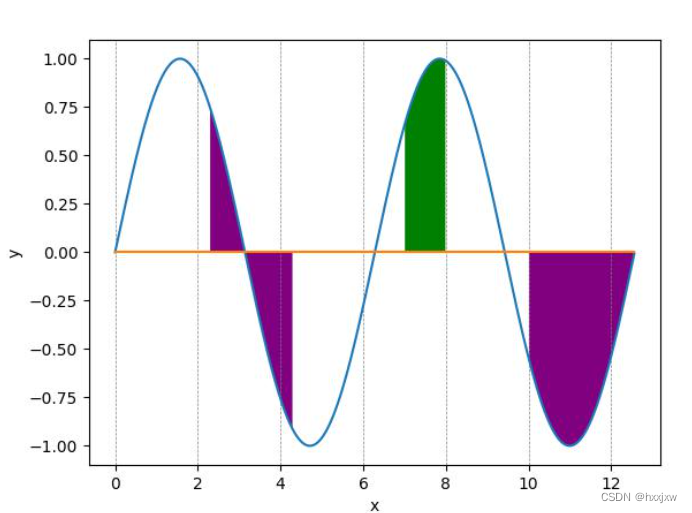
23. plt.grid() 画图带刻度线/网格线
plt.grid()import numpy as np import matplotlib.pyplot as plt # 生成模拟数据 x = np.arange(0.0, 4.0*np.pi, 0.01) y = np.sin(x) # 绘制正弦曲线 plt.plot(x, y) # 绘制基准水平直线 plt.plot((x.min(),x.max()), (0,0)) # 设置坐标轴标签 plt.xlabel('x') plt.ylabel('y') # 填充指定区域 plt.fill_between(x, y, where=(2.3<x) & (x<4.3) | (x>10), facecolor='purple') # 可以填充多次 plt.fill_between(x, y, where=(7<x) & (x<8), facecolor='green') plt.grid() plt.savefig('lian.jpg')加和不加
虚线等可以自己设置
plt.grid(True,linestyle = "--",color = 'gray' ,linewidth = '0.5',axis='both')
只在x/y轴方向加
plt.grid(True,linestyle = "--",color = 'gray' ,linewidth = '0.5',axis='y') plt.grid(True,linestyle = "--",color = 'gray' ,linewidth = '0.5',axis='x')
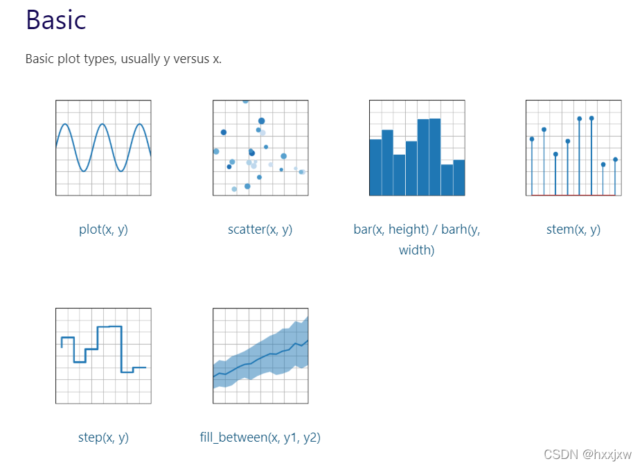
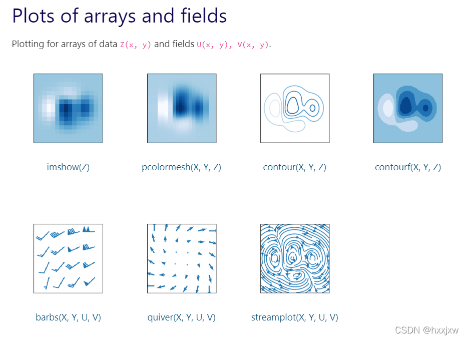
23. plt所有可以画的类型
太多了......想画什么没有的先打开这个看看,基本都能找到
Plot types — Matplotlib 3.5.1 documentation
Examples — Matplotlib 3.5.1 documentation
24. plt.axhline() 轴上添加水平线
plt.axhline(y=0, xmin=0, xmax=1, **kwargs)
- y:该参数是可选的,它是在水平线的数据坐标中的位置。
- xmin:此参数是标量,是可选的。其默认值为0。范围[0-1]
- xmax:此参数是标量,是可选的。默认值为1。范围[0-1]
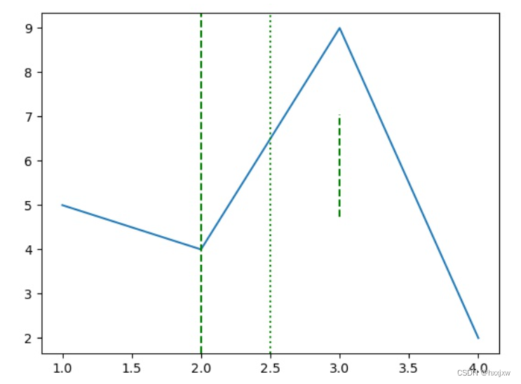
import numpy as np import matplotlib.pyplot as plt plt.plot([1, 2, 3, 4], [5, 4, 9, 2]) plt.axhline(y = 4, color ="green", linestyle ="--") plt.axhline(y = 5, color ="green", linestyle =":") plt.axhline(y = 6, color ="green", xmin=0.4, xmax=0.7, linestyle ="--") plt.show() plt.savefig('output.jpg')
同理,plt.axvline() 添加竖直线
plt.axvline(x=0, ymin=0, ymax=1, **kwargs)import numpy as np import matplotlib.pyplot as plt plt.plot([1, 2, 3, 4], [5, 4, 9, 2]) plt.axvline(x = 2, color ="green", linestyle ="--") plt.axvline(x = 2.5, color ="green", linestyle =":") plt.axvline(x = 3, color ="green", ymin=0.4, ymax=0.7, linestyle ="--",) plt.show() plt.savefig('output.jpg')
25. plt.gca() 挪动坐标轴
gca是get current axes的意思
Matplotlib入门-3-plt.gca( )挪动坐标轴 - 知乎 (zhihu.com)
反转坐标轴
将x轴移动到上部 ax.xaxis.set_ticks_position()
将y轴反转 ax.invert_yaxis()
import matplotlib.pyplot as plt x=[0,1,2,3,4,5] y=[10,20,30,40,50,60] plt.plot(x, y, color='red') ax = plt.gca() #获取到当前坐标轴信息 ax.xaxis.set_ticks_position('top') #将X坐标轴移到上面 # ax.yaxis.set_ticks_position('right') #将Y坐标轴移到右面 ax.invert_yaxis() #反转Y坐标轴 plt.show() plt.savefig('test.jpg')
如果是子图的话就更简单,都不需要plt.gca(), 直接
axs[0].xaxis.set_ticks_position('top')26. plt.xcorr() 漫画风格
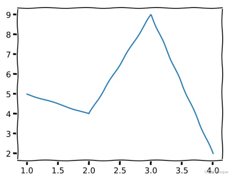
正常
import numpy as np import matplotlib.pyplot as plt plt.plot([1, 2, 3, 4], [5, 4, 9, 2]) plt.show() plt.savefig('output.jpg')
漫画风格
import numpy as np import matplotlib.pyplot as plt with plt.xkcd(): plt.plot([1, 2, 3, 4], [5, 4, 9, 2]) plt.show() plt.savefig('output.jpg')
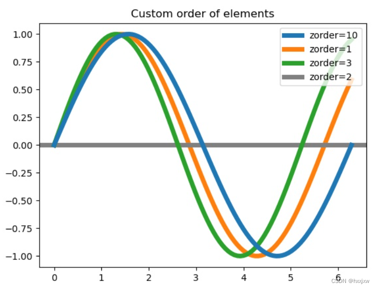
27. zorder() 设置图层顺序
zorder用来控制绘图顺序,其值越大,画上去越晚,线条的叠加就是在上面的
我们可以手动设置zorder值使某些底层的元素显示在最上面等
import numpy as np import matplotlib.pyplot as plt x = np.linspace(0, 2*np.pi, 100) plt.rcParams['lines.linewidth'] = 5 plt.figure() plt.plot(x, np.sin(x), label='zorder=10', zorder=10) # on top plt.plot(x, np.sin(1.1*x), label='zorder=1', zorder=1) # bottom plt.plot(x, np.sin(1.2*x), label='zorder=3', zorder=3) plt.axhline(0, label='zorder=2', color='grey', zorder=2) plt.title('Custom order of elements') l = plt.legend(loc='upper right') l.set_zorder(20) # put the legend on top plt.show() plt.savefig('output.jpg')
28. plt.axis() 设置坐标轴
plt.axis() 不传递任何参数的话相当于坐标轴采用自动缩放(autoscale)方式,由matplotlib根据数据系列自动配置坐标轴范围和刻度。
original
import numpy as np import matplotlib.pyplot as plt plt.plot([1, 2, 3, 4], [5, 4, 9, 2]) plt.show() plt.savefig('output.jpg')
plt.axis()
import matplotlib.pyplot as plt plt.plot([1, 2, 3, 4], [5, 4, 9, 2]) plt.axis() plt.show() plt.savefig('output.jpg')
plt.axis([xmin, xmax, ymin, ymax]) 设置x轴y轴的最小最大值
import matplotlib.pyplot as plt plt.plot([1, 2, 3, 4], [5, 4, 9, 2]) plt.axis([0, 3, 2, 7]) plt.show() plt.savefig('output.jpg')
29. plt.xlim(), plt.ylim() 设置x轴/y轴的范围
和plt.axis的效果一样
import matplotlib.pyplot as plt plt.plot([1, 2, 3, 4], [5, 4, 9, 2]) plt.xlim(xmin=0,xmax=3) plt.ylim(ymin=2,ymax=7) plt.show() plt.savefig('output.jpg')
ax.set_xlim(xmin=0,xmax=3) ax.set_ylim(ymin=2,ymax=7)30. plt画多张图的时候清空画布
plt.clf()31. plt绘制矩形
是x,y,w,h的形式的
plt.gca().add_patch( plt.Rectangle((x, y), w, h, fill=False, edgecolor='green', linewidth=1) )patches.Rectangle()
patches.Rectangle(xy, width, height, angle=0.0, **kwargs)import matplotlib import matplotlib.pyplot as plt fig = plt.figure() ax = fig.add_subplot(111) rect1 = matplotlib.patches.Rectangle((-200, -100), 400, 200, color ='green') rect2 = matplotlib.patches.Rectangle((0, 150), 300, 20, color ='pink') rect3 = matplotlib.patches.Rectangle((-300, -50), 40, 200, color ='yellow') ax.add_patch(rect1) ax.add_patch(rect2) ax.add_patch(rect3) plt.xlim([-400, 400]) plt.ylim([-400, 400]) plt.show() plt.savefig('test.jpg')
32. add_patch 添加补丁,或者贴图
import matplotlib.pyplot as plt from matplotlib.patches import Wedge a = Wedge((.5, .5), .5, 0, 360, width=.25, color='red') plt.gca().add_patch(a) plt.axis('equal') plt.axis('off') plt.show() plt.savefig('wedge.jpg')
33. add_gridspec自定义子图布局
import matplotlib.pyplot as plt fig = plt.figure() gs = fig.add_gridspec(nrows=2, ncols=2) # gs[0, :]表示这个图占第0行和所有列, gs[1, :2]表示这个图占第1行和第2列前的所有列, # gs[1:, 2]表示这个图占第1行后的所有行和第2列, gs[-1, 0]表示这个图占倒数第1行和第0列, # gs[-1, -2]表示这个图占倒数第1行和倒数第2列. ax1 = fig.add_subplot(gs[0, 0]) ax2 = fig.add_subplot(gs[1, 0]) ax3 = fig.add_subplot(gs[:, 1]) fig.suptitle('matplotlib.figure.Figure.add_gridspec() function Example\n\n', fontweight ="bold") plt.show() plt.savefig('test.jpg')
34. plt.minorticks_on() 显示坐标轴上的小刻度
import numpy as np import matplotlib.pyplot as plt size = 5 x = np.arange(size) a = np.random.random(size) b = np.random.random(size) plt.bar(x, a, label='a') plt.bar(x, b, bottom=a, label='b') plt.minorticks_on() plt.legend() plt.savefig('lian.jpg')加和不加plt.minorticks_on() 的区别
35. 取消边框
ax.spines[:].set_visible(False)
import numpy as np import matplotlib.pyplot as plt fig,ax = plt.subplots() size = 5 x = np.arange(size) a = np.random.random(size) b = np.random.random(size) ax.bar(x, a, label='a') ax.bar(x, b, bottom=a, label='b') ax.legend() ax.spines[:].set_visible(False) plt.savefig('lian.jpg')
如果只想去掉右边和上边的
import numpy as np import matplotlib.pyplot as plt fig,ax = plt.subplots() size = 5 x = np.arange(size) a = np.random.random(size) b = np.random.random(size) ax.bar(x, a, label='a') ax.bar(x, b, bottom=a, label='b') ax.legend() # ax.spines[:].set_visible(False) ax.spines['right'].set_visible(False) ax.spines['top'].set_visible(False) plt.savefig('lian.jpg')
36. 当plt.savefig 图片保存不完整, 被截断了
plt.savefig('lian.jpg')
加上参数bbox_inches = 'tight'即可plt.savefig('lian.jpg', bbox_inches='tight')
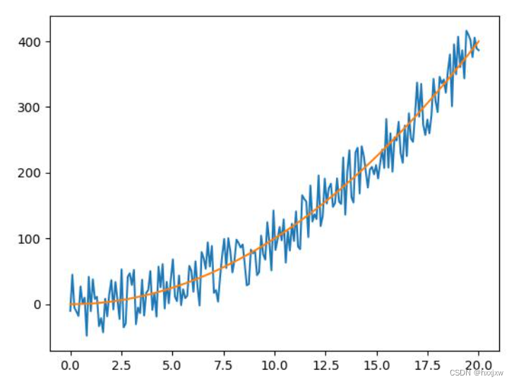
37. 产生混乱曲线
import numpy as np import matplotlib.pyplot as plt x = np.linspace(0,20,200) z = np.random.rand(200) - 0.5 y = x**2 + z*100 plt.plot(x,y) plt.plot(x,x**2) plt.savefig('test.jpg')
38. 透明曲线图
这种其实就是把实际曲线设成半透明的,然后取均值画一条有颜色的线
import numpy as np import matplotlib.pyplot as plt x = np.linspace(0,20,200) z = np.random.rand(200) - 0.5 y = x**2 + z*100 plt.grid(alpha=0.3) plt.plot(x,y,alpha=0.2) plt.plot(x,x**2) plt.savefig('test.jpg')
39、
import math import numpy as np import matplotlib.pyplot as plt u = [i for i in range(5)] # u = 0 # 均值μ sig = [math.sqrt(1) for i in range(5)] # 标准差δ x = [] y = [] color = ['lightsteelblue', 'violet', 'purple', 'blue', 'green'] for i in range(5): x.append(np.linspace(u[i] - 3*sig[i], u[i] + 3*sig[i], 50)) # 定义域 y.append(np.exp(-(x[i] - u[i]) ** 2 / (2 * sig[i] ** 2)) / (math.sqrt(2*math.pi)*sig[i])) # 定义曲线函数 for i in range(5): plt.plot(x[i], y[i], color=color[i], linewidth=2, alpha=0.3) # 加载曲线 plt.fill(x[i], y[i], facecolor=color[i],alpha=0.3) plt.grid(True) # 网格线 plt.show() # 显示 plt.savefig('test.jpg')39、plt显示颜色条
plt.colorbar()
子图显示颜色条
x = axs[0][1].imshow(R) plt.colorbar(x, ax=axs[0][1])如果想好几个图都用x的colorbar, plt.colorbar(x, ax=[axs[0][0],axs[0][1],axs[1][1]])
调节colorbar的大小
plt.colorbar(fraction=0.05, pad=0.05)40、画出这种效果
多个子图,大小不一
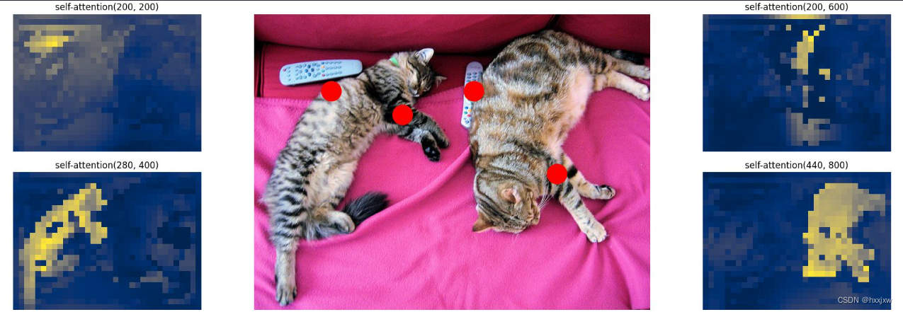
# let's select 4 reference points for visualization idxs = [(200, 200), (280, 400), (200, 600), (440, 800),] # here we create the canvas fig = plt.figure(constrained_layout=True, figsize=(25 * 0.7, 8.5 * 0.7)) # and we add one plot per reference point gs = fig.add_gridspec(2, 4) axs = [ fig.add_subplot(gs[0, 0]), fig.add_subplot(gs[1, 0]), fig.add_subplot(gs[0, -1]), fig.add_subplot(gs[1, -1]), ] # for each one of the reference points, let's plot the self-attention # for that point for idx_o, ax in zip(idxs, axs): idx = (idx_o[0] // fact, idx_o[1] // fact) #sattn是[h,w,h,w] ax.imshow(sattn[..., idx[0], idx[1]], cmap='cividis', interpolation='nearest') # ax.imshow(sattn[idx[0], idx[1],...], cmap='cividis', interpolation='nearest') ax.axis('off') ax.set_title(f'self-attention{idx_o}') # and now let's add the central image, with the reference points as red circles fcenter_ax = fig.add_subplot(gs[:, 1:-1]) fcenter_ax.imshow(im) for (y, x) in idxs: scale = im.height / img.shape[-2] x = ((x // fact) + 0.5) * fact y = ((y // fact) + 0.5) * fact fcenter_ax.add_patch(plt.Circle((x * scale, y * scale), fact // 2, color='r')) fcenter_ax.axis('off') plt.savefig('enc-self_attn_weights.jpg')subplot的不规则划分
但是有时候我们的划分并不是规则的, 比如如下的形式
这种应该怎么划分呢?
将整个表按照 2*2 划分
前两个简单, 分别是 (2, 2, 1) 和 (2, 2, 2)但是第三个图呢, 他占用了 (2, 2, 3) 和 (2, 2, 4)
显示需要对其重新划分, 按照 2 * 1 划分
前两个图占用了 (2, 1, 1) 的位置
因此第三个图占用了 (2, 1, 2) 的位置
41. 自定义colormap
import numpy as np import matplotlib.pyplot as plt import matplotlib.colors x,y,c = zip(*np.random.rand(30,3)*4-2) cmap = matplotlib.colors.LinearSegmentedColormap.from_list("", ["white","blue"]) plt.scatter(x,y,c=c, cmap=cmap) plt.colorbar() plt.show() plt.savefig('pra.jpg')
cmap = matplotlib.colors.LinearSegmentedColormap.from_list("", ["red","violet","blue"])
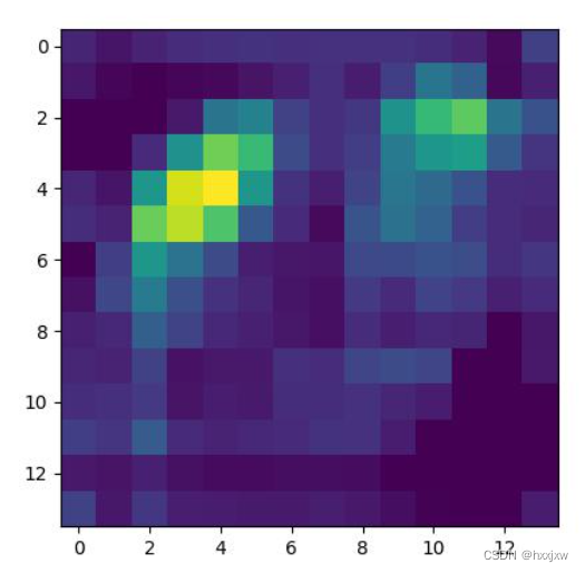
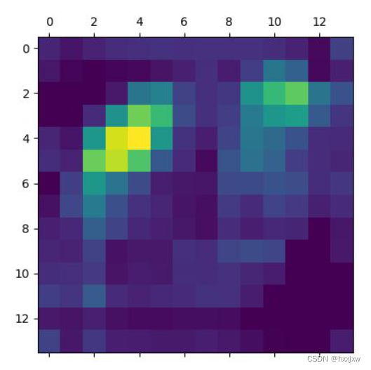
42. plt.matshow()
画矩阵,和plt.imshow()也差不多
plt.imshow()画的
plt.matshow()画的
43. 一张图中画多个子图
法①
plt.figure() for num in range(12): ax = plt.subplot(3, 4, num+1) ##一共有3行4列,当前图画在第几张 plt.imshow(layer_dict[i][0][0][num]) plt.show() plt.savefig(f"layer{i}_output.jpg")法②
(2条消息) DETR query and position encoding 可视化_hxxjxw的博客-CSDN博客
44.
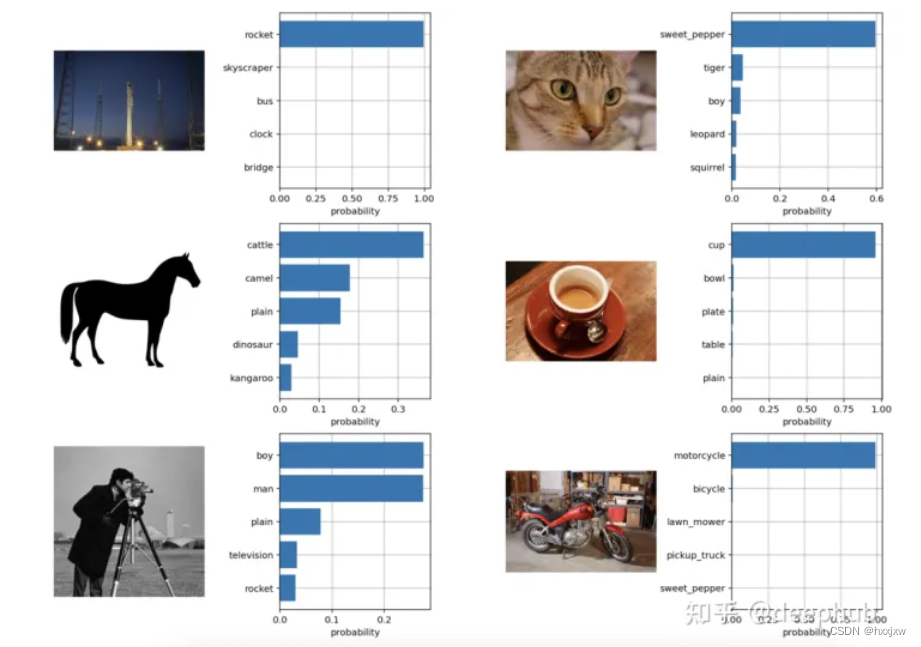
from torchvision.datasets import CIFAR100 cifar100 = CIFAR100(os.path.expanduser("~/.cache"), transform=preprocess, download=True) text_descriptions = [f"This is a photo of a {label}" for label in cifar100.classes] text_tokens = clip.tokenize(text_descriptions).cuda() with torch.no_grad(): text_features = model.encode_text(text_tokens).float() text_features /= text_features.norm(dim=-1, keepdim=True) text_probs = (100.0 * image_features @ text_features.T).softmax(dim=-1) top_probs, top_labels = text_probs.cpu().topk(5, dim=-1) plt.figure(figsize=(16, 16)) for i, image in enumerate(original_images): plt.subplot(4, 4, 2 * i + 1) plt.imshow(image) plt.axis("off") plt.subplot(4, 4, 2 * i + 2) y = np.arange(top_probs.shape[-1]) plt.grid() plt.barh(y, top_probs[i]) plt.gca().invert_yaxis() plt.gca().set_axisbelow(True) plt.yticks(y, [cifar100.classes[index] for index in top_labels[i].numpy()]) plt.xlabel("probability") plt.subplots_adjust(wspace=0.5) plt.show()
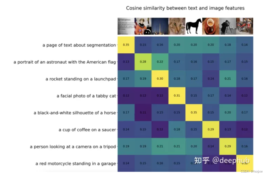
45.
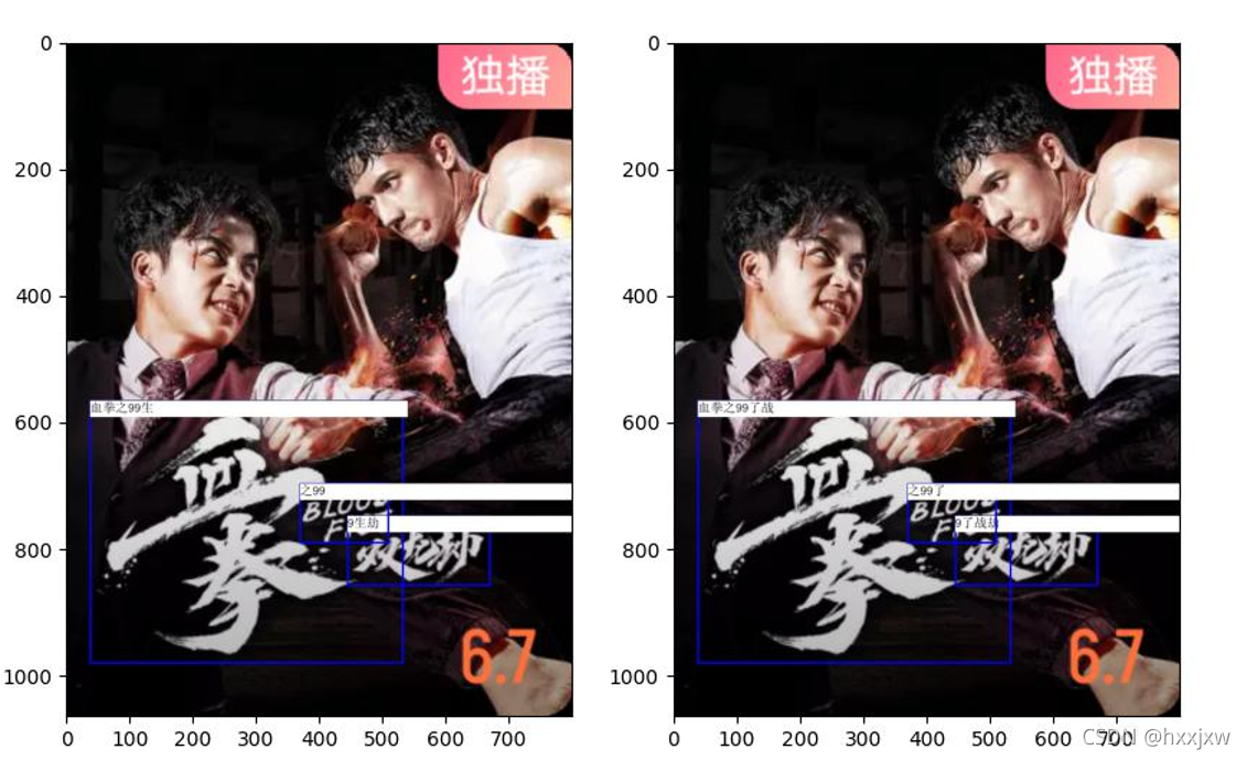
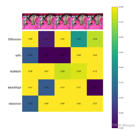
import requests from PIL import Image import matplotlib.pyplot as plt import torch url = 'http://images.cocodataset.org/val2017/000000039769.jpg' im = Image.open(requests.get(url, stream=True).raw) original_images = [] for i in range(5): original_images.append(im) texts = ['1fdssssss','sdfs','fsdfdsfs','4444ffdsf','hhhhhhh'] similarity = torch.rand(5,5).numpy() plt.figure(figsize=(20, 14)) plt.imshow(similarity, vmin=0.1, vmax=0.3) plt.colorbar() plt.yticks(range(5), texts, fontsize=18) plt.xticks([]) for i, image in enumerate(original_images): plt.imshow(image, extent=(i - 0.5, i + 0.5, -1.6, -0.6), origin="lower") for x in range(similarity.shape[1]): for y in range(similarity.shape[0]): plt.text(x, y, f"{similarity[y, x]:.2f}", ha="center", va="center", size=12) for side in ["left", "top", "right", "bottom"]: plt.gca().spines[side].set_visible(False) count=5 plt.xlim([-0.5, count - 0.5]) plt.ylim([count + 0.5, -2]) plt.savefig('test.jpg')
即 想这种效果
46、拉长画布
当标注/标签重叠的时候
即 当这种情况时
就是设置一下画布大小
fig = plt.figure(figsize=(12,4)) # 设置画布大小
47、当标注/标签重叠的时候
即 当这种情况时
可以拉长画布
也可以纵横颠倒
plt.bar()换成plt.barh()
变成这样
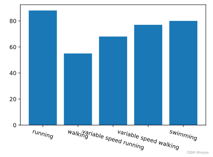
48、标签旋转
当标注/标签重叠的时候
即 当这种情况时
可以旋转标签
plt.xticks(rotation=-15) # 设置x轴标签旋转角度
49. 设置坐标轴及坐标轴标签的颜色
import matplotlib.pyplot as plt fig = plt.figure() ax = fig.add_subplot(121) ax.set_xlabel('X-axis ') ax.set_ylabel('Y-axis ') ax.xaxis.label.set_color('yellow') #setting up X-axis label color to yellow ax.yaxis.label.set_color('blue') #setting up Y-axis label color to blue ax.tick_params(axis='x', colors='red') #setting up X-axis tick color to red ax.tick_params(axis='y', colors='black') #setting up Y-axis tick color to black ax.spines['left'].set_color('red') # setting up Y-axis tick color to red ax.spines['top'].set_color('red') #setting up above X-axis tick color to red plt.plot([3, 4, 1, 0, 3, 0], [1, 4, 4, 3, 0, 0]) plt.savefig('test.jpg')50. 设置坐标轴标签的背景色
import matplotlib.pyplot as plt import numpy as np fig, ax = plt.subplots(figsize=(10,10)) ax.plot(np.linspace(0, 1, 5), np.random.rand(5)) # set xticklabels xtl = [] for x in ax.get_xticks(): xtl += ['lbl: {:.1f}'.format(x)] ax.set_xticklabels(xtl, rotation=90) # modify labels for tl in ax.get_xticklabels(): txt = tl.get_text() if txt == 'lbl: 1.0': txt += ' (!)' tl.set_backgroundcolor('C3') tl.set_text(txt) plt.savefig('test.jpg')
想要这种效果
法2
fig.add_artist()
Artist对象
(23条消息) matplotlib之Artist对象_光与热的博客-CSDN博客
import pandas as pd import matplotlib.pyplot as plt import numpy as np import pandas as pd import matplotlib.patches as patches # Prepare Data df_raw = pd.read_csv("https://github.com/selva86/datasets/raw/master/mpg_ggplot2.csv") df = df_raw[['cty', 'manufacturer']].groupby('manufacturer').apply(lambda x: x.mean()) df.sort_values('cty', inplace=True) df.reset_index(inplace=True) fig, ax = plt.subplots(figsize=(16,10), facecolor='white', dpi= 80) ax.vlines(x=df.index, ymin=0, ymax=df.cty, color='firebrick', alpha=0.7, linewidth=20) # Annotate Text for i, cty in enumerate(df.cty): ax.text(i, cty+0.5, round(cty, 1), horizontalalignment='center') # Title, Label, Ticks and Ylim ax.set_title('Bar Chart for Highway Mileage', fontdict={'size':22}) ax.set(ylabel='Miles Per Gallon', ylim=(0, 30)) plt.xticks(df.index, df.manufacturer.str.upper(), rotation=60, horizontalalignment='right', fontsize=12) # Add patches to color the X axis labels p1 = patches.Rectangle((.57, -0.005), width=.33, height=.13, alpha=.1, facecolor='green', transform=fig.transFigure) p2 = patches.Rectangle((.124, -0.005), width=.446, height=.13, alpha=.1, facecolor='red', transform=fig.transFigure) fig.add_artist(p1) fig.add_artist(p2) plt.show() plt.savefig('test.jpg')
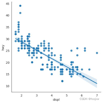
51. 带线性回归最佳拟合线的散点图
sns.lmplot
(5条消息) Python seaborn(sns)_hxxjxw的博客-CSDN博客
52. plt 上设置坐标轴标签(字符串)
import matplotlib.pyplot as plt

data = [5, 20, 15, 25, 10]
labels = ['Tom', 'Dick', 'Harry', 'Slim', 'Jim']

plt.bar(range(len(data)), data, tick_label=labels)
plt.gcf().autofmt_xdate(rotation=45)
plt.show()
import numpy as np
import matplotlib.pyplot as plt

x = range(1,13,1)
y = range(1,13,1)
plt.plot(x,y)
plt.xticks(ticks=x, labels=('Tom','Dick','Harry','Sally','Sue','Lily','Ava','Isla','Rose','Jack','Leo','Charlie'))
plt.show()
plt.savefig('test.jpg')
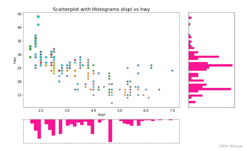
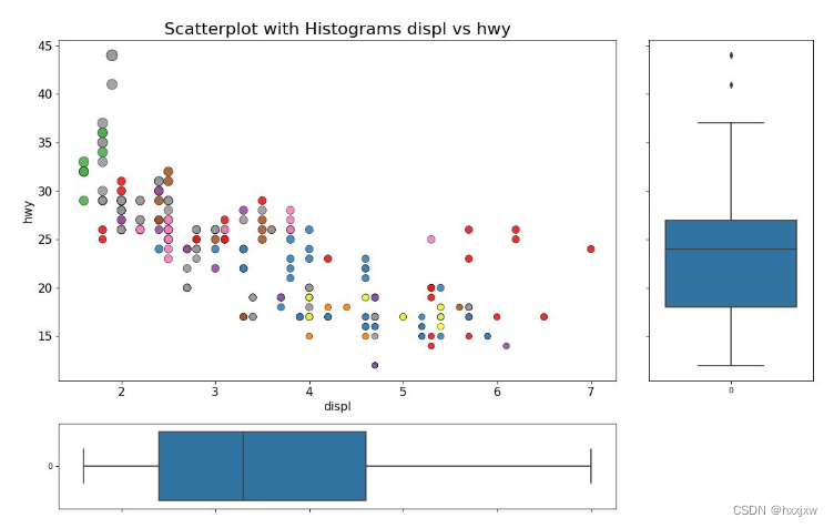
53. 边缘直方图
通过plt.GridSpec() 自定义子图布局实现的
import pandas as pd import matplotlib.pyplot as plt # Import Data df = pd.read_csv("https://raw.githubusercontent.com/selva86/datasets/master/mpg_ggplot2.csv") # Create Fig and gridspec fig = plt.figure(figsize=(16, 10), dpi= 80) grid = plt.GridSpec(4, 4, hspace=0.5, wspace=0.2) # Define the axes ax_main = fig.add_subplot(grid[:-1, :-1]) ax_right = fig.add_subplot(grid[:-1, -1], xticklabels=[], yticklabels=[]) ax_bottom = fig.add_subplot(grid[-1, 0:-1], xticklabels=[], yticklabels=[]) # Scatterplot on main ax ax_main.scatter('displ', 'hwy', s=df.cty*4, c=df.manufacturer.astype('category').cat.codes, alpha=.9, data=df, cmap="tab10", edgecolors='gray', linewidths=.5) # histogram on the right ax_bottom.hist(df.displ, 40, histtype='stepfilled', orientation='vertical', color='deeppink') ax_bottom.invert_yaxis() # histogram in the bottom ax_right.hist(df.hwy, 40, histtype='stepfilled', orientation='horizontal', color='deeppink') # Decorations ax_main.set(title='Scatterplot with Histograms displ vs hwy', xlabel='displ', ylabel='hwy') ax_main.title.set_fontsize(20) for item in ([ax_main.xaxis.label, ax_main.yaxis.label] + ax_main.get_xticklabels() + ax_main.get_yticklabels()): item.set_fontsize(14) xlabels = ax_main.get_xticks().tolist() ax_main.set_xticklabels(xlabels) plt.show() plt.savefig('test.jpg')
边缘箱形图
import pandas as pd
import matplotlib.pyplot as plt
import seaborn as sns

# Import Data
df = pd.read_csv("https://raw.githubusercontent.com/selva86/datasets/master/mpg_ggplot2.csv")

# Create Fig and gridspec
fig = plt.figure(figsize=(16, 10), dpi= 80)
grid = plt.GridSpec(4, 4, hspace=0.5, wspace=0.2)

# Define the axes
ax_main = fig.add_subplot(grid[:-1, :-1])
ax_right = fig.add_subplot(grid[:-1, -1], xticklabels=[], yticklabels=[])
ax_bottom = fig.add_subplot(grid[-1, 0:-1], xticklabels=[], yticklabels=[])

# Scatterplot on main ax
ax_main.scatter('displ', 'hwy', s=df.cty*5, c=df.manufacturer.astype('category').cat.codes, alpha=.9, data=df, cmap="Set1", edgecolors='black', linewidths=.5)

# Add a graph in each part
# ax_right.boxplot(df.hwy)
sns.boxplot(df.hwy, ax=ax_right, orient="v")
sns.boxplot(df.displ, ax=ax_bottom, orient="h")
# ax_bottom.boxplot(df.displ)


# Decorations ------------------
# Remove x axis name for the boxplot
ax_bottom.set(xlabel='')
ax_right.set(ylabel='')

# Main Title, Xlabel and YLabel
ax_main.set(title='Scatterplot with Histograms displ vs hwy', xlabel='displ', ylabel='hwy')

# Set font size of different components
ax_main.title.set_fontsize(20)
for item in ([ax_main.xaxis.label, ax_main.yaxis.label] + ax_main.get_xticklabels() + ax_main.get_yticklabels()):
    item.set_fontsize(14)

plt.show()
plt.savefig('test.jpg')
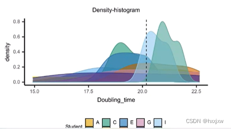
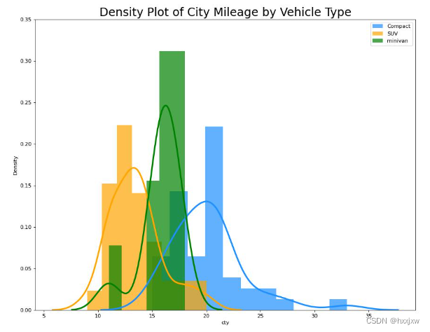
54. 直方密度线图
带有直方图的密度曲线将两个图表传达的集体信息汇集在一起,这样您就可以将它们放在一个图形而不是两个图形中。
主要是靠sns.distplot()函数
import pandas as pd
import matplotlib.pyplot as plt
import seaborn as sns

# Import Data
df = pd.read_csv("https://github.com/selva86/datasets/raw/master/mpg_ggplot2.csv")

# Draw Plot
plt.figure(figsize=(13,10), dpi= 80)
sns.distplot(df.loc[df['class'] == 'compact', "cty"], color="dodgerblue", label="Compact", hist_kws={'alpha':.7}, kde_kws={'linewidth':3})
sns.distplot(df.loc[df['class'] == 'suv', "cty"], color="orange", label="SUV", hist_kws={'alpha':.7}, kde_kws={'linewidth':3})
sns.distplot(df.loc[df['class'] == 'minivan', "cty"], color="g", label="minivan", hist_kws={'alpha':.7}, kde_kws={'linewidth':3})
plt.ylim(0, 0.35)

# Decoration
plt.title('Density Plot of City Mileage by Vehicle Type', fontsize=22)
plt.legend()
plt.show()
plt.savefig('test.jpg')
密度图
Python的数据科学函数包(三)——matplotlib(plt)_hxxjxw的博客-CSDN博客_matplotlib plt
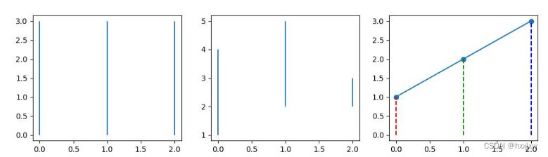
55. plt.hlines() / plt.vlines() 绘制一组有限长度的垂直/水平线
matplotlib.pyplot.hlines(y, xmin, xmax, colors=’k’, linestyles=’solid’, label=”, *, data=None, **kwargsimport matplotlib.pyplot as plt x = range(3) plt.figure(figsize=(12, 3)) plt.subplot(131) plt.vlines(x, 0, 3) plt.subplot(132) plt.vlines(x, [1, 2, 3], [4, 5, 2]) plt.subplot(133) plt.plot(x, range(1, 4), marker='o') plt.vlines(x, [0, 0, 0], range(1, 4), colors=['r', 'g', 'b'], linestyles='dashed') plt.show() plt.savefig('test.jpg')
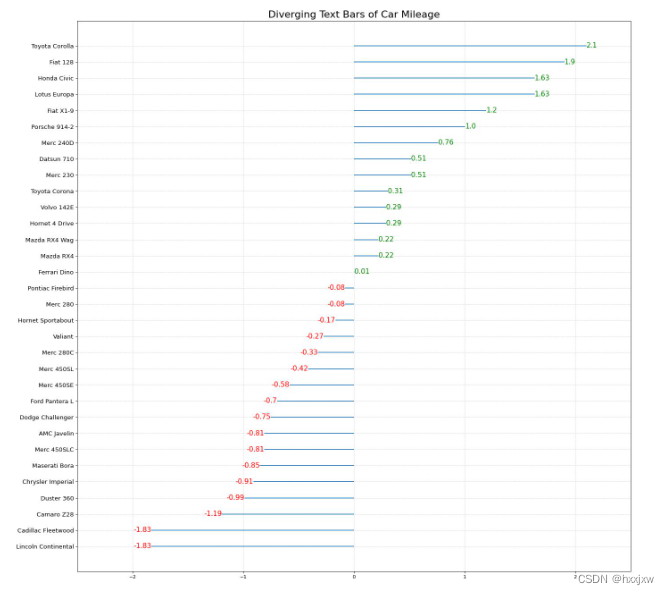
56. 发散型文本
import pandas as pd
import matplotlib.pyplot as plt

# Prepare Data
df = pd.read_csv("https://github.com/selva86/datasets/raw/master/mtcars.csv")
x = df.loc[:, ['mpg']]
df['mpg_z'] = (x - x.mean())/x.std()
df['colors'] = ['red' if x < 0 else 'green' for x in df['mpg_z']]
df.sort_values('mpg_z', inplace=True)
df.reset_index(inplace=True)

# Draw plot
plt.figure(figsize=(20,20), dpi= 80)
plt.hlines(y=df.index, xmin=0, xmax=df.mpg_z)
for x, y, tex in zip(df.mpg_z, df.index, df.mpg_z):
    t = plt.text(x, y, round(tex, 2), horizontalalignment='right' if x < 0 else 'left',
                 verticalalignment='center', fontdict={'color':'red' if x < 0 else 'green', 'size':14})

# Decorations
plt.yticks(df.index, df.cars, fontsize=12)
plt.title('Diverging Text Bars of Car Mileage', fontdict={'size':20})
plt.grid(linestyle='--', alpha=0.5)
plt.xlim(-2.5, 2.5)
plt.show()
plt.savefig('test.jpg')
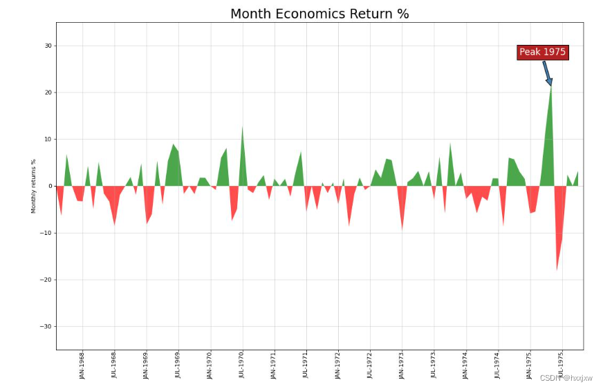
57. 面积图
靠plt.fill_between()
import pandas as pd
import matplotlib.pyplot as plt
import numpy as np
import pandas as pd

# Prepare Data
df = pd.read_csv("https://github.com/selva86/datasets/raw/master/economics.csv", parse_dates=['date']).head(100)
x = np.arange(df.shape[0])
y_returns = (df.psavert.diff().fillna(0)/df.psavert.shift(1)).fillna(0) * 100

# Plot
plt.figure(figsize=(16,10), dpi= 80)
plt.fill_between(x[1:], y_returns[1:], 0, where=y_returns[1:] >= 0, facecolor='green', interpolate=True, alpha=0.7)
plt.fill_between(x[1:], y_returns[1:], 0, where=y_returns[1:] <= 0, facecolor='red', interpolate=True, alpha=0.7)

# Annotate
plt.annotate('Peak 1975', xy=(94.0, 21.0), xytext=(88.0, 28),
             bbox=dict(boxstyle='square', fc='firebrick'),
             arrowprops=dict(facecolor='steelblue', shrink=0.05), fontsize=15, color='white')

# Decorations
xtickvals = [str(m)[:3].upper()+"-"+str(y) for y,m in zip(df.date.dt.year, df.date.dt.month_name())]
plt.gca().set_xticks(x[::6])
plt.gca().set_xticklabels(xtickvals[::6], rotation=90, fontdict={'horizontalalignment': 'center', 'verticalalignment': 'center_baseline'})
plt.ylim(-35,35)
plt.xlim(1,100)
plt.title("Month Economics Return %", fontsize=22)
plt.ylabel('Monthly returns %')
plt.grid(alpha=0.5)
plt.show()
plt.savefig('test.jpg')
58. 棒棒糖图
就是vlines先画一条线
然后scatter再画个点
import pandas as pd
import matplotlib.pyplot as plt
import numpy as np
import pandas as pd

# Prepare Data
df_raw = pd.read_csv("https://github.com/selva86/datasets/raw/master/mpg_ggplot2.csv")
df = df_raw[['cty', 'manufacturer']].groupby('manufacturer').apply(lambda x: x.mean())
df.sort_values('cty', inplace=True)
df.reset_index(inplace=True)

# Draw plot
fig, ax = plt.subplots(figsize=(25,15), dpi= 80)
ax.vlines(x=df.index, ymin=0, ymax=df.cty, color='firebrick', alpha=0.7, linewidth=2)
ax.scatter(x=df.index, y=df.cty, s=75, color='firebrick', alpha=0.7)

# Title, Label, Ticks and Ylim
ax.set_title('Lollipop Chart for Highway Mileage', fontdict={'size':22})
ax.set_ylabel('Miles Per Gallon')
ax.set_xticks(df.index)
ax.set_xticklabels(df.manufacturer.str.upper(), rotation=60, fontdict={'horizontalalignment': 'right', 'size':12})
ax.set_ylim(0, 30)

# Annotate
for row in df.itertuples():
    ax.text(row.Index, row.cty+.5, s=round(row.cty, 2), horizontalalignment= 'center', verticalalignment='bottom', fontsize=14)

plt.show()
plt.savefig('test.jpg')
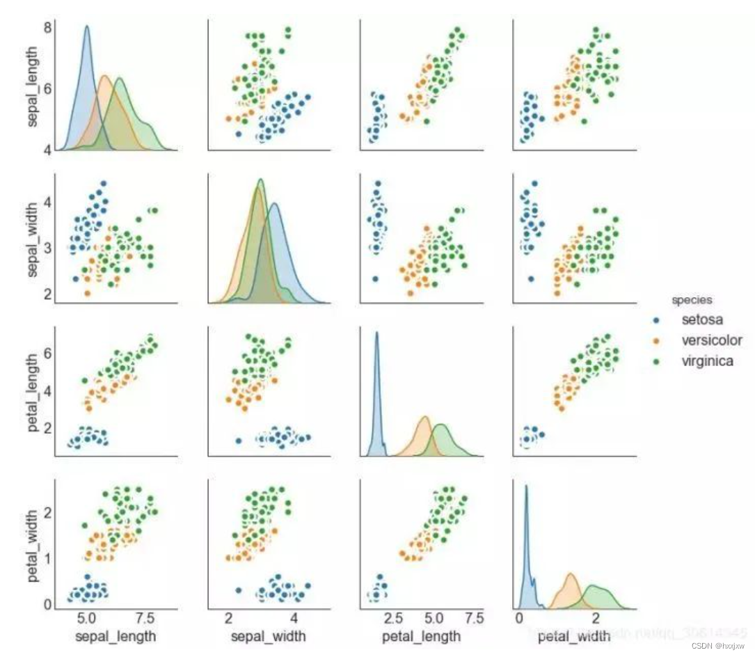
59. 成对图
(23条消息) Python seaborn(sns)_hxxjxw的博客-CSDN博客
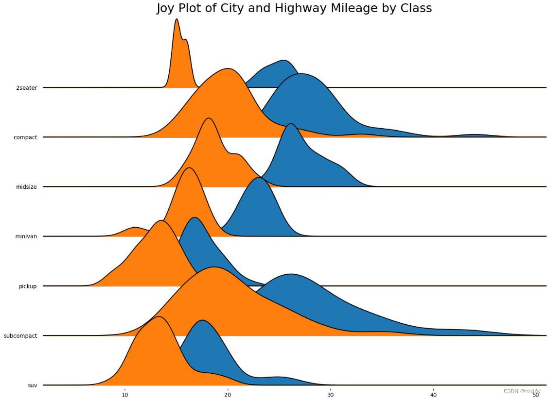
60. 多组密度线
(84条消息) joypy(Joy Plot)_hxxjxw的博客-CSDN博客
61. 雷达图/蛛网图
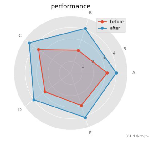
import numpy as np
import matplotlib.pyplot as plt

# 中文和负号的正常显示
# plt.rcParams['font.sans-serif'] = 'Microsoft YaHei'
plt.rcParams['axes.unicode_minus'] = False

# 使用ggplot的绘图风格
plt.style.use('ggplot')

# 构造数据
values = [3.2,2.1,3.5,2.8,3]
values2 = [4,4.1,4.5,4,4.1]
feature = ['A','B','C','D','E']

N = len(values)
# 设置雷达图的角度,用于平分切开一个圆面
angles=np.linspace(0, 2*np.pi, N, endpoint=False)
# 为了使雷达图一圈封闭起来,需要下面的步骤
values=np.concatenate((values,[values[0]]))
values2=np.concatenate((values2,[values2[0]]))
angles=np.concatenate((angles,[angles[0]]))

# 绘图
fig=plt.figure()
ax = fig.add_subplot(111, polar=True)
# 绘制折线图
ax.plot(angles, values, 'o-', linewidth=2, label = 'before')
# 填充颜色
ax.fill(angles, values, alpha=0.25)
# 绘制第二条折线图
ax.plot(angles, values2, 'o-', linewidth=2, label = 'after')
ax.fill(angles, values2, alpha=0.25)
# import ipdb;ipdb.set_trace()
# 添加每个特征的标签
ax.set_thetagrids(angles[:-1] * 180/np.pi, feature)
# 设置雷达图的范围
ax.set_ylim(0,5)
# 添加标题
plt.title('performance')

# 添加网格线
ax.grid(True)
# 设置图例
plt.legend(loc = 'best')
# 显示图形
plt.show()
plt.savefig('out.jpg')
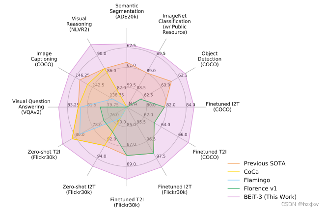
像BEiT v3中画的
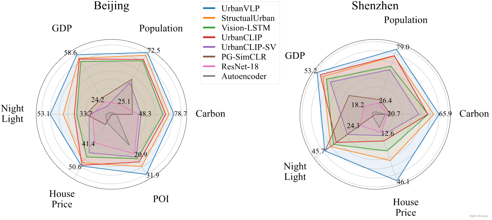
import matplotlib.pyplot as plt
import numpy as np
from matplotlib import rcParams

config = {
    "font.family":'Times New Roman',
    "mathtext.fontset":'cm',
}
rcParams.update(config)


UrbanVLP =       [65.9, 79.0, 53.2, 45.7, 46.1]
StructualUrban = [61.3, 72.4, 48.9, 42.1, 32.1]
VisionLSTM =     [56.4, 62.4, 46.2, 40.4, 25.4]
UrbanCLIP =      [56.2, 72.7, 50.8, 38.7, 18.5]
UrbanCLIP_SV =   [48.3, 58.9, 43.3, 32.0, 14.7]
PG_SimCLR =      [23.4, 29.4, 29.4, 45.4, 0.0]
ResNet_18 =      [20.7, 26.4, 18.2, 24.3, 12.6]
Autoencoder =    [18.9, 17.5, 11.9, 16.6, 9.2]

# Scales for each metric
scales = [
    [10, 90],  # Scale for A
    [15, 100],   # Scale for B
    [10, 65],  # Scale for C
    [15, 60],  # Scale for D
    [0, 60], # Scale for F
]

# Normalize the data
normalized_model_1 = [(value - scale[0]) / (scale[1] - scale[0]) * 100 for value, scale in zip(UrbanVLP, scales)]
normalized_model_2 = [(value - scale[0]) / (scale[1] - scale[0]) * 100 for value, scale in zip(StructualUrban, scales)]
normalized_model_3 = [(value - scale[0]) / (scale[1] - scale[0]) * 100 for value, scale in zip(VisionLSTM, scales)]
normalized_model_4 = [(value - scale[0]) / (scale[1] - scale[0]) * 100 for value, scale in zip(UrbanCLIP, scales)]
normalized_model_5 = [(value - scale[0]) / (scale[1] - scale[0]) * 100 for value, scale in zip(UrbanCLIP_SV, scales)]
normalized_model_6 = [(value - scale[0]) / (scale[1] - scale[0]) * 100 for value, scale in zip(PG_SimCLR, scales)]
normalized_model_7 = [(value - scale[0]) / (scale[1] - scale[0]) * 100 for value, scale in zip(ResNet_18, scales)]
normalized_model_8 = [(value - scale[0]) / (scale[1] - scale[0]) * 100 for value, scale in zip(Autoencoder, scales)]

# The plot is circular, so we need to "complete the loop" and append the start value to the end.
normalized_model_1 += normalized_model_1[:1]
normalized_model_2 += normalized_model_2[:1]
normalized_model_3 += normalized_model_3[:1]
normalized_model_4 += normalized_model_4[:1]
normalized_model_5 += normalized_model_5[:1]
normalized_model_6 += normalized_model_6[:1]
normalized_model_7 += normalized_model_7[:1]
normalized_model_8 += normalized_model_8[:1]

# Labels for each variable
labels = ['Carbon', 'Population', 'GDP', 'Night\nLight', 'House\nPrice']

# Number of variables
num_vars = len(labels)

# Compute angle each bar is centered on:
angles = np.linspace(0, 2 * np.pi, num_vars, endpoint=False).tolist()

# We need to "complete the loop" and append the start value to the end.
angles += angles[:1]


# Initialise the spider plot
# fig, ax = plt.subplots(figsize=(8, 8), subplot_kw=dict(polar=True))
fig, ax = plt.subplots(1, 2, figsize=(18, 20), subplot_kw=dict(polar=True))
fig.tight_layout(h_pad=20)


ax[1].set_title('Shenzhen', fontsize=36, pad=20)

# Plot data for each model
ax[1].plot(angles, normalized_model_1, linewidth=2, linestyle='solid', label='UrbanVLP')
ax[1].fill(angles, normalized_model_1, alpha=0.1)

ax[1].plot(angles, normalized_model_2, linewidth=2, linestyle='solid', label='StructualUrban')
ax[1].fill(angles, normalized_model_2, alpha=0.1)

ax[1].plot(angles, normalized_model_3, linewidth=2, linestyle='solid', label='Vision-LSTM')
ax[1].fill(angles, normalized_model_3, alpha=0.1)

ax[1].plot(angles, normalized_model_4, linewidth=2, linestyle='solid', label='UrbanCLIP')
ax[1].fill(angles, normalized_model_4, alpha=0.1)

ax[1].plot(angles, normalized_model_5, linewidth=2, linestyle='solid', label='UrbanCLIP-SV')
ax[1].fill(angles, normalized_model_5, alpha=0.1)

ax[1].plot(angles, normalized_model_6, linewidth=2, linestyle='solid', label='PG-SimCLR')
ax[1].fill(angles, normalized_model_6, alpha=0.1)

ax[1].plot(angles, normalized_model_7, linewidth=2, linestyle='solid', label='ResNet-18')
ax[1].fill(angles, normalized_model_7, alpha=0.1)

ax[1].plot(angles, normalized_model_8, linewidth=2, linestyle='solid', label='Autoencoder')
ax[1].fill(angles, normalized_model_8, alpha=0.1)

# Correcting the tick settings

# plt.xticks(angles[:-1], labels,  fontsize=24)
ax[1].set_xticks(angles[:-1], labels, fontsize=30)

ax[1].tick_params(axis='x', pad=60)

ax[1].set_yticklabels([])

# Annotate data points
for i, (value1, value2, value3, value4, value5, value6, value7, value8) in enumerate(zip(UrbanVLP, StructualUrban, VisionLSTM, UrbanCLIP, UrbanCLIP_SV, PG_SimCLR, ResNet_18, Autoencoder)):
    angle_rad = angles[i]

    # Adjusting text alignment and position based on angle
    alignment = "center"
    if angle_rad > np.pi/2 and angle_rad < 3*np.pi/2:
        alignment = "right"
    elif angle_rad < np.pi/2 or angle_rad > 3*np.pi/2:
        alignment = "left"

    xytext = (0*np.cos(angle_rad), 5*np.sin(angle_rad))  # Dynamically set text position

    ax[1].annotate(value1, xy=(angle_rad, normalized_model_1[i]), xytext=xytext, textcoords="offset points",
                ha=alignment, va="center", fontsize=22)
    # ax.annotate(value2, xy=(angle_rad, normalized_model_2[i]), xytext=xytext, textcoords="offset points",
    #             ha=alignment, va="center")
    # ax.annotate(value3, xy=(angle_rad, normalized_model_3[i]), xytext=xytext, textcoords="offset points",
    #             ha=alignment, va="center")
    # ax.annotate(value4, xy=(angle_rad, normalized_model_4[i]), xytext=xytext, textcoords="offset points",
    #             ha=alignment, va="center")
    # ax.annotate(value5, xy=(angle_rad, normalized_model_5[i]), xytext=xytext, textcoords="offset points",
    #             ha=alignment, va="center", fontsize=16)
    # ax[0].annotate(value6, xy=(angle_rad, normalized_model_6[i]), xytext=xytext, textcoords="offset points",
    #             ha=alignment, va="center", fontsize=22)
    ax[1].annotate(value7, xy=(angle_rad, normalized_model_7[i]), xytext=xytext, textcoords="offset points",
                ha=alignment, va="center", fontsize=22)
    # ax.annotate(value8, xy=(angle_rad, normalized_model_8[i]), xytext=xytext, textcoords="offset points",
    #             ha=alignment, va="center")


plt.subplots_adjust(wspace=0.75)  # Adjust the value as needed


# Your provided values
UrbanVLP =       [78.7, 72.5, 58.6, 53.1, 50.6, 31.9]
StructualUrban = [74.5, 69.9, 56.0, 47.1, 49.4, 27.7]
VisionLSTM =     [69.2, 64.9, 53.6, 40.9, 47.0, 23.6]
UrbanCLIP =      [71.6, 66.1, 55.5, 42.0, 50.3, 25.3]
UrbanCLIP_SV =   [50.4, 44.7, 20.8, 35.2, 45.3, 22.7]
PG_SimCLR =      [43.0, 47.6, 27.0, 36.7, 34.1, 0.0]
ResNet_18 =      [48.3, 25.1, 24.2, 33.7, 41.4, 20.9]
Autoencoder =    [29.4, 16.4, 16.5, 27.6, 33.2, 16.4]

# Scales for each metric
scales = [
    [25, 100],  # Scale for A
    [15, 85],   # Scale for B
    [15, 70],  # Scale for C
    [25, 65],  # Scale for D
    [30, 60],  # Scale for E
    [0, 40], # Scale for F
]

# Normalize the data
normalized_model_1 = [(value - scale[0]) / (scale[1] - scale[0]) * 100 for value, scale in zip(UrbanVLP, scales)]
normalized_model_2 = [(value - scale[0]) / (scale[1] - scale[0]) * 100 for value, scale in zip(StructualUrban, scales)]
normalized_model_3 = [(value - scale[0]) / (scale[1] - scale[0]) * 100 for value, scale in zip(VisionLSTM, scales)]
normalized_model_4 = [(value - scale[0]) / (scale[1] - scale[0]) * 100 for value, scale in zip(UrbanCLIP, scales)]
normalized_model_5 = [(value - scale[0]) / (scale[1] - scale[0]) * 100 for value, scale in zip(UrbanCLIP_SV, scales)]
normalized_model_6 = [(value - scale[0]) / (scale[1] - scale[0]) * 100 for value, scale in zip(PG_SimCLR, scales)]
normalized_model_7 = [(value - scale[0]) / (scale[1] - scale[0]) * 100 for value, scale in zip(ResNet_18, scales)]
normalized_model_8 = [(value - scale[0]) / (scale[1] - scale[0]) * 100 for value, scale in zip(Autoencoder, scales)]

# The plot is circular, so we need to "complete the loop" and append the start value to the end.
normalized_model_1 += normalized_model_1[:1]
normalized_model_2 += normalized_model_2[:1]
normalized_model_3 += normalized_model_3[:1]
normalized_model_4 += normalized_model_4[:1]
normalized_model_5 += normalized_model_5[:1]
normalized_model_6 += normalized_model_6[:1]
normalized_model_7 += normalized_model_7[:1]
normalized_model_8 += normalized_model_8[:1]


# Labels for each variable
labels = ['Carbon', 'Population', 'GDP', 'Night\nLight', 'House\nPrice', 'POI']

# Number of variables
num_vars = len(labels)

# Compute angle each bar is centered on:
angles = np.linspace(0, 2 * np.pi, num_vars, endpoint=False).tolist()

# We need to "complete the loop" and append the start value to the end.
angles += angles[:1]


ax[0].set_title('Beijing', fontsize=36, pad=90)
# Plot data for each model
ax[0].plot(angles, normalized_model_1, linewidth=2, linestyle='solid', label='UrbanVLP')
ax[0].fill(angles, normalized_model_1, alpha=0.1)

ax[0].plot(angles, normalized_model_2, linewidth=2, linestyle='solid', label='StructualUrban')
ax[0].fill(angles, normalized_model_2, alpha=0.1)

ax[0].plot(angles, normalized_model_3, linewidth=2, linestyle='solid', label='Vision-LSTM')
ax[0].fill(angles, normalized_model_3, alpha=0.1)

ax[0].plot(angles, normalized_model_4, linewidth=2, linestyle='solid', label='UrbanCLIP')
ax[0].fill(angles, normalized_model_4, alpha=0.1)

ax[0].plot(angles, normalized_model_5, linewidth=2, linestyle='solid', label='UrbanCLIP-SV')
ax[0].fill(angles, normalized_model_5, alpha=0.1)

ax[0].plot(angles, normalized_model_6, linewidth=2, linestyle='solid', label='PG-SimCLR')
ax[0].fill(angles, normalized_model_6, alpha=0.1)

ax[0].plot(angles, normalized_model_7, linewidth=2, linestyle='solid', label='ResNet-18')
ax[0].fill(angles, normalized_model_7, alpha=0.1)

ax[0].plot(angles, normalized_model_8, linewidth=2, linestyle='solid', label='Autoencoder')
ax[0].fill(angles, normalized_model_8, alpha=0.1)

# Correcting the tick settings

# plt.xticks(angles[:-1], labels,  fontsize=24)
ax[0].set_xticks(angles[:-1], labels, fontsize=30)

ax[0].tick_params(axis='x', pad=60)

ax[0].set_yticklabels([])

# Annotate data points
for i, (value1, value2, value3, value4, value5, value6, value7, value8) in enumerate(zip(UrbanVLP, StructualUrban, VisionLSTM, UrbanCLIP, UrbanCLIP_SV, PG_SimCLR, ResNet_18, Autoencoder)):
    angle_rad = angles[i]

    # Adjusting text alignment and position based on angle
    alignment = "center"
    if angle_rad > np.pi/2 and angle_rad < 3*np.pi/2:
        alignment = "right"
    elif angle_rad < np.pi/2 or angle_rad > 3*np.pi/2:
        alignment = "left"

    xytext = (0*np.cos(angle_rad), 5*np.sin(angle_rad))  # Dynamically set text position

    ax[0].annotate(value1, xy=(angle_rad, normalized_model_1[i]), xytext=xytext, textcoords="offset points",
                ha=alignment, va="center", fontsize=22)
    ax[0].annotate(value7, xy=(angle_rad, normalized_model_7[i]), xytext=xytext, textcoords="offset points",
                ha=alignment, va="center", fontsize=22)


legend = plt.legend(fontsize=26,
                    loc=(-0.66, 0.7),  #先x后y
                    labelspacing=0.2,  #图例中标签之间的间距为字体大小的 0.2 倍
                    borderpad=0.4,   #图例边框与内容之间的填充调整为字体大小的 0.4 倍
                    framealpha=0.5,  #图例的背景框的透明度设置为 0.5,使其部分透明
                    handlelength=1.2 #将图例标记(表示图例中每个项目的彩色线条或符号)的长度设置为默认长度的 1.2 倍。
                    )

# 获取图例线条
legend_lines = legend.get_lines()

# 调整图例线条的粗细
for line in legend_lines:
    line.set_linewidth(5.0)  # 您可以根据需要调整粗细


# Show the plot
# plt.show()
plt.savefig('radar.pdf', dpi=800, bbox_inches='tight')
62.画图的同时显示注释
wrapped_text能自动换行
import textwrap
from PIL import Image
import cv2

for i in range(10):
    img_path = df['Path'][i]
    x = cv2.imread(str(img_path), flags=0)  #灰度图
    # tranform images
    x = resize_img(x, scale=256)  #[256,256]
    img = Image.fromarray(x).convert("RGB")
    # img = Image.fromarray(x).convert("L")
    fig, (ax1, ax2) = plt.subplots(1, 2, figsize=(20, 6))
    # fig, (ax1, ax2, ax3) = plt.subplots(1, 3, figsize=((12, 6), (8, 6), (6, 6)))

    ax1.imshow(img)
    impression = f'impression: {path2sent_impression[img_path]}'
    findings = f'findings: {path2sent_findings[img_path]}'
    wrapped_text = textwrap.wrap(impression, width=80)
    ax2.text(0.05, 0.8,  '\n'.join(wrapped_text), fontsize=12)
    wrapped_text = textwrap.wrap(findings, width=80)
    ax2.text(0.05, 0.2, '\n'.join(wrapped_text), fontsize=12)
    plt.savefig('lian.jpg')
63. 小提琴图
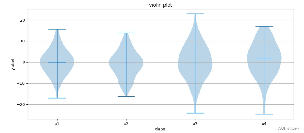
import matplotlib.pyplot as plt
import numpy as np

fig, axes = plt.subplots(figsize=(12, 5))

all_data = [np.random.normal(0, std, 100) for std in range(6, 10)]

axes.violinplot(all_data,
                   showmeans=False,
                   showmedians=True
                   )
axes.set_title('violin plot')

# adding horizontal grid lines

axes.yaxis.grid(True)
axes.set_xticks([y + 1 for y in range(len(all_data))], )
axes.set_xlabel('xlabel')
axes.set_ylabel('ylabel')

plt.setp(axes, xticks=[y + 1 for y in range(len(all_data))],
         xticklabels=['x1', 'x2', 'x3', 'x4'],
         )

plt.show()
plt.savefig('lian.jpg')
64.
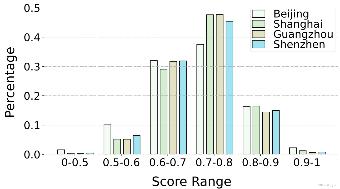
import numpy as np
import matplotlib.pyplot as plt

# x_name = ["0-50%","50-60%","60-70%","70-80%","80-90%","90-100%"] # 横轴
x_name = ['0-0.5', '0.5-0.6', '0.6-0.7', '0.7-0.8', '0.8-0.9', '0.9-1']
x = range(len(x_name))
x = [i-1 for i in x]

bj = np.array([0.015461733973453826, 0.10307822648969217, 0.32003671279299634, 0.3752471053374753, 0.16365433493363457, 0.02252188647274781])
sh = np.array([0.003714139344262295, 0.05206198770491803, 0.2905993852459016, 0.4764984631147541, 0.16470286885245902, 0.012423155737704918])
gz = np.array([0.0024589357725976198, 0.05163765122455002, 0.31739942952690076, 0.47732861217664996, 0.14468378085964395, 0.006491590439657716])
sz = np.array([0.004453176162409954, 0.06483300589390963, 0.3189259986902423, 0.45396201702685, 0.14970530451866404, 0.008120497707924034])

plt.figure(figsize=(10,5), dpi=300)
bwith = 0
# colors = ['#2F9D6B', '#8B30C2', '#3BBAE1']

ax = plt.gca()
ax.spines['bottom'].set_linewidth(bwith)
ax.spines['left'].set_linewidth(bwith)
ax.spines['top'].set_linewidth(bwith)
ax.spines['right'].set_linewidth(bwith)
plt.grid(linestyle='-.',axis='y')
plt.bar(x, bj, width=0.15, label="Beijing", color='#f1fdf3', edgecolor='black')
plt.bar([i+0.21 for i in x], sh, width=0.15, label="Shanghai", color='#d5eecf', edgecolor='black')
plt.bar([i+0.42 for i in x], gz, width=0.15, label="Guangzhou", color='#e3e2c3', edgecolor='black')
plt.bar([i+0.63 for i in x], sz, width=0.15, label="Shenzhen", color='#a0e4f1', edgecolor='black')
plt.legend(fontsize=20, loc = [0.7,0.7], labelspacing=0, borderpad=0.15, framealpha=0.5, handlelength=1.2)
plt.xlabel("Score Range", fontsize=24, labelpad=15)
plt.ylabel("Percentage", fontsize=24, labelpad=15)
plt.ylim([0.0, 0.5])
plt.yticks(fontsize=20)
plt.xticks([i+0.3 for i in x], x_name, fontsize=20)

plt.savefig('pra1.jpg', dpi=800, bbox_inches='tight')
65.
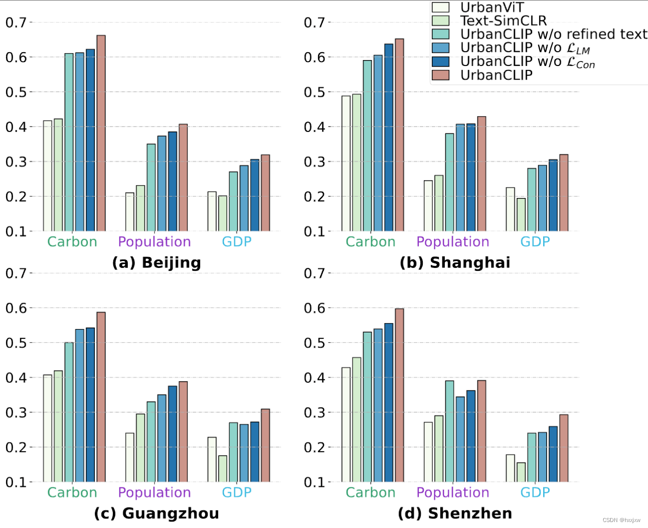
import pandas as pd
import matplotlib.pyplot as plt
import numpy as np


x_name = ["Carbon","Population","GDP"] # 横轴
x = range(len(x_name))
x = [i-1 for i in x]

vit = np.array([0.417, 0.210, 0.213])
text = np.array([0.422, 0.231, 0.201])
ref = np.array([0.61, 0.35, 0.27])
lm = np.array([0.612, 0.373, 0.288])
con = np.array([0.622, 0.385, 0.306])
urbanclip = np.array([0.662, 0.407, 0.319])

plt.figure(figsize=(14,12), dpi=300)
bwith = 0
colors = ['#2F9D6B', '#8B30C2', '#3BBAE1']

plt.subplot(2,2,1)
ax = plt.gca()
ax.spines['bottom'].set_linewidth(bwith)
ax.spines['left'].set_linewidth(bwith)
ax.spines['top'].set_linewidth(bwith)
ax.spines['right'].set_linewidth(bwith)
plt.grid(linestyle='-.',axis='y')
plt.bar(x, vit, width=0.1, label="UrbanViT", color='#f7fcf1', edgecolor='black')
plt.bar([i+0.13 for i in x], text, width=0.1, label="Text-SimCLR", color='#d5eecf', edgecolor='black')
plt.bar([i+0.26 for i in x], ref, width=0.1, label="UrbanCLIP w/o text", color='#8ed3ca', edgecolor='black')
plt.bar([i+0.39 for i in x], lm, width=0.1, label="UrbanCLIP w/o $\mathcal{L}_{LM}$", color='#5ba4cc', edgecolor='black')
plt.bar([i+0.52 for i in x], con, width=0.1, label="UrbanCLIP w/o $\mathcal{L}_{con}$", color='#2674af', edgecolor='black')
plt.bar([i+0.65 for i in x], urbanclip, width=0.1, label="UrbanCLIP", color='#cc948a', edgecolor='black')
plt.xlabel("(a) Beijing", fontsize=22, weight='bold', labelpad=10)
plt.ylim([0.1, 0.7])
plt.yticks(fontsize=20)
plt.xticks([i+0.3 for i in x], x_name, fontsize=20)
for i, tick_label in enumerate(ax.get_xticklabels()):
    tick_label.set_color(colors[i])


vit = np.array([0.488,	0.245,	0.225])
text = np.array([0.493,	0.260,	0.194])
ref = np.array([0.59,	0.38,	0.28])
lm = np.array([0.605,	0.407,	0.289])
con = np.array([0.637,	0.408,	0.305])
urbanclip = np.array([0.652, 0.429, 0.320])

plt.subplot(2,2,2)
ax = plt.gca()
ax.spines['bottom'].set_linewidth(bwith)
ax.spines['left'].set_linewidth(bwith)
ax.spines['top'].set_linewidth(bwith)
ax.spines['right'].set_linewidth(bwith)
plt.grid(linestyle='-.',axis='y')
plt.bar(x, vit, width=0.1, label="UrbanViT", color='#f7fcf1', edgecolor='black')
plt.bar([i+0.13 for i in x], text, width=0.1, label="Text-SimCLR", color='#d5eecf', edgecolor='black')
plt.bar([i+0.26 for i in x], ref, width=0.1, label="UrbanCLIP w/o refined text", color='#8ed3ca', edgecolor='black')
plt.bar([i+0.39 for i in x], lm, width=0.1, label="UrbanCLIP w/o $\mathcal{L}_{LM}$", color='#5ba4cc', edgecolor='black')
plt.bar([i+0.52 for i in x], con, width=0.1, label="UrbanCLIP w/o $\mathcal{L}_{Con}$", color='#2674af', edgecolor='black')
plt.bar([i+0.65 for i in x], urbanclip, width=0.1, label="UrbanCLIP", color='#cc948a', edgecolor='black')
plt.legend(fontsize=20, loc = (0.4, 0.7), labelspacing=0, borderpad=0.15, framealpha=0.5, handlelength=1.2)
plt.xlabel("(b) Shanghai", fontsize=22, weight='bold', labelpad=10)
plt.ylim([0.1, 0.7])
plt.yticks(fontsize=20)
plt.xticks([i+0.3 for i in x], x_name , fontsize=20)
for i, tick_label in enumerate(ax.get_xticklabels()):
    tick_label.set_color(colors[i])

vit = np.array([0.407,	0.240,	0.228])
text = np.array([0.419,	0.295,	0.175])
ref = np.array([0.50,	0.33,	0.27])
lm = np.array([0.538,	0.350,	0.265])
con = np.array([0.542,	0.375,	0.272])
urbanclip = np.array([0.587,	0.388,	0.309])

plt.subplot(2,2,3)
ax = plt.gca()
ax.spines['bottom'].set_linewidth(bwith)
ax.spines['left'].set_linewidth(bwith)
ax.spines['top'].set_linewidth(bwith)
ax.spines['right'].set_linewidth(bwith)
plt.grid(linestyle='-.',axis='y')
plt.bar(x, vit, width=0.1, label="UrbanViT", color='#f7fcf1', edgecolor='black')
plt.bar([i+0.13 for i in x], text, width=0.1, label="Text-SimCLR", color='#d5eecf', edgecolor='black')
plt.bar([i+0.26 for i in x], ref, width=0.1, label="UrbanCLIP w/o text", color='#8ed3ca', edgecolor='black')
plt.bar([i+0.39 for i in x], lm, width=0.1, label="UrbanCLIP w/o $\mathcal{L}_{LM}$", color='#5ba4cc', edgecolor='black')
plt.bar([i+0.52 for i in x], con, width=0.1, label="UrbanCLIP w/o $\mathcal{L}_{con}$", color='#2674af', edgecolor='black')
plt.bar([i+0.65 for i in x], urbanclip, width=0.1, label="UrbanCLIP", color='#cc948a', edgecolor='black')
plt.xlabel("(c) Guangzhou", fontsize=22, weight='bold', labelpad=10)
plt.ylim([0.1, 0.7])
plt.yticks(fontsize=20)
plt.xticks([i+0.3 for i in x], x_name , fontsize=20)
for i, tick_label in enumerate(ax.get_xticklabels()):
    tick_label.set_color(colors[i])


vit = np.array([0.428,	0.271,	0.178])
text = np.array([0.457,	0.290,	0.155])
ref = np.array([0.53,	0.39,	0.24])
lm = np.array([0.539,	0.344,	0.242])
con = np.array([0.555,	0.362,	0.259])
urbanclip = np.array([0.597,	0.391,	0.293])

plt.subplot(2,2,4)
ax = plt.gca()
ax.spines['bottom'].set_linewidth(bwith)
ax.spines['left'].set_linewidth(bwith)
ax.spines['top'].set_linewidth(bwith)
ax.spines['right'].set_linewidth(bwith)
plt.grid(linestyle='-.',axis='y')
plt.bar(x, vit, width=0.1, label="UrbanViT", color='#f7fcf1', edgecolor='black')
plt.bar([i+0.13 for i in x], text, width=0.1, label="Text-SimCLR", color='#d5eecf', edgecolor='black')
plt.bar([i+0.26 for i in x], ref, width=0.1, label="UrbanCLIP w/o text", color='#8ed3ca', edgecolor='black')
plt.bar([i+0.39 for i in x], lm, width=0.1, label="UrbanCLIP w/o $\mathcal{L}_{LM}$", color='#5ba4cc', edgecolor='black')
plt.bar([i+0.52 for i in x], con, width=0.1, label="UrbanCLIP w/o $\mathcal{L}_{con}$", color='#2674af', edgecolor='black')
plt.bar([i+0.65 for i in x], urbanclip, width=0.1, label="UrbanCLIP", color='#cc948a', edgecolor='black')
plt.xlabel("(d) Shenzhen", fontsize=22, weight='bold', labelpad=10)
plt.ylim([0.1, 0.7])
plt.yticks(fontsize=20)
plt.xticks([i+0.3 for i in x], x_name , fontsize=20)
for i, tick_label in enumerate(ax.get_xticklabels()):
    tick_label.set_color(colors[i])

plt.savefig('ablation.pdf', dpi=800, bbox_inches='tight')
还可以直接保存成pdf
66.
import pandas as pd
import matplotlib.pyplot as plt
import seaborn as sns
import os
import numpy as np
from matplotlib.lines import Line2D
from mpl_toolkits.axes_grid1 import make_axes_locatable
from matplotlib import rcParams
config = {
    "font.family":'Times New Roman',
    "mathtext.fontset":'cm',
}
rcParams.update(config)

df = pd.read_excel('draw/draw.xlsx')
# ipdb> df
#          group      model type      BJ      SH      GZ      SZ
# 0       Carbon  UrbanCLIP   BJ  0.7492  0.5844  0.5123  0.5102
# 1       Carbon  UrbanCLIP   SH  0.5962  0.7833  0.5164  0.5333
# 2       Carbon  UrbanCLIP   GZ  0.4833  0.4752  0.7652  0.5611
# 3       Carbon  UrbanCLIP   SZ  0.4967  0.4955  0.5618  0.7890
# 4       Carbon  PG-SimCLR   BJ  0.7300  0.5422  0.4712  0.4988
# 5       Carbon  PG-SimCLR   SH  0.5611  0.7408  0.4688  0.5033
# 6       Carbon  PG-SimCLR   GZ  0.4565  0.4401  0.7221  0.5122
# 7       Carbon  PG-SimCLR   SZ  0.4494  0.4108  0.4888  0.7027
# 8   Population  UrbanCLIP   BJ  0.6559  0.3561  0.2804  0.2967
# 9   Population  UrbanCLIP   SH  0.3672  0.6782  0.2615  0.2700
# 10  Population  UrbanCLIP   GZ  0.3128  0.3077  0.5902  0.3011
# 11  Population  UrbanCLIP   SZ  0.3177  0.2987  0.2988  0.5633
# 12  Population  PG-SimCLR   BJ  0.6382  0.3247  0.2467  0.2301
# 13  Population  PG-SimCLR   SH  0.3257  0.6010  0.2312  0.2013
# 14  Population  PG-SimCLR   GZ  0.2783  0.2748  0.5283  0.2972
# 15  Population  PG-SimCLR   SZ  0.2374  0.2333  0.2599  0.5066
# 16         GDP  UrbanCLIP   BJ  0.4904  0.2342  0.1623  0.1792
# 17         GDP  UrbanCLIP   SH  0.2610  0.5012  0.1548  0.1702
# 18         GDP  UrbanCLIP   GZ  0.1863  0.1766  0.4301  0.2138
# 19         GDP  UrbanCLIP   SZ  0.1866  0.1852  0.1965  0.4488
# 20         GDP  PG-SimCLR   BJ  0.4903  0.1836  0.1173  0.1126
# 21         GDP  PG-SimCLR   SH  0.1802  0.4712  0.1182  0.1263
# 22         GDP  PG-SimCLR   GZ  0.1522  0.1356  0.3719  0.1428
# 23         GDP  PG-SimCLR   SZ  0.1428  0.1462  0.1273  0.4231


# Create the 1x6 figure again and render the heatmap with centered titles and colorbars

fig, axes = plt.subplots(1, 6, figsize=(28, 5))

# Loop over the groups to plot the heatmaps
col = 0
cbar_axes = []
for name, group in df.groupby('group'):
    # Extract data
    data1 = group.loc[group['model'] == 'UrbanCLIP', ['type', 'BJ', 'SH', 'GZ', 'SZ']].set_index('type')
    data2 = group.loc[group['model'] == 'PG-SimCLR', ['type', 'BJ', 'SH', 'GZ', 'SZ']].set_index('type')
    min_ = min(data1.min().min(), data2.min().min())
    max_ = max(data1.max().max(), data2.max().max())
    import ipdb;ipdb.set_trace()
    # Plot UrbanCLIP heatmap
    sns.heatmap(data1, annot=True, cmap='GnBu', alpha=0.88, linewidths=2.0, linecolor='white', fmt='.4f', vmin=min_, vmax=max_, ax=axes[col], cbar=False, annot_kws={"size": 16})
    axes[col].set_title('UrbanCLIP', fontsize=22, pad=20, color='red')
    axes[col].set_xlabel('Source Region', fontsize=20, labelpad=10)
    axes[col].set_ylabel('Target Region', fontsize=20, labelpad=10)
    axes[col].tick_params(labelsize=16)
    col += 1

    # Plot PG-SimCLR heatmap
    sns.heatmap(data2, annot=True, cmap='GnBu', alpha=0.88, linewidths=2.0, linecolor='white', fmt='.4f', vmin=min_, vmax=max_, ax=axes[col], cbar=False, annot_kws={"size": 16})
    axes[col].set_title('PG-SimCLR', fontsize=22, pad=20, color='black')
    axes[col].set_xlabel('Source Region', fontsize=20, labelpad=10)
    axes[col].set_ylabel('Target Region', fontsize=20, labelpad=10)
    axes[col].tick_params(labelsize=16)
    col += 1

# Adjust layout and display
plt.tight_layout()

# Add colorbars
cbar_ax = fig.add_axes([1.01, 0.30, 0.015, 0.5])
cbar = fig.colorbar(axes[0].collections[0], cax=cbar_ax)
cbar.ax.tick_params(labelsize=16)


dashed_line_x1 = (axes[1].get_position().xmax + axes[2].get_position().xmin) / 2 - 0.012
dashed_line_x2 = (axes[3].get_position().xmax + axes[4].get_position().xmin) / 2 - 0.012
dashed_line_y1 = 0.05
dashed_line_y2 = 0.98
line1 = Line2D([dashed_line_x1, dashed_line_x1], [dashed_line_y1, dashed_line_y2], color="grey", linestyle="--", transform=fig.transFigure, figure=fig, clip_on=False)
line2 = Line2D([dashed_line_x2, dashed_line_x2], [dashed_line_y1, dashed_line_y2], color="grey", linestyle="--", transform=fig.transFigure, figure=fig, clip_on=False)
fig.lines.extend([line1, line2])


fig.subplots_adjust(bottom=0.25)
fig.text(0.18, 0.05, '(a) Carbon', ha='center', va='center', fontsize=24, weight='bold', color='#2F9D6B')
fig.text(0.51, 0.05, '(b) Population', ha='center', va='center', fontsize=24, weight='bold', color='#8B30C2')
fig.text(0.845, 0.05, '(c) GDP', ha='center', va='center', fontsize=24, weight='bold', color='#3BBAE1')

plt.savefig(f'transferability.pdf', dpi=800, bbox_inches='tight')


终极小笔记
所有线型,以及绘线可调控可操作的参数
import matplotlib.pyplot as plt
import numpy as np
fig, ax = plt.subplots(figsize=(12,6))

x = np.arange(0,10,1)
y = -x*x + 8*x
ax.plot(x, y+1, color="red", linewidth=0.25)
ax.plot(x, y+2, color="red", linewidth=0.50)
ax.plot(x, y+3, color="red", linewidth=1.00)
ax.plot(x, y+4, color="red", linewidth=2.00)

# possible linestype options ‘-‘, ‘–’, ‘-.’, ‘:’, ‘steps’
ax.plot(x, y+5, color="green", lw=3, linestyle='-')
ax.plot(x, y+6, color="green", lw=3, ls='-.')
ax.plot(x, y+7, color="green", lw=3, ls=':')

# custom dash
line, = ax.plot(x, y+8, color="black", lw=1.50)
line.set_dashes([5, 10, 15, 10]) # format: line length, space length, ...

# possible marker symbols: marker = '+', 'o', '*', 's', ',', '.', '1', '2', '3', '4', ...
ax.plot(x, y+ 9, color="blue", lw=3, ls='-', marker='+')
ax.plot(x, y+10, color="blue", lw=3, ls='--', marker='o')
ax.plot(x, y+11, color="blue", lw=3, ls='-', marker='s')
ax.plot(x, y+12, color="blue", lw=3, ls='--', marker='1')

# marker size and color
ax.plot(x, y+13, color="purple", lw=1, ls='-', marker='o', markersize=2)
ax.plot(x, y+14, color="purple", lw=1, ls='-', marker='o', markersize=4)
ax.plot(x, y+15, color="purple", lw=1, ls='-', marker='o', markersize=8, markerfacecolor="red")
ax.plot(x, y+16, color="purple", lw=1, ls='-', marker='s', markersize=8,
markerfacecolor="yellow", markeredgewidth=3, markeredgecolor="green");
plt.show()
论文中画图用plt的效果


为开发者提供学习成长、分享交流、生态实践、资源工具等服务,帮助开发者快速成长。
更多推荐


 10
10 0
0- 0


 已为社区贡献20条内容

所有评论(0)