读取excel文件并使用matplotlib绘图(含柱状图、柱状图加数值的显示和直方图)
首先推荐matplotlib官网的各种显示代码实例:<https://matplotlib.org/stable/gallery/index.html>其次推荐matplotlib官网教程:<https://matplotlib.org/stable/users/index.html>xlrd官网api:<https://xlrd.readthedocs.io/en/latest/api.html
·
1. 读取excel数据,并显示折线图
代码如下
#!/usr/bin/env python
'''
测试环境:ubuntu18.04下测试
'''

import numpy as np
import matplotlib.pyplot as plt
import xlrd

# 打开一个workbook
workbook = xlrd.open_workbook('/home/myName/python_ws/excel_matplot_ws/read_plot/plot_data.xlsx')# window下要加r

# 抓取所有sheet页的名称
worksheets = workbook.sheet_names()#Sheet1,Sheet2...
print('worksheets is %s' % worksheets)

#我的sheet
mySheet = workbook.sheet_by_name(u'Sheet1')
# table = excel_file.sheet_by_index(1) # 通过索引打开
'''
1. 整行或者整列:myData = mySheet.row_values(0). # 0整行。col_values(0)表示0整列
2.  (1)单元格取值:mySheet.cell_value(1,1)取1行1列格子的值,从0开始。
     (2)单元格取值:mySheet.row(2)[3].value # 第3行第4列的值
     (3)单元格取值:mySheet.cell(0,1).value
3. 行数、列数:mySheet.nrows和mySheet.ncols
'''
myData1 = []
myData2 = []
myData3 = []
myData4 = []
myData5 = []

myRow = 8
for c in range(1,myRow):
    myData1.append(mySheet.cell(1, c).value)
for c in range(1,myRow):
    myData2.append(mySheet.cell(2, c).value)
    #画出其中一组的数值
    #plt.text(c - 1, mySheet.cell(2, c).value, '%f'%mySheet.cell(2, c).value, ha='center', va='bottom', fontsize=10)#ha:水平对齐,va垂直对齐
for c in range(1,myRow):
    myData3.append(mySheet.cell(3, c).value)
for c in range(1,myRow):
    myData4.append(mySheet.cell(4, c).value)
for c in range(1,myRow):
    myData5.append(mySheet.cell(5, c).value)

print(myData2)
x = range(0,myRow - 1)
plt.title("测试结果")
plt.ylabel("数值大小:ms")
plt.xlabel("数值类型")
l1, = plt.plot(x, myData1)# 默认折线、实线
l2, = plt.plot(x, myData2, color="blue", linewidth=1.5, linestyle="-") # 蓝色,1.5宽,线段
l3, = plt.plot(x, myData3,'r',linewidth = 2.5,linestyle ='--')# 红色,2.5宽,虚线
l4, = plt.plot(x, myData4,'c',linestyle ='-.')# 线段类型-.
l5, = plt.plot(x, myData5,linestyle =':')# 虚点

plt.legend(handles=[l1,l2, l3, l4, l5],labels=['PoseOptimization','OptimizeSim3','LocalBundleAdjustment', 'OptimizeEssentialGraph', 'GlobalBundleAdjustment'],loc='best')

# plt.xlim((0,4))    # 坐标轴的取值范围
# plt.ylim((1,10))
plt.show()
测试结果:

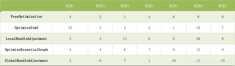
测试数据为:
2. 柱状图或条形图
import numpy as np
import matplotlib.pyplot as plt

x1 =[1,3,,7,9]
x2 =[2,4,6,8,10]
y1=[15,3,3,3,20]
y2 =[6,12,22,15,12]
plt.bar(x1,y1,label='bar1')
plt.bar(x2,y2,label='bar2')
plt.xlabel('x轴')
plt.ylabel('y轴')
plt.title('柱形图')
plt.legend()
plt.show()

3. 柱状图加数值
mport numpy as np
import matplotlib.pyplot as plt

def auto_label(rects):
    for rect in rects:
        height = rect.get_height()
        ax.annotate('{}'.format(height), # put the detail data
                    xy=(rect.get_x() + rect.get_width() / 2, height), # get the center location.
                    xytext=(0, 3),  # 3 points vertical offset
                    textcoords="offset points",
                    ha='center', va='bottom')

def auto_text(rects):
    for rect in rects:
        ax.text(rect.get_x(), rect.get_height(), rect.get_height(), ha='left', va='bottom')

labels = ['L1', 'L2', 'L3', 'L4', 'L5']
men_means = [20, 34, 30, 35, 27]
women_means = [25, 32, 34, 20, 25]

index = np.arange(len(labels))
width = 0.2

fig, ax = plt.subplots()
#和上例子一样,添加数据,并添加角标
rect1 = ax.bar(index - width / 2, men_means, color ='lightcoral', width=width, label ='Men')
rect2 = ax.bar(index + width / 2, women_means, color ='springgreen', width=width, label ='Women')

ax.set_title('按性别统计分数')
ax.set_xticks(ticks=index)
ax.set_xticklabels(labels)
ax.set_ylabel('分数')

ax.set_ylim(0, 50)
# auto_label(rect1)
# auto_label(rect2)
auto_text(rect1)
auto_text(rect2)

ax.legend(loc='upper right', frameon=False)
fig.tight_layout()
#plt.savefig('2.tif', dpi=300)# 保存图片
plt.show()
输出结果:

4. 直方图
直方图属于一种统计类型,下面的例子表示统计年龄段内人数。
population_ages =[22,55,62,45,21,22,34,42,42,4,99,102,110,120,121,122,130,111,115,112,80,75,65,54,44,43,42,48]

bins= [0,10,20,30,40,50,60,70,80,90,100,110,120,130]# 分组
plt.hist(population_ages,bins,label='直方图')
plt.xlabel('x轴')
plt.ylabel('y轴')
plt.title('直方图')
plt.legend()
plt.show()
输出结果:

结尾推荐几个相关的网站:
-
首先推荐matplotlib官网的各种显示代码实例(包括3D图的绘制):
-
其次推荐matplotlib官网教程:
-
xlrd官网api(Excel操作):

为开发者提供学习成长、分享交流、生态实践、资源工具等服务,帮助开发者快速成长。
更多推荐


 11
11 0
0- 0


 已为社区贡献15条内容

所有评论(0)