超全的 Python 可视化教程,收藏
今天小编总结归纳了若干个常用的可视化图表,并且通过调用、、、和等模块来分别绘制这些常用的可视化图表,最后无论是绘制可视化的代码,还是会指出来的结果都会通过调用模块展示在一个可视化大屏,出来的效果如下图所示那我们接下去便一步一步开始可视化大屏的制作吧!首先我们对标题、副标题部分的内容,代码如下然后便是下拉框的制作,代码如下\对于图表的展示可以选择是“双排式”的,如下图所示也可以选择是沉浸式的,也即是
今天小编总结归纳了若干个常用的可视化图表,并且通过调用plotly、matplotlib、altair、bokeh和seaborn等模块来分别绘制这些常用的可视化图表,最后无论是绘制可视化的代码,还是会指出来的结果都会通过调用streamlit模块展示在一个可视化大屏,出来的效果如下图所示
那我们接下去便一步一步开始可视化大屏的制作吧!
标题、副标题以及下拉框
首先我们对标题、副标题部分的内容,代码如下
with st.container():
    st.title("Python可视化合集")
    st.header("经典常用的Python可视化模块")
    st.write("""包括代码和可视化图表展示""")
然后便是下拉框的制作,代码如下\
plot_types = (
    "Scatter",
    "Histogram",
    "Bar",
    "Line",
    "Boxplot"
)
# 选择绘制的图表种类
chart_type = st.selectbox("Choose your chart type", plot_types)

with st.container():
    st.subheader(f"Showing:  {chart_type}")
    st.write("")
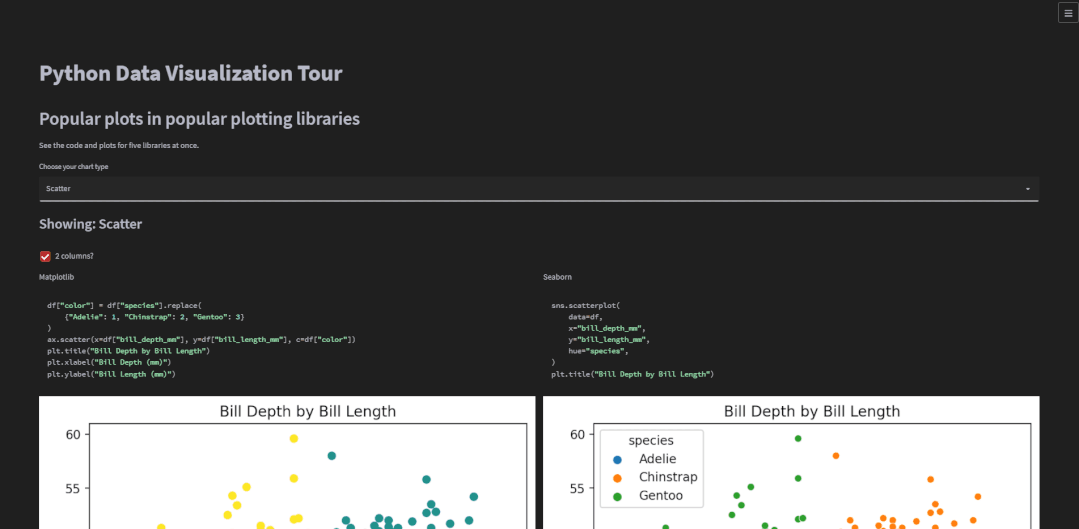
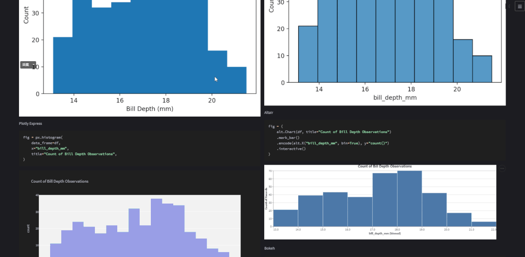
对于图表的展示可以选择是“双排式”的,如下图所示
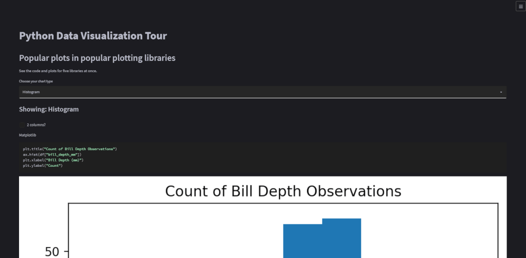
也可以选择是沉浸式的,也即是“单排式”的,如下图所示
代码如下
two_cols = st.checkbox("2 columns?", True)
if two_cols:
    col1, col2 = st.columns(2)

# 展示图表
if two_cols:
    with col1:
        show_plot(kind="Matplotlib")
    with col2:
        show_plot(kind="Seaborn")
    with col1:
        show_plot(kind="Plotly Express")
    with col2:
        show_plot(kind="Altair")
    with col1:
        show_plot(kind="Pandas Matplotlib")
    with col2:
        show_plot(kind="Bokeh")
else:
    with st.container():
        for lib in libs:
            show_plot(kind=lib)
对于双排式的展示方式而言,col1也就是左边,放置的是matplotlib、plotly、以及pandas绘制出来的图表,右边也就是col2也就是右边,放置的是seaborn、altair以及bokeh绘制出来的图表,而上述代码中调用的show_plot()函数代码如下
# 生成图表
def show_plot(kind: str):
    st.write(kind)
    if kind == "Matplotlib":
        plot = matplotlib_plot(chart_type, df)
        st.pyplot(plot)
    elif kind == "Seaborn":
        plot = sns_plot(chart_type, df)
        st.pyplot(plot)
    elif kind == "Plotly Express":
        plot = plotly_plot(chart_type, df)
        st.plotly_chart(plot, use_container_width=True)
    elif kind == "Altair":
        plot = altair_plot(chart_type, df)
        st.altair_chart(plot, use_container_width=True)
    elif kind == "Pandas Matplotlib":
        plot = pd_plot(chart_type, df)
        st.pyplot(plot)
    elif kind == "Bokeh":
        plot = bokeh_plot(chart_type, df)
        st.bokeh_chart(plot, use_container_width=True)
是一系列if...else...的判断,当绘制图表的模块是matplotlib时就调用对应的matplotlib_plot()函数,当绘制图表的模块是seaborn时就调用对应的sns_plot()函数,依次同理。我们来看其中一个函数sns_plot()的具体逻辑,代码如下
def sns_plot(chart_type: str, df):
    """ 生成seaborn绘制的图表 """

    fig, ax = plt.subplots()
    if chart_type == "Scatter":
        with st.echo():
            sns.scatterplot(
                data=df,
                x="bill_depth_mm",
                y="bill_length_mm",
                hue="species",
            )
            plt.title("Bill Depth by Bill Length")
    elif chart_type == "Histogram":
        with st.echo():
            sns.histplot(data=df, x="bill_depth_mm")
            plt.title("Count of Bill Depth Observations")
    elif chart_type == "Bar":
        with st.echo():
            sns.barplot(data=df, x="species", y="bill_depth_mm")
            plt.title("Mean Bill Depth by Species")
    elif chart_type == "Boxplot":
        with st.echo():
            sns.boxplot(data=df["bill_depth_mm"].dropna())
            plt.title("Bill Depth Observations")
    elif chart_type == "Line":
        with st.echo():
            sns.lineplot(data=df, x=df.index, y="bill_length_mm")
            plt.title("Bill Length Over Time")
    return fig
其实也是一系列if...else...的判断,当所要绘制的图表是散点图时,调用的是sns.scatterplot()函数,所要绘制的是直方图时,调用的是sns.histplot(),绘制的柱状图或者是折线图时也是同理
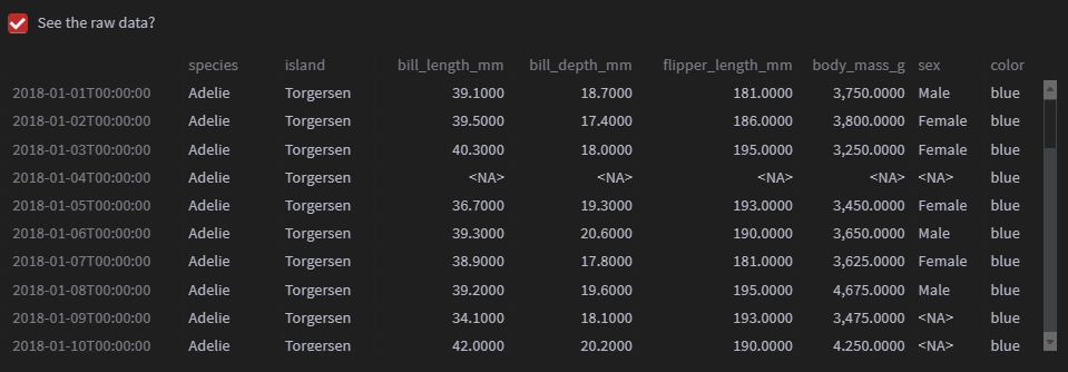
最后要是我们想要查看源数据时,也可以查看,代码如下
# 展示源数据
with st.container():
    show_data = st.checkbox("See the raw data?")

    if show_data:
        df

    # 要点
    st.subheader("Notes")
    st.write(
        """
        - 这个应用是通过python当中的streamlit模块制作出来的
        - 关注"关于数据分析与可视化",学习更多数据分析和可视化知识与技能
        """
    )
output
以上就是本次分享的所有内容,如果你觉得文章还不错,欢迎关注公众号:Python编程学习圈,每日干货分享,发送“J”还可领取大量学习资料。或是前往编程学习网,了解更多编程技术知识。

华为开发者空间,是为全球开发者打造的专属开发空间,汇聚了华为优质开发资源及工具,致力于让每一位开发者拥有一台云主机,基于华为根生态开发、创新。
更多推荐


 6
6 0
0- 0


 已为社区贡献11条内容

所有评论(0)