使用matplotlib绘制并列柱状图并在柱上方标注数值
自己查阅了资料和众多博客,记录一下,以备不时之需。import numpy as npimport matplotlib.pyplot as pltcourses = ["语文", "数学", "英语", "物理", "化学", "生物"]x_arange = np.arange(len(courses))# [0 1 2 3 4 5],相当于x轴上的坐标序列scores_zhangsan = [
·
自己查阅了资料和众多博客,记录一下,以备不时之需。
----------2021.07.30------------
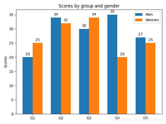
补:matplotlib 3.4版本之后,已经提供了专门的在柱上方添加数值标注的api
官方给出的示例代码如下:
import matplotlib.pyplot as plt
import numpy as np


labels = ['G1', 'G2', 'G3', 'G4', 'G5']
men_means = [20, 34, 30, 35, 27]
women_means = [25, 32, 34, 20, 25]

x = np.arange(len(labels))  # the label locations
width = 0.35  # the width of the bars

fig, ax = plt.subplots()
rects1 = ax.bar(x - width/2, men_means, width, label='Men')
rects2 = ax.bar(x + width/2, women_means, width, label='Women')

# Add some text for labels, title and custom x-axis tick labels, etc.
ax.set_ylabel('Scores')
ax.set_title('Scores by group and gender')
ax.set_xticks(x)
ax.set_xticklabels(labels)
ax.legend()

ax.bar_label(rects1, padding=3)  # 更加简单好用的api
ax.bar_label(rects2, padding=3)

fig.tight_layout()

plt.show()
----------以下为原内容--------
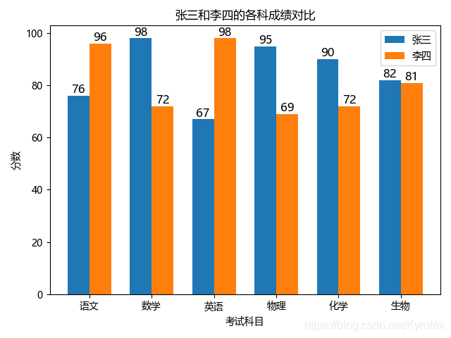
import numpy as np
import matplotlib.pyplot as plt


courses = ["语文", "数学", "英语", "物理", "化学", "生物"]
x_arange = np.arange(len(courses))  # [0 1 2 3 4 5],相当于x轴上的坐标序列
scores_zhangsan = [76, 98, 67, 95, 90, 82]
scores_lisi = [96, 72, 98, 69, 72, 81]

bar_width = 0.35  # 一个bar的宽度,注意x轴每两项的刻度的间距为1,注意合理设置宽度

plt.rcParams['font.sans-serif'] = ['Microsoft YaHei']  # 防止中文乱码

"""
绘制条形图,各入参的含义:
x_arange - bar_width / 2:第一个bar在x轴上的中心值,每个刻度值减一半bar宽度得到,第二个bar则是加一半bar宽度;
scores_zhangsan:bar高度,这里也就是分数值;
bar_width:bar宽度;
label:标签
"""
plt.bar(x_arange - bar_width / 2, scores_zhangsan, bar_width, label="张三")
plt.bar(x_arange + bar_width / 2, scores_lisi, bar_width, label="李四")

# 在各个bar上标注数值,使用zip()来同步遍历x_arange, scores_zhangsan, scores_lisi
for x, score_zhangsan, score_lisi in zip(x_arange, scores_zhangsan, scores_lisi):
	"""
	各入参含义:
	x - bar_width / 2:所需绘制的数值在x轴的位置;
	score_zhangsan + 1:所需绘制的数值在y轴的位置,加个1是为了在数值和bar顶部留点空隙;
	score_zhangsan:所需绘制的数值;
	ha='center':对齐方式,这里居中;
	fontsize=12:字号大小
	"""
    plt.text(x - bar_width / 2, score_zhangsan + 1, score_zhangsan, ha='center', fontsize=12)
    plt.text(x + bar_width / 2, score_lisi + 1, score_lisi, ha='center', fontsize=12)

plt.xlabel("考试科目")
plt.ylabel("分数")
plt.xticks(x_arange, labels=courses)  # x轴上的刻度用courses的项来绘制
plt.title("张三和李四的各科成绩对比")
plt.legend()
plt.show()
效果如下:
理解了这种并列柱状图的绘制原理,除了这种2个bar并列的,更多bar并列的柱状图也能类似画出。

为开发者提供学习成长、分享交流、生态实践、资源工具等服务,帮助开发者快速成长。
更多推荐


 15
15 0
0- 0


 已为社区贡献2条内容

所有评论(0)