Matplotlib绘图-快速上手可视化工具
快速上手matplotlib绘图,全面讲解。
Matplotlib快速上手
✅作者简介:大家好我是爱康代码!
👦我亦无他,唯手熟尔!天下没有难学的技术,多看多练就会了!
🔥💖如果觉得博主的文章还不错的话,请👍三连支持一下博主哦🤞
一、初识Matplotlib
🔥是Python最常见的可视化工具之一🔥
1.1 认识Matplotlib的图像结构
💖容器层:
Canvas:画板,位于最低分层,用户一般接触不到。
Figure:画布,建立在画板之上,相当于一个设计图纸。
Axes: 绘图区,建立在画之上。
📢辅助显示层:
是Axes(绘图区)中除了根据数据绘制出的图像以外的内容
如x,y坐标轴,边框线,绘图标题,网格线等。
📡图像层:
是指Axes内通过plot、scatter、bar、histogram、pie等函数根据数据绘制出的图形
1.2 绘制一个折线图
🔉使用plt.plot(x,y)绘制折线图:
#调用matplotlib中的pyplot的绘图函数plot()方法进行绘图
#生成画布figure,然后在绘图区axes绘图

#在jupyter notebook中启用对matploytlib的支持
%matplotlib inline
#导包并将pyplot起别名为plt
from matplotlib import pyplot as plt
#添加数据
x = range(1,8)
y = [12,15,13,16,11,12,19]
#绘图
plt.plot(x,y)
#展示绘图
plt.show()

☎️将下列代码加入上面代码给图像加点料:
参数含义:
color:设置折线颜色
alpha:设置折线透明度
linestyle:设置折线样式,支持’-', ‘–’, ‘-.’, ‘:’
linewidth: 设置折线的粗细
marker: 设置拐点的样式
#自定义折线的颜色,粗细以及拐点
plt.plot(x,y,color='red',alpha=0.5,linestyle='-',linewidth=3,marker='*')

💻增加标题的描述信息:
#有可能不显示中文,添加这行代码
plt.rcParams['font.sans-serif'] = ['SimHei']
#添加坐标轴和标题
plt.plot(x,y)
plt.xlabel('x轴坐标')
plt.ylabel('y轴坐标')
plt.title('我是图的标题')

二、给图像添加修饰
2.1 自定义x的刻度
xticks参数:
xticks(locs,[labels],kwargs)
locs:是数组参数,表示x-axis的刻度线显示标注的地方**,就是ticks的地方
第二个参数也是数组参数,表示locs数组表示的位置添加的标签,也就标签的值。
#导包
from matplotlib import pyplot as plt
import random
x=range(1,61)
y=[random.randint(15,18) for i in x]# 利用random.randint()函数在15-18之间取值60次
plt.figure(figsize=(20,8),dpi=80)
plt.plot(x,y)
#设置x刻度
x_ticks = ["10点{}分".format(i) for i in x]
plt.xticks(list(x)[::3],x_ticks[::3],rotation=45) #[::3]从头到尾,间隔为3.
plt.show()
plt.xticks(list(x)[::3],x_ticks[::3],rotation=45)
list(x)[::3] :第一个参数,根据x的个数,调整x轴的疏密程度
x_ticks[::3]:第二个参数,还是用x的值作为刻度的标签,但是只获取了其中的一部分,为了确保第一个参数和第二个参数个数相同
rotation=45:默认刻度是横向的,这个是对文字进行旋转45度。

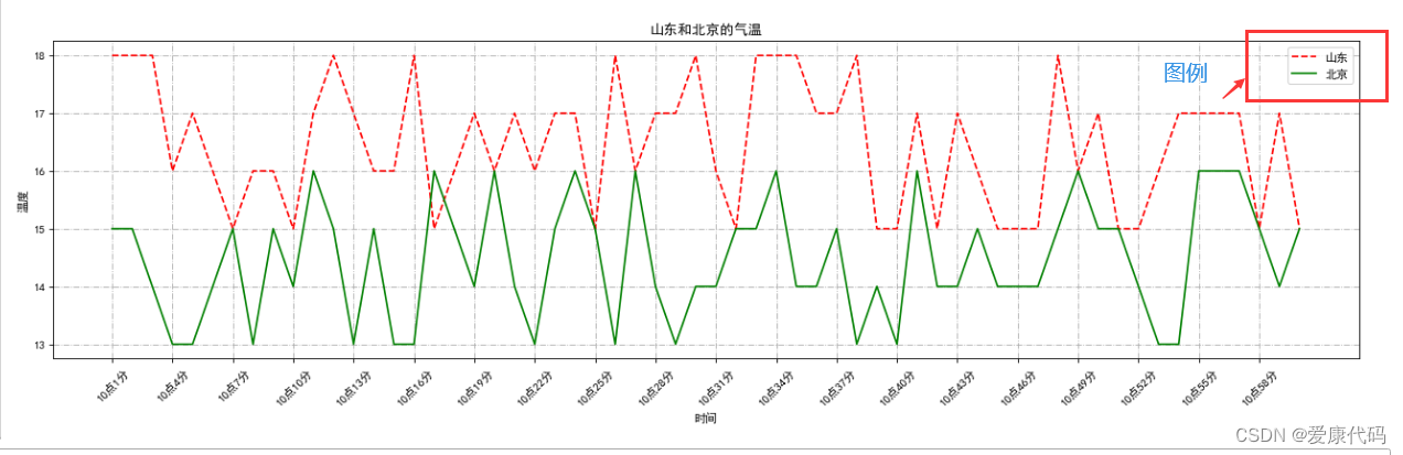
2.2一图多线
💰其实就是在一张画布上画两次,主要是学习一下如何区分开两条线。也就是增加描述信息。
#导包
from matplotlib import pyplot as plt
import random
#准备数据
x=range(1,61)
print(x)
#手动模拟山东和北京的气温
y_shandong = [random.randint(15,18)for i in x]
y_beijing = [random.randint(13,16)for i in x]
#绘制图形画布
plt.figure(figsize=(20,8),dpi=80)
plt.plot(x,y_shandong,label='山东',linestyle='--',color='red')
plt.plot(x,y_beijing,label='北京',linestyle='-',color='green')
#增加描述信息
plt.title("山东和北京的气温")
plt.xlabel("时间")
plt.ylabel("温度")
#设置x刻度,上个图的基础
x_ticks = ["10点{}分".format(i) for i in x]
plt.xticks(list(x)[::3],x_ticks[::3],rotation=45)
plt.show()

✉️plt.grid设置网格线:把代码加到上一个代码plt.show()前
plt.grid(alpha=1,linestyle='-.')
💡legend()用来显示图例,图例中的文字需要在绘制方法中添加
plt.legend(loc=0)
🎉添加这两行代码所示图像:

2.3一图绘制多个坐标系子图
🔔subplot方法参数:
plt.subplot(nrows,ncols,index)创建子图:
nrows:指定数据图区域分成多少行
ncols:指定将数据图区域分成多少列
index:指代获取第几个区域
#设置画布
fig,axes=plt.subplots(nrows=2,ncols=2,figsize=(20.,8),dpi=80)

🎁将多个子图画在一张图上:
#导包
from matplotlib import pyplot as plt
import numpy as np
#准备数据
x=[1,10,14,16,17,18]
y=np.array([3,4,6,2,1,5])
#准备画布
plt.figure(figsize=(20.,8),dpi=80)
#绘制第一个子图
plt.subplot(2,2,1)
plt.plot(y)
plt.title("Axes1")
#绘制第二个子图
plt.subplot(2,2,2)
plt.plot(y**3)
plt.title("Axes2")
#绘制第三个子图
plt.subplot(2,2,3)
plt.plot(y**3)
plt.title("Axes3")
plt.show()

三、主流图形的绘制
3.1绘制柱状图
🎊柱状图:利用柱子的高度,反应数据的差异
plt.bar(x,heigh,wight,color)
x:记录x轴上的标签
height:记录柱子高度
wight:设置柱子宽度
color:设置柱子的颜色,传入颜色列表[‘red’,‘blue’,‘black’,‘green’,‘gray’]等多种颜色
#在jupyter notebook中启用对matploytlib的支持
%matplotlib inline
#中文字体
plt.rcParams['font.sans-serif'] = ['SimHei']
#导包并将pyplot起别名为plt
from matplotlib import pyplot as plt
#准备数据
a=['流浪地球','疯狂的外星人','飞驰人生','大黄蜂','新喜剧之王']
b=[38.13,19.85,14.89,11.36,5.93]
#准备画布
plt.figure(figsize=(20.,8),dpi=80)
plt.bar(a,b)
plt.show()

🎅 设置宽度和颜色属性:
plt.bar(a,b,width=0.3,color=['red','#7CFC00','yellow'])

👻在柱状图上面添加标注(水平居中): 直接看到柱子的高度
#导包并将pyplot起别名为plt
from matplotlib import pyplot as plt#在jupyter notebook中启用对matploytlib的支持
%matplotlib inline
#中文字体
plt.rcParams['font.sans-serif'] = ['SimHei']
#准备数据
a=['流浪地球','疯狂的外星人','飞驰人生','大黄蜂','新喜剧之王']
b=[38.13,19.85,14.89,11.36,5.93]
#准备画布
plt.figure(figsize=(20.,8),dpi=80)
rects=plt.bar(a,b,width=0.3,color=['red','#7CFC00','yellow']) #设置一个参数,获取bar函数返回的值
#在柱状图上面添加标注(水平居中)
for rect in rects:
    height = rect.get_height()
    plt.text(rect.get_x()+rect.get_width()/2,height+0.3,str(height),ha='center')
    #通过get_x() get_width() get_height()分别获取了左边的x值,柱状图的宽度和高度
    #使用plt.plot()函数添加文字信息
plt.show()

3.2绘制直方图
🎒用来绘制连续性的数据展示一组或者多组数据的分布情况(统计)
plt.hist(data,bins,facecolor,edgecolor)
参数解释:
data:绘制用到的数据
bins:设置柱子的宽度
facecolor:矩阵的填充颜色
edgercolor:矩阵的边框颜色
🌄其实是描述数据之间的数学关系,如实现统计count种各个数值出现的次数:(每次运行结果是随机的)
#在jupyter notebook中启用对matploytlib的支持
%matplotlib inline
#导包并将pyplot起别名为plt
from matplotlib import pyplot as plt
import random
#中文字体
plt.rcParams['font.sans-serif'] = ['SimHei']
#准备数据
count=[123, 140, 104, 106, 119, 140, 118, 126, 101, 118, 134, 128, 110, 128, 102, 141, 136, 127, 113, 139, 113, 123, 139,
       109, 111, 135, 123, 102, 105, 130, 148, 107, 150, 104, 141, 125, 123, 146, 119, 138, 124, 107, 140, 146, 146, 145,
       130, 115, 112, 103, 134, 140, 104, 132, 109, 134, 143, 119, 129, 109, 134, 116, 145, 148, 135, 109, 150, 101, 130,
       138, 109, 101, 136, 133, 100, 132, 129, 100, 147, 116, 122, 121, 147, 108, 114, 118, 118, 101, 121, 134, 148, 142,
       104, 123, 148, 122, 119, 111, 100, 101, 107, 135, 124, 146, 122, 111, 121, 123, 107, 102, 107, 103, 138, 102, 139,
       126, 129, 134, 113, 150, 119, 137, 140, 125, 115, 132, 146, 114, 110, 147, 117, 114, 148, 132, 135, 128, 101, 114,
       148, 113, 135, 101, 141, 120, 138, 121, 149, 127, 148, 142, 133, 106, 133, 138, 147, 141, 146, 101, 138, 136, 127,
       104, 105, 107, 136, 132, 101, 140, 115, 137, 138, 105, 149, 138, 130, 150, 133, 125, 131, 129, 100, 122, 101, 116,
       116, 126, 142, 124, 110, 123, 134, 129, 109, 128, 149, 119, 122, 122, 105, 134, 114, 116, 102, 138, 140, 124, 106,
       111, 141, 129, 102, 122, 111, 126, 139, 143, 118, 142, 146, 124, 133, 143, 119, 110, 129, 129, 114, 116, 107, 127,
       128, 147, 147, 100, 109, 148, 126, 142, 141, 119, 147, 105, 145, 121, 124, 141, 122, 124, 108, 107, 122, 105, 129,
       125, 122, 136, 143, 137, 132, 144, 149, 115, 150, 101, 116, 145, 142, 149, 126, 121, 102, 136, 150, 110, 139, 128,
       105, 133, 106, 111, 121, 100, 145, 137, 149, 112, 146, 130, 127, 134, 119, 130, 103, 120, 135, 133, 140, 144, 109,
       117, 102, 127, 119, 128, 101, 108, 117, 100, 100, 131, 100, 139, 114, 107, 111, 113, 104, 120, 114, 149, 117, 130,
       101, 132, 145, 103, 138, 135, 110, 143, 127, 111, 136, 136, 143, 116, 149, 130, 121, 106, 119, 111, 125, 121, 149,
       109, 145, 110, 108, 106]
#准备画布
plt.figure(figsize=(20.,8),dpi=80)
#开始绘图
plt.hist(time)
plt.show()

🌝设置柱形宽度: 其实就是把这些数据分成多少个组,分组越多,柱状图越细
#开始绘图,将此代码加入上一个代码中
#设置组距
distance=2
#计算组数
group_num = int(max(count)-min(count)/distance)
plt.hist(count,group_num)

🌐修改x的刻度:
plt.xticks(range(min(count),max(count)))
#加在plt.show()上面

3.2散点图的绘制
🌼用于判断变量之间是否存在关联趋势(如身高和体重是否有关联),展示离群点(分布规律)
ptl.scatter(x,y,s,c,marker,alpha,linewidths)
参数解释:
x,y:数组
s:散点图中点的大小,可选
c:散点图中点的颜色,可选
marker:散点图的形状,可选
alpha:表示透明度,0-1之间,可选
linewidths:表示线条的粗细 ,可选
🌱**绘制数据散点图:**绘制身高和体重相关性图
%matplotlib inline
from matplotlib import pyplot as plt
import pandas as pd
df=pd.read_csv('./data/SOCR-HeightWeight.csv')#网上自己下载一个身高体重的数据
#准备画布
plt.figure(figsize=(20.,8),dpi=80)
#准备身高和体重数据
x=df['Height(Inches)']
y=df['Weight(Pounds)']
plt.scatter(x,y)
plt.show()

🌰修改点的颜色,样式和透明度:
plt.scatter(x,y,c='red',marker='*',alpha=0.6)

3.4绘制饼图
🌰分析数据的占比情况(占比)
plt.pie(x,lables,autopct,shadow,startangle)
参数解释:
x:绘制饼图用到的数据
labels:用于设置饼图中每一个扇形外侧的显示说明数据的文字
autopct:设置饼图内百分比数据,可以使用format字符串,或者使用format function,“%。2f%%”指小数保留两位
shadow:表示是否在饼图下绘制阴影,默认Fales。
startangle:设置起始绘制角度,默认是从x轴正方向逆时针花起。
🌷绘制一个不同种衣服占比的简单饼状图::
%matplotlib inline
from matplotlib import pyplot as plt
import pandas as pd
df=pd.read_csv('./data/uniqlo.csv')#自己找个分类的数据集
x=df.groupby('product').size() #根据衣服产品进行分组并统计个数
#设置画布
plt.figure(figsize=(20.,8),dpi=80)
plt.pie(x)
#展示绘图
plt.show()


🌸绘制详细的饼状图添加外侧对应名称,对应占比,阴影,绘图起始位置(逆时针)
#增加参数
plt.pie(x,labels=x.index,autopct="%.2f%%",shadow=True,startangle=90)


华为开发者空间,是为全球开发者打造的专属开发空间,汇聚了华为优质开发资源及工具,致力于让每一位开发者拥有一台云主机,基于华为根生态开发、创新。
更多推荐


 11
11 1
1- 0


 已为社区贡献1条内容

所有评论(0)