气象数据分析之EOF分析以及python的实现
import numpy as npimport cartopy.crs as ccrsimport cartopy.feature as cfeatureimport matplotlib.pyplot as pltfrom eofs.multivariate.standard import MultivariateEoffrom eofs.standard import Eof#计算权重:以纬
·
EOF分析是气象分析中常见的一种分析方法,已经有大神写好了一个库分享在Github上, 本文分享一下这个库的用法~
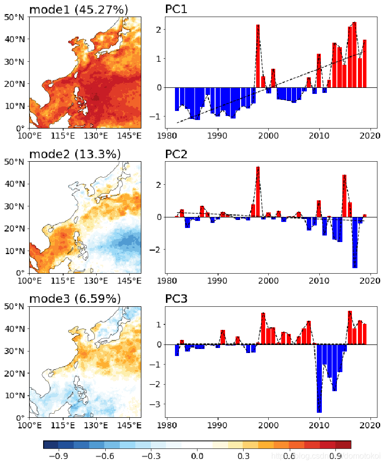
先上例图~
把一个三维场分解为空间模态和时间序列(分析的时候就是把空间模态和时间序列乘起来看,比如mod1里填色都是红的表示整个地区的年际变化都是pc1的形态,mod2里红色的地区是pc2的形态而蓝色填色地区则是pc2相反的变化形态)。
下图中mode1和pc1表示在大部分地区都呈现逐年增长的趋势,在1988年有一个明显的高峰;mod2表示在一个年际震荡的现象,南海东海等近海地区和远海地区呈现相反的年际震荡。
import numpy as np
import cartopy.crs as ccrs
import cartopy.feature as cfeature
import matplotlib.pyplot as plt

from eofs.multivariate.standard import MultivariateEof
from eofs.standard import Eof


def eof_analys(data,lat):
    #计算权重:纬度cos值开方
    coslat = np.cos(np.deg2rad(lat))
    wgts = np.sqrt(coslat)[..., np.newaxis]

    #做EOF分析
    solver = Eof(data, weights = wgts)
    EOFs   = solver.eofsAsCorrelation()#空间模态
    PCs    = solver.pcs(npcs   = 3, pcscaling = 1)#时间序列,取前三个模态

	#方差贡献
    eigen_Values   = solver.eigenvalues()
    percentContrib = eigen_Values * 100./np.sum(eigen_Values)

	#返回空间模态,时间序列和方差贡献
    return EOFs,PCs,percentContrib
附赠一个可视化程序,打包成一个计算和可视化一体的函数~
 def mapart(ax):
    '''
    添加地图元素
    '''
    projection=ccrs.PlateCarree()
    ax.coastlines(color='k',lw=0.5)
    ax.add_feature(cfeature.LAND, facecolor='white')
    #设置地图范围
    ax.set_extent([100, 150, 0, 50],crs=ccrs.PlateCarree())
    #设置经纬度标签
    ax.set_xticks([100,115,130,145], crs=projection)
    ax.set_yticks([0,10,20,30,40,50], crs=projection)
    lon_formatter = LongitudeFormatter(zero_direction_label=True)
    lat_formatter = LatitudeFormatter()
    ax.xaxis.set_major_formatter(lon_formatter)
    ax.yaxis.set_major_formatter(lat_formatter)

def eof_contourf(EOFs,PCs,pers,name):
    plt.close
    fig = plt.figure(figsize=(12,12))
    projection=ccrs.PlateCarree()
    year=range(1982,2020)
    ax1 = fig.add_subplot(3,2, 1, projection=projection)
    mapart(ax1)
    p = ax1.contourf(lon,lat,EOFs[0] ,np.linspace(-1,1,21),cmap=cmaps.BlueWhiteOrangeRed)
    ax1.set_title('mode1 (%s'%(round(pers[0],2))+"%)",font2,loc ='left')

    ax2 = fig.add_subplot(3,2, 2)
    ax2.plot(year,PCs[:,0] ,color='k',linewidth=1.2,linestyle='--')
    #print(np.polyfit(range(len(PCs[:,0])),PCs[:,0],1))
    y1=np.poly1d(np.polyfit(year,PCs[:,0],1))
    ax2.plot(year,y1(year),'k--',linewidth=1.2)
    b=ax2.bar(year,PCs[:,0] ,color='r')
    #对y值大于0设置为蓝色  小于0的柱设置为绿色
    for bar,height in zip(b,PCs[:,0]):
        if height<0:
            bar.set(color='blue')
    ax2.set_title('PC1'%(round(pers[0],2)),font2,loc ='left')

    ax3 = fig.add_subplot(3,2, 3, projection=projection)
    mapart(ax3)
    pp = ax3.contourf(lon,lat,EOFs[1] ,np.linspace(-1,1,21),cmap=cmaps.BlueWhiteOrangeRed)
    ax3.set_title('mode2 (%s'%(round(per2,2))+"%)",font2,loc ='left')

    ax4 = fig.add_subplot(3,2, 4)
    ax4.plot(year,PCs[:,1] ,color='k',linewidth=1.2,linestyle='--')
    ax4.set_title('PC2'%(round(per2,2)),font2,loc ='left')
    print(np.polyfit(year,PCs[:,1],1))
    y2=np.poly1d(np.polyfit(year,PCs[:,1],1))
    #print(y2)
    ax4.plot(year,y2(year),'k--',linewidth=1.2)

    bb=ax4.bar(year,PCs[:,1] ,color='r')
    #对y值大于0设置为蓝色  小于0的柱设置为绿色
    for bar,height in zip(bb,PCs[:,1]):
        if height<0:
            bar.set(color='blue')

    ax5 = fig.add_subplot(3,2, 5, projection=projection)
    mapart(ax5)
    ppp = ax5.contourf(lon,lat,EOFs[2] ,np.linspace(-1,1,21),cmap=cmaps.BlueWhiteOrangeRed)
    ax5.set_title('mode3 (%s'%(round(pers[2],2))+"%)",font2,loc ='left')

    ax6 = fig.add_subplot(3,2, 6)
    ax6.plot(year,PCs[:,2] ,color='k',linewidth=1.2,linestyle='--')
    ax6.set_title('PC3'%(round(per3,2)),font2,loc ='left')

    y3=np.poly1d(np.polyfit(year,PCs[:,2],1))
    #print(y3)
    ax6.plot(year,y3(year),'k--',linewidth=1.2)

    bbb=ax6.bar(year,pers[:,2] ,color='r')
    #对y值大于0设置为蓝色  小于0的柱设置为绿色
    for bar,height in zip(bbb,PCs[:,2]):
        if height<0:
            bar.set(color='blue')

    #添加0线
    ax2.axhline(y=0,  linewidth=1, color = 'k',linestyle='-')
    ax4.axhline(y=0,  linewidth=1, color = 'k',linestyle='-')
    ax6.axhline(y=0,  linewidth=1, color = 'k',linestyle='-')

    #在图下边留白边放colorbar
    fig.subplots_adjust(bottom=0.1)
    #colorbar位置: 左 下 宽 高
    l = 0.25
    b = 0.04
    w = 0.6
    h = 0.015
    #对应 l,b,w,h;设置colorbar位置;
    rect = [l,b,w,h]
    cbar_ax = fig.add_axes(rect)

    c=plt.colorbar(pp, cax=cbar_ax,orientation='horizontal', aspect=20, pad=0.1)
    c.ax.tick_params(labelsize=14)
    #c.set_label('%s'%(labelname),fontsize=20)
    #c.set_ticks(np.arange(1,6,1))

    plt.subplots_adjust( wspace=-0.12,hspace=0.3)


    plt.savefig('eof_%s.jpg'%name,dpi=300,format='jpg',bbox_inches = 'tight',transparent=True, pad_inches = 0)
    plt.show()

def eof_analyze(data,lat,name):
    EOFs,PCs,per=eof_anyls(data, lat)
    print('前三个模态的方差贡献分别是:%s,%s,%s'%(round(per1,2),round(per2,2),round(per3,2)))
    eof_contourf(EOFs,PCs,percentContrib,name)

#%%
#调用上面写的eof分析和可视化函数
#输入一个三维数据,纬度,和要保存的图片名字
eof_analyze(data,lat,'fig_name')
祝大家科研顺利,身心健康~
文中有错误或者有更好的写法欢迎在评论区分享讨论!

为开发者提供学习成长、分享交流、生态实践、资源工具等服务,帮助开发者快速成长。
更多推荐


 40
40 0
0- 0


 已为社区贡献2条内容

所有评论(0)