python matplotlib坐标轴刻度设置
matplotlib设置坐标轴刻度,设置刻度方向向内向外;设置主次刻度;设置对数坐标
讲解比较全面的几篇文章
- https://zhuanlan.zhihu.com/p/448571003
- https://www.mianshigee.com/note/detail/80630djz/
- https://blog.51cto.com/topic/pythonhuatushezhizuobiaozhoukeduyincang.html
设置坐标轴刻度向内
作图默认的坐标轴刻度是向外的,但有些期刊要求刻度向内。
方法1
通过rcParams设置,类似的方式在设置中文字体时用过,但自己还不是特别熟,不知道会不会改变默认样式(似乎不会)。
plt.rcParams['xtick.direction'] = 'in'  # 将x轴的刻度线方向设置向内
plt.rcParams['ytick.direction'] = 'in'  # 将y轴的刻度线方向设置向内
方法2
通过ax.tick_params中从参数direction来设置
'''
axis: x轴还是y轴
direction:"in" 向内,"out"向外
which:"major" 设置主轴参数,"minor"设置次轴参数,"both"l两个轴的参数一起设置
labelsize:设置刻度标签的字体大小
length:设置标签刻度的长度
'''
# y轴
ax.yaxis.set_minor_locator(yminor_1)
ax.yaxis.set_major_locator(ymajor_1)
ax.tick_params(axis="y", direction="in", which="minor", length=4)
ax.tick_params(axis="y", direction="out", which="major", labelsize=15, length=5)
设置主次刻度
参考链接 https://blog.csdn.net/Admiral_x/article/details/124778091
示例代码如下
import numpy as np
import matplotlib.pyplot as plt
from matplotlib.ticker import MultipleLocator, AutoLocator, FixedLocator

x = np.arange(1, 100)
y = x**2

fig = plt.figure(figsize=(9, 6))
ax = fig.add_subplot(111)

# 准备 x/y轴刻度,以及刻度标签
# x轴
xmajor = MultipleLocator(10)  # 主 10 的倍数
xminor = MultipleLocator(2)  # 次 2的倍数
# y轴
ymajor_1 = MultipleLocator(2000)
yminor_1 = MultipleLocator(400)

# 设置 x/y轴刻度,以及刻度标签
# x 轴
ax.xaxis.set_minor_locator(xminor)
ax.xaxis.set_major_locator(xmajor)
ax.tick_params(axis="x", direction="in", which="minor", length=4)
ax.tick_params(axis="x", direction="out", which="major", labelsize=15, length=5)
'''
axis: x轴还是y轴
direction:"in" 向内,"out"向外
which:"major" 设置主轴参数,"minor"设置次轴参数,"both"l两个轴的参数一起设置
labelsize:设置刻度标签的字体大小
length:设置标签刻度的长度
'''
# y轴
ax.yaxis.set_minor_locator(yminor_1)
ax.yaxis.set_major_locator(ymajor_1)
ax.tick_params(axis="y", direction="in", which="minor", length=4)
ax.tick_params(axis="y", direction="out", which="major", labelsize=15, length=5)

ax.plot(x,y)
plt.show()
对数坐标
之前自己采用的方案是ax1.set_xscale('log')搭配plt.style.use(‘ggplot’)使用,显示效果更佳。之前写的链接。
其他可供选择方案如下
ax.semilogx
ax.semilogy
ax.loglog
设置坐标刻度
参考链接:
https://blog.csdn.net/MXYHWX/article/details/118701835
https://blog.51cto.com/u_10721944/5406719
官方文档:
https://matplotlib.org/stable/api/_as_gen/matplotlib.pyplot.xticks.html
https://matplotlib.org/stable/api/_as_gen/matplotlib.pyplot.xticks.html
xticks()中有3个参数:
xticks(locs, [labels], **kwargs) # Set locations and labels

# ticks:数组类型,用于设置X轴刻度间隔
# [labels]:数组类型,用于设置每个间隔的显示标签
# **kwargs:用于设置标签字体倾斜度和颜色等外观属性。
locs参数为数组参数(array_like, optional),表示x-axis的刻度线显示标注的地方,即ticks放置的地方,上述例子中,如果希望显示1到12所有的整数,就可以将locs参数设置为range(1,13,1),第二个参数也为数组参数(array_like, optional),可以不添加该参数,表示在locs数组表示的位置添加的标签,labels不赋值,在这些位置添加的数值即为locs数组中的数。
直接上代码:
import random
import matplotlib.pyplot as plt
from pylab import mpl
import numpy as np
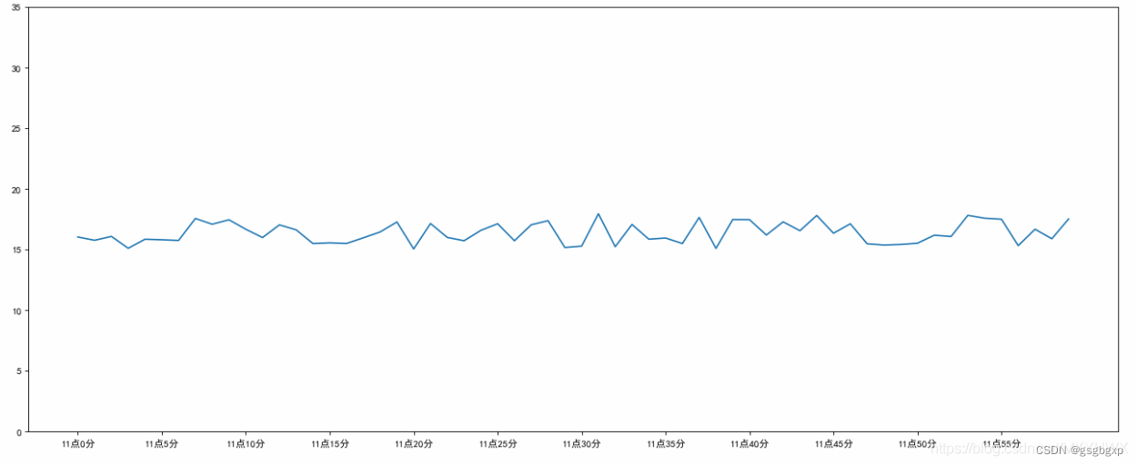
# 0.准备x, y坐标的数据
x = range(60)
y_shanghai = [random.uniform(15, 18) for i in x]
# 1.创建画布
plt.figure(figsize=(20, 8), dpi=80)
# 2.绘制折线图
plt.plot(x, y_shanghai)
# 构造x轴刻度标签
x_ticks_label = ["11点{}分".format(i) for i in x]
# 构造y轴刻度
y_ticks = [ i for i in range(40)]
# 修改x,y轴坐标的刻度显示
plt.xticks(x[::5], x_ticks_label[::5])
plt.yticks(y_ticks[::5])
#3.显示图像
plt.show()
结果
**kwargs参数有很多衍生,关于双星号的用法参见链接https://blog.csdn.net/gsgbgxp/article/details/123889475:
import numpy as np
import matplotlib.pyplot as plt
import calendar
x = range(1,13,1)
y = range(1,13,1)
plt.plot(x,y)
plt.xticks(x, calendar.month_name[1:13],color='blue',rotation=60)
plt.show()
结果
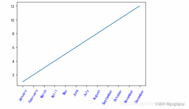
这里添加了 calendar 模块,用于显示月份的名称。calendar.month_name[1:13]即1月份到12月份每个月份的名称的数组。后面的参数color='blue’表示将标签颜色置为蓝色,rotation表示标签逆时针旋转60度。
坐标刻度也可以是公式,和设置坐标轴名称是一样的,例如
plt.xticks([1,2], [r'$\alpha$',r'$\sigma_0$'])
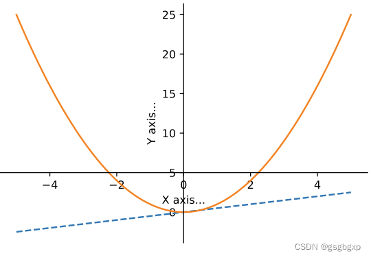
改变坐标轴位置
参考链接 https://blog.csdn.net/sinat_34328764/article/details/80246139
示例代码
import matplotlib.pyplot as plt
import numpy as np

x = np.linspace(-5, 5, 100)
y1 = 0.5 * x
y2 = x * x

plt.figure()
plt.xlabel('X axis...')
plt.ylabel('Y axis...')                        #设置坐标轴的文字标签

ax = plt.gca()                                 # get current axis 获得坐标轴对象

ax.spines['right'].set_color('none')           # spine 这个单词的意思是脊梁,应该就是包围图表的线条
ax.spines['top'].set_visible(False)             # 将右边、上边的两条边颜色设置为空 其实就相当于抹掉这两条边,或者是用set_visible设置为False

# ax.xaxis.set_ticks_position('bottom')        # 这两行似乎没用
# ax.yaxis.set_ticks_position('left')          # 指定下边的边作为x轴,指定左边的边为y轴

ax.spines['bottom'].set_position(('data', 5))  # 指定data设置的bottom(也就是指定的x轴)绑定到y轴的0这个点上
ax.spines['left'].set_position(('data', 0))    # 这个data的函数似乎还不太清楚

plt.plot(x, y1, linestyle='--')
plt.plot(x, y2)
作图结果
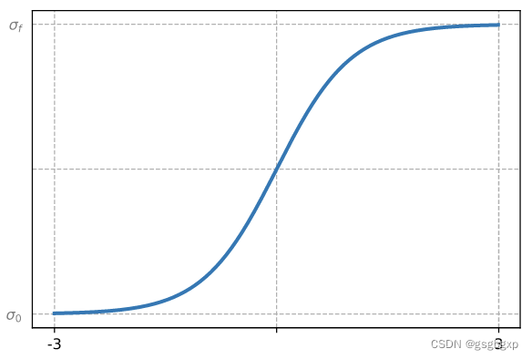
坐标轴的显示与关闭
参考链接
https://blog.51cto.com/u_15127506/3910835
https://blog.csdn.net/lsjweiyi/article/details/120611395
plt.xticks(alpha=0)
plt.tick_params(axis='x', width=0)
ax1.spines['bottom'].set_visible(False)
代码示例
import numpy as np
import matplotlib.pyplot as plt

x = np.arange(start=-3, stop=3, step=0.01)
y = np.tanh(x)

plt.plot(x,y,lw=2.5)

plt.xticks([-3,3],[-3,3],alpha=1)
plt.yticks([-1,1],[r'$\sigma_0$',r'$\sigma_f$'],alpha=0.5)
plt.yticks([-1,0,1])
plt.xticks([-3,0,3])
# plt.tick_params(axis='x', width=0)
plt.tick_params(axis='y', width=0)

plt.grid(linestyle='--')
结果
其他关键参数
具体用法可查阅官方文档
ax.set_xticks
ax.set_yticks
from matplotlib import pyplot as plt
x=range(2,26,2)
y=[13,15,23,16,14,34,14,14,16,36,25,26]
fig=plt.figure(figsize=(20,8),dpi=80)#figsize是调整图片大小,dpi是调整图片清晰度
plt.plot(x,y)
#x,y轴刻度问题
plt.xticks(x)#其实也可以 plt.xticks(range(2,26))
plt.yticks(y)
#plt.savefig("./no1.png")#保存为svg图像格式 放大后不会有锯齿
plt.show()

为开发者提供学习成长、分享交流、生态实践、资源工具等服务,帮助开发者快速成长。
更多推荐


 7
7 1
1- 0


 已为社区贡献6条内容

所有评论(0)