ggplot2 | 统计变换与柱形图、直方图、密度图
柱形图、直方图和密度图是比较常见的统计图形。本篇来系统总结下这三种图形在ggplot2系统中的绘制方法及「统计变换」在其中的应用。1 引言这三种图形既有联系又有区别:柱形图和直方图从外观上是类似的,都是使用「柱子」来表达每组的样本数;区别在于柱形图应用于离散变量,直方图应用于连续变量;密度图可以看作是直方图的极限形式,并且使用「曲线」表示;介于密度图和直方图之间的形式是使...
柱形图、直方图和密度图是比较常见的统计图形。本篇来系统总结下这三种图形在ggplot2系统中的绘制方法及「统计变换」在其中的应用。
1 引言
这三种图形既有联系又有区别:
柱形图和直方图从外观上是类似的,都是使用「柱子」来表达每组的样本数;区别在于柱形图应用于离散变量,直方图应用于连续变量;
密度图可以看作是直方图的极限形式,并且使用「曲线」表示;
介于密度图和直方图之间的形式是使用「折线图」代替直方图。
与基础绘图系统每种图形对应一个绘图函数不同,ggplot2绘图系统通过统计变换可以一定程度上淡化它们之间的区别,实现一个函数绘制多种图形。
2 柱形图
柱形图对应的数据是离散的,比如考试成绩,可以是汇总的或未汇总的:
汇总的数据是指,已经统计了每个离散值出现的频次;数据包含两列,一列是所有离散值,另一列是对应的频次;
未汇总的数据是指,频次未经统计,数据只有一列,记录每个样本对应的离散值。
set.seed(0704)
# 未汇总数据
(bar.1 <- rpois(50, 5))
##  [1]  7  4  9  6  7  3  2  3  7 11  7  8  5  5  1 11  6  5  8 11  5  3  9  4  1
## [26]  4  1 10  3  4  4  4  4  6  7  6  5  6 10  2  8  4  1  1  3  8  6  5  7  5

# 汇总数据
(bar.2 <- data.frame(x = 1:5, y = rpois(5, 10)))
##   x  y
## 1 1 14
## 2 2  8
## 3 3 14
## 4 4 11
## 5 5 8在ggplot2绘图系统中,两种情况分别对应的几何函数分别是geom_bar()和geom_col()。
library(ggplot2)
library(patchwork)
# 未汇总
p1 <- ggplot() +
  geom_bar(aes(x = bar.1), stat = "count")

# 汇总
p2 <- ggplot(data = bar.2) +
  geom_col(aes(x, y))

p1 + p2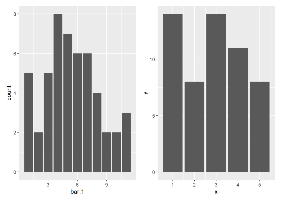
上面代码中stat = "count"可以省略,因为它是geom_bar()函数默认的参数设置。通过更改参数值可以使用该函数绘制已汇总的数据。
ggplot(data = bar.2) +
  geom_bar(aes(x,y), stat = "identity")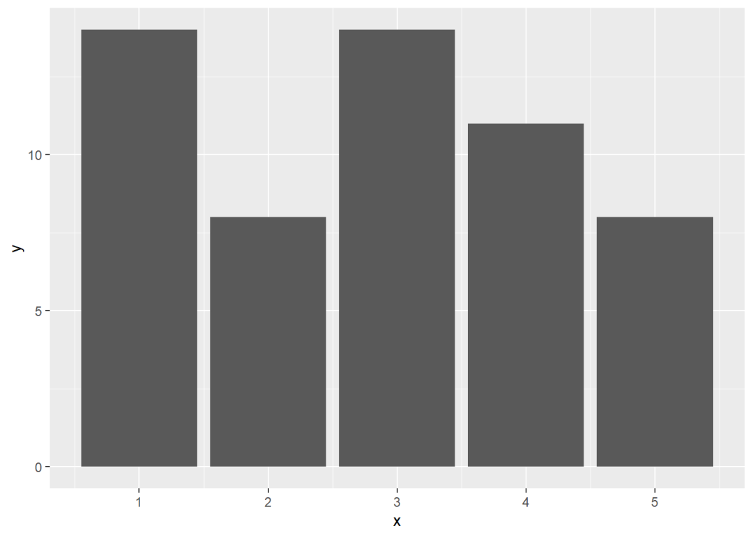
柱形图对应的统计变换函数是stat_count():
ggplot() +
  stat_count(aes(bar.1), geom = "bar")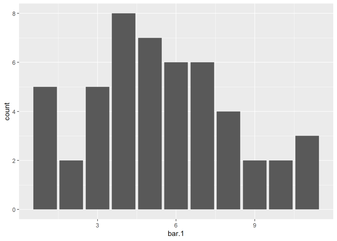
关于分组柱形图的各种设置已经在推文ggplot2 | 位置调整函数中进行了介绍,这里不再重复;关于几何函数与统计变换函数的关系可查看推文ggplot2 | 统计变换的初步理解。
3 直方图
直方图对应的数据形式与柱形图未汇总的数据形式是类似的,区别只在于数据类型是离散的。直方图是通过将这些离散值进行分段统计,再绘制柱形图。
set.seed(0704)
head(hist.1 <- rnorm(1000, 50, 10))
## [1] 59.60479 66.27459 59.38820 37.07023 58.07678 58.68494直方图对应的函数是geom_histogram()。binwidth参数可以指定分组带宽,bins参数可以指定分组数目。
# 指定带宽
p1 <- ggplot() +
  geom_histogram(aes(hist.1), binwidth = 4,
                 col = "black")

# 指定分组数
p2 <- ggplot() +
  geom_histogram(aes(hist.1), bins = 20,
                 col = "black")

p1 + p2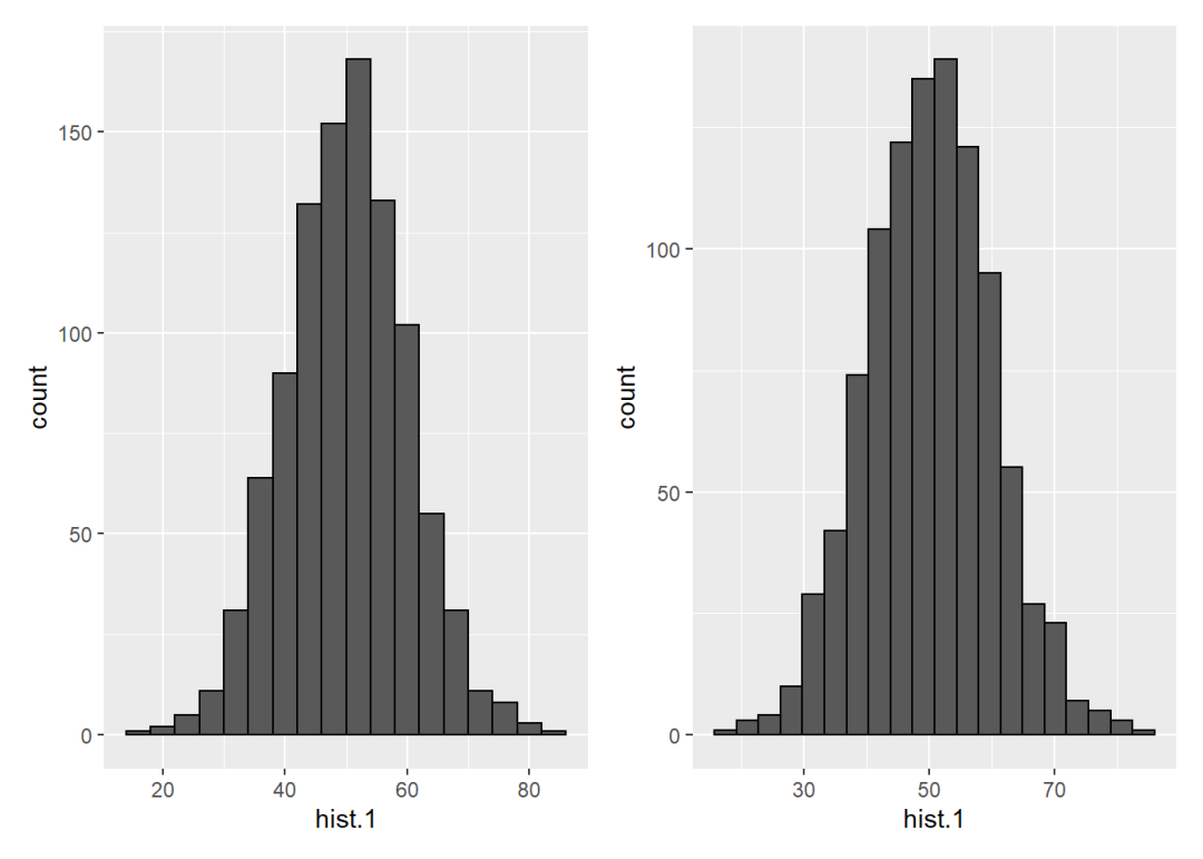
直方图对应的统计变换函数是stat_bin():
p1 <- ggplot() +
  stat_bin(aes(hist.1), geom = "bar",
           binwidth = 4, col = "black")

p2 <- ggplot() +
  stat_bin(aes(hist.1), geom = "bar",
           bins = 20, col = "black")

p1 + p2
如果要使用折线图代替柱形图,可以使用geom_freqpoly()函数:
ggplot() +
  geom_histogram(aes(hist.1), bins = 20,
                 col = "black") +
  geom_freqpoly(aes(hist.1), bins = 20, col = "grey") +
  geom_point(aes(hist.1), stat = "bin",
             bins = 20, col = "red")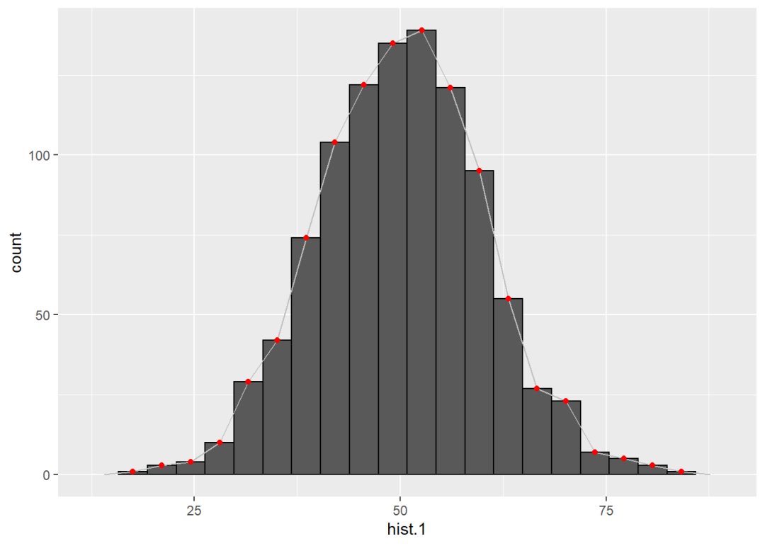
也可以使用统计变换函数stat_bin(),但是要把几何参数换成line:
ggplot() +
  geom_histogram(aes(hist.1), bins = 20,
                 col = "black") +
  stat_bin(aes(hist.1), geom = "line",
           bins = 20, col = "grey") +
  geom_point(aes(hist.1), stat = "bin",
             bins = 20, col = "red")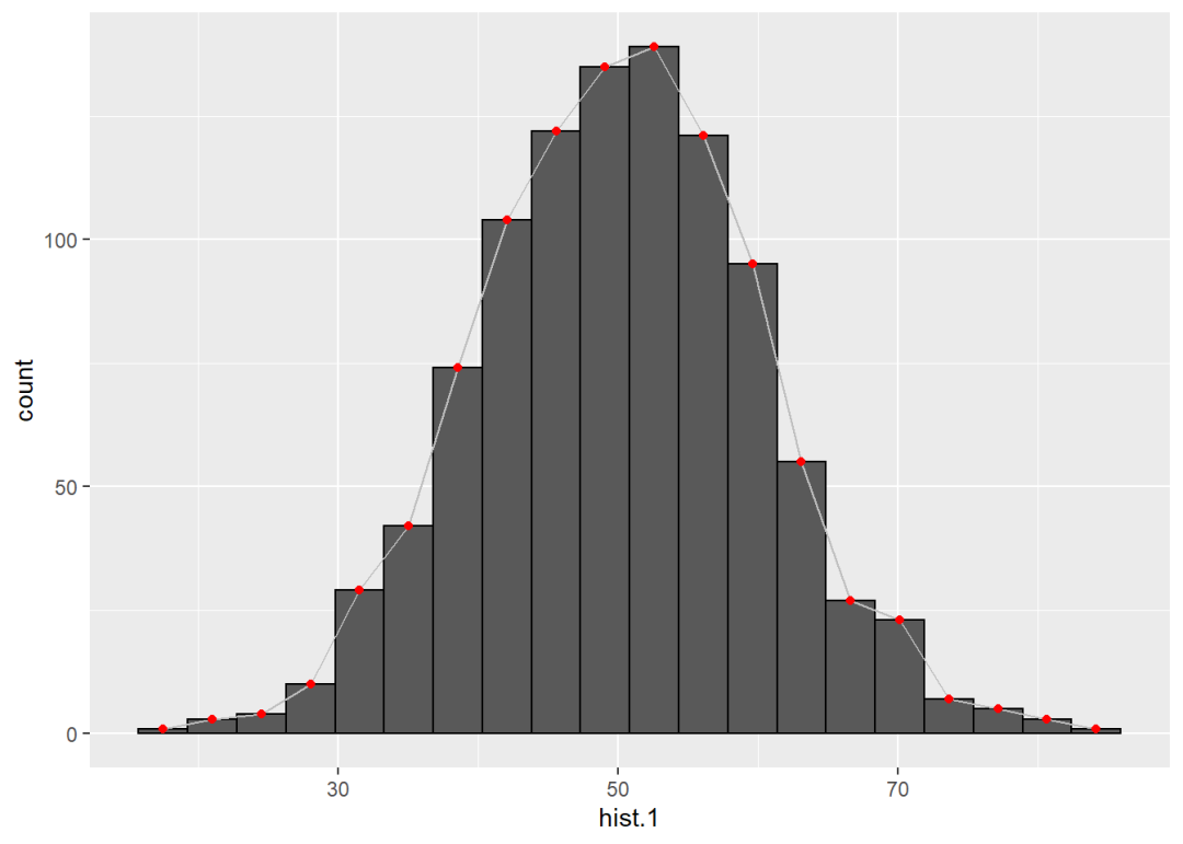
4 密度图
密度图对应的数据形式和直方图是完全一致的,对应的几何函数是geom_density()。
density.1 <- hist.1
ggplot() +
  geom_density(aes(density.1), stat = "density")
密度图对应的统计变换函数是stat_density():
p1 <- ggplot() +
  stat_density(aes(density.1), geom = "area")

p2 <- ggplot() +
  stat_density(aes(density.1), geom = "line")

p1 + p2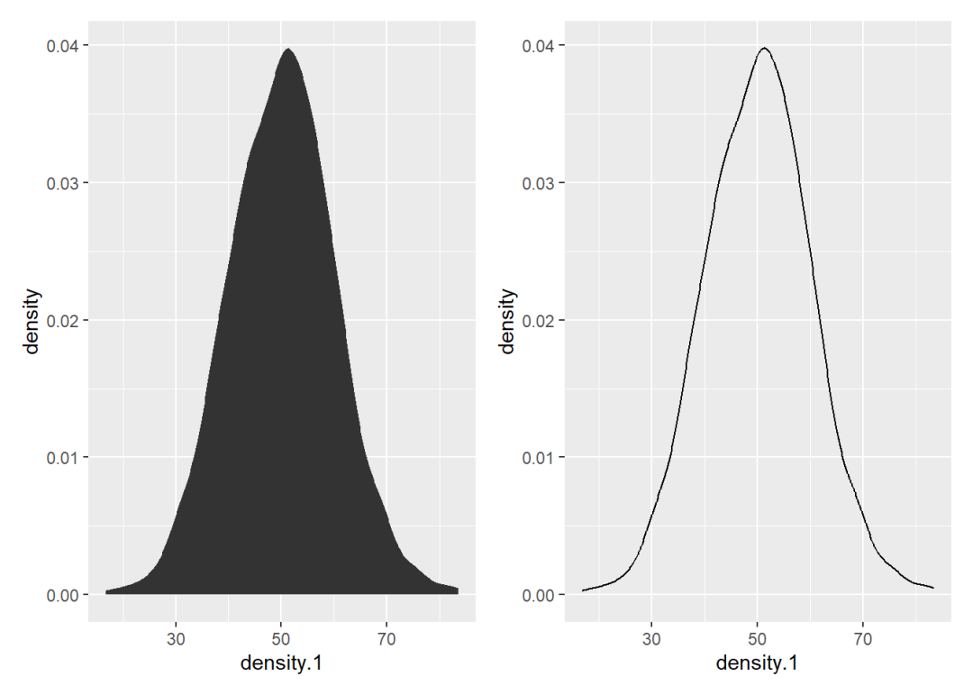
如果把geom_density()函数中的统计变换参数从density换成bin,绘制的图形就变成了折线图:
ggplot() +
  geom_density(aes(density.1), stat = "bin",
               bins = 20, col = "black")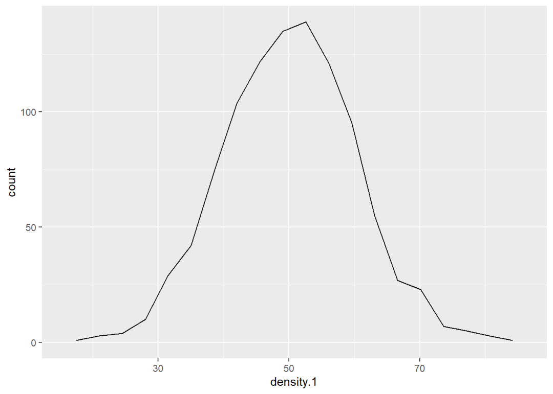
直方图和折线图的纵轴都是「计数」,而密度图的纵轴是「比例」,那能不能把折线图或直方图的纵轴也换成比例呢?
可以的。因为统计变换bin生成的结果是count,它以隐形变量的形式被当作y参数。使用after_stat()函数可以将统计变换的结果显性化,然后再进行运算即可,这里需要的运算是比例 = 计数/总样本,总样本为1000。
p1 <- ggplot() +
  geom_density(aes(x = density.1,
                   y = after_stat(count/1000)),
               stat = "bin", bins = 20, col = "black")

p2 <- ggplot() +
  geom_histogram(aes(x = density.1,
                     y = after_stat(count/1000)),
                 stat = "bin", bins = 20, col = "black")

p1 + p2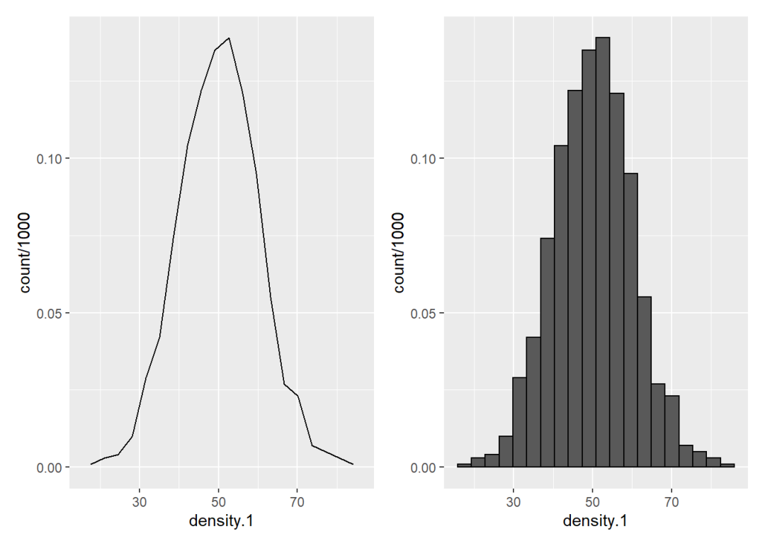
下面是关于分组密度图的一些示例:
set.seed(0704)
density.2 <- data.frame(x = rep(1:3,1000),
                        y = rnorm(3000, mean = c(50, 51, 52)))

p1 <- ggplot(density.2) +
  geom_density(aes(y, fill = factor(x), col = factor(x)),
               alpha = 0.3, position = "identity")

p2 <- ggplot(density.2) +
  geom_density(aes(y, fill = factor(x), col = factor(x)),
               alpha = 0.3, position = "stack")

p3 <- ggplot(density.2) +
  geom_density(aes(y, fill = factor(x), col = factor(x)),
               alpha = 0.3, position = "fill")

(p1 + p2) / p3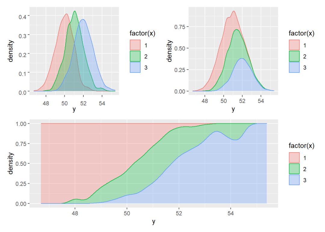
推荐阅读


为开发者提供学习成长、分享交流、生态实践、资源工具等服务,帮助开发者快速成长。
更多推荐


 2
2 0
0- 0


 已为社区贡献10条内容

所有评论(0)